第一段挖空
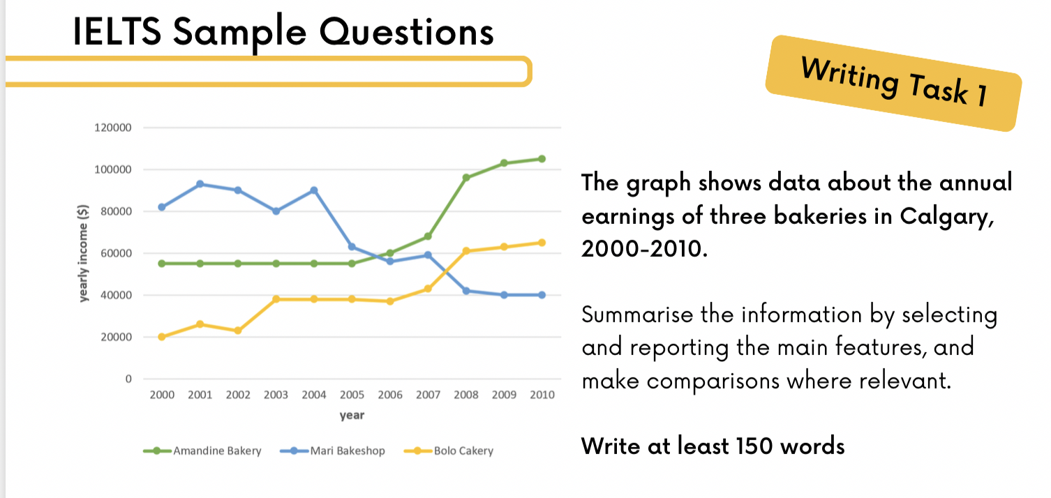
The graph shows information about the (XXX) over a (多少年) period betweon year1 and year2
Overall, what stands out from the graph(明显的是,可以放一些急剧上升,最牛逼最菜) is that there were considerable upward trends (剧增)in the income of both BoloCakery and Amandine Bakery, while the earnings of Mari Bakeshop saw a substantial fall over the period in question(). Another interesting point(后面加的就是,比较奇怪的,比如说被反超,或者指标没有全部第一) is that Mari Bakeshop was the most popular bakery in 2000, but in 2010,Amandine Bakery earned more money than the others.(感觉这段应该是over view ,应该都是在说谁一直在增,谁在减,谁是最牛的,谁是最菜的)
Looking at the details,as regards Bolo Cakery, income started at 20000 in 2000, then there was a fluctuation over the (起伏)next three years, at which point it levelled off at(稳定) just under $40,000 until 2006(临界).Then the figure went up significantly(急剧上升), finishing at(边界) around S65,p00 in 2010. if we look at(转移目标) Amandine Bakery, the trend was similar(相似). Havingremained stable at approxinmately $55,000 in the first half of the decade, income then rose sharply, reaching nearlys(达到)100,000 in 2008.There was then a gradual rise to around(缓慢上升) S105,000 in 2010.
By contrast, the income of Mari Bakeshop went in the opposite direction.Takings fluctuated(波动) around s90,000 untl2004.After That despite falling sharply to just over S40,0o0 in 2008,the figure then levelled off in the last two years.