一、创建ReactNative项目
1.1、React Native 有一个内置的命令行界面,你可以用它来生成一个新项目。您可以使用 Node.js 附带的 访问它,而无需全局安装任何内容。让我们创建一个名为“AwesomeProject”的新 React Native 项目:npx
npx react-native@latest init AwesomeProject

现在ReactNative的项目就创建完成了,我们就用VScode打开,运行项目以及编辑。
二、目录结构
 ├── /_test_                   # RN生成,测试目录
  ├── /android                 # RN生成,android代码目录,具体见下图
  ├── /ios                     # RN生成,代码目录,具体见下图
  ├── /node_modules            # 自动生成,安装依赖的目录,不会被提交
  ├── .babelrc                 # RN生成,Babel配置文件
  ├── .buckconfig              # RN生成,Buck是Mac OS X和Linux使用的构建工具,Buck的配置文件,buck是Facebook开源的高效构建系统
  ├── .flowconfig              # RN生成,Flow是一个静态的类型检查工具
  ├── .gitattributes           # RN生成,配置Git对一个特定的子目录或子文件集运用那些设置项
  ├── .gitignore               # RN生成,配置Git忽略提交的文件
  ├── .watchmanconfig          # RN生成,Watchman用于监控文件变化,辅助实现工程修改所见即所得
  ├── yarn.lock                # RN生成,Yarn是node包管理器,yarn.lock文件使程序在不同的机器上以同样的方式安装依赖
  ├── package.json             # RN生成,用于描述项目的基本信息以及需要的依赖信息
  ├── index.android.js         # RN生成,android入口文件
  ├── index.ios.js             # RN生成,ios入口文件
  ├── index.web.js             # 自定义,web入口文件
  ├── CHANGELOG.md             # 自定义,版本更新日志
  ├── README.md                # 自定义,项目运行说明
2.1、运行项目
第 1 步:启动地铁
npx react-native start
第 2 步:启动应用程序
npx react-native run-android
第3步:项目启动完成

第4步、设置模拟器悬浮在窗口最顶端段


三、React Native核心组件

四、基础语法
4.1、StyleSheet
StyleSheet是RN声明样式的API
RN中的样式与CSS的不同
- 没有继承性:RN中的继承只发生在Text组件上
- 样式名采用小驼峰命名:fontSize VS font-size
- 所有尺寸都是没有单位:width:100
- 有些特殊的样式名:marginHorizontal(水平外边距),marginVertical(垂直外边距)
RN样式的声明
- 通过style属性直接声明
-
属性值为对象:<组件 style={{样式}}/>; 属性值为数组:<组件 style={[{样式1},...{样式2}]}/> - 在style属性中调用StyleSheet声明样式
-
引入:import {StySheet,View} from 'react-native'
声明:const styles=StyleSheet.create({foo;{样式1},bar:{样式2}})
使用:<View style={[styles.foo,styles]}>内容</View>
创建组件,RNC快捷命令
按Ctrl+M,弹出调试菜单,点击热更新,页面就会更新


4.2、Flexbox布局
Flexbox——术语
- 容器(container):采用Flex布局的元素,称为Flex容器(Flex container),简称“容器”。
- 项目(Item):容器所有的子元素,称为Flex项目(Flex item),简称“项目”。
- 主轴:(main axis)
- 交叉轴:(cross axis)

Flexbox ——属性(常用)
- flexDirection:声明主轴方向:row(Web默认)| column(RN默认)
- justifyContent:声明项目的主轴的对齐方式
- alignItems:声明项目在交叉轴的对齐方式
- flex:声明项目在主轴上的尺寸比例
4.2.1、flexDirection


/* eslint-disable prettier/prettier */
import React, {Component} from 'react';
import {Text, StyleSheet, View,ScrollView} from 'react-native';

export default class FlexDirection extends Component {
  render() {
    return (
      // View非滚动
      <View>
        <Text style={[styles.div1]}> 主轴方向 </Text>
        {/* ScrollView可滚动 */}
        <ScrollView>
          <Text style={[styles.div2]}>flexDirection:"colum(默认)" </Text>
          <View style={[styles.container]}>
            <Text style={[styles.itemBase]}>苹果</Text>
            <Text style={[styles.itemBase]}>香蕉</Text>
            <Text style={[styles.itemBase]}>芒果</Text>
          </View>
          <Text style={[styles.div2]}>flexDirection:"colum-reverse" </Text>
          <View style={[styles.container,styles.flexColumnReverse]}>
            <Text style={[styles.itemBase]}>苹果</Text>
            <Text style={[styles.itemBase]}>香蕉</Text>
            <Text style={[styles.itemBase]}>芒果</Text>
          </View>
          <Text style={[styles.div2]}>flexDirection:"row" </Text>
          <View style={[styles.container,styles.flexRow]}>
            <Text style={[styles.itemBase]}>苹果</Text>
            <Text style={[styles.itemBase]}>香蕉</Text>
            <Text style={[styles.itemBase]}>芒果</Text>
          </View>
          <Text style={[styles.div2]}>flexDirection:"row-reverse" </Text>
          <View style={[styles.container,styles.flexRowReverse]}>
            <Text style={[styles.itemBase]}>苹果</Text>
            <Text style={[styles.itemBase]}>香蕉</Text>
            <Text style={[styles.itemBase]}>芒果</Text>
          </View>
        </ScrollView>
      </View>
    );
  }
}


const styles = StyleSheet.create({
  container:{
    height:150,
    margin:10,
    borderWidth:1,
    borderColor:'pink',
  },
  div1:{
    fontSize:30,
    marginHorizontal:10,
  },
  div2:{
    fontSize:24,
    marginHorizontal:10,
  },
  itemBase:{
    height:30,
    borderWidth:1,
    borderColor:'red',
    backgroundColor:'pink',
    padding:5,
    textAlign:'center',
  },
  flexColumn:{
    flexDirection:'column',
  },
  flexColumnReverse:{
    flexDirection:'column-reverse',
  },
  flexRow:{
    flexDirection:'row',
  },
  flexRowReverse:{
    flexDirection:'row-reverse',
  },
});
运行效果:

4.2.2、justifyContent
/* eslint-disable prettier/prettier */
import React, {Component} from 'react';
import {Text, StyleSheet, View,ScrollView} from 'react-native';

export default class JustifyContent extends Component {
  render() {
    return (
      // View非滚动
      <View>
        <Text style={[styles.div1]}> 项目在主轴上对齐方式 </Text>
        {/* ScrollView可滚动 */}
        <ScrollView>
          <Text style={[styles.div2]}>JustifyContent:"flex-start(默认)" </Text>
          <View style={[styles.container,styles.flexRow,styles.JustifyContentStart]}>
            <Text style={[styles.itemBase]}>苹果</Text>
            <Text style={[styles.itemBase]}>香蕉</Text>
            <Text style={[styles.itemBase]}>芒果</Text>
          </View>
          <Text style={[styles.div2]}>flexDirection:"flex-center" </Text>
          <View style={[styles.container,styles.flexRow,styles.JustifyContentCenter]}>
            <Text style={[styles.itemBase]}>苹果</Text>
            <Text style={[styles.itemBase]}>香蕉</Text>
            <Text style={[styles.itemBase]}>芒果</Text>
          </View>
          <Text style={[styles.div2]}>flexDirection:"flex-end" </Text>
          <View style={[styles.container,styles.flexRow,styles.JustifyContentEnd]}>
            <Text style={[styles.itemBase]}>苹果</Text>
            <Text style={[styles.itemBase]}>香蕉</Text>
            <Text style={[styles.itemBase]}>芒果</Text>
          </View>
          <Text style={[styles.div2]}>flexDirection:"space-around" </Text>
          <View style={[styles.container,styles.flexRow,styles.JustifyContentAround]}>
            <Text style={[styles.itemBase]}>苹果</Text>
            <Text style={[styles.itemBase]}>香蕉</Text>
            <Text style={[styles.itemBase]}>芒果</Text>
          </View>
          <Text style={[styles.div2]}>flexDirection:"space-evenly" </Text>
          <View style={[styles.container,styles.flexRow,styles.JustifyContentEvenly]}>
            <Text style={[styles.itemBase]}>苹果</Text>
            <Text style={[styles.itemBase]}>香蕉</Text>
            <Text style={[styles.itemBase]}>芒果</Text>
          </View>
          <Text style={[styles.div2]}>flexDirection:"space-between" </Text>
          <View style={[styles.container,styles.flexRow,styles.JustifyContentBetween]}>
            <Text style={[styles.itemBase]}>苹果</Text>
            <Text style={[styles.itemBase]}>香蕉</Text>
            <Text style={[styles.itemBase]}>芒果</Text>
          </View>
        </ScrollView>
      </View>
    );
  }
}


const styles = StyleSheet.create({
  container:{
    height:150,
    margin:10,
    borderWidth:1,
    borderColor:'pink',
  },
  div1:{
    fontSize:30,
    marginHorizontal:10,
  },
  div2:{
    fontSize:24,
    marginHorizontal:10,
  },
  itemBase:{
    height:30,
    borderWidth:1,
    borderColor:'red',
    backgroundColor:'pink',
    padding:5,
    textAlign:'center',
  },
  flexColumn:{
    flexDirection:'column',
  },
  flexColumnReverse:{
    flexDirection:'column-reverse',
  },
  flexRow:{
    flexDirection:'row',
  },
  flexRowReverse:{
    flexDirection:'row-reverse',
  },
  JustifyContentStart:{
    justifyContent:'flex-start',
  },
  JustifyContentCenter:{
    justifyContent:'center',
  },
  JustifyContentEnd:{
    justifyContent:'flex-end',
  },
  JustifyContentAround:{
    justifyContent:'space-around',
  },
  JustifyContentEvenly:{
    justifyContent:'space-evenly',
  },
  JustifyContentBetween:{
    justifyContent:'space-between',
  },
});
运行效果:

4.2.2、alignItems
AlignItems.tsx
/* eslint-disable prettier/prettier */
import React, {Component} from 'react';
import {Text, StyleSheet, View,ScrollView} from 'react-native';

export default class AlignItems extends Component {
  render() {
    return (
      // View非滚动
      <View style={{height:'100%'}}>
        <Text style={[styles.div1]}> 项目在主轴上对齐方式 </Text>
        {/* ScrollView可滚动 */}
        <ScrollView>
          <Text style={[styles.div2]}>alignItems:"flex-start(默认)" </Text>
          <View style={[styles.container,styles.flexRow,styles.alignItemsStart]}>
            <Text style={[styles.itemBase]}>苹果</Text>
            <Text style={[styles.itemBase]}>香蕉</Text>
            <Text style={[styles.itemBase]}>芒果</Text>
          </View>
          <Text style={[styles.div2]}>alignItems:"center" </Text>
          <View style={[styles.container,styles.flexRow,styles.alignItemsCenter]}>
            <Text style={[styles.itemBase]}>苹果</Text>
            <Text style={[styles.itemBase]}>香蕉</Text>
            <Text style={[styles.itemBase]}>芒果</Text>
          </View>
          <Text style={[styles.div2]}>alignItems:"flex-end" </Text>
          <View style={[styles.container,styles.flexRow,styles.alignItemsEnd]}>
            <Text style={[styles.itemBase]}>苹果</Text>
            <Text style={[styles.itemBase]}>香蕉</Text>
            <Text style={[styles.itemBase]}>芒果</Text>
          </View>
          <Text style={[styles.div2]}>alignItems:"stretch" </Text>
          <View style={[styles.container,styles.flexRow,styles.alignItemsStretch]}>
            <Text style={[styles.itemBase]}>苹果</Text>
            <Text style={[styles.itemBase]}>香蕉</Text>
            <Text style={[styles.itemBase]}>芒果</Text>
          </View>
          <Text style={[styles.div2]}>alignItems:"baseline" </Text>
          <View style={[styles.container,styles.flexRow,styles.alignItemsBaseline]}>
            <Text style={[styles.itemBase]}>苹果</Text>
            <Text style={[styles.itemBase]}>香蕉</Text>
            <Text style={[styles.itemBase]}>芒果</Text>
          </View>
        </ScrollView>
      </View>
    );
  }
}


const styles = StyleSheet.create({
  container:{
    height:150,
    margin:10,
    borderWidth:1,
    borderColor:'pink',
  },
  div1:{
    fontSize:30,
    marginHorizontal:10,
  },
  div2:{
    fontSize:24,
    marginHorizontal:10,
  },
  itemBase:{
    height:30,
    borderWidth:1,
    borderColor:'red',
    backgroundColor:'pink',
    padding:5,
    textAlign:'center',
  },
  flexColumn:{
    flexDirection:'column',
  },
  flexColumnReverse:{
    flexDirection:'column-reverse',
  },
  flexRow:{
    flexDirection:'row',
  },
  flexRowReverse:{
    flexDirection:'row-reverse',
  },
  alignItemsStart:{
    alignItems:'flex-start',
  },
  alignItemsCenter:{
    alignItems:'center',
  },
  alignItemsEnd:{
    alignItems:'flex-end',
  },
  alignItemsStretch:{
    alignItems:'stretch',
  },
  alignItemsBaseline:{
    alignItems:'baseline',
  },
});
运行效果:

4.2.2、Flex
Flex.tsx
/* eslint-disable prettier/prettier */
/* eslint-disable react-native/no-inline-styles */
/* eslint-disable prettier/prettier */
import React, {Component} from 'react';
import {Text, StyleSheet, View,ScrollView} from 'react-native';

export default class Flex extends Component {
  render() {
    return (
      // View非滚动
      <View style={{height:'100%'}}>
        <Text style={[styles.div1]}> 项目在主轴上占比 </Text>
        {/* ScrollView可滚动 */}
        <ScrollView>
          <Text style={[styles.div2]}>flexRow 1:1:1</Text>
          <View style={[styles.container,styles.flexRow]}>
            <Text style={[styles.itemBase,{flex:1}]}>苹果</Text>
            <Text style={[styles.itemBase,{flex:1}]}>香蕉</Text>
            <Text style={[styles.itemBase,{flex:1}]}>芒果</Text>
          </View>
          <Text style={[styles.div2]}>flexRow 1:2:3 </Text>
          <View style={[styles.container,styles.flexRow]}>
            <Text style={[styles.itemBase,{flex:1}]}>苹果</Text>
            <Text style={[styles.itemBase,{flex:2}]}>香蕉</Text>
            <Text style={[styles.itemBase,{flex:3}]}>芒果</Text>
          </View>
          <Text style={[styles.div2]}>flexColumn:1:1:1 </Text>
          <View style={[styles.container,styles.flexColumn]}>
            <Text style={[styles.itemBase,{flex:1}]}>苹果</Text>
            <Text style={[styles.itemBase,{flex:1}]}>香蕉</Text>
            <Text style={[styles.itemBase,{flex:1}]}>芒果</Text>
          </View>
          <Text style={[styles.div2]}>flexColumn:1:2:3 </Text>
          <View style={[styles.container,styles.flexColumn]}>
            <Text style={[styles.itemBase,{flex:1}]}>苹果</Text>
            <Text style={[styles.itemBase,{flex:2}]}>香蕉</Text>
            <Text style={[styles.itemBase,{flex:3}]}>芒果</Text>
          </View>
        </ScrollView>
      </View>
    );
  }
}


const styles = StyleSheet.create({
  container:{
    height:150,
    margin:10,
    borderWidth:1,
    borderColor:'pink',
  },
  div1:{
    fontSize:30,
    marginHorizontal:10,
  },
  div2:{
    fontSize:24,
    marginHorizontal:10,
  },
  itemBase:{
    height:30,
    borderWidth:1,
    borderColor:'red',
    backgroundColor:'pink',
    padding:5,
    textAlign:'center',
  },
  flexColumn:{
    flexDirection:'column',
  },
  flexColumnReverse:{
    flexDirection:'column-reverse',
  },
  flexRow:{
    flexDirection:'row',
  },
  flexRowReverse:{
    flexDirection:'row-reverse',
  },
});
运行效果:

五、响应式布局
-
Flexbox模型
React Native 在布局和样式上极大程度上借鉴了 Web 前端所使用的 CSS 规格。CSS 布局方面的算法主要由三个部分组成,首先是解决单个 UI 元素的尺寸问题的 Box 模型(具体由 width,height,padding,border,margin 属性构成),其次是解决 UI 元素相对位置的 Position 模型(具体由 position,top,right,bottom,left 属性构成),最后是解决剩余空间分配问题的 Flexbox 模型。
-
Dimensions (获取屏幕信息)
Dimensions API 是 React Native 提供的获取屏幕信息用的 API。开发人员可以通过调用 Dimensions.get()方法取得一个包含屏幕长宽信息的对象,来把握当前用户的设备的屏幕大小,并且以此来简易推测用户是否处于横屏状态。
用户使用应用的过程中,由于设备的旋转方向变化或者多应用分屏等情况,屏幕信息可能随时会产生变化。作为可以对应各种变化情况的最佳实践,推荐在组件的 onLayout 的回调中使用 Dimensions.get()方法来获取屏幕信息。
import {Dimensions} from 'react-native';
const windowWidth=Dimension.get('window').width;
const windowHeight=Dimension.get('window').height;
使用Dimensions
创建:DimensionsTest.tsx
/* eslint-disable prettier/prettier */
import React, {Component} from 'react';
import {Text, StyleSheet, View, Dimensions} from 'react-native';

export default class DimensionsTest extends Component {
  render() {
    return (
      <View style={[styles.container]}>
        <View style={styles.itemBase}>
          <Text style={styles.h3}> 首页 </Text>
        </View>
        <View style={styles.itemBase}>
          <Text style={styles.h3}> 分类 </Text>
        </View>
        <View style={styles.itemBase}>
          <Text style={styles.h3}> 动态 </Text>
        </View>
        <View style={styles.itemBase}>
          <Text style={styles.h3}> 筛选 </Text>
        </View>
      </View>
    );
  }
}

const styles = StyleSheet.create({
  container:{
    flexDirection:'row',
  },
  itemBase:{
    justifyContent:'center',
    alignItems:'center',
    backgroundColor:'pink',
    //获取窗口的宽度然后分4份
    width:Dimensions.get('window').width / 4,
    height:90,
    borderWidth:1,
    borderColor:'yellow',
    //设置字体无效,因为RN不存在继承,需要单独设置
    fontSize:25,
  },
  h3:{
    fontSize:24,
  },
});
运行效果:

六、组件简介
6.1、简介
RN中的核心组件,是对原生组件的封装
- 原生组件:Android或ios内的组件
- 核心组件:RN中常用的,来自react-native的组件


原生组件
在 Android 开发中是使用 Kotlin 或 Java 来编写视图;在 iOS 开发中是使用 Swift 或 Objective-C 来编写视图。在 React Native 中,则使用 React 组件通过 JavaScript 来调用这些视图。在运行时,React Native 为这些组件创建相应的 Android 和 iOS 视图。由于 React Native 组件就是对原生视图的封装,因此使用 React Native 编写的应用外观、感觉和性能与其他任何原生应用一样。我们将这些平台支持的组件称为原生组件。
核心组件
官网的核心主键,React Native 具有许多核心组件,从表单控件到活动指示器,应有尽有。你可以在API 章节找到它们。您将主要使用以下核心组件:

这是参考的核心组件有:


官网的案例:
/* eslint-disable prettier/prettier */
import React, { Component } from 'react';
import { Text, StyleSheet, View , Image, ScrollView, TextInput} from 'react-native';

export default class CoreComponent  extends Component {
  render() {
    return (
        <ScrollView>
        <Text>Some text</Text>
        <View>
          <Text>Some more text</Text>
          <Image
            source={{
              uri: 'https://reactnative.dev/docs/assets/p_cat2.png',
            }}
            // eslint-disable-next-line react-native/no-inline-styles
            style={{ width: 200, height: 200 }}
          />
        </View>
        <TextInput
          // eslint-disable-next-line react-native/no-inline-styles
          style={{
            height: 40,
            borderColor: 'gray',
            borderWidth: 1,
          }}
          defaultValue="You can type in me"
        />
      </ScrollView>
    );
  }
}

// eslint-disable-next-line @typescript-eslint/no-unused-vars
const styles = StyleSheet.create({});
效果:

Alert和Button
Button是一个简单的跨平台的按钮组件。下面是一个最简示例:
AlertAndButton.tsx
上面这段代码会在 iOS 上渲染一个蓝色的标签状按钮,在 Android 上则会渲染一个蓝色圆角矩形带白字的按钮。点击这个按钮会调用"onPress"函数,具体作用就是显示一个 alert 弹出框。你还可以指定"color"属性来修改按钮的颜色。
运行效果:点击按钮弹出提示框


再试试下面这个使用Button的例子吧。你可以点击"Tap to Play"来预览真实效果
buttonBasics.tsx
import React, { Component } from 'react';
import { Alert, Button, StyleSheet, View } from 'react-native';

export default class ButtonBasics extends Component {
  _onPressButton() {
    Alert.alert('You tapped the button!')
  }

  render() {
    return (
      <View style={styles.container}>
        <View style={styles.buttonContainer}>
          <Button
            onPress={this._onPressButton}
            title="Press Me"
          />
        </View>
        <View style={styles.buttonContainer}>
          <Button
            onPress={this._onPressButton}
            title="Press Me"
            color="#841584"
          />
        </View>
        <View style={styles.alternativeLayoutButtonContainer}>
          <Button
            onPress={this._onPressButton}
            title="This looks great!"
          />
          <Button
            onPress={this._onPressButton}
            title="OK!"
            color="#841584"
          />
        </View>
      </View>
    );
  }
}

const styles = StyleSheet.create({
  container: {
   flex: 1,
   justifyContent: 'center',
  },
  buttonContainer: {
    margin: 20
  },
  alternativeLayoutButtonContainer: {
    margin: 20,
    flexDirection: 'row',
    justifyContent: 'space-between'
  }
})
运行效果:

Switch和StatuBas
/* eslint-disable prettier/prettier */
import React, { Component } from 'react';
import { StatusBar, StyleSheet, Switch, View } from 'react-native';

export default class SwitchAndStatuBar extends Component<any,any> {
    constructor(props:any){
        super(props);
        this.state = {
            hideStatusBar:false,
        };
    }
  render() {
    return (
      <View style={[styles.container]}>
        <StatusBar
            hidden={this.state.hideStatusBar} //是否显示顶部
            backgroundColor="blue" //仅在Android应用下有效
            barStyle={'dark-content'}
         //用于设置状态栏文字的颜色,其值是枚举类型enum(‘default’, ‘light-content’, ‘dark-content’):
         //default:黑色文字(默认)
         //light-content:白色文字
         //dark-content: 暗色文字
        />
      //开关组件
        <Switch
        trackColor={{false:'red',true:'green'}}
        thumbColor={this.state.hideStatusBar ? 'red' : 'white'}
        value={this.state.hideStatusBar}
      //选中事件
        onValueChange={()=>{this.setState({hideStatusBar:!this.state.hideStatusBar});}}
        />
      </View>
    );
  }
}


const styles = StyleSheet.create({
    container:{
        flex:1,
        justifyContent:'center',
        alignItems:'center',
    },
});
运行效果:

ActivityIndicator
ActivityIndicator的效果类似我们平时看到了loading,在android中ActivityIndicator是progressBar 的Indeterminate(false)模式,说白了就是一个半圆转啊转。
具体属性:
1、ViewPropTypes props… :包含View控件的所有属性,具体咱们看View的属性解释。
2、animating:是否显示,默认true(显示)
3、color: 指示器的颜色, ios默认为gray(#999999),android 默认使用progressBar的系统样式,取决于你设置的style。
4、size: 表示大小,可以设置的值有:
‘small’: 宽高各20
‘large’: 宽高各36
5、hidesWhenStopped:此属性只在ios生效,当停止动画的时候,是否隐藏。默认为true。
ActivityIndicatorDemo.tsx
import React, {Component} from 'react';
    import {
        StyleSheet,
        View,
        Text,
        ActivityIndicator,
    } from 'react-native';
    export default class ActivityIndicatorDemo extends Component {

    render() {
        return (
            <View style={{flex:1}}>
                <View style={{flexDirection:'row'}}>
                    <Text>全部默认:</Text>
                    <ActivityIndicator />
                </View>
                <View style={{flexDirection:'row'}}>
                    <Text>添加背景色:</Text>
                    <ActivityIndicator style={{backgroundColor:'blue'}}/>
                </View>
                <View style={{flexDirection:'row'}}>
                    <Text>animating=false (隐藏):</Text>
                    <ActivityIndicator animating={false}/>
                </View>
                <View style={{flexDirection:'row'}}>
                    <Text>设置color:</Text>
                    <ActivityIndicator color='red'/>
                </View>
                <View style={{flexDirection:'row'}}>
                    <Text>size small:</Text>
                    <ActivityIndicator size="small"/>
                    <Text>size large:</Text>
                    <ActivityIndicator size="large"/>

                </View>
                <View style={{flexDirection:'row'}}>
                    <Text>view props属性设置:</Text>
                    <ActivityIndicator style={{height:100,width:80,backgroundColor:'black'}} />

                </View>
            </View>
        );
    }
    }
运行效果:

Image图片加载
1、source图片路径
ImageDemo.tsx
/* eslint-disable prettier/prettier */
import React, {Component} from 'react';
import {View, Image, StyleSheet, Dimensions} from 'react-native';

export default class ImageDemo extends Component {
  render() {
    return (
      <View style={[styles.container]}>
        <Image style={[styles.items]} source={require('./images/logo.jpg')} />
        <Image
          style={styles.tinyLogo}
          source={{uri: 'https://reactnative.dev/img/tiny_logo.png'}}
        />
        <Image
          style={styles.logo}
          source={{
            uri: 'data:image/png;base64,iVBORw0KGgoAAAANSUhEUgAAADMAAAAzCAYAAAA6oTAqAAAAEXRFWHRTb2Z0d2FyZQBwbmdjcnVzaEB1SfMAAABQSURBVGje7dSxCQBACARB+2/ab8BEeQNhFi6WSYzYLYudDQYGBgYGBgYGBgYGBgYGBgZmcvDqYGBgmhivGQYGBgYGBgYGBgYGBgYGBgbmQw+P/eMrC5UTVAAAAABJRU5ErkJggg==',
          }}
        />
      </View>
    );
  }
}

const styles = StyleSheet.create({
  container: {
    flex: 1,
    justifyContent: 'center',
    alignItems: 'center',
  },
  items:{
    height:200,
    width:Dimensions.get('window').width,
  },
  tinyLogo: {
    width: 50,
    height: 50,
  },
  logo: {
    width: 66,
    height: 58,
  },
});
运行效果:

TextInput
TextInputDemo.tsx
/* eslint-disable prettier/prettier */
import React, {Component} from 'react';
import {
  StyleSheet,
  View,
  TextInput,
  Dimensions,
  Button,
  Alert,
} from 'react-native';

export default class TextInputDemo extends Component<any, any> {
  constructor(props: any) {
    super(props);
    this.state = {
      username: '',
      password: '',
    };
  }
  doLogin = () => {
    Alert.alert(this.state.username);
  };
  render() {
    return (
      <View style={[styles.containers]}>
        <TextInput
          value={this.state.username}
          style={[styles.input]}
          placeholder="请输入用户名"
          onChangeText={_val => {
            this.setState({username: _val});
          }}
        />
        <TextInput
          style={[styles.input]}
          placeholder="请输入密码"
          value={this.state.password}
          //保护密码
          secureTextEntry={true}
          onChangeText={_val => {
            this.setState({password: _val});
          }}
        />

        <TextInput
          style={[styles.input]}
          placeholder="请输入手机号"
          //数字键盘
          keyboardType="number-pad"
        />

        <TextInput
          style={[styles.input]}
          placeholder="文本域"
          multiline={true}
          numberOfLines={5}
          textAlignVertical="top"
        />
        <View>
          <Button title="登录" onPress={this.doLogin} />
        </View>
      </View>
    );
  }
}

const styles = StyleSheet.create({
  containers: {
    flex: 1,
    justifyContent: 'center',
  },
  input: {
    width: Dimensions.get('window').width - 20,
    margin: 10,
    borderWidth: 1,
    borderColor: 'red',
    paddingHorizontal: 5,
  },
});
运行效果:

Touchable组件
- TouchableHighlight:触碰后,高亮显示
- TouchableOpacity:触碰后,透明度降低(模糊显示)
- TouchaleWithoutFeedback:触碰后,无影响
TouchaleDemo.tsx
/* eslint-disable prettier/prettier */
import React, { Component } from 'react';
import { Text, StyleSheet, View, TouchableHighlight, Alert, TouchableOpacity, TouchableWithoutFeedback } from 'react-native';

export default class TouchaleDemo extends Component {
  render() {
    return (
      <View style={[styles.container]}>
        <TouchableHighlight onPress={()=>{
           Alert.alert('触碰高亮显示');
        }} >
        <View>
              <Text style={[styles.item]}> 触碰高亮 </Text>
        </View>
        </TouchableHighlight>

        <TouchableOpacity onPress={()=>{
           Alert.alert('触碰透明的变化');
        }}>
        <View>
              <Text style={[styles.item]}> 触碰透明的变化 </Text>
        </View>
        </TouchableOpacity>

        <TouchableWithoutFeedback onPress={()=>{
           Alert.alert('触碰无效');
        }}>
        <View>
              <Text style={[styles.item]}> 触碰无效 </Text>
        </View>
        </TouchableWithoutFeedback>
      </View>
    );
  }
}


const styles = StyleSheet.create({
    container:{
        flex:1,
        justifyContent:'center',
        alignItems:'center',
    },
    item:{
        marginBottom:20,
        padding:10,
        borderWidth:1,
        borderColor:'red',
    },
});
运行效果:

ScrollView和SafeAreaView
ScrollView是一个通用的可滚动的容器,你可以在其中放入多个组件和视图,而且这些组件并不需要是同类型的。ScrollView不仅可以垂直滚动(默认),还能水平滚动(通过horizontal属性来设置)。
ScrollView常用属性:
horizontal(布尔值):当此属性为true的时候,所有的的子视图会在水平方向上排成一行,而不是默认的在垂直方向上排成一列。默认值为false。
showsHorizontalScrollIndicator(布尔值):当此属性为true的时候,显示一个水平方向的滚动条。
showsVerticalScrollIndicator(布尔值):与showsHorizontalScrollIndicator相对,当此属性为true的时候,显示一个垂直方向的滚动条。
OnMomentumScrollEnd(function) :当一帧滚动完毕的时候调用,e.nativeEvent.contentOffset,可以用来获取偏移量。
onScrollBeginDrag(function) :当开始手动拖拽的时候调用。
onScrollEndDrag(function) :当结束手动拖拽的时候调用。
onScroll(function) :在滚动的过程中,每帧最多调用一次此回调函数。调用的频率可以用scrollEventThrottle属性来控制。
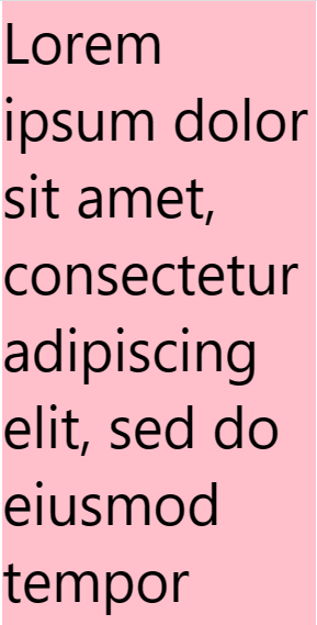
/* eslint-disable prettier/prettier */
import React, {Component} from 'react';
import {
  Text,
  StyleSheet,
  SafeAreaView,
  ScrollView,
  StatusBar,
  View,
} from 'react-native';

export default class ScrollViewDemo extends Component {
  render() {
    return (

      <SafeAreaView style={styles.container}>
        <ScrollView
        style={styles.scrollView}
        //隐藏滚动条
        showsVerticalScrollIndicator={false}
        >
          <Text style={styles.text}>
            Lorem ipsum dolor sit amet, consectetur adipiscing elit, sed do
            eiusmod tempor incididunt ut labore et dolore magna aliqua. Ut enim
            ad minim veniam, quis nostrud exercitation ullamco laboris nisi ut
            aliquip ex ea commodo consequat. Duis aute irure dolor in
            reprehenderit in voluptate velit esse cillum dolore eu fugiat nulla
            pariatur. Excepteur sint occaecat cupidatat non proident, sunt in
            culpa qui officia deserunt mollit anim id est laborum.
          </Text>
        </ScrollView>
      </SafeAreaView>
    );
  }
}

const styles = StyleSheet.create({
  container: {
    flex: 1,
    paddingTop: StatusBar.currentHeight,
  },
  scrollView: {
    backgroundColor: 'pink',
    marginHorizontal: 20,
  },
  text: {
    fontSize: 42,
  },
});
运行效果:有滚动效果
SectionList
用于呈现分区列表的高性能界面,支持最方便的功能:
- 完全跨平台。
- 可配置的可见度回传。
- 列表标题支持。
- 列表页脚支持。
- 项目分隔符支持。
- 节标题支持。
- 节分隔符支持。
- 异构数据和项目呈现支持。
- 拉动以刷新。
- 滚动加载。
如果您不需要部分支持并且想要更简单的界面,请使用<FlatList>
官网案例:
SectionListDemo.tsx
/* eslint-disable prettier/prettier */
import React, {Component} from 'react';
import { StyleSheet,
    Text,
    View,
    SafeAreaView,
    SectionList,
    StatusBar} from 'react-native';

export default class SectionListDemo extends Component {
     DATA = [
        {
          title: 'Main dishes',
          data: ['Pizza', 'Burger', 'Risotto'],
        },
        {
          title: 'Sides',
          data: ['French Fries', 'Onion Rings', 'Fried Shrimps'],
        },
        {
          title: 'Drinks',
          data: ['Water', 'Coke', 'Beer'],
        },
        {
          title: 'Desserts',
          data: ['Cheese Cake', 'Ice Cream'],
        },
      ];
  render() {
    return (
        <SafeAreaView style={styles.container}>
        <SectionList
          sections={this.DATA}
          keyExtractor={(item, index) => item + index}
          renderItem={({item}) => (
            <View style={styles.item}>
              <Text style={styles.title}>{item}</Text>
            </View>
          )}
          renderSectionHeader={({section: {title}}) => (
            <Text style={styles.header}>{title}</Text>
          )}
        />
      </SafeAreaView>
    );
  }
}


const styles = StyleSheet.create({
    container: {
        flex: 1,
        paddingTop: StatusBar.currentHeight,
        marginHorizontal: 16,
      },
      item: {
        backgroundColor: '#f9c2ff',
        padding: 20,
        marginVertical: 8,
      },
      header: {
        fontSize: 32,
        backgroundColor: '#fff',
      },
      title: {
        fontSize: 24,
      },
});
运行效果:
