需求:
设计一个标题,让中间部分随着文字而撑大,同时文字渐变,两边自适应,这种情况就不能用传统的背景图片了,想到可以使用图片边框来做
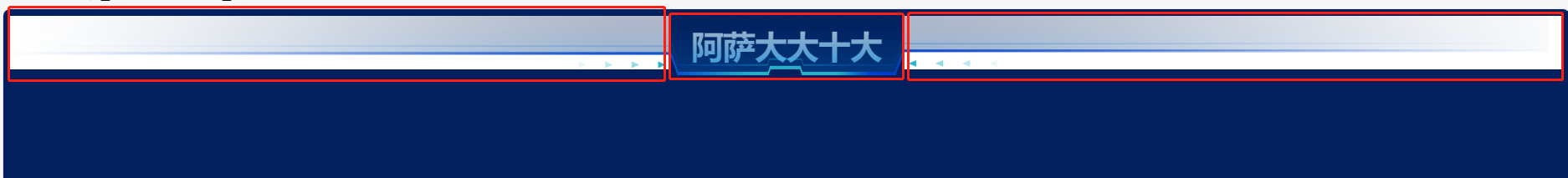
解决思路:
1.需要一个大盒子和三个小盒子
2.大盒子设置display:flex; 左右两个小盒子分别设置flex-grow; 并设置背景图片
3.给中间盒子设置边框图片(重点)关于边框图片可参考:CSS 边框图像 (w3school.com.cn)
上代码:
<!DOCTYPE html>
<html>
<head>
	<meta charset="utf-8">
	<meta name="viewport" content="width=device-width, initial-scale=1">
	<title>demo</title>
	<style type="text/css">
		body {
			background-image: url('background_main.png');
			background-position: center center;
			background-repeat: no-repeat;
			background-attachment: fixed;
			background-size: cover;
		}
		.left, .right {
			flex-grow: 1;
    		/* 背景图不平铺 */
    		background-repeat: no-repeat;
    		/* 当内容高度大于图片高度时,背景图像的位置相对于viewport固定 */
/*    		background-attachment: fixed;*/
    		/* 让背景图基于容器大小伸缩 */
    		background-size: 100% 90%;
    		/* 设置背景颜色,背景图加载过程中会显示背景色 */
		}

		.left {
			text-align: right;
			background-image: url('left.png');

		}
		.right {
			text-align: left;
			background-image: url("right.png");
		}
		.box {
			letter-spacing: -1px;
			font-weight: bold;
			color: #0072F0;
			font-size: 39px;
			background: linear-gradient(0deg, #69CCFF 0%, #FFFFFF 100%); // 文字渐变
			-webkit-background-clip:text;  // 文字渐变
			-webkit-text-fill-color:transparent; // 文字渐变
			width: auto;
			display: inline-block;
			border: 10px solid; // 图片边框设置
			border-top: 0; // 图片边框设置,(注意:我的demo是不需要设置上边框的,所以添加了该属性,请大家自行选择)
			padding: 0 15px;
			border-image-source: url('background_head.png'); // 图片边框设置
			border-image-slice: 1 595 70 595 fill; // 图片边框设置 (注意:我的图片较大,请根据图片裁剪)
			border-image-width: 0 0 35; // 图片边框设置
			border-image-repeat: stretch; // 图片边框设置
		}
	</style>
</head>
<body style="background: #031F5E;">
	<!-- background: url('left.png') no-repeat center; -->
	<div style="width:100%; height: auto; text-align: center; display: flex;">
		<div class="left">
		</div>
		<div class="box">阿萨大大十大</div>
		<div class="right">
		</div>
	</div>

</body>
</html>