【关键字】
标题栏、常用内置组件整合、JavaUI、自定义组件
【1、写在前面】
平时我们在开发一个应用时,我们都知道一个完整的项目中会有很多个页面,而这些页面中会有许多通用的部分,比如通用标题栏、通用Dialog、通用下拉菜单等等,在Android开发中我们可以通过LayoutInflater.from(Context).inflate(layout,root,false)解析XML布局,从而将多个Android中内置的控件实现一个组合式的自定义View,以达到组件通用化,提高代码的复用性的效果。那么在HarmonyOS应用开发中,同样的也会遇到这种需求,就以标题栏为例,如果每个页面都写一遍,代码既冗余也不美观,所以本着复用的思想,我们需要想办法来解决这个问题,那么在鸿蒙应用开发中该怎么实现这种效果呢,继续往下读,本篇我们的任务就是通过Java语言来实现一个通用的标题栏。
【2、标题栏布局】
首先,我们需要编写一个xml文件,在entry/src/main/resources/base/layout文件夹下新建common_title_layout.xml布局文件,代码如下:
<?xml version="1.0" encoding="utf-8"?>
<DependentLayout
xmlns:ohos="http://schemas.huawei.com/res/ohos"
ohos:height="48vp"
ohos:width="match_parent"
ohos:background_element="#FF0000">

<Text
ohos:id="$+id:custom_close"
ohos:height="match_content"
ohos:width="60vp"
ohos:align_parent_start="true"
ohos:end_padding="5vp"
ohos:start_padding="5vp"
ohos:text_size="16fp"
ohos:text="关闭"
ohos:vertical_center="true"/>

<Text
ohos:id="$+id:custom_title"
ohos:height="match_content"
ohos:width="60vp"
ohos:text="测试"
ohos:center_in_parent="true"
ohos:text_color="#0000FF"
ohos:text_size="16fp"/>

<Image
ohos:id="$+id:custom_img"
ohos:height="40vp"
ohos:width="40vp"
ohos:align_parent_end="true"
ohos:end_padding="5vp"
ohos:image_src="$media:icon"
ohos:start_padding="5vp"
ohos:vertical_center="true"/>

</DependentLayout>
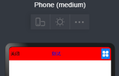
预览一下效果:
【3、标题栏配置】
有了上面的布局文件,接下来我们来实现标题栏的逻辑代码,首先新建一个类CommonTitleBar,然后让该类继承自ComponentContainer,在构造方法中,我们可以通过LayoutScatter这个类来实现类似安卓中LayoutInflater.from(Context).inflate(layout,root,false)解析XML布局的效果,再调用addComponent将解析的结果添加进去,就完成了自定义组合控件的效果了,代码如下所示:

另外,还可以通过自定义属性的形式对自定义组件中的相关属性进行配置,代码如下:
通过上面的代码我们就可以实现在XML布局中类似于使用ohos:bg_color="#FF0000"这种通过配置修改组件属性的效果了。
最后,再来看一下自定义组件中内置组件的事件如何处理呢?这个其实就很简单了,我们可以在类中定义一个返回对应内置组件的方法,然后在实现类中去处理具体的事件:
完整代码如下:
public class CommonTitleBar extends ComponentContainer {
private Text close;
private Text title;
private Image img;
public CommonTitleBar(Context context) {
this(context, null);
}
public CommonTitleBar(Context context, AttrSet attrSet) {
super(context, attrSet);
init(context, attrSet);
}
private void init(Context context, AttrSet attrSet) {
Component component = LayoutScatter.getInstance(context).parse(ResourceTable.Layout_common_title_layout, null, false);
close = (Text) component.findComponentById(ResourceTable.Id_custom_close);
title = (Text) component.findComponentById(ResourceTable.Id_custom_title);
img = (Image) component.findComponentById(ResourceTable.Id_custom_img);
addComponent(component);
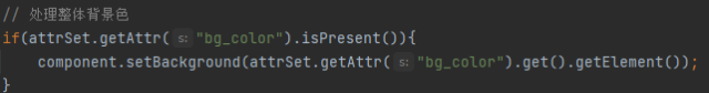
// 处理整体背景色
if (attrSet.getAttr("bg_color").isPresent()) {
component.setBackground(attrSet.getAttr("bg_color").get().getElement());
}
// 处理返回按钮文字
if (attrSet.getAttr("close_text").isPresent()) {
close.setText(attrSet.getAttr("close_text").get().getStringValue());
} else {
close.setText("<---");
}
// 处理标题文字
if (attrSet.getAttr("title_text").isPresent()) {
title.setText(attrSet.getAttr("title_text").get().getStringValue());
} else {
title.setText("标题");
}
// 处理右侧图片按钮
if (attrSet.getAttr("right_img").isPresent()) {
img.setImageElement(attrSet.getAttr("right_img").get().getElement());
}
}
// 返回左侧关闭按钮
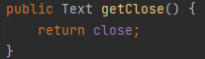
public Text getClose() {
return close;
}
// 返回中间标题
public Text getTitle() {
return title;
}
// 返回右侧菜单按钮
public Image getImg() {
return img;
}
}【4、使用自定义组件】
通过上面的步骤我们已经完成了自定义组件,下面我们在别的页面中具体的来使用一下这个组件吧。
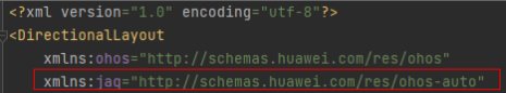
我们在MainAbilitySlice的布局中引用该组件,打开ability_main.xml这个布局,首先我们需要为自定义组件的自定义属性来创建一个命名空间,名字可以自己取,如下:
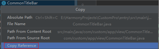
然后我们就可以通过自定义的这个命名空间来引用上一步在代码中自定义的属性了,需要注意的是,在引入自定义组件时,需要使用自定义组件的全类名,可以选中自定义组件的类,然后鼠标右键,选择Copy Reference选项即可,如下图所示:
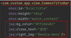
然后就可以正常使用该组件了,如果使用了自定义属性,那么该属性会按照这里的配置进行修改,如果有的属性没使用到,那么就会按照代码中的默认值进行设置,比如我们可以这样设置:
完整的代码如下:
<?xml version="1.0" encoding="utf-8"?>
<DirectionalLayout
xmlns:ohos="http://schemas.huawei.com/res/ohos"
xmlns:jaq="http://schemas.huawei.com/res/ohos-auto"
ohos:height="match_parent"
ohos:width="match_parent"
ohos:alignment="horizontal_center"
ohos:orientation="vertical">
<com.custom.app.view.CommonTitleBar
ohos:id="$+id:title"
ohos:height="48vp"
ohos:width="match_content"
jaq:bg_color="#FF2AD4B2"
jaq:close_text="返回"
jaq:right_img="$media:menu"/>
<Text
ohos:id="$+id:content"
ohos:height="match_parent"
ohos:width="match_parent"
ohos:text="内容"
ohos:text_alignment="center"
ohos:text_size="20fp"/>
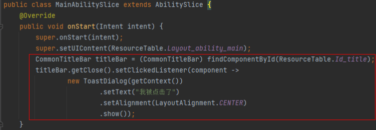
</DirectionalLayout>然后在MainAbilitySlice类中,我们来实现自定义组件中左侧返回按钮的点击事件处理,代码如下:
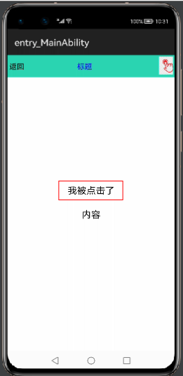
最后实现的效果如下:
好了,到这里本篇的内容就介绍完了,下期再会!
欲了解更多更全技术文章,欢迎访问https://developer.huawei.com/consumer/cn/forum/?ha_source=zzh