弹性盒子flex
disply:flex
是一种新的布局方式,特别适合移动端
影响
1、子元素默认横向排列
2、行内元素变成块级元素
3、只有一个元素的时候,margin:auto自动居中
flex-direction: row-reverse;修改主轴方向
justify-content:主轴对齐方向
flex-start
flex-end
center
sapce-between 两端对齐
sapce-around 距离环绕
align-items: 调整侧轴
flex-start
flex-end
center
align-content 控制折行后行间距
flex-start
flex-end
center
sapce-between 两端对齐
sapce-around
flex-wrap:wrap折行
justify-content:space-between;
p标签 text-indent:10px;
flex:1 //占满剩余空间。如果都设置flex1 则平分宽度
position:sticky粘性定位
box-sizing:border-box; 怪异盒模型
align-self:项目对齐方式
flex示例:
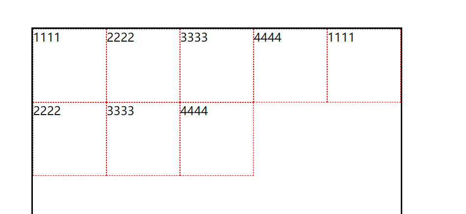
<!DOCTYPE html>
<html lang="en">
<head>
    <meta charset="UTF-8">
    <meta name="viewport" content="width=device-width, initial-scale=1.0">
    <title>Document</title>
    <style>
        .box{
            width: 500px;
            height: 500px;
            margin: 100px auto;
            border: 2px solid black;
            display: flex;
            flex-wrap: wrap;
            /* justify-content: space-between; */
            align-content: flex-start;
            /* flex-direction:; */
            /* flex-direction: column; */
            /* justify-content: space-between; 2端对齐 */
            /* align-items:center; */
            /* flex-direction: row-reverse;修改主轴方向 */
        }
        .box span{
              width: 100px;
              height: 100px;
              border: 1px dashed red;
              box-sizing: border-box;
              /*margin: auto;  flex标签在最中间 */
        }
    </style>
</head>
<body>
  <div class="box">
    <span>1111</span>
    <span>2222</span>
    <span>3333</span>
    <span>4444</span>
    <span>1111</span>
    <span>2222</span>
    <span>3333</span>
    <span>4444</span>
  </div>
</body>
</html>
支付宝布局

代码
<!DOCTYPE html>
<html lang="en">

<head>
    <meta charset="UTF-8">
    <meta name="viewport" content="width=device-width, initial-scale=1.0">
    <title>Document</title>
    <style>
        .box {
            width: 955px;
            height: 1420px;
            margin: 0 auto;
            background: yellow;
            display: flex;
            flex-direction: column;
        }
        header,footer{
            height: 181px;
            background-color: gray;
        }
        header{
            display: flex;
        }
        header i{
            height: 124px;
            line-height:118px;
            width: 118px;
            text-align: center;
        }
        header span{
            flex: 1;
            height: 124px;
            line-height:124px;
            /* height: 124px;
            line-height:118px;
            width: 118px;
            text-align: center; */
        }
        section{
            flex: 1;
        }
        .main{
            display: flex;
            height: 278px;
            background: white;
            justify-content: space-around;
            align-items: center;
        }
        .main div{
            width: 120px;
            height: 168px;
            background: red;
            display: flex;
            flex-direction: column;
            justify-content: space-between;
        }
        .main div i{
            text-align: center;
            font-size: 50px;
        }
        .main div span{
            font-size: 32px;
            text-align: center;
        }


        .list{
            display: flex;
            flex-wrap: wrap;
            background: white;
        }
        .list div{
            width: 25%;
            height: 208px;
            border: 1px solid gray;
            box-sizing: border-box;
            display: flex;
            flex-direction: column;
            justify-content: center;
        }
        .list div i{
            text-align: center;
            height: 77px;
            font-size: 50px;
        }
        .list div span{
            font-size: 32px;
            height: 61px;
            text-align: center;
        }

        footer {
            display: flex;
        }
        footer div{
            flex: 1;
            display: flex;
            flex-direction: column;
        }

        footer div i{
            text-align: center;
            height: 77px;
            font-size: 50px;
        }
        footer div span{
            text-align: center;
            height: 77px;
            font-size: 50px;
        }
    </style>
</head>

<body>
    <div class="box">
        <header>
            <i>A</i>
            <span>账单</span>
            <i>B</i>
            <i>C</i>
            <i>D</i>
        </header>
        <section>
            <div class="main">
             <div>
                <i>A</i>
                <span>扫一扫</span>
             </div>
             <div><i>B</i>
                <span>付款</span></div>
             <div><i>C</i>
                <span>卡卷</span></div>
             <div><i>D</i>
                <span>admin</span></div>
            </div>
            <div class="list">
                <div>
                    <i>A</i>
                    <span>账单</span>
                </div>
                <div>111</div>
                <div>111</div>
                <div>111</div>
                <div>111</div>
                <div>111</div>
                <div>111</div>
                <div>111</div>
             </div>
             <div>
                图片
             </div>
        </section>
        <footer>
            <div>
                <i>A</i>
                <span>支付宝</span>
            </div>
            <div>
                <i>A</i>
                <span>口碑</span>
            </div>
            <div>
                <i>A</i>
                <span>朋友</span>
            </div>
            <div>
                <i>A</i>
                <span>我的</span>
            </div>
        </footer>
    </div>
</body>

</html>
其它布局再补充...