一、滚动贴合介绍
滚动贴合:鼠标滚动的时候,自动贴合到浏览器的底部或顶部
设置CSS滚动贴合需要使用到两个属性:
1、给滚动容器设置scroll-snap-type,值为滚动的方向和方式
.container {
            /* display: flex; */
            /* 第一个值为滚动贴合的方向,y表示纵向滚动贴合,
            第二个值表示贴合方式,mandatory表示强制滚动 */
            scroll-snap-type: y mandatory;
        }
2、给滚动的内容设置scroll-snap-align,即滚动贴合的对齐方式,值为start、center、end
.child{
            /* 设置子元素的贴合对齐方式 */
            scroll-snap-align: center;
        }
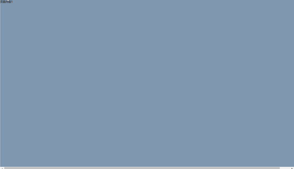
二、未使用滚动贴合时的效果
使用之前代码:
<!DOCTYPE html>
<html lang="en">
<head>
    <meta charset="UTF-8">
    <meta name="viewport" content="width=device-width, initial-scale=1.0">
    <title>Document</title>
    <style>
        main {
            /* 需要把滚动条设置到直接父容器,
            scroll-snap-type才能生效,
            默认是再body上,现在是在main上 */
            overflow: scroll;
            height: 100vh;
        }
        section{
            width: 100vw;
            height: 100vh;
        }
        /* 给每个页面设置不同的颜色用于区分 */
        main > section:nth-child(1){
            background-color: #7f97ae;
        }
        main > section:nth-child(2){
            background-color: #c6b9a3;
        }
        main > section:nth-child(3){
            background-color: #bbcadc;
        }
        main > section:nth-child(4){
            background-color: #d7c6d9;
        }
        main > section:nth-child(5){
            background-color: #bfbea8;
        }
    </style>
</head>
<body>
    <main>
        <section>页面内容1</section>
        <section>页面内容2</section>
        <section>页面内容3</section>
        <section>页面内容4</section>
    </main>
</body>
</html>
效果如下:

发现用鼠标滚轮滚动时,页面不会自动贴合到浏览器的顶部或者底部
三、使用滚动贴合
假设我们有四屏的内容需要垂直滚动贴合,我们用main元素表示滚动的容器,四个section表示要滚动贴合的内容。
每个section都设置为占满全屏,即宽为100vw,高为100vh。
使用之后的代码:
<!DOCTYPE html>
<html lang="en">
<head>
    <meta charset="UTF-8">
    <meta name="viewport" content="width=device-width, initial-scale=1.0">
    <title>Document</title>
    <style>
        main {
            /* 第一个值为滚动贴合的方向,y表示纵向滚动贴合,
            第二个值表示贴合方式,mandatory表示强制滚动 */
            scroll-snap-type: y mandatory;
            /* 需要把滚动条设置到直接父容器,
            scroll-snap-type才能生效,
            默认是再body上,现在是在main上 */
            overflow: scroll;
            height: 100vh;
        }
        section{
            width: 100vw;
            height: 100vh;
            /* 设置子元素的贴合对齐方式 start表示下一屏的内容会直接贴合到main元素的顶部*/
            scroll-snap-align: start;
        }
        /* 给每个页面设置不同的颜色用于区分 */
        main > section:nth-child(1){
            background-color: #7f97ae;
        }
        main > section:nth-child(2){
            background-color: #c6b9a3;
        }
        main > section:nth-child(3){
            background-color: #bbcadc;
        }
        main > section:nth-child(4){
            background-color: #d7c6d9;
        }
        main > section:nth-child(5){
            background-color: #bfbea8;
        }
    </style>
</head>
<body>
    <main>
        <section>页面内容1</section>
        <section>页面内容2</section>
        <section>页面内容3</section>
        <section>页面内容4</section>
    </main>
</body>
</html>
效果如下:

这样就实现了滚动贴合的效果
(1)、如果我们把section的高度加长为150vh,再把scroll-snap-align的属性设置为end,那么滚动的时候,下一屏内容的底部就会贴合到main元素的底部
<!DOCTYPE html>
<html lang="en">
<head>
    <meta charset="UTF-8">
    <meta name="viewport" content="width=device-width, initial-scale=1.0">
    <title>Document</title>
    <style>
        main {
            /* 第一个值为滚动贴合的方向,y表示纵向滚动贴合,
            第二个值表示贴合方式,mandatory表示强制滚动 */
            scroll-snap-type: y mandatory;
            /* 需要把滚动条设置到直接父容器,
            scroll-snap-type才能生效,
            默认是再body上,现在是在main上 */
            overflow: scroll;
            height: 100vh;
        }
        section{
            width: 100vw;
            height: 150vh;
            /* 设置子元素的贴合对齐方式 */
            scroll-snap-align: end;
        }
        /* 给每个页面设置不同的颜色用于区分 */
        main > section:nth-child(1){
            background-color: #7f97ae;
        }
        main > section:nth-child(2){
            background-color: #c6b9a3;
        }
        main > section:nth-child(3){
            background-color: #bbcadc;
        }
        main > section:nth-child(4){
            background-color: #d7c6d9;
        }
        main > section:nth-child(5){
            background-color: #bfbea8;
        }
    </style>
</head>
<body>
    <main>
        <section>页面内容1</section>
        <section>页面内容2</section>
        <section>页面内容3</section>
        <section>页面内容4</section>
    </main>
</body>
</html>
效果如下:
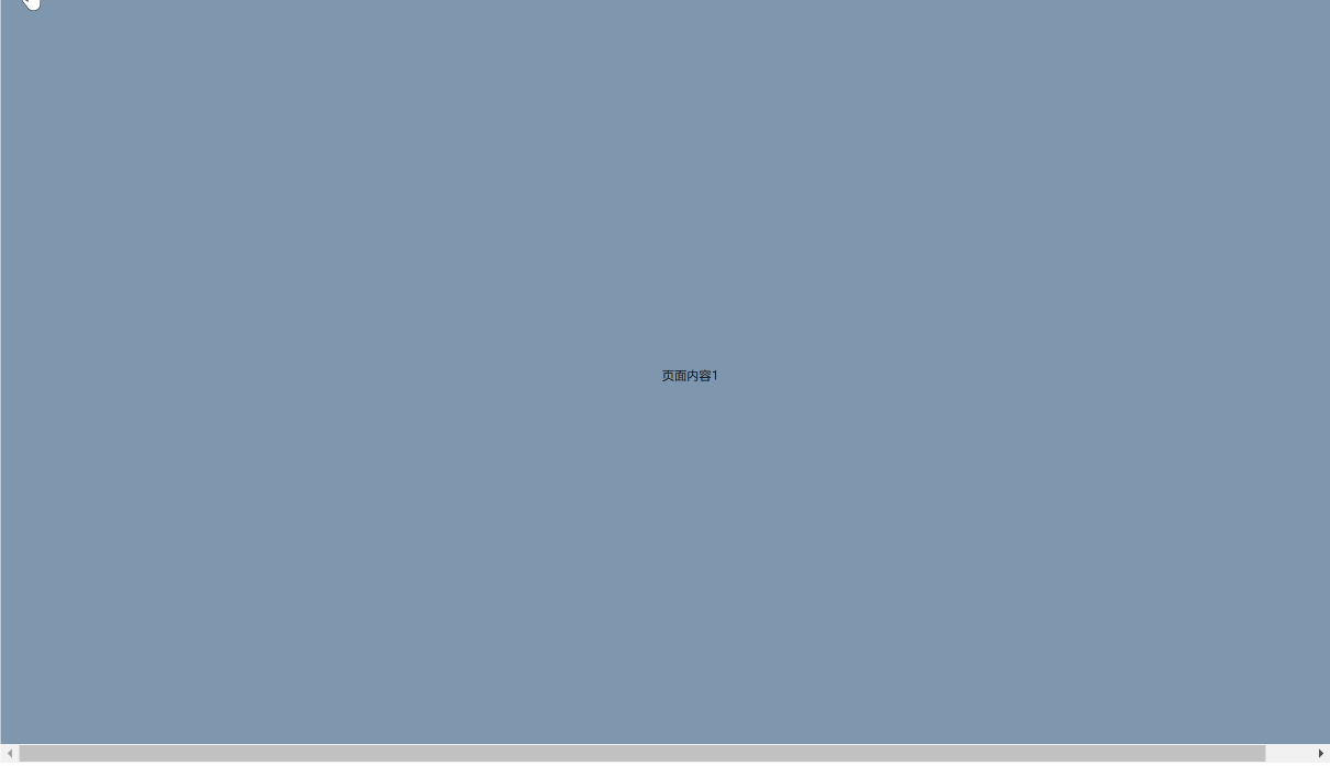
(2)、如果我们把section的高度加长为150vh,再把scroll-snap-align的属性设置为center,那么滚动的时候,下一屏内容就会和main元素垂直居中对齐
<!DOCTYPE html>
<html lang="en">
<head>
    <meta charset="UTF-8">
    <meta name="viewport" content="width=device-width, initial-scale=1.0">
    <title>Document</title>
    <style>
        main {
            /* display: flex; */
            /* 第一个值为滚动贴合的方向,y表示纵向滚动贴合,
            第二个值表示贴合方式,mandatory表示强制滚动 */
            scroll-snap-type: y mandatory;
            /* 需要把滚动条设置到直接父容器,
            scroll-snap-type才能生效,
            默认是再body上,现在是在main上 */
            overflow: scroll;
            height: 100vh;
        }
        section{
            width: 100vw;
            height: 150vh;
            /* 设置子元素的贴合对齐方式 */
            scroll-snap-align: center;
        }
        /* 给每个页面设置不同的颜色用于区分 */
        main > section:nth-child(1){
            background-color: #7f97ae;
            display: flex;
            justify-content: center;
            align-items: center;

        }
        main > section:nth-child(2){
            background-color: #c6b9a3;
            display: flex;
            justify-content: center;
            align-items: center;
        }
        main > section:nth-child(3){
            background-color: #bbcadc;
            display: flex;
            justify-content: center;
            align-items: center;
        }
        main > section:nth-child(4){
            background-color: #d7c6d9;
            display: flex;
            justify-content: center;
            align-items: center;
        }
    </style>
</head>
<body>
    <main>
        <section>页面内容1</section>
        <section>页面内容2</section>
        <section>页面内容3</section>
        <section>页面内容4</section>
    </main>
</body>
</html>
效果如下:

四、水平滚动贴合
代码:
<!DOCTYPE html>
<html lang="en">
<head>
    <meta charset="UTF-8">
    <meta name="viewport" content="width=device-width, initial-scale=1.0">
    <title>Document</title>
    <style>
        main {
            display: flex;
            /* 第一个值为滚动贴合的方向,y表示纵向滚动贴合,
            第二个值表示贴合方式,mandatory表示强制滚动 */
            scroll-snap-type: x mandatory;
            /* 需要把滚动条设置到直接父容器,
            scroll-snap-type才能生效,
            默认是再body上,现在是在main上 */
            overflow: scroll;
            width: 100vw;
            height: 100vh;
        }
        section{
            width: 100vw;
            height: 100vh;
            /* 设置子元素的贴合对齐方式 */
            scroll-snap-align: center;
            flex-shrink: 0;
        }
        /* 给每个页面设置不同的颜色用于区分 */
        main > section:nth-child(1){
            background-color: #7f97ae;
            display: flex;
            justify-content: center;
            align-items: center;

        }
        main > section:nth-child(2){
            background-color: #c6b9a3;
            display: flex;
            justify-content: center;
            align-items: center;
        }
        main > section:nth-child(3){
            background-color: #bbcadc;
            display: flex;
            justify-content: center;
            align-items: center;
        }
        main > section:nth-child(4){
            background-color: #d7c6d9;
            display: flex;
            justify-content: center;
            align-items: center;
        }
    </style>
</head>
<body>
    <main>
        <section>页面内容1</section>
        <section>页面内容2</section>
        <section>页面内容3</section>
        <section>页面内容4</section>
    </main>
</body>
</html>
效果如下:

五、使用proximity小于一定距离的时候进行贴合
使用mandatory强制贴合的方式,适合内容尺寸较小的情况,如果有的元素内容非常长,那么在滚动的时候,会直接滑动到下一屏,导致不在屏幕上的内容很快就会滑过,这时候,我们可以把scroll-snap-type属性的第二个值改为proximity,这样让元素滚动到离贴合点小于一定距离的时候再进行贴合,这个距离是根据浏览器自己规定的。
<!DOCTYPE html>
<html lang="en">
<head>
    <meta charset="UTF-8">
    <meta name="viewport" content="width=device-width, initial-scale=1.0">
    <title>Document</title>
    <style>
        main {
            /* 第一个值为滚动贴合的方向,y表示纵向滚动贴合,
            第二个值表示贴合方式,mandatory表示强制滚动 */
            scroll-snap-type: y proximity;
            /* 需要把滚动条设置到直接父容器,
            scroll-snap-type才能生效,
            默认是再body上,现在是在main上 */
            overflow: scroll;
            height: 100vh;
        }
        section{
            width: 100vw;
            height: 100vh;
            /* 设置子元素的贴合对齐方式 */
            scroll-snap-align: end;
        }
        /* 给每个页面设置不同的颜色用于区分 */
        main > section:nth-child(1){
            background-color: #7f97ae;
            display: flex;
            justify-content: center;
            align-items: center;

        }
        main > section:nth-child(2){
            background-color: #c6b9a3;
            display: flex;
            justify-content: center;
            align-items: center;
        }
        main > section:nth-child(3){
            background-color: #bbcadc;
            height: 250vh;
            display: flex;
            justify-content: center;
            align-items: center;
        }
        main > section:nth-child(4){
            background-color: #d7c6d9;
            display: flex;
            justify-content: center;
            align-items: center;
        }
    </style>
</head>
<body>
    <main>
        <section>页面内容1</section>
        <section>页面内容2</section>
        <section>页面内容3</section>
        <section>页面内容4</section>
    </main>
</body>
</html>
效果如下:
六、设置sticky头部时的滚动贴合
在贴合的时候,我们还可以给容器设置间距,让贴合点偏离浏览器底部或顶部一些距离,当有一个position为sticky头部时,由于它占据了一定的空间,如果直接设置滚动贴合,那么元素会贴合到main元素的顶部,这样会有一部分内容被sticky头部覆盖,这种情况下我们可以给滚动的容器main元素设置scroll-padding,大小跟sticky头部的高度一致,这样就能在贴合的时候,与main元素有一定的间距,从而把头部的空间流出来。
scroll-padding和padding的取值方式是一样的,分别是上右下左
<!DOCTYPE html>
<html lang="en">
<head>
    <meta charset="UTF-8">
    <meta name="viewport" content="width=device-width, initial-scale=1.0">
    <title>Document</title>
    <style>
        main {
            /* 第一个值为滚动贴合的方向,y表示纵向滚动贴合,
            第二个值表示贴合方式,mandatory表示强制滚动 */
            scroll-snap-type: y mandatory;
            scroll-padding: 80px;
            /* 需要把滚动条设置到直接父容器,
            scroll-snap-type才能生效,
            默认是再body上,现在是在main上 */
            overflow: scroll;
            height: 100vh;
        }
        h1{
            height: 80px;
            position: sticky;
            top: 0;
            background-color: red;
        }
        section{
            width: 100vw;
            height: 100vh;
            /* 设置子元素的贴合对齐方式 */
            scroll-snap-align: start;
        }
        /* 给每个页面设置不同的颜色用于区分 */
        main > section:nth-child(2){
            background-color: #7f97ae;

        }
        main > section:nth-child(3){
            background-color: #c6b9a3;
        }
        main > section:nth-child(4){
            background-color: #bbcadc;
        }
        main > section:nth-child(5){
            background-color: #663d69;
        }
    </style>
</head>
<body>
    <main>
        <h1>H1标题</h1>
        <section>页面内容1</section>
        <section>页面内容2</section>
        <section>页面内容3</section>
        <section>页面内容4</section>
    </main>
</body>
</html>
效果:

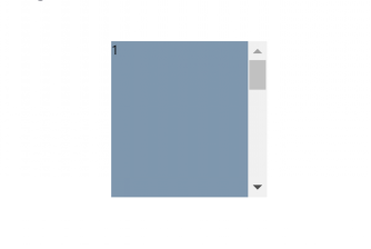
七、列表滚动
滚动贴合不仅仅可以用于全屏滚动,也可以用于ul这种小的列表滚动
<!DOCTYPE html>
<html lang="en">
<head>
    <meta charset="UTF-8">
    <meta name="viewport" content="width=device-width, initial-scale=1.0">
    <title>Document</title>
    <style>
        main {
            width: 100vw;
            height: 100vh;
            display: grid;
            place-items: center;
        }
        ul{
            width: 200px;
            height: 200px;
            scroll-snap-type: y mandatory;
            overflow-y:scroll;  /*只是y方向*/
            list-style: none;
            /* 隐藏x向滚动条 */
            overflow-x: hidden;

        }
        li{
            scroll-snap-align: start;
        }
        /* 给每个页面设置不同的颜色用于区分 */
        ul > li:nth-child(1){
            background-color: #7f97ae;
            width: 200px;
            height: 200px;

        }
        ul > li:nth-child(2){
            background-color: #c6b9a3;
            width: 200px;
            height: 200px;
        }
        ul > li:nth-child(3){
            background-color: #bbcadc;
            width: 200px;
            height: 200px;
        }
        ul > li:nth-child(4){
            background-color: #663d69;
            width: 200px;
            height: 200px;
        }
    </style>
</head>
<body>
    <main>
        <ul>
            <li>1</li>
            <li>2</li>
            <li>3</li>
            <li>4</li>
        </ul>
    </main>
</body>
</html>
效果如下: