Avalonia的自定义控件几乎和wpf的一样,是由axaml 和cs文件来构成的,axaml文件用来写自定义控件的样式。cs文件用来写处理逻辑,今天我们来重写一个textbox文本输入框
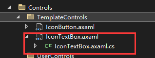
首先我们新建一个新建项 选择avalonia中的Templated Control 如图,我将他命名为 IconTextBox

然后新建完就得到了这么两个文件
我们直接去cs文件中写逻辑
using Avalonia;
using Avalonia.Controls;
using Avalonia.Controls.Metadata;
using Avalonia.Controls.Primitives;
using Avalonia.Controls.Templates;
using Avalonia.Input;
using Avalonia.LogicalTree;
using Avalonia.Media;
using Avalonia.VisualTree;
using System;

namespace omc64_aval.Controls.TemplateControls
{
    [TemplatePart(Name = "PART_root", Type = typeof(Border))]
    [TemplatePart(Name = "PART_continer", Type = typeof(Grid))]
    [TemplatePart(Name = "PART_icon", Type = typeof(TextBlock))]
    [TemplatePart(Name = "PART_text", Type = typeof(TextBox))]
    public class IconTextBox : TemplatedControl
    {

        private TextBox? txtbox = null;

        public IconTextBox()
        {

        }


        public string Icon
        {
            get => GetValue(IconProperty);
            set => SetValue(IconProperty, value);
        }

        public static readonly StyledProperty<string> IconProperty = AvaloniaProperty.Register<IconTextBox, string>
        (
            nameof(Icon)
        );

        public string Text
        {
            get { return GetValue(TextProperty); }
            set { SetValue(TextProperty, value); }
        }

        public static readonly StyledProperty<string> TextProperty = AvaloniaProperty.Register<IconTextBox, string>
        (
            nameof(Text)
         );

        public IBrush? IconBrush
        {
            get { return GetValue(IconBrushProperty); }
            set { SetValue (IconBrushProperty, value); }
        }

        public static readonly StyledProperty<IBrush?> IconBrushProperty = AvaloniaProperty.Register<IconTextBox, IBrush?>(
            nameof(IconBrush)
            );

        public char PasswordChar
        {
            get { return GetValue(PasswordCharProperty); }
            set { SetValue(PasswordCharProperty, value); }
        }

        public static readonly StyledProperty<char> PasswordCharProperty = AvaloniaProperty.Register<IconTextBox, char>(
            nameof(PasswordChar));

        protected override void OnApplyTemplate(TemplateAppliedEventArgs e)
        {
            base.OnApplyTemplate(e);

            TextBox? tb = e.NameScope.Find<TextBox>("PART_text");

            if (tb != null)
            {
                txtbox = tb;
            }

        }

        protected override void OnGotFocus(GotFocusEventArgs e)
        {
            base.OnGotFocus(e);

            txtbox?.Focus();

        }

    }
}
在这里我新建了 Icon、Text、PasswordChar、IconBrush 这几个依赖项属性,从写法看来与wpf有一些区别
然后在axaxml中写下样式
<Styles xmlns="https://github.com/avaloniaui" xmlns:x="http://schemas.microsoft.com/winfx/2006/xaml" xmlns:controls="using:omc64_aval.Controls.TemplateControls"> <Design.PreviewWith> <controls:IconTextBox Text="123" /> </Design.PreviewWith> <Style Selector="TextBox"> <Setter Property="MinWidth" Value="120"></Setter> <Setter Property="MinHeight" Value="30"></Setter> <Setter Property="BorderThickness" Value="0"/> <Setter Property="Background" Value="Transparent"/> <Setter Property="Padding" Value="0"/> <Setter Property="Template"> <Setter.Value> <ControlTemplate> <Border Background="{TemplateBinding Background}" BorderBrush="{TemplateBinding BorderBrush}" BorderThickness="{TemplateBinding BorderThickness}" MinWidth="{TemplateBinding MinWidth}" MinHeight="{TemplateBinding MinHeight}" VerticalAlignment="Center" HorizontalAlignment="Left"> <TextPresenter Name="PART_TextPresenter" CaretBrush="{TemplateBinding CaretBrush}" CaretIndex="{TemplateBinding CaretIndex}" LineHeight="{TemplateBinding LineHeight}" LetterSpacing="{TemplateBinding LetterSpacing}" PasswordChar="{TemplateBinding PasswordChar}" RevealPassword="{TemplateBinding RevealPassword}" SelectionBrush="{TemplateBinding SelectionBrush}" SelectionEnd="{TemplateBinding SelectionEnd}" SelectionForegroundBrush="{TemplateBinding SelectionForegroundBrush}" SelectionStart="{TemplateBinding SelectionStart}" Text="{TemplateBinding Text,Mode=TwoWay}" TextAlignment="{TemplateBinding TextAlignment}" TextWrapping="{TemplateBinding TextWrapping}" VerticalAlignment="Center"/> </Border> </ControlTemplate> </Setter.Value> </Setter> </Style> <Style Selector="controls|IconTextBox"> <Setter Property="Icon" Value=""></Setter> <Setter Property="BorderThickness" Value="0,0,0,1"></Setter> <Setter Property="BorderBrush" Value="Black"></Setter> <Setter Property="IconBrush" Value="Black"></Setter> <Setter Property="Width" Value="100"></Setter> <Setter Property="Height" Value="30"></Setter> <Setter Property="FontSize" Value="20"></Setter> <Setter Property="Background" Value="Transparent"></Setter> <!-- Set Defaults --> <Setter Property="Template"> <ControlTemplate> <Border x:Name="PART_root" BorderThickness="{TemplateBinding BorderThickness}" BorderBrush="{TemplateBinding BorderBrush}" Width="{TemplateBinding Width}" Background="{TemplateBinding Background}" Margin="1"> <Grid x:Name="PART_continer" Width="{Binding ElementName=PART_root,Path=Width}" Height="{Binding ElementName=PART_root,Path=Height}"> <Grid.ColumnDefinitions> <ColumnDefinition Width="auto"></ColumnDefinition> <ColumnDefinition></ColumnDefinition> </Grid.ColumnDefinitions> <TextBlock Classes="" x:Name="PART_icon" VerticalAlignment="Center" FontFamily="/Assets/Fonts/fonteditor.ttf#fonteditor" Text="{TemplateBinding Icon}" Foreground="{TemplateBinding IconBrush}" FontSize="{TemplateBinding FontSize}"></TextBlock> <TextBox x:Name="PART_text" Grid.Column="1" Margin="3,0,0,0" BorderBrush="Red" BorderThickness="0" Background="{TemplateBinding Background}" Text="{TemplateBinding Text}" FontSize="{TemplateBinding FontSize}" PasswordChar="{TemplateBinding PasswordChar}" Focusable="{Binding Focusable,RelativeSource={RelativeSource TemplatedParent},Mode=OneWayToSource}" ></TextBox> </Grid> </Border> </ControlTemplate> </Setter> </Style> <Style Selector="controls|IconTextBox:focus"> <Setter Property="BorderBrush" Value="Orange"></Setter> <Setter Property="IconBrush" Value="Orange"></Setter> </Style> <!--<Style Selector="controls|IconTextBox:pointerover"> <Setter Property="BorderBrush" Value="Orange"></Setter> <Setter Property="IconBrush" Value="Orange"></Setter> </Style>--> </Styles>
这样我们就写好了 一个自定义的控件,那么该如何使用呢?
与wpf一样,首先使用的时候需要引入命名空间
xmlns:tc="clr-namespace:omc64_aval.Controls.TemplateControls",这里命名空间需要与你写的控件的一致,然后在你使用的地方直接使用
<tc:IconTextBox BorderBrush="Gray" IconBrush="Gray" Classes="IconTextBox" Width="200" Height="30" Text=""></tc:IconTextBox>
这个时候控件还显示不出来,是因为没有引入刚才的样式文件,我这里要全局使用于是在app.axaml中引入样式就可以了
<!--自定义控件-->
<StyleInclude Source="avares://omc64_aval/Controls/ControlsStylesSummary.axaml"></StyleInclude>
注意 我写的这个ControlsStylesSummary.axaml 里面包含了 IconTextbox的样式,也可以直接引用 IconTextBox.axaml文件
这样我们就得到了这样的自定义控件
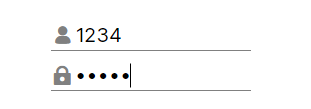
其中需要注意的是,小人和小锁的图标使用的是IconFont