
一,代码:
|
1
2
3
4
5
6
7
8
9
10
11
12
13
14
15
16
17
18
19
20
21
22
23
24
25
26
27
28
29
30
31
32
33
34
35
36
37
38
39
40
41
42
43
44
45
46
47
48
49
50
51
52
53
54
55
56
57
58
59
|
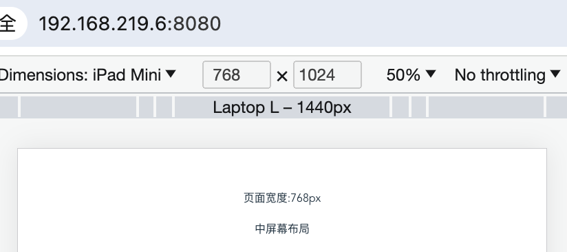
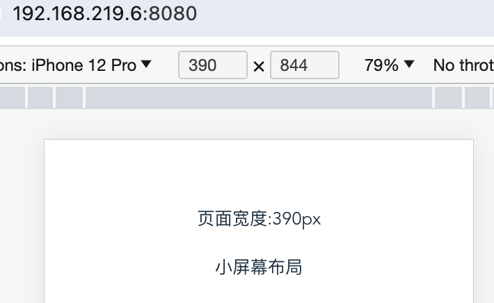
<template> <div class="hello"> <div>页面宽度:{{screenWidth}}px</div> <h1>{{ msg }}</h1> <div v-if="screenWidth < 768">小屏幕布局</div> <div v-else-if="screenWidth < 992">中屏幕布局</div> <div v-else>大屏幕布局</div> </div></template><script>import { ref,onMounted,onUnmounted } from 'vue';export default { name: 'HelloWorld', setup() { //获取屏幕宽度 const screenWidth = ref(window.innerWidth); //处理resize const handleResize = () => { screenWidth.value = window.innerWidth } //加载页面时,添加对resize的响应 onMounted(() => { window.addEventListener("resize", handleResize) }) //页面umount时,移除监听事件 onUnmounted(() => { window.removeEventListener('resize', handleResize); }) return { screenWidth, } },}</script><!-- Add "scoped" attribute to limit CSS to this component only --><style scoped>h3 { margin: 40px 0 0;}ul { list-style-type: none; padding: 0;}li { display: inline-block; margin: 0 10px;}a { color: #42b983;}</style> |
二,测试效果:
说明:刘宏缔的架构森林—专注it技术的博客,
网站:https://blog.imgtouch.com
原文: https://blog.imgtouch.com/index.php/2023/09/09/vue-js-xiang-ying-shi-bu-ju-vue-3-3-4/
代码: https://github.com/liuhongdi/ 或 https://gitee.com/liuhongdi
说明:作者:刘宏缔 邮箱: 371125307@qq.com
三,查看vue版本:
root@lhdpc:/data/vue/responsive# npm list vue
responsive@0.1.0 /data/vue/responsive
├─┬ @vue/cli-plugin-babel@5.0.8
│ └─┬ @vue/babel-preset-app@5.0.8
│   ├─┬ @vue/babel-preset-jsx@1.4.0
│   │ └── vue@3.3.4 deduped
│   └── vue@3.3.4 deduped
└─┬ vue@3.3.4
  └─┬ @vue/server-renderer@3.3.4
    └── vue@3.3.4 deduped