【关键字】
标题栏、常用内置组件整合、ArkUI、自定义组件
1、写在前面
在上一篇文章中我们通过Java语言实现了一个通用的标题栏组件,有需要的可以看下,文章地址:
https://developer.huawei.com/consumer/cn/forum/topic/0202117373459738584?fid=0101587866109860105
现在很多朋友都已经转战ArkTS语言了,那么今天就来使用ArkTS实现一个同样的通用标题栏组件,样式选择还和之前保持一致,左侧文本按钮、中间文本、右侧图片按钮,关于样式,大家可以自行根据项目实际需求进行修改,废话不多说,下面进入代码实战吧!
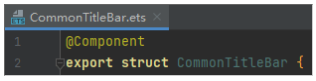
2、自定义标题栏
首先,新建一个CommonTitleBar.ets文件,在该文件中封装通用标题栏组件:
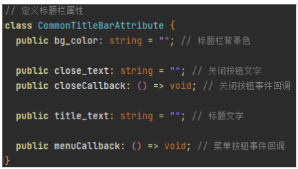
然后,定义标题栏组件需要的相关属性:
最后,在标题栏组件类中使用内置组件拼装组合,创建上面定义的属性类的类型的变量,在内置组件中的相应属性通过该变量控制,如下图所示:
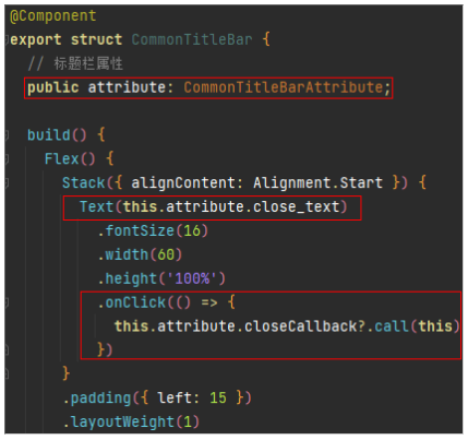
完整的自定义标题栏组件代码如下:
@Component
export struct CommonTitleBar {
  // 标题栏属性
  public attribute: CommonTitleBarAttribute;

  build() {
    Flex() {
      Stack({ alignContent: Alignment.Start }) {
        Text(this.attribute.close_text)
          .fontSize(16)
          .width(60)
          .height('100%')
          .onClick(() => {
            this.attribute.closeCallback?.call(this)
          })
      }
      .padding({ left: 15 })
      .layoutWeight(1)

      Stack({ alignContent: Alignment.Center }) {
        Text(this.attribute.title_text)
          .fontSize(16)
          .fontColor('#0000ff')
          .width(60)
          .textAlign(TextAlign.Center)
          .height('100%')
      }
      .layoutWeight(2)

      Stack({ alignContent: Alignment.End }) {
        Image($r('app.media.menu'))
          .width(40)
          .height(40)
          .objectFit(ImageFit.Contain)
          .onClick(() => {
            this.attribute.menuCallback?.call(this)
          })
      }
      .padding({ right: 15 })
      .height('100%')
      .layoutWeight(1)
    }
    .width('100%')
    .height(48)
    .backgroundColor(this.attribute.bg_color)
  }
}

// 定义标题栏属性
class CommonTitleBarAttribute {
  public bg_color: string = ""; // 标题栏背景色

  public close_text: string = ""; // 关闭按钮文字
  public closeCallback: () => void; // 关闭按钮事件回调

  public title_text: string = ""; // 标题文字

  public menuCallback: () => void; // 菜单按钮事件回调
}
3、使用标题栏组件
上面定义好了标题栏组件,下面开始在别的页面引用该组件,在首页Index.ets中引用,首先导入该组件:

然后引用该组件,为组件配置相应的属性值:
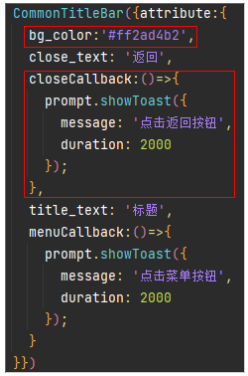
完整代码如下:
import prompt from '@ohos.prompt';
import { CommonTitleBar } from './CommonTitleBar';
@Entry
@Component
struct Index {
build() {
Column() {
CommonTitleBar({attribute:{
bg_color:'#ff2ad4b2',
close_text: '返回',
closeCallback:()=>{
prompt.showToast({
message: '点击返回按钮',
duration: 2000
});
},
title_text: '标题',
menuCallback:()=>{
prompt.showToast({
message: '点击菜单按钮',
duration: 2000
});
}
}})
Text('内容')
.fontSize(20)
.textAlign(TextAlign.Center)
.width('100%')
.height('100%')
}
.width('100%')
.height('100%')
}
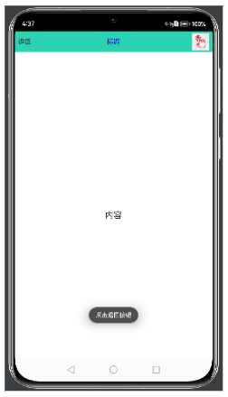
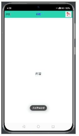
}最后一起来看一下实现的效果吧:
欲了解更多更全技术文章,欢迎访问https://developer.huawei.com/consumer/cn/forum/?ha_source=zzh