一、flexible.js
https://github.com/amfe/lib-flexible
默认把当前屏幕划分10等份
二、vscode
-
cssrem插件(把px转换为rem)
- 可以设置font-size大小
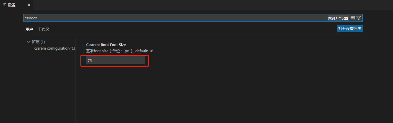
- 可以设置font-size大小
-
easy less(保存.less文件后,自动生成对应的.css文件)
三、示例
//index.less
// 当屏幕超过750px时,强制把html字体大小改为75px,这样宽度就不会超过750px
@media screen and (min-width:750px) {
    html {
        font-size: 75px !important;
    }
}

body {
    min-width: 320px;
    max-width: 750px;
    width: 10rem;
    margin: 0 auto;

}

a {
    text-decoration: none;
}


.header {
    width: 10rem;
    display: flex;
    height: 1.1733rem;
    position: fixed;
    top: 0;
    left: 50%;
    transform: translateX(-50%);

}

.search-classify {
    width: 2rem;
    background-color: pink;
}

.search {
    flex: 1;
    background-color: coral;
}

.search-login {
    width: 2rem;
    background-color: skyblue;
}
#index.html
<!DOCTYPE html>
<html lang="en">

<head>
    <meta charset="UTF-8">
    <meta http-equiv="X-UA-Compatible" content="IE=edge">
    <meta name="viewport"
        content="width=device-width, initial-scale=1.0 ,user-scalable=0,minimum-scale=1,maximum-scale=1">
    <title>Document</title>
    <link rel="stylesheet" href="./css/normalize.css">
    <link rel="stylesheet" href="./css/index.css">
    <script src="./js/flexible.js"></script>
</head>

<body>
    <header class="header">
        <div class="search-classify">1</div>
        <div class="search">2</div>
        <div class="search-login">3</div>
    </header>
</body>

</html>