参考文档:https://www.cnblogs.com/cyfeng/p/12625606.html
html文件:
<div class="item"></div>
css文件:

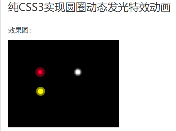
<!DOCTYPE HTML>
<html>

<head>
    <title>纯CSS3实现圆圈动态发光特效动画</title>
    <style>
        body {
            background-color: #000000;
        }

        @keyframes twinkling {
            0% {
                opacity: 0.2;
                transform: scale(1);
            }

            50% {
                opacity: 0.5;
                transform: scale(1.12);
            }

            100% {
                opacity: 0.2;
                transform: scale(1);
            }
        }

        .circle-wrap {
            position: absolute;
            left: 100px;
            top: 100px;
        }

        .circle {
            position: relative;
            width: 24px;
            height: 24px;
        }

        .small-circle {
            border-radius: 50%;
            width: 12px;
            height: 12px;
            background: #FF0033;
            position: absolute;
        }

        .big-circle {
            position: absolute;
            top: -6px;
            left: -6px;
            width: 100%;
            height: 100%;
            border-radius: 50%;
            background: #FF0033;
            animation: twinkling 1s infinite ease-in-out;
            animation-fill-mode: both;
        }

        @keyframes scale {
            0% {
                transform: scale(1)
            }

            50%,
            75% {
                transform: scale(3)
            }

            78%,
            100% {
                opacity: 0
            }
        }

        @keyframes scales {
            0% {
                transform: scale(1)
            }

            50%,
            75% {
                transform: scale(2)
            }

            78%,
            100% {
                opacity: 0
            }
        }

        .smallcircle2 {
            position: absolute;
            width: 12px;
            height: 12px;
            background-color: #ffffff;
            border-radius: 50%;
            top: 100px;
            left: 200px;
        }

        .smallcircle2:before {
            content: '';
            display: block;
            width: 12px;
            height: 12px;
            border-radius: 50%;
            opacity: .4;
            background-color: #ffffff;
            animation: scale 1s infinite cubic-bezier(0, 0, .49, 1.02);
        }

        .bigcircle2 {
            position: absolute;
            width: 12px;
            height: 12px;
            border-radius: 50%;
            opacity: .4;
            background-color: #ffffff;
            top: 100px;
            left: 200px;
            animation: scales 1s infinite cubic-bezier(0, 0, .49, 1.02);
        }

        @keyframes scaless {
            0% {
                transform: scale(1)
            }

            50%,
            75% {
                transform: scale(3)
            }

            78%,
            100% {
                opacity: 0
            }
        }

        .item {
            position: absolute;
            width: 14px;
            height: 14px;
            background-color: #FFFF00;
            border-radius: 50%;
            top: 150px;
            left: 100px;
        }

        .item:before {
            content: '';
            display: block;
            width: 14px;
            height: 14px;
            border-radius: 50%;
            opacity: .7;
            background-color: #FFFF00;
            animation: scaless 1s infinite cubic-bezier(0, 0, .49, 1.02);
        }
    </style>
</head>

<body>
    <div class="circle-wrap">
        <div class="circle">
            <div class="big-circle"></div>
            <div class="small-circle"></div>
        </div>
    </div>
    <div class="smallcircle2"></div>
    <div class="bigcircle2"></div>
    <div class="item"></div>
</body>

</html>