WPF 选项卡 控件 美化
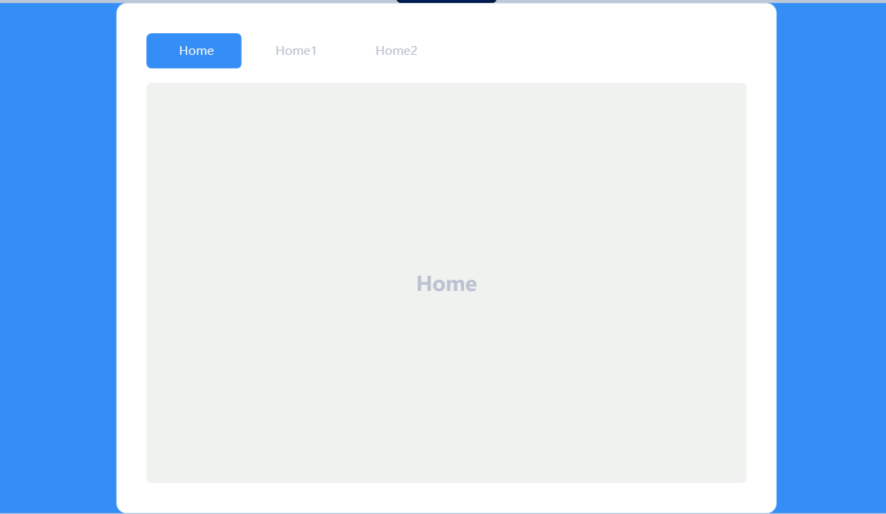
效果:
样式
<LinearGradientBrush x:Key="TabItem.Selected.BordernCjh" StartPoint="0,0" EndPoint="0,1">
    <GradientStop Color="#FFE8A6" Offset="0.07" />
    <GradientStop Color="#FFFAEA" Offset="0.1" />
    <GradientStop Color="#FFFAEA" Offset="0.4" />
    <GradientStop Color="#FFE8A6" Offset="0.5" />
</LinearGradientBrush>
<SolidColorBrush x:Key="PrimaryBlueColor" Color="#348EF6"/>
<SolidColorBrush x:Key="SecundaryBlueColor" Color="#EFF2EF"/>
<SolidColorBrush x:Key="PrimaryTextColor" Color="#FFFFFF"/>
<SolidColorBrush x:Key="SecundaryTextColor" Color="#BBC1D1"/>

<!--start Style-->

<!--start tabItem Style
    Foreground="{DynamicResource SecundaryTextColor}"
-->
<Style x:Key="TabItemStyle" TargetType="TabItem">
    <Setter Property="Background" Value="Transparent"/>
    <Setter Property="Foreground" Value="{DynamicResource SecundaryTextColor}"/>
    <!--<Setter Property="FontWeight" Value="Bold"/>-->
    <Setter Property="BorderThickness" Value="0"/>
    <Setter Property="Margin" Value="0 0 5 0"/>
    <Setter Property="Width" Value="100"/>
    <Setter Property="Padding" Value="10 10"/>
    <Setter Property="VerticalAlignment" Value="Top"/>
    <Setter Property="HorizontalAlignment" Value="Left"/>
    <Setter Property="Template">
        <Setter.Value>
            <ControlTemplate TargetType="TabItem">
                <Grid SnapsToDevicePixels="True">
                    <Border CornerRadius="5"
                            Background="{TemplateBinding Background}"
                            BorderThickness="{TemplateBinding BorderThickness}"
                            BorderBrush="{TemplateBinding BorderBrush}"
                            Margin="{TemplateBinding Margin}"
                            />
                    <ContentPresenter HorizontalAlignment="Center"
                                      VerticalAlignment="{TemplateBinding VerticalAlignment}"
                                      SnapsToDevicePixels="True"
                                      RecognizesAccessKey="True"
                                      Margin="{TemplateBinding Padding}"
                                      ContentSource="Header"
                                      Focusable="True"/>
                </Grid>
                <ControlTemplate.Triggers>
                    <Trigger Property="IsMouseOver" Value="True">
                        <Setter Property="Background" Value="{DynamicResource SecundaryBlueColor}"/>
                        <Setter Property="Foreground" Value="{DynamicResource PrimaryBlueColor}"/>
                    </Trigger>
                    <Trigger Property="IsSelected" Value="True">
                        <Setter Property="Background" Value="{DynamicResource PrimaryBlueColor}"/>
                        <Setter Property="Foreground" Value="{DynamicResource SecundaryBlueColor}"/>
                    </Trigger>
                </ControlTemplate.Triggers>
            </ControlTemplate>
        </Setter.Value>
    </Setter>
</Style>
<!--end tabItem Style-->

<!--start tabControl Style-->
<Style x:Key="TabControlStyle" TargetType="TabControl">
    <Setter Property="Background" Value="{DynamicResource SecundaryBlueColor}"/>
    <Setter Property="BorderThickness" Value="0"/>
    <Setter Property="BorderBrush" Value="Transparent"/>
    <Setter Property="Padding" Value="5"/>
    <Setter Property="VerticalAlignment" Value="Center"/>
    <Setter Property="HorizontalAlignment" Value="Center"/>
    <Setter Property="Template">
        <Setter.Value>
            <ControlTemplate TargetType="TabControl">
                <Grid SnapsToDevicePixels="True">
                    <Grid.RowDefinitions>
                        <RowDefinition Height="50"/>
                        <RowDefinition Height="*"/>
                    </Grid.RowDefinitions>
                    <!--TabPanel 可以设置 HorizontalAlignment 属性改变选项卡的对齐方式-->
                    <TabPanel Grid.Row="0"
                              Background="Transparent"
                              IsItemsHost="True"
                              />

                    <Border Grid.Row="1"
                            CornerRadius="5"
                            BorderThickness="{TemplateBinding BorderThickness}"
                            BorderBrush="{TemplateBinding BorderBrush}"
                            Background="{TemplateBinding Background}"
                            >
                        <ContentPresenter ContentSource="SelectedContent"
                                          SnapsToDevicePixels="True"
                                          Margin="{TemplateBinding Padding}"/>
                    </Border>
                </Grid>
            </ControlTemplate>
        </Setter.Value>
    </Setter>
</Style>
<!--end tabControl Style-->

<!--end Style-->
<Grid Background="{DynamicResource PrimaryBlueColor}">
    <Border CornerRadius="10"
            Padding="30"
            VerticalAlignment="Center"
            HorizontalAlignment="Center"
            Background="{DynamicResource PrimaryTextColor}">
        <TabControl Width="600" Height="450" Style="{DynamicResource TabControlStyle}">
            <TabItem Header="Home" Style="{DynamicResource TabItemStyle}" >
                <Grid>
                    <TextBlock Text="Home"
                               Foreground="{DynamicResource SecundaryTextColor}"
                               FontSize="20"
                               FontWeight="Bold"
                               VerticalAlignment="Center"
                               HorizontalAlignment="Center"
                               />
                </Grid>
            </TabItem>

            <TabItem Header="Home1" Style="{DynamicResource TabItemStyle}">
                <Grid>
                    <TextBlock Text="Home1"
       Foreground="{DynamicResource SecundaryTextColor}"
       FontSize="20"
       FontWeight="Bold"
       VerticalAlignment="Center"
       HorizontalAlignment="Center"
       />
                </Grid>
            </TabItem>

            <TabItem Header="Home2" Style="{DynamicResource TabItemStyle}">
                <Grid>
                    <TextBlock Text="Home2"
       Foreground="{DynamicResource SecundaryTextColor}"
       FontSize="20"
       FontWeight="Bold"
       VerticalAlignment="Center"
       HorizontalAlignment="Center"
       />
                </Grid>
            </TabItem>
        </TabControl>
    </Border>
</Grid>
看视频学的:https://www.bilibili.com/video/BV1d44y1T7Bc/?spm_id_from=333.337.search-card.all.click&vd_source=07b3362db38d9aab6f79acf5dcc1901c