前面整理了一个JS实现回到顶部的功能,但没有给出具体的界面样式,这次从网上找几个好看的参考,自己动手也实现一下:
效果图如下:
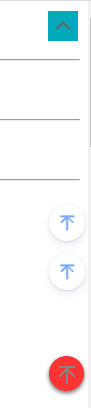
代码如下:
<!DOCTYPE html>
<html lang="cn">
<head>
    <meta charset="UTF-8">
    <title>css arrow</title>
</head>
<body>
以下是方式一:
<style>

 .arrowDiv{
    background-color:#0ab;
    position: fixed;
    top: 10px;
    right:10px;
    height:30px;
    width: 30px;
    cursor: pointer;
    display: flex;
    align-items: center;
    justify-content: center;
 }

 .arrow:before {
    content: "";
    display: inline-block;
    -webkit-transform: rotate(135deg);
    -ms-transform: rotate(135deg);
    transform: rotate(-45deg);
    height: .5rem;
    width: .5rem;
    border-width: 2px 2px 0 0;
    border-color: #666;
    border-style: solid;

}

.arrowDiv:hover {
    border-color: #fff;
    background-color: #0dd;
}


</style>

向上箭头,使用CSS实现
<div class="arrowDiv">
    <i class="arrow"></i>
</div>
<br /><br />
<hr />


以下是模拟:https://www.cnblogs.com/fulongyuanjushi/archive/2023/08/21/17645311.html
<link rel="stylesheet" type="text/css" href="https://cdn.cnblogs.com/gh/BNDong/Cnblogs-Theme-SimpleMemory@v2.1.0/dist/style/fonticon.b054622b.css">
<style>
.rightMenuItem {
    bottom:1px;
    right:3px;
    width: 28px;
    height: 28px;
    padding: 4px;
    font-size: 15px;
    cursor: pointer;
    text-align: center;
    line-height: 28px;
    margin-bottom: 120px;
    border-radius: 50%;
    position: fixed;
    display: block;
    -webkit-box-shadow: 0 4px 11px -2px rgb(37 44 97 / 15%), 0 1px 3px 0 rgb(93 100 148 / 20%);
    box-shadow: 0 4px 11px -2px rgb(37 44 97 / 15%), 0 1px 3px 0 rgb(93 100 148 / 20%);
    color: #77aaff;
}

.rightMenuItem:hover {
    color:#fff;
    background-color: #0dd;
}

.iconfont {
    font-weight: 600;
    font-size: 16px;
    display: block;
    cursor: pointer;
    text-align: center;
    line-height: 28px;
    font-family: iconfont!important;
    font-size: 16px;
    font-style: normal;
    -webkit-font-smoothing: antialiased;
    -moz-osx-font-smoothing: grayscale;
}
.iconfont:before {
    content: "\e739";
}
</style>

<div id="toUpDown" class="rightMenuItem" style="bottom:50px" data="up">
    <div id="toUpDownI" title="返回顶部" style="transform: rotate(0deg); transform-origin: 50% 50%;">
        <i banmv="" class="iconfont">
        </i>
    </div>
</div>

<div id="toUpDownI" title="返回顶部"  class="rightMenuItem" style="transform: rotate(0deg); transform-origin: 50% 50%;">
    <i banmv="" class="iconfont"></i>
</div>

<br /><br />
<hr />


参考出处:https://www.cnblogs.com/eventhorizon/p/17660272.html
<style>
.upShow {
    position: fixed;
    bottom: 20px;
    right: 4px;
    z-index: 1001;
    cursor: pointer;
    height: 35px;
    width:  35px;
    text-align: center;
    line-height: 35px;
    opacity: 0.8;
    border-radius: 50%;/*决定四角圆弧*/
    box-shadow: 0 2px 4px 1px rgba(0,0,0,.6);
    background-color:red;
    transition: all .4s ease;/*延时变化*/
    display: flex;
    align-items: center;
    flex-direction: column;
}

.upShow:hover{background-color: #0dd;}
.upShow:hover .upArrow,
.upShow:hover .upArrow:before,
.upShow:hover .upArrow:after{border-color: #fff;}

.upArrow {
    display: inline-block;
    border-width: 2px 0 0 0;
    border-color: #666;
    border-style: solid;
    font: normal normal normal 14px/1 FontAwesome;
    text-rendering: auto;
    -webkit-font-smoothing: antialiased;
    -moz-osx-font-smoothing: grayscale;

    background-color:transparent;
    height: 16px;
    width:  16px;
    margin: 10px 0;
    padding: 2px 0;
}
.upArrow:before{
    content: "";
    display: inline-block;
    height: 10px;
    width:  10px;
    transform: rotate(45deg);
    border-width: 2px 0 0 2px;
    border-color: #666;
    border-style: solid;
}
.upArrow:after{
    content: "";
    position: absolute;
    display: inline-block;
    height: 14px;
    right:16px;
    border-width: 0 0 0 2px;
    border-color: #666;
    border-style: solid;
}

</style>
<span class="upShow" title="返回顶部">
    <i class="upArrow"></i>
</span>

<br /><br />
<hr />


<div style="height: 1000px;"></div>


</body>
</html>