1.介绍
- css定位属性允许对元素进行定位改变其在页面的位置。
- css有三种基本定位机制:普通流、浮动和绝对定位。
- 普通流的元素的位置由元素在html中的位置决定。
2.定位属性
设置偏移量:left、right、top、bottom(左、右、上、下)
3.定位方式
①静态定位(static):(很少用)
默认值,默认布局。
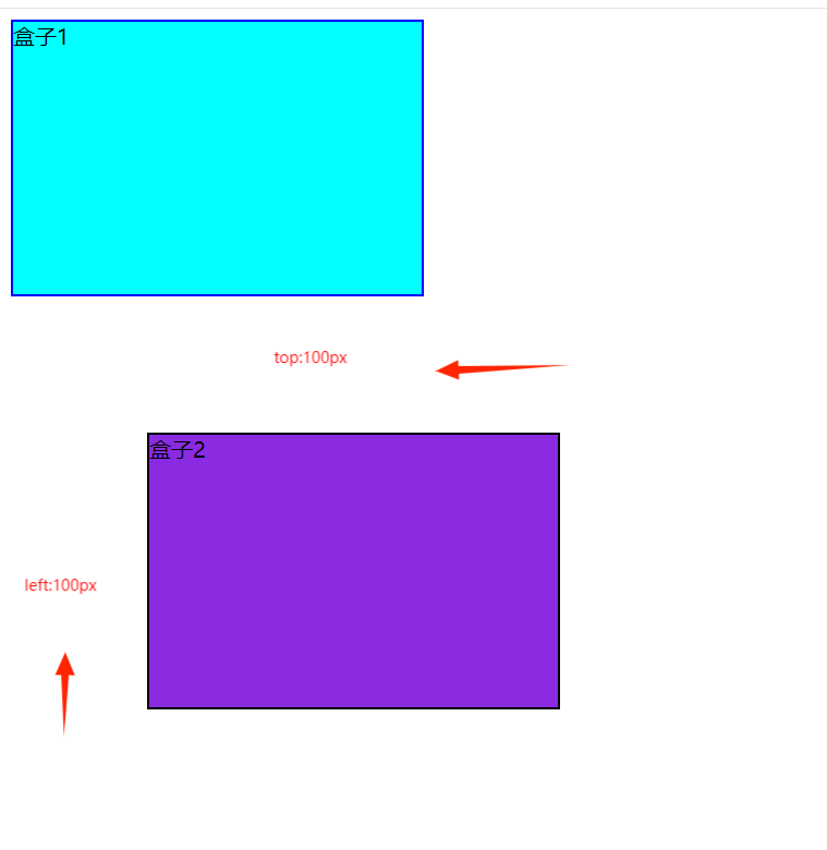
②相对定位(position:relative):(重点)
设置偏移量:left、right、top、bottom
不会脱离文档流(从上往下)
代码:
 1 <!DOCTYPE html>
 2 <html lang="en">
 3 <head>
 4     <meta charset="UTF-8">
 5     <meta name="viewport" content="width=device-width, initial-scale=1.0">
 6     <title>Document</title>
 7     <!-- <link rel="stylesheet" href="../position.css/position1.css"> -->
 8
 9     <style>
10         .box1{
11     width: 300px;
12     height: 200px;
13     border: 2px solid blue;
14     background-color: aqua;
15 }
16 .box2{
17     /* 盒子2宽高300*200 */
18     width: 300px;
19     height: 200px;
20     /* 盒子2边框、背景色 */
21     border: 2px solid black;
22     background-color: blueviolet;
23     /* 盒子2偏移量:上、左 */
24     top: 100px;
25     left: 100px;
26     /* 相对自己定位 */
27     position: relative;
28 }
29     </style>
30 </head>
31 <body>
32     <div class="box1">盒子1</div>
33     <div class="box2">盒子2</div>
34 </body>
35 </html>
视图:
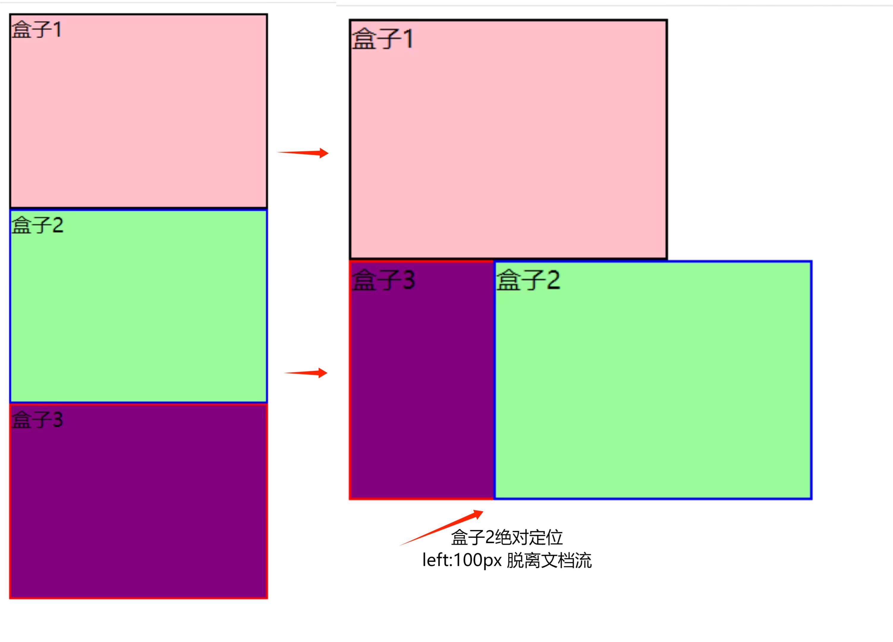
③绝对定位(position:absolute):(重点)
设置偏移量:left、right、top、bottom
脱离文档流(从上往下)
代码:
<!DOCTYPE html>
<html lang="en">
<head>
<meta charset="UTF-8">
<meta name="viewport" content="width=device-width, initial-scale=1.0">
<title>Document</title>
<style>
/* 盒子1 */
.box1{
width: 200px;
height: 150px;
border: 2px solid black;
background-color: pink;
}
/* 盒子2 绝对固定 左偏移 100px */
.box2{
width: 200px;
height: 150px;
border: 2px solid blue;
background-color: palegreen;
/* 绝对固定 左偏移 100px */
position: absolute;
left: 100px;
}
/* 盒子3 */
.box3{
width: 200px;
height: 150px;
border: 2px solid red;
background-color: purple;
}
</style>
</head>
<body>
<div class="box1">盒子1</div>
<div class="box2">盒子2</div>
<div class="box3">盒子3</div>
</body>
</html>
视图:
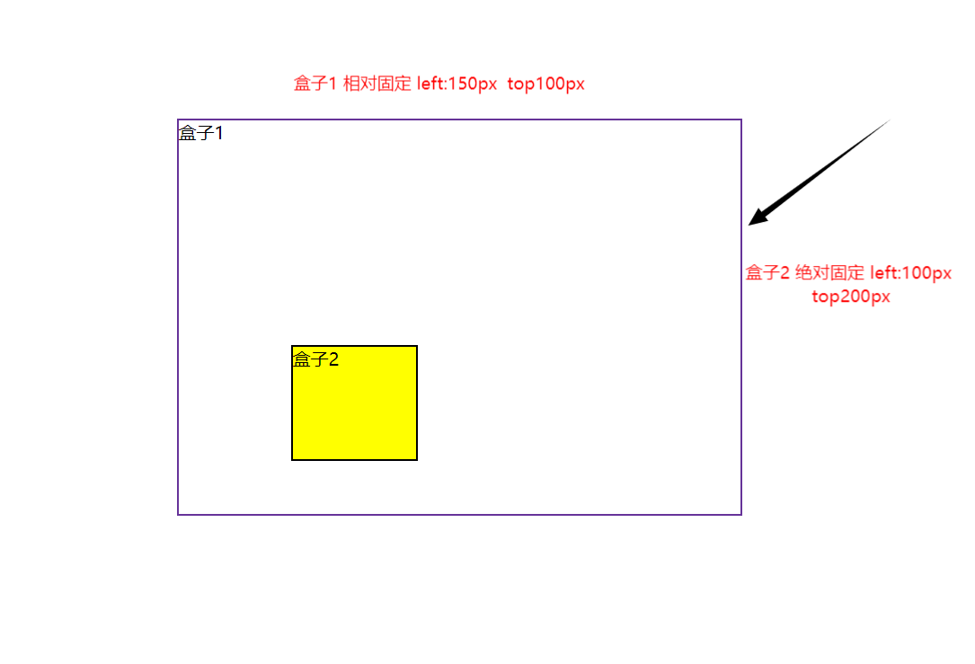
④父相子绝:(嵌套)(重点)
配合使用:
1.给父元素设置相对定位
2.给子元素设置绝对定位
此时,绝对定位是相对于父元素的。
相对定位:相对于自己进行偏移,绝对定位相对于整个页面进行偏移
不单独使用绝对定位
代码:
<!DOCTYPE html>
<html lang="en">
<head>
    <meta charset="UTF-8">
    <meta name="viewport" content="width=device-width, initial-scale=1.0">
    <title>Document</title>

    <style>
        .box1{
            /* 盒子1 父元素 */
            width: 500px;
            height: 350px;
            border: 2px solid rebeccapurple;
            /* 相对定位  左边距为一半 */
            position: relative;
            left: 150px;
            top: 100px;
        }
        /* 盒子2 子元素 */
        .box2{
            width: 110px;
            height: 100px;
            background-color: yellow;
            border: 2px solid black;
            /* 盒子2 子元素 绝对定位 左偏移100px 上偏移200px */
            position: absolute;
            left: 100px;
            top: 200px;
        }
    </style>
</head>
<body>
    <!-- 嵌套 -->
    <div class="box1">盒子1
        <div class="box2">盒子2</div>
    </div>
</body>
</html>
视图:
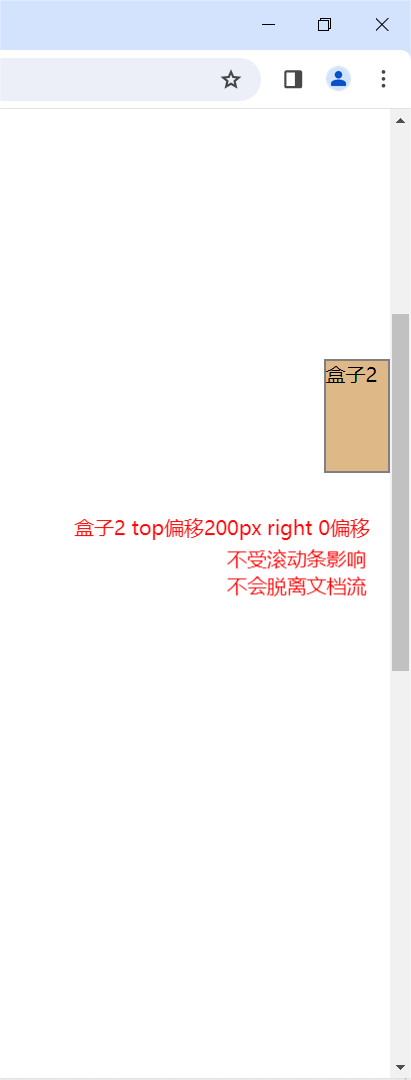
⑤固定定位(position:fixed):
不受滚动条影响
不会脱离文档流;
代码:
<!DOCTYPE html>
<html lang="en">
<head>
    <meta charset="UTF-8">
    <meta name="viewport" content="width=device-width, initial-scale=1.0">
    <title>Document</title>

    <style>
        /* body height设高一点 */
        body{
            height: 2000px;
        }
       /* 盒子2 */
       .box2{
        width: 50px;
        height: 88px;
        border: 2px solid gray;
        background-color: burlywood;
        position: fixed;
        right: 0px;
        top: 200px;
       }
    </style>
</head>
<body>
    <div class="box2">盒子2</div>
</body>
</html>
视图:
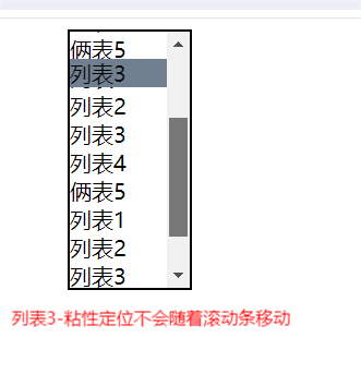
⑥粘性定位(position:sticky):
超过阈(yu)值一直会定位;
代码:
<!DOCTYPE html>
<html lang="en">
<head>
    <meta charset="UTF-8">
    <meta name="viewport" content="width=device-width, initial-scale=1.0">
    <title>Document</title>

    <style>
        .box1{
            width: 88px;
            height: 188px;
            border: 2px solid black;
            /* 显示滚动条 */
            overflow: auto;
            /* 居中 */
            margin: 0px auto;
            /* 父元素 相对固定 */
            position: relative;
            top: 0px;
        }
        #li3{
            /* 粘性定位 top偏移20px */
            top: 20px;
            position: sticky;
            background-color: slategrey;
        }
        li{
            list-style: none;
        }
    </style>
</head>
<body>
    <div class="box1">盒子1
        <li>列表1</li>
        <li>列表2</li>
        <li id="li3">列表3</li>
        <li>列表4</li>
        <li>俩表5</li>
        <li>列表1</li>
        <li>列表2</li>
        <li>列表3</li>
        <li>列表4</li>
        <li>俩表5</li>
        <li>列表1</li>
        <li>列表2</li>
        <li>列表3</li>
        <li>列表4</li>
        <li>俩表5</li>
    </div>
</body>
</html>
视图:
4.扩展
- 居中盒子--margin: auto
- overflow:auto--滚动条
- 设置元素的堆叠顺序(z-index):
- 需定位;
- 数字越小,越在下展示;数字越大,越在上展示;