1.1 多列布局
这里感谢小甲鱼,毕竟编程是小甲鱼带入坑了
鱼C-Web-CSS-速查
1.1.1 column-count
定义: column-count属性指定某个元素应分为的列数。
column-count: number|auto;
| 值 | 说明 |
|---|---|
| number | 列的最佳数目将其中的元素的内容无法流出 |
| auto | 列数将取决于其他属性。 |
<style>
    .newspaper
    {
        -moz-column-count:4; /* Firefox */
        -webkit-column-count:4; /* Safari and Chrome */
        column-count:4;
    }
</style>
1.1.2 column-gap
定义: column-gap的属性指定的列之间的差距。
column-gap: length|normal;
| 值 | 说明 |
|---|---|
| length | 一个指定的长度,将设置列之间的差距 |
| normal | 指定一个列之间的普通差距。 W3C建议1EM值 |
<style>
    .newspaper
    {
        -moz-column-count:4; /* Firefox */
        -webkit-column-count:4; /* Safari and Chrome */
        column-count:4;

        -moz-column-gap:2em; /* Firefox */
        -webkit-column-gap:2em; /* Safari and Chrome */
        column-gap:2em;
    }
</style>
1.1.3 column-width
定义: column-width属性指定列的宽度。
column-width: auto|length;
| 值 | 说明 |
|---|---|
| auto | 浏览器将决定列的宽度 |
| length | 指定列宽的长度 |
<style>
   .newspaper {
        column-width:333px;
        /* Firefox */
        -moz-column-width:333px;
        /* Safari and Chrome */
        -webkit-column-width:333px;
    }
</style>
1.1.4 column-span
定义: column-span属性指定某个元素应该跨越多少列。
column-span: 1|all;
| 值 | 说明 |
|---|---|
| 1 | 元素应跨越一列 |
| all | 该元素应该跨越所有列 |
<style>
   .newspaper{
        column-count:3;
        column-rule-width: 33px;
        /* Safari and Chrome */
        -webkit-column-count:3;
        -webkit-column-rule-width: 33px;
    }
    /*column-span属性只能在需跨越的元素上使用,以下意思是h1元素可以跨越所有列 */
    h1{
        column-span:all;
        -webkit-column-span:all; /* Safari and Chrome */
    }
</style>
1.1.5 columns(常用)
定义: columns属性设置列宽和列数。
columns: column-width column-count;
| 值 | 说明 |
|---|---|
| column-width | 列的宽度 |
| column-count | 列数 |
<style>
    .newspaper {
        columns:111px 6;
        /* Safari and Chrome */
        -webkit-columns:111px 6;
        /* Firefox */
        -moz-columns:111px 6;
    }
</style>
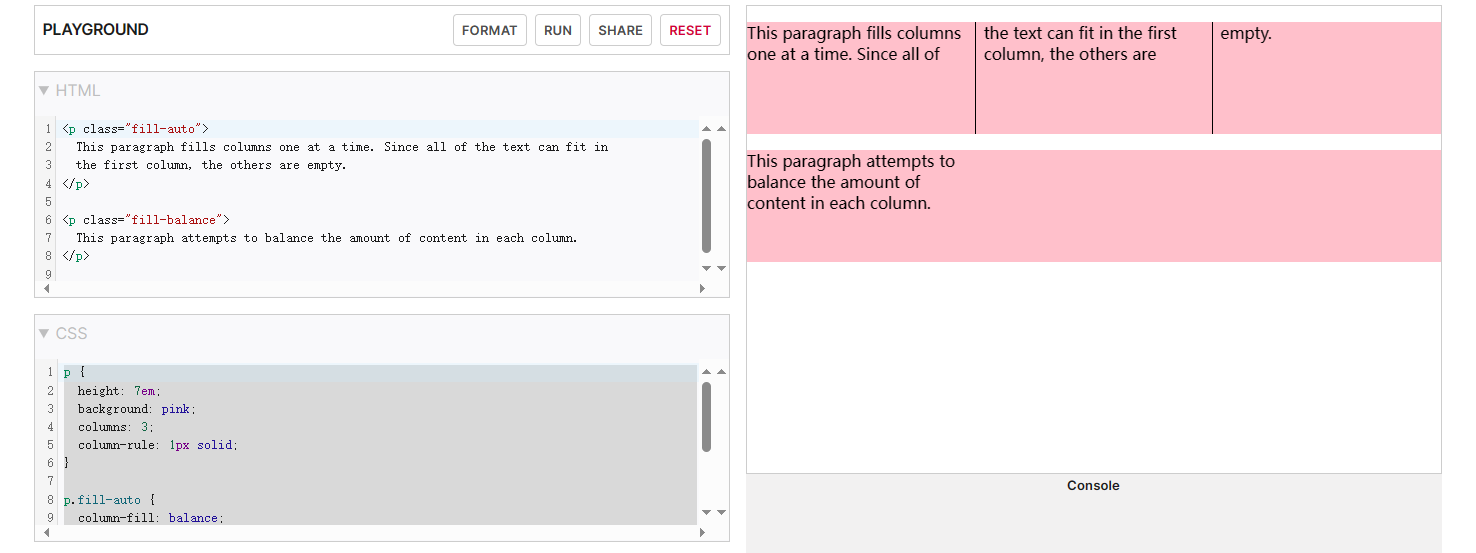
1.1.6 column-fill
定义: 控制元素的内容在分成列时如何平衡
column-fill: auto | balance;
| 值 | 说明 |
|---|---|
| auto | 列按顺序填充。内容仅占用所需的空间,可能导致某些列保持空白。 |
| balance | 内容在列之间平均分配。 |
还有其他属性值考虑兼容问题就不列举,以上属性值是大部分浏览器兼容的
<style>
p {
  height: 7em;
  background: pink;
  columns: 3;
  column-rule: 1px solid;
}

p.fill-auto {
  column-fill: balance;
}

p.fill-balance {
  column-fill: auto;
}
</style>
1.2 常用布局
1.2.1 居中
对于行内元素而言,一般水平居中就是设置text-align:center;
而行内元素垂直居中设置为:line-height:height;
但是对于块级元素有好几种方法如下:
-
方法一:
- 使当前块级元素脱离文档流
position: absolute top: 0; right: 0; bottom: 0; left: 0;, 使元素撑满整个屏幕widht: 200px; height: 200px;,设置完元素的宽高margin: auto;最后点金之笔,浏览器就会自动均分为我们的div外边距
- 使当前块级元素脱离文档流
-
方法二:
- 使当前块级元素脱离文档流
position: absolute - 先让元素左上角居中
top: 50%; left: 50%; - 再根据容器的大小来设置外边距偏移量
width: 800px;
height: 500px;

margin-left: -400px;
margin-top: -250px;
- 使当前块级元素脱离文档流
弊端: absolute:绝对定位,是相对于最近的且不是static定位的父元素来定位
拓展:
Position的属性值有:
- absolute:绝对定位,是相对于最近设置了position的元素定位的(不包括position设置的值:static)
- fixed:绝对定位,是相对于浏览器窗口来定位的,是固定的,不会跟屏幕一起滚动。
- relative:相对定位,是相对于其原本的位置来定位的。
- static:默认值,没有定位。
- inherit:继承父元素的position值。
1.2.2 双列布局
演示:
<style>
    aside {
        width: 200px;
        height: 500px;
        background-color: pink;
        position: absolute;
        top: 0;
        left: 0;
    }

    main {
        height: 500px;
        margin-left: 200px;
        background-color: lightblue;
    }
    .container{
        position:relative;
    }
</style>

<body>
    <div class="container">
        <aside></aside>
        <main></main>
    </div>
</body>
外面嵌套一个container是使aside的absolute不相对浏览器窗口定位,你们也可以自己将浏览器默认样式给清除
padding: 0;margin: 0;
效果:
1.2.3 三列布局
- 浮动大法
<style type="text/css">
    .left {
        width: 200px;
        height: 500px;
        float: left;
        background-color: pink;
    }

    .right {
        width: 200px;
        height: 500px;
        float: right;
        background-color: lightblue;
    }

    .center {
         /*中间不能设置宽度是其为:auto默认值,让浏览器自适应*/
        height: 500px;
        margin: 0 200px;
        background-color: cornsilk;
    }
</style>

<body>
    <div class="left"></div>
    <div class="right"></div>
    <div class="center"></div>
</body>
- 绝对定位法
<style type="text/css">
    .left {
        width: 200px;
        height: 500px;
        position: absolute;
        top: 0;
        left: 0;
        background-color: pink;
    }

    .right {
        width: 200px;
        height: 500px;
        position: absolute;
        top: 0;
        right: 0;
        background-color: lightblue;
    }

    .center {
        height: 500px;
        margin: 0 200px;
        background-color: cornsilk;
    }

    .container {
        position: relative;
    }
</style>


<body>
    <div class="container">
        <div class="left"></div>
        <div class="right"></div>
        <div class="center"></div>
    </div>
</body>
1.2.4 margin负值法
<style type="text/css">
    .container {
        width: 100%;
        float: left;
    }

    .center {
        height: 500px;
        margin: 0 200px;
        background-color: cornsilk;
    }

    .left {
        width: 200px;
        height: 500px;
        float: left;
        margin-left: -100%;
        background-color: pink;
    }

    .right {
        width: 200px;
        height: 500px;
        float: left;
        margin-left: -200px;
        background-color: lightblue;
    }
</style>

<body>
    <div class="container">
        <div class="center"></div>
    </div>
    <div class="left"></div>
    <div class="right"></div>
</body>
1.2.5 双飞翼布局
<style type="text/css">
     header {
        width: 100%;
        height: 30px;
        background-color: red;
    }

    main {
        overflow: hidden;
    }

    footer {
        width: 100%;
        height: 30px;
        background-color: red;
    }
    .container {
        width: 100%;
        float: left;
    }

    .center {
        height: 500px;
        margin: 0 200px;
        background-color: cornsilk;
    }

    .left {
        width: 200px;
        height: 500px;
        float: left;
        margin-left: -100%;
        background-color: pink;
    }

    .right {
        width: 200px;
        height: 500px;
        float: left;
        margin-left: -200px;
        background-color: lightblue;
    }
</style>

<body>
    <header></header>
    <main>
        <div class="container">
            <div class="center"></div>
        </div>
        <div class="left"></div>
        <div class="right"></div>
    </main>
    <footer></footer>
</body>
1.2.6 圣杯布局
<style>
    body {
        min-width: 600px;
    }

    main {
        padding: 0 200px;
    }

    .test {
        float: left;
    }

    #center {
        width: 100%;
        height: 500px;
        background-color: cornsilk;
    }

    #left {
        width: 200px;
        height: 500px;
        margin-left: -100%;
        position: relative;
        right: 200px;
        background-color: pink;
    }

    #right {
        width: 200px;
        height: 500px;
        margin-right: -200%;
        background-color: lightblue;
    }

    header {
        height: 30px;
        background-color: red;
    }

    footer {
        height: 30px;
        clear: both;
        background-color: red;
    }
    </style>

<body>
    <header></header>
    <main>
        <div id="center" class="test"></div>
        <div id="left" class="test"></div>
        <div id="right" class="test"></div>
    </main>
    <footer></footer>
</body>
总而言是用float脱离文档流,再用内外边距来控制元素的位置,从而达到自己想要的效果,是一手好玩法!大家也可以自己研究或者自己用大佬的代码(CV认证)
1.2.7 瀑布流布局(最受欢迎)
<style>
    body {
        background-color: pink;
        margin: 10px;
    }

    #page {
        width: 888px;
        margin: 0 auto;
    }

    .col {
        columns: 3;
        column-gap: atuo;
    }

    .pic {
        background-color: #FFF;
        padding: 20px;
        margin-bottom: 20px;
        box-shadow: 0 0 5px #00000061;
    }

    .pic img {
        width: 260px;
    }
</style>


<body>
    <div id="page">
        <div class="col">
            <div class="pic">
                <p>纸短情长,不敢承诺地老天荒。</p>
                <img src="img/1.jpg" alt="">
            </div>

            <div class="pic">
                <p>别慌,月亮也会在大海的某处迷茫。</p>
                <img src="img/2.jpg" alt="">
            </div>

            <div class="pic">
                <p>你是近处的灯火,也是遥远的星河。</p>
                <img src="img/3.jpg" alt="">
            </div>

            <div class="pic">
                <p>独自走过苍苍莽莽,与你同行才有了光。</p>
                <img src="img/4.jpg" alt="">
            </div>

            <div class="pic">
                <p>我遇见你,是最灿烂的花开,最美丽的意外。</p>
                <img src="img/5.jpg" alt="">
            </div>

            <div class="pic">
                <p>我在人间贩卖黄昏,只为收集世间温柔去见你。</p>
                <img src="img/6.jpg" alt="">
            </div>

            <div class="pic">
                <p>活在活着的人的心里,就是没有死去。(坎贝尔)</p>
                <img src="img/7.jpg" alt="">
            </div>

            <div class="pic">
                <p>你也曾是银河的浪漫子民,孤身坠入地球,等不到群星来信。</p>
                <img src="img/8.jpg" alt="">
            </div>

            <div class="pic">
                <p>经一场大梦,梦中见满眼山花如翡,如见故人,喜不自胜。</p>
                <img src="img/9.jpg" alt="">
            </div>

            <div class="pic">
                <p>如果你愿意,我可以翻山越岭。如果你愿意,我可以一生守住陶罐。(海桑)</p>
                <img src="img/10.jpg" alt="">
            </div>

            <div class="pic">
                <p>天地辽阔,四处皆可流浪,若你应允,我最想抖落一身星光,从此长眠于你心上。</p>
                <img src="img/11.png" alt="">
            </div>

            <div class="pic">
                <p>对待自己温柔一点。你只不过是宇宙的孩子,与植物、星辰没什么两样。(麦克斯·埃尔曼)</p>
                <img src="img/12.jpg" alt="">
            </div>
        </div>
    </div>
</body>
1.2.8 弹性盒子
设置元素为弹性盒子
display:flex;

display:inline-flex;
1.2.8.1 flex-direction
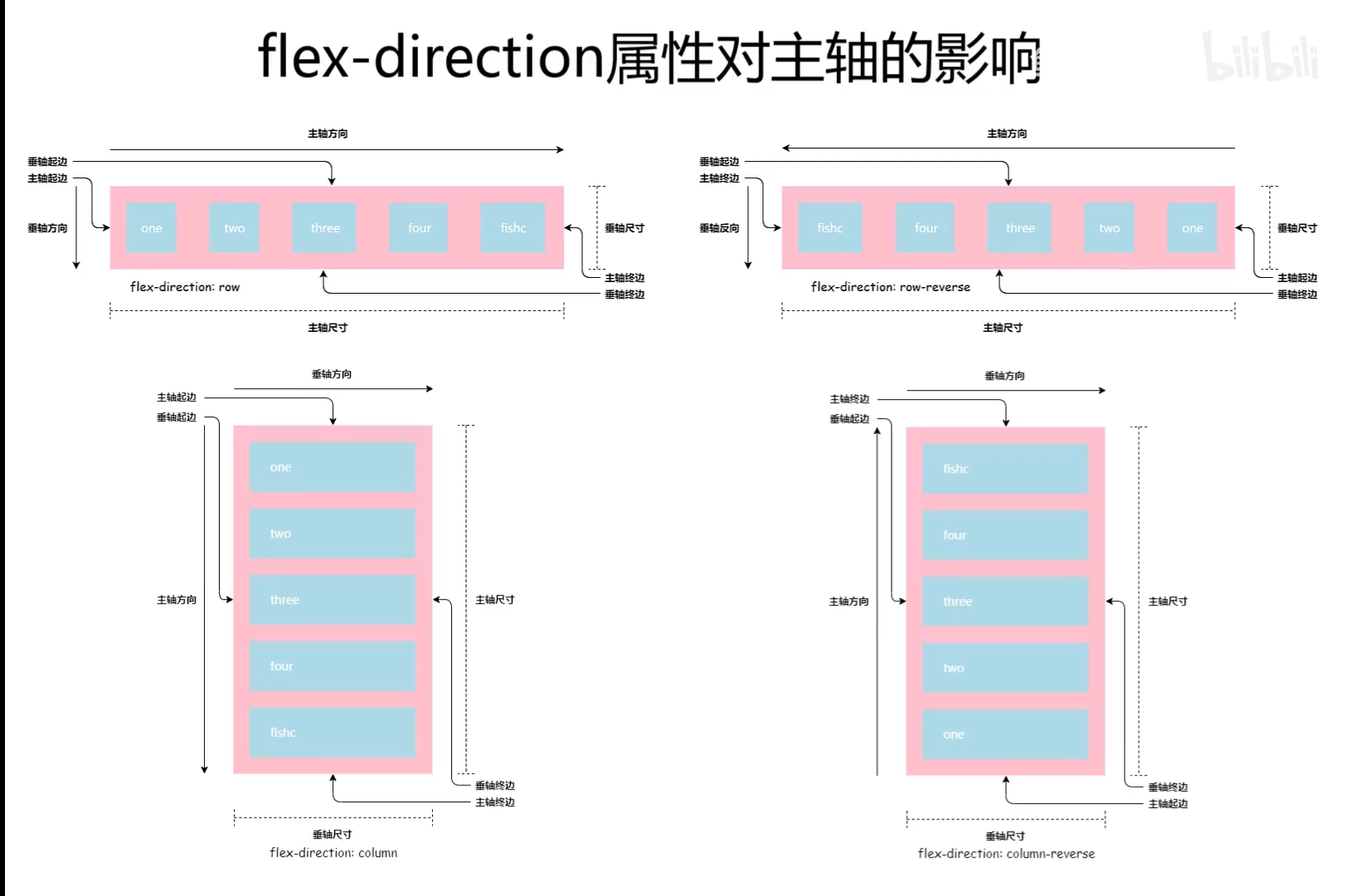
定义: flex-direction 属性规定灵活项目的方向。
如果元素不是弹性盒对象的元素,则 flex-direction 属性不起作用。
flex-direction: row|row-reverse|column|column-reverse|initial|inherit;
| 值 | 描述 |
|---|---|
| row | 默认值,灵活的项目将水平显示,正如一个行一样 |
| column | 灵活的项目将垂直显示,正如一个列一样。 |
| column-reverse | 与 column 相同,但是以相反的顺序。 |
| initial | 设置该属性为它的默认值。 |
| inherit | 从父元素继承该属性。 |
1.2.8.2 flex-wrap
定义: flex-wrap 属性规定 flex 容器是单行或者多行,同时横轴的方向决定了新行堆叠的方向。
如果元素不是弹性盒对象的元素,则 flex-wrap 属性不起作用。
flex-wrap:nowrap|wrap|wrap-reverse|initial|inherit;
| 值 | 描述 |
|---|---|
| nowrap | 默认值。规定灵活的项目不拆行或不拆列。 |
| wrap | 规定灵活的项目在必要的时候拆行或拆列。 |
| wrap-reverse | 规定灵活的项目在必要的时候拆行或拆列,但是以相反的顺序。 |
| initial | 设置该属性为它的默认值。 |
| inherit | 从父元素继承该属性。 |
1.2.8.2 flex-flow(复合属性)
定义: flex-flow 属性是 flex-direction 和 flex-wrap 属性的复合属性。
如果元素不是弹性盒对象的元素,则 flex-flow 属性不起作用。
如果元素不是弹性盒对象的元素,则 flex-wrap 属性不起作用。
flex-flow:flex-direction flex-wrap|initial|inherit;
| 值 | 描述 |
|---|---|
| flex-direction | 可能的值:row、row-reverse、column、column-reverse、initial、inherit,默认值是 “row”。规定灵活项目的方向。 |
| flex-wrap | 可能的值:nowrap、wrap、wrap-reverse、initial、inherit、默认值是 “nowrap”。规定灵活项目是否拆行或拆列。 |
| initial | 设置该属性为它的默认值。 |
| inherit | 从父元素继承该属性。 |
1.2.8.3 弹性盒布局
主轴与垂轴
1.2.8.4 justify-content(影响主轴对齐)
定义: justify-content 用于设置或检索弹性盒子元素在主轴(横轴)方向上的对齐方式。
justify-content: flex-start|flex-end|center|space-between|space-around|initial|inherit;
| 值 | 描述 |
|---|---|
| flex-start | 默认值。项目位于容器的开头。 |
| flex-end | 项目位于容器的结尾 |
| center | 项目位于容器的中心。 |
| space-between | 项目位于各行之间留有空白的容器内。 |
| space-around | 项目位于各行之前、之间、之后都留有空白的容器内。 |
| initial | 设置该属性为它的默认值。 |
| inherit | 从父元素继承该属性。 |
1.2.8.4 align-items (影响垂轴对齐)
定义: align-items 属性定义 flex 子项在 flex 容器的当前行的侧轴(纵轴)方向上的对齐方式。
align-items: stretch|center|flex-start|flex-end|baseline|initial|inherit;
| 值 | 描述 |
|---|---|
| stretch | 默认值。元素被拉伸以适应容器。如果指定侧轴大小的属性值为’auto’,则其值会使项目的边距盒的尺寸尽可能接近所在行的尺寸,但同时会遵照’min/max-width/height’属性的限制。 |
| center | 元素位于容器的中心。弹性盒子元素在该行的侧轴(纵轴)上居中放置。(如果该行的尺寸小于弹性盒子元素的尺寸,则会向两个方向溢出相同的长度)。 |
| flex-start | 元素位于容器的开头。弹性盒子元素的侧轴(纵轴)起始位置的边界紧靠住该行的侧轴起始边界。 |
| flex-end | 元素位于容器的结尾。弹性盒子元素的侧轴(纵轴)起始位置的边界紧靠住该行的侧轴结束边界。 |
| baseline | 元素位于容器的基线上。如弹性盒子元素的行内轴与侧轴为同一条,则该值与’flex-start’等效。其它情况下,该值将参与基线对齐。 |
| initial | 设置该属性为它的默认值。 |
| inherit | 从父元素继承该属性。 |
1.2.8.4 align-content (影响垂轴对齐)
定义: align-content 属性在弹性容器内的各项没有占用交叉轴上所有可用的空间时对齐容器内的各项(垂直)。
align-content: stretch|center|flex-start|flex-end|space-between|space-around|initial|inherit;
| 值 | 描述 |
|---|---|
| stretch | 默认值。元素被拉伸以适应容器。各行将会伸展以占用剩余的空间。如果剩余的空间是负数,该值等效于’flex-start’。在其它情况下,剩余空间被所有行平分,以扩大它们的侧轴尺寸。 |
| center | 元素位于容器的中心。各行向弹性盒容器的中间位置堆叠。各行两两紧靠住同时在弹性盒容器中居中对齐,保持弹性盒容器的侧轴起始内容边界和第一行之间的距离与该容器的侧轴结束内容边界与第最后一行之间的距离相等。(如果剩下的空间是负数,则各行会向两个方向溢出的相等距离。) |
| flex-start | 元素位于容器的开头。各行向弹性盒容器的起始位置堆叠。弹性盒容器中第一行的侧轴起始边界紧靠住该弹性盒容器的侧轴起始边界,之后的每一行都紧靠住前面一行。 |
| flex-end | 元素位于容器的结尾。各行向弹性盒容器的结束位置堆叠。弹性盒容器中最后一行的侧轴起结束界紧靠住该弹性盒容器的侧轴结束边界,之后的每一行都紧靠住前面一行。 |
| space-between | 元素位于各行之间留有空白的容器内。各行在弹性盒容器中平均分布。如果剩余的空间是负数或弹性盒容器中只有一行,该值等效于’flex-start’。在其它情况下,第一行的侧轴起始边界紧靠住弹性盒容器的侧轴起始内容边界,最后一行的侧轴结束边界紧靠住弹性盒容器的侧轴结束内容边界,剩余的行则按一定方式在弹性盒窗口中排列,以保持两两之间的空间相等。 |
| space-around | 元素位于各行之前、之间、之后都留有空白的容器内。各行在弹性盒容器中平均分布,两端保留子元素与子元素之间间距大小的一半。如果剩余的空间是负数或弹性盒容器中只有一行,该值等效于’center’。在其它情况下,各行会按一定方式在弹性盒容器中排列,以保持两两之间的空间相等,同时第一行前面及最后一行后面的空 |
| initial | 设置该属性为它的默认值。 |
| inherit | 从父元素继承该属性。 |
1.2.8.5 单独控制弹性盒子排序 order属性
用:nth-of-type(n) 选择弹性盒子里的元素设置其 order值
**:nth-of-type(n) **
理解:用于定位兄弟元素
:nth-of-type(n) 选择器匹配属于父元素的指定类型的第 n 个子元素。
注意:n 可以是数字、关键词或公式。
:nth-of-type(number)
{
    CSS 样式
}
特殊玩法:
-
正方向范围:
li:nth-of-type(n+6)选中从第6个开始的子元素
-
负方向范围
li:nth-of-type(-n+9)选中从第1个到第9个子元素中的所有元素。
-
前后限制范围
:nth-of-type(n+4):nth-of-type(-n+8)选中第4-8个子元素间的所有元素。
-
奇数、偶数位
/*奇数*/ :nth-of-type(odd) /*偶数*/ :nth-of-type(even) -
高级玩法
5.1隔选择子元素
:nth-of-type(3n+1),选择1,4,7,10子元素。
5.2. 范围法:nth-of-type(n+1):nth-of-type(odd):nth-of-type(-n+5)将会选中的子元素是从第1位到第5位,并且只包含奇数位。
1.2.9 栅格布局
尤为精彩,大受启发,不思进取,不作笔记!