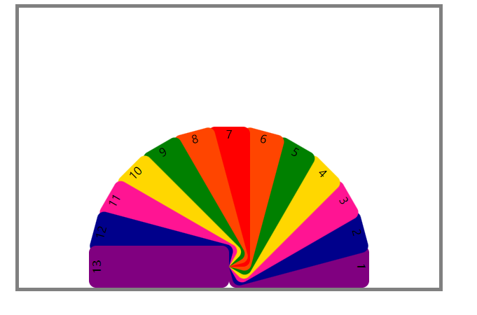
搭建扇子结构
<body>
    <ul>
        <li>1</li>
        <li>2</li>
        <li>3</li>
        <li>4</li>
        <li>5</li>
        <li>6</li>
        <li>7</li>
        <li>8</li>
        <li>9</li>
        <li>10</li>
        <li>11</li>
        <li>12</li>
        <li>13</li>
    </ul>
</body>
样式设置
<style>
* {
margin: 0;
padding: 0;
}
ul {
list-style: none;
}
ul {
margin: 10px auto;
width: 600px;
height: 400px;
border: 5px solid gray;
position: relative;
}
li {
width: 60px;
height: 200px;
position: absolute;
left: 50%;
margin-left: -30px;
bottom: 30px;
text-align: center;
transform-origin: bottom center;
border-radius: 10px;
transition: all 2s;
}
ul li:not(:nth-child(7)) {
opacity: 0;
}
ul:hover li {
opacity: 1;
}
ul li:nth-child(1),
ul li:nth-child(13) {
background: purple;
}
ul li:nth-child(2),
ul li:nth-child(12) {
background: darkblue;
}
ul li:nth-child(3),
ul li:nth-child(11) {
background: deeppink;
}
ul li:nth-child(4),
ul li:nth-child(10) {
background: gold;
}
ul li:nth-child(5),
ul li:nth-child(9) {
background: green;
}
ul li:nth-child(6),
ul li:nth-child(8) {
background: orangered;
}
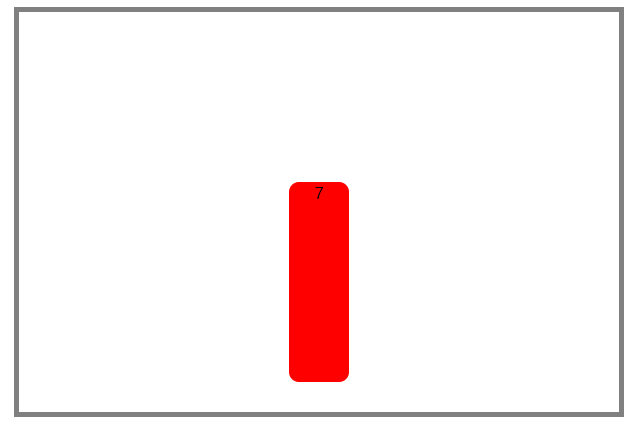
ul li:nth-child(7) {
background: red;
}
ul:hover li:nth-child(1) {
transform: rotate(90deg);
}
ul:hover li:nth-child(13) {
transform: rotate(-90deg);
}
ul:hover li:nth-child(2) {
transform: rotate(75deg);
}
ul:hover li:nth-child(12) {
transform: rotate(-75deg);
}
ul:hover li:nth-child(3) {
transform: rotate(60deg);
}
ul:hover li:nth-child(11) {
transform: rotate(-60deg);
}
ul:hover li:nth-child(4) {
transform: rotate(45deg);
}
ul:hover li:nth-child(10) {
transform: rotate(-45deg);
}
ul:hover li:nth-child(5) {
transform: rotate(30deg);
}
ul:hover li:nth-child(9) {
transform: rotate(-30deg);
}
ul:hover li:nth-child(6) {
transform: rotate(15deg);
}
ul:hover li:nth-child(8) {
transform: rotate(-15deg);
}
</style>
实现效果:
鼠标移上去时展开