小程序中最常见的功能就是底部导航栏了,今天就来看一下怎么设置一个好看的导航栏~这里我们使用的是支付宝官方小程序 IDE 做示范。
官方提供的底部导航栏
第一步:页面创建
一般的小程序会有四个 tab,我们这次也是配置四个 tab 的导航栏。
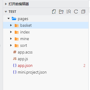
首先,我们先创建四个页面:
tab 最多可以设置五个,参考 ? [tabBar 能设置几个 tab]
第二步:在 app.json 中配置底部导航栏的信息
? 底部导航栏需要在 app.json 文件中通过 tabBar 属性配置,其中:
- textColor:设置文字颜色
- selectedColor:设置选中文字颜色
- backgroundColor:设置背景色
- items:每个 tab 配置
- pagePath:对应 tab 页面路径
- name:对应显示 tab 名称
- icon:非选中状态下图标路径
- activeIcon:选中状态下图图标路径
app.json文件代码
{
  "pages": [
    "pages/index/index",
    "pages/mine/mine",
    "pages/sort/sort",
    "pages/basket/basket"
  ],
  "window": {
    "defaultTitle": "购物商城"
  },
  //底部导航栏的信息
  "tabBar": {
    "textColor": "#dddddd",
    "selectedColor": "#49a9ee",
    "backgroundColor": "#ffffff",
    "items": [
      {
        "pagePath": "pages/index/index",
        "name": "首页"
      },
      {
        "pagePath": "pages/sort/sort",
        "name": "分类"
      },
      {
        "pagePath": "pages/basket/basket",
        "name": "购物车"
      },
      {
        "pagePath": "pages/mine/mine",
        "name": "我的"
      }
    ]
  }
}
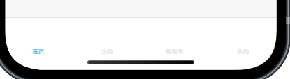
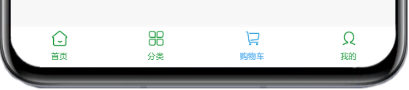
实现效果
这里收集了一下导航栏的常见问题,帮大家避坑:
- [tabBar 的位置是否支持设置成顶部]
- [切换 tabBar 时报错 Cannot read property 'getCurrentPages' of undefined 如何处理]
- [如何监听 tabBar 点击事件]
第三步:美化导航栏
简单的 tab 功能实现后,我们可以通过图标(icon/activeIcon)、颜色等属性对导航栏进行下美化。
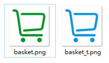
先配一个图标,图标大家可以自行搜索,记得找透明底色图片(否则会有白底儿 ?)。
一个 tab 需要配置图标的两个状态,即 选中状态 和 非选中状态,例如:
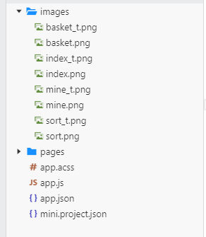
创建 images 文件夹,把图片拖进去:
稍微美化后的 tabBar 代码:
"tabBar": {
    "textColor": "#0e932e",
    "selectedColor": "#49a9ee",
    "backgroundColor": "#ffffff",
    "items": [
      {
        "pagePath": "pages/index/index",
        "icon": "images/index.png",
        "activeIcon": "images/index_t.png",
        "name": "首页"
      },
      {
        "pagePath": "pages/sort/sort",
        "icon": "images/sort.png",
        "activeIcon": "images/sort_t.png",
        "name": "分类"
      },
      {
        "pagePath": "pages/basket/basket",
        "icon": "images/basket.png",
        "activeIcon": "images/basket_t.png",
        "name": "购物车"
      },
      {
        "pagePath": "pages/mine/mine",
        "icon": "images/mine.png",
        "activeIcon": "images/mine_t.png",
        "name": "我的"
      }
    ]
  }
实现效果
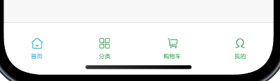
配置完上面信息之后一个简单的 tab 页面就出来了,基本就可以满足一般小程序的要求了。
tabBar 样式配置的常见问题给大家参考下:
第四步:导航栏进阶功能
如果对应的页面需要提示用户进行交互的话,我们就可以用到下面的功能,例如 tab 红点提示、tab 文本提示 。
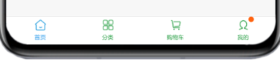
tab 红点提示
通过 my.showTabBarRedDot 方法给【我的】增加红点提醒
//index.js
Page({
  onLoad(query) {
    my.showTabBarRedDot({
      index: 3,//左边开始,从0计数
      success: function(res) {
        console.log(res);    //{ "success": true}
      },
      fail: function(err) {
        console.log(err);
      }
    })
    console.info(`Page onLoad with query: ${JSON.stringify(query)}`);
  },
})
实现效果
通过 my.hideTabBarRedDot 方法在点击【我的】时候隐藏红点:
//mine.js
Page({
  onLoad() {
    my.hideTabBarRedDot({
      index: 3,//左边开始,从0计数
      success: function(res) {
        console.log(res);   //{ "success": true}
      },
      fail: function(err) {
        console.log(err);
      }
    });
  },
});
实现效果
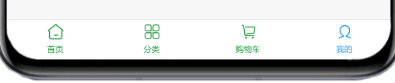
tab 文本提示
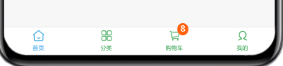
通过 my.setTabBarBadge 方法给【购物车】增加数量
<!--index.axml -->
<button size="default" type="primary" onTap="addShop">加入购物车</button>
//index.js
Page({
  addShop(){
    my.setTabBarBadge({
      index: 2,//左边开始,从0计数
      text: '8',//全部显示只支持3个字符
      success(res) {
        console.log(res);
      },
      fail(res) {
        console.log('setTabBarBadge fail: ', res);
      }
    })
  }
});
实现效果
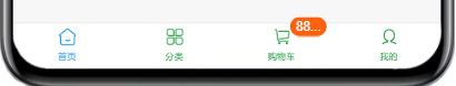
超过 3 个字符效果
如果需要移除文本的话,可以通过 my.removeTabBarBadge 方法实现
//basket.js
Page({
  onLoad() {
    my.removeTabBarBadge({
      index: 2,//左边开始,从0计数
      success: function(res) {
        console.log(res);   // { "success": true}
      },
      fail: function(err) {
        console.log(err);
      }
    });
  },
});
实现效果
tabBar 切换的问题大家可以参考:
自定义底部导航栏
如果想要设置更多能力的 tabBar 的话,可以使用自定义Tab来实现。
⚠ 注意:
- 使用自定义 tabBar 后,与 tabBar 样式相关的接口都无法使用,例如设置红点(my.showTabBarRedDot )、修改样式(my.setTabBarStyle)等。
- 自定义 tabBar 相当于是自定义了一个组件,可以通过 getTabBar 获取自定义 tabBar 实例进行操作。
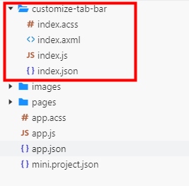
第一步:创建自定义 tabBar 目录
添加自定义的 tabBar 文件,文件位置和名字要保持一致:
第二步:修改 app.json 文件
配置 app.json 文件,在 tabBar 下添加 customize 属性,设置为 true
{
  "pages": [
    "pages/index/index",
    "pages/mine/mine",
    "pages/sort/sort",
    "pages/basket/basket",
    "pages/member/member"
  ],
  "window": {
    "defaultTitle": "购物商城"
  },
  "tabBar": {
    "customize": true,
    "items": [
      {
        "pagePath": "pages/index/index",
        "name": "首页"
      },
      {
        "pagePath": "pages/sort/sort",
        "name": "分类"
      },
       {
        "pagePath": "pages/member/member",
        "name": "会员"
      },
      {
        "pagePath": "pages/basket/basket",
        "name": "购物车"
      },
      {
        "pagePath": "pages/mine/mine",
        "name": "我的"
      }
    ]
  }
}
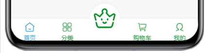
第三步:编写自定义 tabBar 代码
customize-tab-bar 文件下
index.axml 页面:
<view class="tabbar_box">
  <view class="tabbar_nav {{index === 2 ? 'active' : ''}}" onTap="switchTab" data-index="{{index}}" data-item={{item}} a:for="{{tabBar.items}}" a:key="index">
    <!-- 图标 -->
    <image class="tabbar_icon" src="{{selected === index ? item.activeIcon : item.icon}}"></image>
    <!-- 文字 -->
    <text style="color:{{selected === index ? tabBar.selectedColor : tabBar.textColor}}" >{{item.name}}</text>
  </view>
</view>
index.js 页面:
Component({
  data: {
    selected: 0,
    tabBar: {
      textColor: "#0e932e",
      selectedColor: "#49a9ee",
      items: [
        {
          pagePath: "/pages/index/index",
          name: "首页",
          icon: "/images/index.png",
          activeIcon: "/images/index_t.png",
        },
        {
          pagePath: "/pages/sort/sort",
          name: "分类",
          icon: "/images/sort.png",
          activeIcon: "/images/sort_t.png",
        },
        {
          pagePath: "/pages/member/member",
          name: "",
          icon: "/images/member.png",
          activeIcon: "/images/member_t.png"
        },
        {
          pagePath: "/pages/basket/basket",
          name: "购物车",
          icon: "/images/basket.png",
          activeIcon: "/images/basket_t.png",
        },
        {
          pagePath: "/pages/mine/mine",
          name: "我的",
          icon: "/images/mine.png",
          activeIcon: "/images/mine_t.png",
        }
      ]
    }
  },
  methods: {
    switchTab(e) {
      const {dataset: { item: { pagePath = '' }} = {}} = e.target
      my.switchTab({
        url: pagePath
      })
    }
  }
});
index.acss 页面
.tabbar_box {
  display: -webkit-box;
  display: -ms-flexbox;
  display: flex;
  -webkit-box-orient: horizontal;
  -webkit-box-direction: normal;
  -ms-flex-direction: row;
  flex-direction: row;
  -ms-flex-pack: distribute;
  justify-content: space-around;
  position: fixed;
  bottom: 0;
  left: 0;
  z-index: 999;
  width: 100%;
  box-shadow: 0 1rpx 6rpx rgba(0, 0, 0, 0.2);
  background: #ffffff;
  padding-top: 16rpx;
  padding-bottom: env(safe-area-inset-bottom);
  box-sizing: content-box;
}

.tabbar_nav {
  display: -webkit-box;
  display: -ms-flexbox;
  display: flex;
  -webkit-box-orient: vertical;
  -webkit-box-direction: normal;
  -ms-flex-direction: column;
  flex-direction: column;
  -webkit-box-pack: center;
  -ms-flex-pack: center;
  justify-content: space-around;
  -webkit-box-align: center;
  -ms-flex-align: center;
  align-items: center;
  font-size: 25rpx;
  height: 100%;
  flex: 1;
  background: #fff;
}

.tabbar_nav.active {
  padding-top: 50rpx;
}

.tabbar_nav.active image {
  width: 100rpx;
  z-index: 2;
  height: 100rpx;
  border-radius: 50%;
  line-height: 100rpx;
  font-size: 50rpx;
  top: -50rpx;
  left: 0;
  right: 0;
  margin: auto;
  padding: 0;
  position: absolute;
}

.tabbar_nav.active::after {
  content: "";
  position: absolute;
  width: 120rpx;
  height: 120rpx;
  top: -60rpx;
  left: 0;
  right: 0;
  margin: auto;
  box-shadow: 0 -3rpx 8rpx rgba(0, 0, 0, 0.06);
  border-radius: 60rpx;
  background-color: inherit;
  z-index: 0;
}

.tabbar_nav.active::before {
  content: "";
  position: absolute;
  width: 120rpx;
  height: 30rpx;
  bottom: 30rpx;
  left: 0;
  right: 0;
  margin: auto;
  background-color: inherit;
  z-index: 1;
}

.tabbar_icon {
  width: 40rpx;
  height: 40rpx;
}

.tabbar_nav text {
  font-size: 24rpx;
  margin-top: 6rpx;
}
pages/index 文件下

index.js 文件:

Page({
  // 页面显示
  onShow() {
    if (typeof this.getTabBar === 'function' && this.getTabBar()) {
      this.getTabBar().setData({
        selected: 0,
      });
    }
  }
})
实现效果
以上就是关于小程序底部导航栏的所有内容啦,希望对你有所帮助*★,°*:.☆( ̄▽ ̄)/$:*.°★* 。