@
.NET MAUI 跨平台框架包含了识别平移手势的功能,在之前的博文[MAUI 项目实战] 手势控制音乐播放器(二): 手势交互中利用此功能实现了pan-pit拖拽系统。
简单来说就是拖拽物(pan)体到坑(pit)中,手势容器控件PanContainer描述了pan运动和pit位置的关系,并在手势运动中产生一系列消息事件。
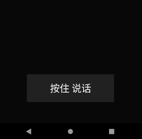
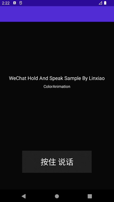
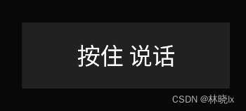
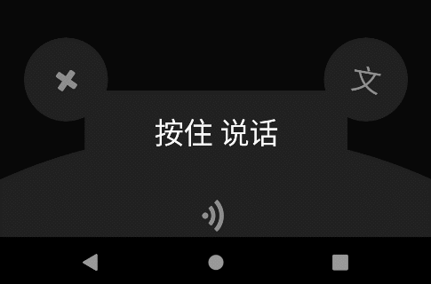
今天使用这个控件,做一个模仿微信“按住-说话”的小功能,最终效果如下:
使用.NET MAU实现跨平台支持,本项目可运行于Android、iOS平台。
创建页面布局
新建.NET MAUI项目,命名HoldAndSpeak
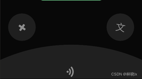
MainPage.xaml中创建一个PitContentLayoutGrid容器,并对Grid容器进行如下布局:
在手机屏幕的底部设置两行两列的布局:
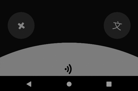
第一行第一列,对应取消发送手势区域,
第一行第二列,对应语音转文字手势区域,
第二行独占两列,对应发送手势区域。
布局如下图所示
<Grid x:Name="PitContentLayout"
        Opacity="1">
    <Grid.RowDefinitions>
        <RowDefinition Height="1*" />
        <RowDefinition Height="1*" />
    </Grid.RowDefinitions>
    <Grid.ColumnDefinitions>
        <ColumnDefinition Width="1*" />
        <ColumnDefinition Width="1*" />
    </Grid.ColumnDefinitions>
</Grid>
创建三个PitGrid控件,并对这三个功能区域的PitGrid控件命名,CancelPit、TransliterationPit,分别对应了取消发送、语音转文字、发送。
为每个PitGrid控件添加内容:
发送区域是一个底部弧形区域,我们用一个巨大的圆形+Y轴方向的偏移,通过只保留屏幕底部往上的一部分圆形区域来实现底部弧形区域的效果,代码如下:
<BoxView TranslationY="450"
        x:Name="SendBox"
        HeightRequest="1000"
        WidthRequest="1000"
        CornerRadius="500">
</BoxView>
取消发送和语音转文字区域是一个圆形区域,我们用一个正常大小的圆形来实现。
PitContentLayout区域整体代码如下
<Grid x:Name="PitContentLayout"
        Opacity="1">
    <Grid.RowDefinitions>
        <RowDefinition Height="1*" />
        <RowDefinition Height="1*" />
    </Grid.RowDefinitions>
    <Grid.ColumnDefinitions>
        <ColumnDefinition Width="1*" />
        <ColumnDefinition Width="1*" />
    </Grid.ColumnDefinitions>
    <controls1:PitGrid x:Name="CancelPit"
                        TranslationX="-40"

                        PitName="CancelPit">

        <BoxView x:Name="CancelBox"
                    HeightRequest="80"
                    WidthRequest="80"
                    CornerRadius="50"
                    Margin="7.5"
                    Color="{StaticResource PhoneContrastBackgroundBrush}"
                    VerticalOptions="CenterAndExpand"
                    HorizontalOptions="CenterAndExpand"></BoxView>
        <Label   x:Name="CancelLabel"
                    TextColor="{StaticResource PhoneContrastForegroundBrush}"
                    FontFamily="FontAwesome"
                    FontSize="28"
                    Rotation="-10"
                    HorizontalOptions="CenterAndExpand"
                    Margin="0"></Label>


    </controls1:PitGrid>
    <controls1:PitGrid x:Name="TransliterationPit"
                        PitName="TransliterationPit"
                        TranslationX="40"
                        Grid.Column="1">

        <BoxView x:Name="TransliterationBox"
                    HeightRequest="80"
                    WidthRequest="80"
                    CornerRadius="50"
                    Margin="7.5"
                    Color="{StaticResource PhoneContrastBackgroundBrush}"
                    VerticalOptions="CenterAndExpand"
                    HorizontalOptions="CenterAndExpand"></BoxView>
        <Label  x:Name="TransliterationLabel"
                TextColor="{StaticResource PhoneContrastForegroundBrush}"
                FontSize="28"
                Text="文"
                Rotation="10"
                HorizontalOptions="CenterAndExpand"
                Margin="0"></Label>


    </controls1:PitGrid>
    <controls1:PitGrid x:Name="SendPit"
                        PitName="SendPit"
                        Grid.ColumnSpan="2"
                        Grid.Row="1">

        <BoxView TranslationY="450"
                    x:Name="SendBox"
                    HeightRequest="1000"
                    WidthRequest="1000"
                    CornerRadius="500"
                    Margin="7.5"
                    Color="{StaticResource PhoneContrastBackgroundBrush}"
                    VerticalOptions="CenterAndExpand"
                    HorizontalOptions="CenterAndExpand"></BoxView>
        <Label x:Name="SendLabel"
                TranslationY="30"
                FontSize="28"
                Rotation="45"
                TextColor="{StaticResource PhoneContrastForegroundBrush}"
                FontFamily="FontAwesome"
                HorizontalOptions="CenterAndExpand"
                Margin="0"></Label>


    </controls1:PitGrid>

</Grid>
效果如下
创建手势控件
创建一个手势控件。他包裹的内容。是一个带有按住说话的按钮。
<controls1:PanContainer BackgroundColor="Transparent"
        x:Name="DefaultPanContainer"
        OnTapped="DefaultPanContainer_OnOnTapped"
        AutoAdsorption="False"
        OnfinishedChoise="DefaultPanContainer_OnOnfinishedChoise">

    <Grid PropertyChanged="BindableObject_OnPropertyChanged"
            VerticalOptions="Start"
            HorizontalOptions="Start">

        <BoxView HeightRequest="80"
                    WidthRequest="250"
                    Margin="7.5"
                    Color="{StaticResource PhoneContrastBackgroundBrush}"></BoxView>
        <Label  x:Name="PauseLabel"
                HorizontalOptions="CenterAndExpand"
                FontSize="28"
                TextColor="{StaticResource PhoneForegroundBrush}"
                Text="按住 说话"
                Margin="0"></Label>

    </Grid>


</controls1:PanContainer>
此时应该是可以拖动,并且在拖拽开始,进入pit,离开pit,释放时,分别触发Start,In,Out,Over四个状态。
但我们希望在拖拽时隐藏这个按钮,这将在创建动画章节将介绍。
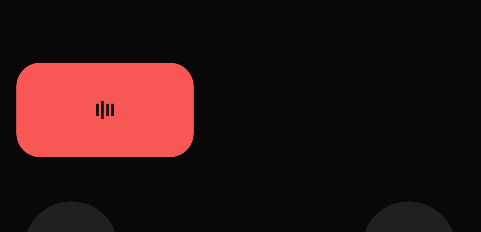
创建TalkBox
创建一个圆角矩形,用来显示正在说话的动画。
<Grid Grid.Row="1"
            Opacity="1"
            x:Name="TalkBoxLayout">
        <BoxView x:Name="TalkBox"
                    HeightRequest="80"
                    WidthRequest="200"
                    CornerRadius="20"
                    Margin="7.5"
                    Color="{StaticResource PhoneAccentBrush}"
                    VerticalOptions="CenterAndExpand"
                    HorizontalOptions="CenterAndExpand"></BoxView>

        <controls:PlayingMotionView   HorizontalOptions="CenterAndExpand"
                                        x:Name="MotionView"
                                        Margin="0"></controls:PlayingMotionView>

    </Grid>
</Grid>
效果如下

创建动画
拖拽物动画
在拖拽时我们希望可以隐藏拖拽物,设置 PanScale和PanScaleAnimationLength属性为0,代码如下:
<controls1:PanContainer BackgroundColor="Transparent"
        x:Name="DefaultPanContainer"
        OnTapped="DefaultPanContainer_OnOnTapped"
        AutoAdsorption="False"
        PanScale="0.0"
        PanScaleAnimationLength="0">
按钮激活动画
Codebeind代码中,配置Active和DeActive方法,用于激活和取消激活功能区域按钮的样式。
激活时,对应功能区域按钮背景颜色变为白色,字体颜色变为黑色,并且放大到1.2倍。
取消激活时,恢复到原来的样式。

代码如下
private void Active(BoxView currentContent, Label text, Color toColor, Color txtToColor, double scaleTo = 1.2)
{
    currentContent.AbortAnimation("ActivateFunctionAnimations");
    var parentAnimation = new Animation();


    var txtFromColor = text.TextColor;

    var animation2 = new Animation(t => text.TextColor = GetColor(t, txtFromColor, txtToColor), 0, 1, Easing.SpringOut);


    var fromColor = currentContent.Color;

    var animation4 = new Animation(t => currentContent.Color = GetColor(t, fromColor, toColor), 0, 1, Easing.SpringOut);
    var animation5 = new Animation(v => currentContent.Scale = v, currentContent.Scale, scaleTo);


    parentAnimation.Add(0, 1, animation2);
    parentAnimation.Add(0, 1, animation4);
    parentAnimation.Add(0, 1, animation5);

    parentAnimation.Commit(this, "ActivateFunctionAnimations", 16, 300);
}


private void DeActive(BoxView currentContent, Label text)
{
    currentContent.AbortAnimation("DeactivateFunctionAnimations");
    var parentAnimation = new Animation();


    var txtFromColor = text.TextColor;
    var txtToColor = (Color)Application.Current.Resources["PhoneContrastForegroundBrush"];

    var animation2 = new Animation(t => text.TextColor = GetColor(t, txtFromColor, txtToColor), 0, 1, Easing.SpringOut);


    var fromColor = currentContent.Color;
    var toColor = (Color)Application.Current.Resources["PhoneContrastBackgroundBrush"];

    var animation4 = new Animation(t => currentContent.Color = GetColor(t, fromColor, toColor), 0, 1, Easing.SpringOut);
    var animation5 = new Animation(v => currentContent.Scale = v, currentContent.Scale, 1.0);


    parentAnimation.Add(0, 1, animation2);
    parentAnimation.Add(0, 1, animation4);
    parentAnimation.Add(0, 1, animation5);

    parentAnimation.Commit(this, "DeactivateFunctionAnimations", 16, 300);
}
在拖拽进入pit的事件中设置激活状态,在拖拽离开pit的事件中设置取消激活状态。
case PanType.Out:
    switch (args.CurrentPit?.PitName)
    {
        case "CancelPit":
            DeActive(this.CancelBox, this.CancelLabel);
            break;

        case "SendPit":
            DeActive(this.SendBox, this.SendLabel);
            break;

        case "TransliterationPit":
            DeActive(this.TransliterationBox, this.TransliterationLabel);
            break;

        default:
            break;
    }
    break;
case PanType.In:
    var parentAnimation = new Animation();

    Color toColor = default;
    double translationX = default;
    double width = default;
    switch (args.CurrentPit?.PitName)
    {
        case "CancelPit":
            Active(this.CancelBox, this.CancelLabel, Colors.White, Colors.Black);

            this.TalkBox.AbortAnimation("TalkBoxAnimations");

            break;

        case "SendPit":
            Active(this.SendBox, this.SendLabel, Colors.Gray, Colors.Black, 1.0);
            break;

        case "TransliterationPit":
            Active(this.TransliterationBox, this.TransliterationLabel, Colors.White, Colors.Black);
            break;

        default:
            break;
    }
TalkBox动画
创建GetColor方法,使用插值法用于获取渐变过程中获取当前进度的颜色
    private Color GetColor(double t, Color fromColor, Color toColor)
    {
        return Color.FromRgba(fromColor.Red + t * (toColor.Red - fromColor.Red),
                           fromColor.Green + t * (toColor.Green - fromColor.Green),
                           fromColor.Blue + t * (toColor.Blue - fromColor.Blue),
                           fromColor.Alpha + t * (toColor.Alpha - fromColor.Alpha));
    }
在进入功能区域时,TalkBox的颜色,偏移量和宽度都会发生变化,创建一个复合动画TalkBoxAnimations,用于触发TalkBox的动画效果。
this.TalkBox.AbortAnimation("TalkBoxAnimations");

var fromColor = this.TalkBox.Color;

var animation2 = new Animation(t => this.TalkBox.Color = GetColor(t, fromColor, toColor), 0, 1, Easing.SpringOut);
var animation4 = new Animation(v => this.TalkBoxLayout.TranslationX = v, this.TalkBoxLayout.TranslationX, translationX);
var animation5 = new Animation(v => this.TalkBox.WidthRequest = v, this.TalkBox.Width, width);


parentAnimation.Add(0, 1, animation2);
parentAnimation.Add(0, 1, animation4);
parentAnimation.Add(0, 1, animation5);

parentAnimation.Commit(this, "TalkBoxAnimations", 16, 300);
最终效果如下:
Layout动画
创建一个用于显示功能区域和TalkBox的渐变动画,用于在拖拽开始和结束时,显示和隐藏这两个控件。
private void ShowLayout(double opacity = 1)
{
    this.PitContentLayout.FadeTo(opacity);
    this.TalkBoxLayout.FadeTo(opacity);
}
case PanType.Over:
    ShowLayout(0);
    break;
case PanType.Start:
    ShowLayout();
    break;