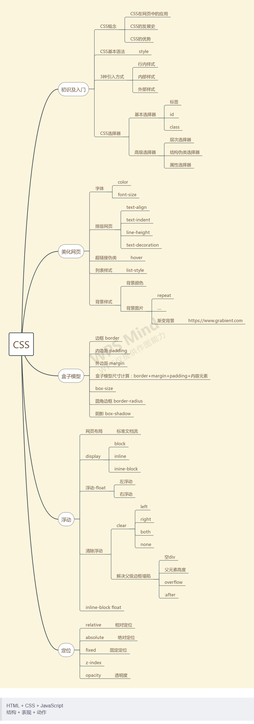
CSS简介
// 结构 + 表现 + 动作
HTML + CSS + JavaScript
如何学习
- CSS是什么
- CSS怎么用(快速入门)
- CSS选择器(重点+难点)
- 美化网页(文字,阴影,超链接,列表,渐变…)
- 盒子模型
- 浮动
- 定位
- 网页动画(特效效果)
什么是CSS
Cascading Style Sheet层叠样式表
CSS:表现(美化网页)
字体,颜色,边距,高度,宽度,背景图片,网页定位,网页浮动
发展史
CSS1.0
CSS2.0:DIV(块)+CSS,HTML与CSS结构分离的思想,网页变得简单,SEO
CSS2.1:浮动,定位
CSS3.0:圆角、阴影、动画…浏览器兼容性~
快速入门
<!DOCTYPE html>
<html lang="en">
<head>
    <meta charset="UTF-8">
    <title>Title</title>

    <!--
        规范,<style>可以编写CSS的代码,每一个声明最好以“;”结尾
        语法:
            选择器{
                    声明1;
                    声明2;
                    声明3;
                }
    -->
    <style>
        h1{
            color: crimson;
        }
    </style>

</head>

<body>
    <h1>CSS测试</h1>
</body>
</html>
建议使用这种规范
CSS的优势
- 内容和表现分离
- 网页结构表现统一,可以实现复用
- 样式十分的丰富
- 建议使用独立于html的css文件
- 利用SEO(搜索引擎优化),容易被搜索引擎收录
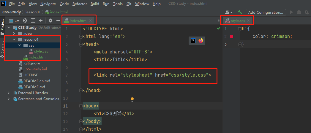
CSS的3种导入方式
行内样式
内部样式
外部样式
-
链接式:建议使用
-
导入式:@import是CSS2.1特有的
优先级:采用就近原则
<!DOCTYPE html>
<html lang="en">
<head>
    <meta charset="UTF-8">
    <title>Title</title>

    <!--
        优先级:就近原则
    -->

    <!--内部样式-->
    <style>
        h1{
            color: green;
        }
    </style>

    <!--外部样式-->

    <!--1.链接式-->
    <link rel="stylesheet" href="css/style.css" />

    <!--2.导入式-->
    <style>
        @import "css/style.css";
    </style>

</head>

<body>

    <!--行内样式:在标签元素中,编写一个style属性,编写样式即可-->
    <h1 style="color: red">这是标签</h1>

</body>
</html>
选择器
作用:选择页面上的某一个或者某一类元素
基本选择器
标签选择器
选择一类标签
格式:标签{}
<!DOCTYPE html>
<html lang="en">
<head>
    <meta charset="UTF-8">
    <title>Title</title>

    <style>
        h1{
            color: orange;
            background: blue;
            border-radius: 10px;
        }
    </style>

</head>

<body>
    <h1>标签选择器</h1>
</body>
</html>
类选择器
选择所有class一致的标签,跨标签
格式:.类名{}
<!DOCTYPE html>
<html lang="en">
<head>
    <meta charset="UTF-8">
    <title>Title</title>

    <style>

        /*
            类选择器的格式 .class的名称{}
            好处:可以多个标签归类,是同一个class,可以复用
        */
        .demo1{
            color: blue;
        }
        .demo2{
            color: red;
        }
        .demo3{
            color: aqua;
        }

    </style>

</head>
<body>
    <h1 class = "demo1">类选择器:demo1</h1>
    <h1 class="demo2">类选择器:demo2</h1>
    <h1 class="demo3">类选择器:demo3</h1>
</body>
</html>
id 选择器
全局唯一
格式:#id名{}
<!DOCTYPE html>
<html lang="en">
<head>
    <meta charset="UTF-8">
    <title>Title</title>

    <style>
        /*
            id选择器:id必须保证全局唯一
            #id名称{}
            不遵循就近原则,优先级是固定的
            id选择器 > 类选择器  >  标签选择器
        */
        #demo1{
            color: aqua;
        }
        .demo2{
            color: red;
        }
        #demo2{
            color: orange;
        }
        h1{
            color: blue;
        }
    </style>

</head>

<body>
    <h1 id="demo1">id选择器:demo1</h1>
    <h1 class="demo2" id = "demo2">id选择器:demo2</h1>
    <h1 class="demo2">id选择器:demo3</h1>
    <h1>id选择器:demo4</h1>
    <h1>id选择器:demo5</h1>
</body>
</html>
优先级
id 选择器> 类选择器> 标签选择器
层次选择器
后代选择器
选择所有的后代
/*后代选择器*/
<style>

    body p{
        background:red;
    }

</style>
子选择器
子代
选择后一代
/*子选择器*/
<style>

    body>p{
        background:orange;
    }

</style>
相邻的兄弟选择器
同辈
向下选择第一个兄弟(只有一个)
/*相邻兄弟选择器:只有一个,相邻(向下)*/
<style>

    .active+p{
        background: red
    }

</style>
通用兄弟选择器
向下选择所有的兄弟,不包括当前元素
/*通用兄弟选择器,当前选中元素的向下所有兄弟元素*/
<style>

    .active~p{
        background: blueviolet;
    }

</style>
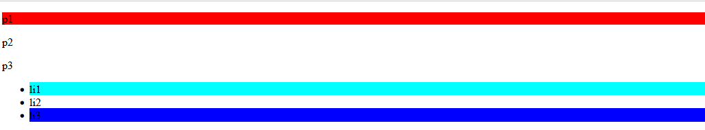
结构伪类选择器
伪类:用 : 号
<!DOCTYPE html>
<html lang="en">
<head>
    <meta charset="UTF-8">
    <title>Title</title>

    <style>

        /*ul的第一个子元素*/
        ul li:first-child{
            background: aqua;
        }

        /*ul的最后一个子元素*/
        ul li:last-child{
            background: blue;
        }

        /*
            根据顺序
            选中p1:定位到父元素,选择当前的第一个元素
        */
        p:nth-child(1){
            background: orange;
        }

        /*
            根据类型
            选中p1:选择当前p元素的父级元素,选中父级元素的第一个,并且是当前元素才生效!
            选择当前元素的父元素的第一个类型为p元素的元素
        */
        p:nth-of-type(1){
            background: red;
        }

    </style>

</head>

<body>

    <p>p1</p>
    <p>p2</p>
    <p>p3</p>
    <ul>
        <li>li1</li>
        <li>li2</li>
        <li>li3</li>
    </ul>

</body>
</html>
属性选择器(常用)
结合:id选择器 + class选择器
= 绝对等于

*= 包含这个元素

^= 以这个开头

$= 以这个结尾
<!DOCTYPE html>
<html lang="en">
<head>
    <meta charset="UTF-8">
    <title>Title</title>

    <style>
        .demo a{
            display: block;
            height: 50px;
            width: 50px;
            float:left;
            border-radius: 10px;
            background: blue;
            text-align: center;
            color: beige;
            text-decoration: none;
            margin-right: 5px;
            font: bold 20px/50px Arial;
        }

        /*
            格式:选择器[属性名=属性值(正则)]

            =表示绝对等于
            *=表示包含
            ^=表示以...开头
            $=表示以...结尾
        */

        /*a标签中有id属性的元素*/
         a[id]{
             background: red;
         }

        /*a标签中id=first的元素*/
         a[id=first]{
             background: aqua;
         }

        /*a标签中class属性包含links元素*/
        a[class*="links"]{
            background: black ;
        }

        /*a标签中href属性以http开头的元素*/
        a[href^="http"]{
            background: orange;
        }

        /*a标签中href属性以http开头的元素*/
        a[href$="http"]{
            background: orange;
        }

    </style>

</head>

<body>
    <p class="demo">
        <a href="http://www.baidu.com" class="links item first" id="first">1</a>
        <a href="/adad/faf" class="links item2 first2" >2</a>
        <a href="qwe123" class="links item3 first3" >3</a>
        <a href="eweqe" class="links item4 first4" >4</a>
        <a href="rrrrr" class="links item5 first5" >5</a>
        <a href="ttt" class="links item6 first6" >6</a>
        <a href="yyy" class="links item7 first7" >7</a>
    </p>
</body>
</html>
美化网页元素
为什么要美化网页
原因:
1、有效的传递页面信息
2、美化网页,页面漂亮才能吸引客户
3、凸显页面的主题
4、提高用户的体验
span标签:重点要突出的字,使用span标签套起来
<!DOCTYPE html>
<html lang="en">
<head>
    <meta charset="UTF-8">
    <title>Title</title>

    <style>
        #title1{
            font-size: 50px;
        }
    </style>

</head>

<body>

    学习语言<span id="title1">JAVA</span>
</body>
</html>
字体样式
font-style:风格
font-weight:字体的粗细
font-size:字体大小
font-family:字体
color:字体颜色
<!DOCTYPE html>
<html lang="en">
<head>
    <meta charset="UTF-8">
    <title>Title</title>

    <!--
        font-style:风格
        font-weight:字体的粗细
        font-size:字体大小
        font-family:字体
        color:字体颜色
    -->
    <style>

        /*font-style:风格*/
        .p1{
            /*italic:斜体*/
            font-style: italic;
        }

        /*font-weight:字体的粗细*/
        .p1{
            /*值:10、20、lighter、bolder...*/
            font-weight: lighter;
        }

        /*font-size:字体大小*/
        h1{
            /*单位:px、em*/
            font-size: 50px;
        }

        /*font-family:字体*/
        body{
            /*英文:Arial Black 中文:楷体*/
            font-style: italic;
            font-family:"Arial Black",楷体;
            color: #a13d30;
        }

        /*组合使用*/
        h1{
            /*风格、粗细、大小、字体*/
            font: oblique bolder 12px "楷体";
        }

    </style>
</head>

<body>
    <h1>故事介绍</h1>

    <p class="p1">
        按照表现的内容可分为神话、仙侠、武侠、科幻、悬疑、古传、当代、浪漫青春、游戏竞技等。
    </p>

    <p>
        按照体制可分为章回体小说、日记体小说、书信体小说、自传体小说。按照语言形式可分为文言小说和白话小说。
    </p>

    <p>
        Hooray! It's snowing! It's time to make a snowman.James runs out.
    </p>
</body>
</html>
文本样式
color:颜色
text-align:文本位置
text-indent:首行缩进
line-height:行高
text-decoration: 下、中、上划线
vertical-align:middle:垂直居中
简单样式
<head>
    <meta charset="UTF-8">
    <title>Title</title>

    <style>

        /*
            color:颜色
            text-align:文本位置
            text-indent:首行缩进
            line-height:行高
            text-decoration: 下、中、上划线
        */

        h1{
            /*
              color:颜色
                单词:red
                RGB:0→F
                RGBA:A表示透明度 0→1
            */
            color: rgba(255,0,0,0.9);

            /*
              text-align:文本位置
                center:居中
                right:偏右
                left:偏左
            */
            text-align: center;
        }

        .p1{
            /*
              text-indent:首行缩进
                2em:2个字符
                2px:2个像素
            */
            text-indent: 2em;
        }

        .p2{
            background: rgb(0,255,255);
            height: 200px;
            /*line-height:行高,指的是一行的高度,如果和块的高度一致,就可以上下居中*/
            line-height: 200px;
        }

        .p3{
            /*
              text-decoration:下中上划线
                underline:下划线
                line-through:中划线
                overline:上划线
                none:没有样式
            */
            text-decoration:line-through;
        }

    </style>

</head>

<body>

    <h1>故事介绍</h1>
    <p class="p1">
        按照表现的内容可分为神话
    </p>
    <p class="p2">
        按照体制可分为章回体小说
    </p>
    <p class="p3">
        按照体制可分为章回体小说
    </p>

</body>
高级样式
文字、图片水平居中
<head>
    <meta charset="UTF-8">
    <title>Title</title>

    <style>
        /*
            垂直居中 参照物 a b
        */
        img,span{
            vertical-align:middle;
        }

    </style>

</head>

<body>

    <p>
        <img src="images/a.jpg" alt="">
        <span>性格重情重义、有仇必报、机智过人</span>
    </p>

</body>
阴影
/* text-shadow: 阴影颜色,水平偏移,垂直偏移,阴影半径*/
#price{
    text-shadow: #323832 20px 10px 2px;
}
超链接伪类
a:link {color: #FF0000} 未访问的链接

a:visited {color: #00FF00} 已访问的链接,点击之后的状态

a:hover {color: #FF00FF} 鼠标移动到链接上,鼠标悬浮的状态

a:active {color: #0000FF} 选定的链接,鼠标按住未释放的状态
<head>
<meta charset="UTF-8">
<title>Title</title>
<style>
/* 默认颜色 */
a{
text-decoration: none;
color: #000000;
}
/* 鼠标悬浮的颜色 (只需要记住这个)*/
a:hover{
color: burlywood;
font-size: 30px;
}
/* 鼠标按主未释放的状态 */
a:active{
color: #008800;
}
/* 未访问的链接 */
a:link{
color: maroon;
}
/* 已访问的链接 */
a:visited{
color: darkmagenta;
}
/* text-shadow: 阴影颜色,水平偏移,垂直偏移,阴影半径*/
#price{
text-shadow: #323832 20px 10px 2px;
}
</style>
</head>
<body>
<a href="#">
<img src="images/b.jpg" alt="">
</a>
<p>
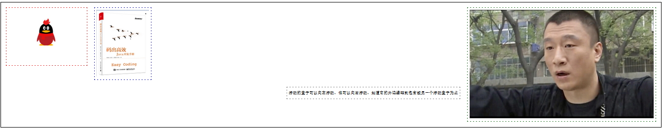
<a href="#">码出高校:Java开发手册</a>
</p>
<p>
<a href="">作者:孤尽老师</a>
</p>
<p id="price">
¥99
</p>
</body>
列表
无序列表 ul li
list-style:
  none:去掉圆点
  circle:空心圆
  decimal:数字
  square:正方形
<head>
<meta charset="UTF-8">
<title>列表样式</title>
<link rel="stylesheet" href="css/style.css" type="text/css">
</head>
<body>
<div id="nav">
<h2 class="title">全部商品分类</h2>
<ul>
<li><a href="#">图书</a> <a href="#">音响</a> <a href="#">数字商品</a></li>
<li><a href="#">家用电器</a> <a href="#">手机</a> <a href="#">数码</a></li>
<li><a href="#">电脑</a> <a href="#">办公</a></li>
<li><a href="#">家居</a> <a href="#">家装</a> <a href="#">厨具</a></li>
<li><a href="#">服饰鞋帽</a> <a href="#">个护化妆</a></li>
<li><a href="#">礼品箱包</a> <a href="#">中标</a> <a href="#">珠宝</a></li>
<li><a href="#">食品饮料</a> <a href="#">保健食品</a></li>
<li><a href="#">彩票</a> <a href="#">旅行</a> <a href="#">充值</a> <a href="#">票务</a></li>
</ul>
</div>
</body>
style.css文件
#nav{
    width: 300px;
    background: darkgrey;
}

.title{
    font-size: 18px;
    font-weight: bold;
    text-indent: 1em;
    line-height: 35px;
    background: red;
}

ul{
    background: darkgrey;
}

/*
list-style:
  none:去掉圆点
  circle:空心圆
  decimal:数字
  square:正方形
*/
ul li{
    height: 30px;
    list-style: circle;
    text-indent: 1em;
}

a{
    text-decoration: none;
    font-size: 14px;
    color: black;
}
a:hover{
    color: orange;
    text-decoration: underline;
}
背景
背景颜色
background: red;
<head>
    <meta charset="UTF-8">
    <title>Title</title>

    <style>

        div{
            width: 1000px;
            height: 700px;
            border: 1px solid red;
        }

        /*
        	background 背景颜色
        */
        .div1{
            background: red;
        }

    </style>

</head>

<body>
    <div class="div1"></div>
</body>
背景图片
background-image:背景图片
  url("images/a.jpg"):图片路径

background-repeat:平铺方式
  repeat-x:水平平铺
  repeat-y:垂直平铺
  no-repeat:不平铺

background-position:图片位置
  270px:沿x轴偏移270个像素
  2px:沿y轴偏移2个像素
<head>
    <meta charset="UTF-8">
    <title>Title</title>

    <style>

        /*
            background-image:背景图片,默认是全部平铺的
              url("images/a.jpg"):图片路径
            background-repeat:平铺方式
              repeat-x:水平平铺
              repeat-y:垂直平铺
              no-repeat:不平铺
        */

        div{
            width: 1000px;
            height: 700px;
            border: 1px solid red;
            background-image: url("images/a.jpg"); /*默认是全部平铺的 repeat*/

        }

        .div1{
            /*水平平铺*/
            background-repeat: repeat-x;
        }

        .div2{
            /*垂直平铺*/
            background-repeat: repeat-y;
        }

        .div3{
            /*不平铺*/
            background-repeat: no-repeat;
        }

    </style>
</head>

<body>

    <div class="div1"></div>
    <div class="div2"></div>
    <div class="div3"></div>

</body>
综合使用
/*
	red:颜色
	url:图片路径
	270px:沿x轴偏移270个像素
	10px:沿y轴偏移10个像素
	no-repeat:不平铺
*/
background:red url("图片相对路径") 270px 10px no-repeat;
渐变
径向渐变、圆形渐变
/*分开使用*/
background-color: #00DBDE;
background-image: linear-gradient(281deg, #00DBDE 0%, #FC00FF 100%);

/*综合使用*/
background:  #00DBDE linear-gradient(281deg, #00DBDE 0%, #FC00FF 100%);
盒子模型
介绍
简介
margin:外边距
padding:内边距
border:边框
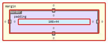
计算方式
margin+border+padding+内容的大小
边框
border:边框
    粗细:10px
    样式:solid、dashed...
    颜色:#00FF00
border: 10px solid red;
<head>
    <meta charset="UTF-8">
    <title>Title</title>
    <style>

        /*
          body总有一个默认的外边距margin
          常见操作就是对一些标签进行初始化
            内外边距
            下划线
            ...
        */
        body{
            margin: 0;
            padding: 0;
            text-decoration: none;
        }

        body{
            width: 1000px;
            height: 500px;
            /*
              border:边框
                粗细:10px
                样式:solid、dashed...
                颜色:#00FF00
            */
            border: 10px solid red;
        }

    </style>
</head>

<body>
</body>
外边距
margin
外边距的妙用就是居中
/*
  外边距的妙用:居中
  上下外边距为0px
  左右auto自动居中
*/
margin: 0 auto;
实现居中的前提
- 该元素的父元素必须是块元素
- 如果父元素是块元素的前提下还是实现不了居中(如img标签),那么父元素要进行 text-align: center; 设置
一般元素
<head>
    <meta charset="UTF-8">
    <title>Title</title>
    <style>
        div{
            width: 500px;
            height: 500px;
            border: 10px solid red;
        }

        #div1{
            width: 250px;
            height: 250px;
            border: 10px solid red;
            /*一般元素实现了居中*/
            margin: 0px auto;
        }
    </style>
</head>

<body>
    <div>
        <div id="div1"></div>
    </div>
</body>
实现不了居中的元素,如img标签
<head>
    <meta charset="UTF-8">
    <title>Title</title>
    <style>
        div{
            width: 500px;
            height: 500px;
            border: 10px solid red;
            /*
              图像元素不能居中,必须实现这个
              该方式能够实现任何标签的居中
            */
            text-align: center;
        }

        img{
            margin: 0 auto;
        }
    </style>
</head>

<body>
    <div>
        <img src="images/b.jpg"/>
    </div>
</body>
使用方式
综合使用:
    margin: 0 0 0 0; 按照上右下左(从上开始,顺时针旋转)
    margin: 0 1px; 上下外边距为0,左右外边距为1个像素
    margin: 0 auto; 上下外边距为0,左右外边距自动居中
    margin: 0; 四个外边距都是0

分开使用:
    margin-top: 0; 上外边距
    margin-right: 0; 右外边距
    margin-bottom: 0; 下外边距
    margin-left: 0; 左外边距
<head>
    <meta charset="UTF-8">
    <title>Title</title>
    <style>
        body{
            margin: 0;
            padding: 0;
            text-decoration: none;
            width: 1000px;
            height: 500px;
            border: 10px solid red;
        }
        body{
            /*
              外边距的妙用:居中
              上下外边距为0px
              左右auto自动居中
            */
            margin: 0 auto;
        }

        /*
        综合使用:
          margin: 0 0 0 0; 按照上右下左(从上开始,顺时针旋转)
          margin: 0 1px; 上下边距为0,左右为1个像素
          margin: 0 auto; 上下边距为0,左右自动居中
          margin: 0; 四个边距都是0

        分开使用:
          margin-top: 0; 上外边距
          margin-right: 0; 右外边距
          margin-bottom: 0; 下外边距
          margin-left: 0; 左外边距
        */
        div{
            width: 200px;
            height: 200px;
            border: 10px solid green;
            /*综合使用margin*/
            margin: 0 0 0 0;

        }

    </style>

</head>

<body>
    <div></div>
</body>
内边距
padding
使用方式和外边距一样
综合使用:
    padding: 0 0 0 0; 按照上右下左(从上开始,顺时针旋转)
    padding: 0 1px; 上下内边距为0,左右内边距为1个像素
    padding: 0 auto; 上下内边距为0,左右内边距自动居中
    padding: 0; 四个内边距都是0

分开使用:
    padding-top: 0; 上内边距
    padding-right: 0; 右内边距
    padding-bottom: 0; 下内边距
    padding-left: 0; 左内边距
圆角边框
border-radius:圆角边框
圆圈(在长度和宽度相等时): 圆角 = 宽度

border-radius: 100px 100px 100px 100px; 左上角 右上角 右下角 左下角(顺时针方向)
border-radius: 100px 50px; 左上角、右下角为100像素,右上角、左下角为50像素
border-radius: 100px; 四个角都为100像素
<head>
    <meta charset="UTF-8">
    <title>Title</title>
    <!--
        圆圈(在长度和宽度相等时): 圆角 = 宽度

        border-radius: 100px 100px 100px 100px; 左上角 右上角 右下角 左下角(顺时针方向)
        border-radius: 100px 50px; 左上角、右下角为100像素,右上角、左下角为50像素
        border-radius: 100px; 四个角都为100像素
    -->
    <style>
        div{
            width: 100px;
            height: 100px;
            border: 10px solid red;
            /*综合使用:图像是个圆圈*/
            border-radius: 100px;
        }
    </style>
</head>

<body>
    <div></div>
</body>
盒子阴影
box-shadow最多有6个参数组成
box-shadow: offset-x offset-y blur spread color position;
- offset-x:水平方向的偏移量
- offset-y:竖直方向的偏移量
- blur:阴影的模糊半径
- spread:阴影扩展半径
- color:阴影的颜色
- position:可选值,如果不设值,其默认的投影方式是外阴影
- inset:内阴影
/*inset 内阴影*/
box-shadow: 0px 20px 10px 0px rgba(0,0,0,0.5) inset
<!DOCTYPE html>
<html lang="en">
<head>
    <meta charset="UTF-8">
    <title>Title</title>
    <style>
        img{
            border-radius: 50px;
            box-shadow: 10px 10px 100px yellow;
        }
    </style>
</head>

<body>
    <div>
        <div style="width: 500px;display: block;text-align: center ">
            <div>
                <img src="images/tx.jpg" alt="">
            </div>
        </div>
    </div>
</body>
</html>
浮动
标准文档流
块级元素block:独占一行 h1~h6 、p、div、 列表…
行内元素inline:不独占一行 span、a、img、strong
注: 行内元素可以包含在块级元素中,反之则不可以。
display(重要)
- block:块元素
- inline:行内元素
- inline-block:是块元素,但是可以内联,在一行
- none:使元素消失
<head>
    <meta charset="UTF-8">
    <title>Title</title>

    <!--
        block 块元素
        inline 行内元素
        inline-block 是块元素,但是可以内联 ,在一行
    -->
    <style>
        div{
            width: 100px;
            height: 100px;
            border: 1px solid red;
            display: inline-block;
        }
        span{
            width: 100px;
            height: 100px;
            border: 1px solid red;
            display: inline-block;
        }
    </style>
</head>

<body>
    <div>div块元素</div>
    <span>span行内元素</span>
</body>
这也是一种实现行内元素排列的方式,但是我们很多情况用float
QQ会员页面导航练习
<!DOCTYPE html>
<html lang="en">
<head>
    <meta charset="UTF-8">
    <title>QQ会员</title>
    <link rel="stylesheet" href="css/style.css" />
</head>
<body>
<div class="wrap">
    <!--头部-->
    <header class="nav-header">
        <div class="head-contain">
            <a href="" class="top-logo"><img src="img/logo.png" width="145" height="90" /></a>
            <nav class="top-nav">
                <ul>
                    <li><a href="">功能特权</a> </li>
                    <li><a href="">游戏特权</a> </li>
                    <li><a href="">生活特权</a> </li>
                    <li><a href="">会员特权</a> </li>
                    <li><a href="">成长体系</a> </li>
                    <li><a href="">年费专区</a> </li>
                    <li><a href="">超级会员</a> </li>
                </ul>
            </nav>
            <div class="top-right">
                <a href="">登录</a>
                <a href="">开通超级会员</a>
            </div>
        </div>
    </header>
</div>
</body>
</html>
style.css
*{
    padding:0;
    margin: 0;
}
a{
    text-decoration: none;
}
.nav-header{
    height: 90px;
    width: 100%;
    background: rgba(0,0,0,.6);
}
.head-contain{
    width: 1180px;
    height: 90px;
    margin: 0 auto;
    text-align: center;
}
.top-logo,.top-nav,.top-nav li,.top-right{
    height: 90px;
    display: inline-block;
    vertical-align: top;
}
.top-nav{
    margin: 0 48px;
}
.top-nav li{
    line-height: 90px;
    width: 90px;
}
.top-nav li a{
    display: block;
    text-align: center;
    font-size: 16px;
    color: #fff;
}
.top-nav li a:hover{
    color: blue;
}

.top-right a{
    display: inline-block;
    font-size: 16px;
    text-align: center;
    margin-top: 25px;
    border-radius: 35px;
}
.top-right a:first-of-type{
    width: 93px;
    height: 38px;
    line-height: 38px;
    color: #fad65c;
    border: 1px #fad65c solid;
}
.top-right a:first-of-type:hover{
    color: #986b0d;
    background: #fad65c;
}
.top-right a:last-of-type{
    width: 140px;
    height: 40px;
    font-weight: 700;
    line-height: 40px;
    background: #fad65c;
    color: #986b0d;
}
.top-right a:last-of-type:hover{
    background: #fddc6c;
}
float
left/right 左右浮动
clear:both 清除左右浮动
<!DOCTYPE html>
<html lang="en">
<head>
    <meta charset="UTF-8">
    <title>Title</title>
    <link rel="stylesheet" href="css/style.css" type="text/css">
</head>
<body>
<div id="father">
    <div class="layer01"><img src="images/1.jpg" alt=""></div>
    <div class="layer02"><img src="images/2.jpg" alt=""></div>
    <div class="layer03"><img src="images/3.jpg" alt=""></div>
    <div class="layer04">
        浮动的盒子可以向左浮动,也可以向右浮动,直到它的外边缘碰到包含或另一个浮动盒子为止
    </div>
</div>
</body>
</html>
style.css
div{
    margin: 10px;
    padding: 5px;
}
#father{
    border: 1px #000 solid;
}
.layer01{
    border: 1px #F00 dashed;
    display: inline-block;
    float: left;/*向左浮动*/
    clear: both;/*清除浮动*/
}
.layer02{
    border: 1px #00F dashed;
    display: inline-block;
    float: left;
    clear: both;/*清除浮动*/
}
.layer03{
    border: 1px #060 dashed;
    display: inline-block;
    float: left;
    clear: both;/*清除浮动*/
}
.layer04{
    border: 1px #666 dashed;
    font-size: 12px;
    line-height: 23px;
    float: left;
    clear: both;/*清除浮动*/
}
overflow及父级边框塌陷问题
clear
clear:清除浮动
right:右侧不允许有浮动元素,如果有浮动元素,该元素会跑到下面
left:左侧不允许有浮动元素,如果有浮动元素,该元素会跑到下面
both:两侧不允许有浮动元素,如果有浮动元素,该元素会跑到下面
none:不清楚,可以有浮动
解决父级边框塌陷问题
方案一:增加父级元素的高度
不建议使用
#father{
    border: 1px #000 solid;
    height: 800px;
}
方案二:增加div标签,清除浮动
增加一个空的div标签,清除浮动
<!DOCTYPE html>
<html lang="en">
<head>
    <meta charset="UTF-8">
    <title>Title</title>
    <link rel="stylesheet" href="css/style.css" type="text/css">
</head>
<body>
<div id="father">
    <div class="layer01"><img src="images/1.png" alt=""></div>
    <div class="layer02"><img src="images/2.png" alt=""></div>
    <div class="layer03"><img src="images/3.png" alt=""></div>
    <div class="layer04">
        浮动的盒子可以向左浮动,也可以向右浮动,知道它的外边缘碰到包含或另一个浮动盒子为止
    </div>
    <!--增加一个空div,清除浮动,内外边距设置为0-->
    <div class="clear"></div>
</div>
</body>
</html>
style.css
div{
    margin: 10px;
    padding: 5px;
}
#father{
    border: 1px #000 solid;
    height: 800px;
}
.layer01{
    border: 1px #F00 dashed;
    display: inline-block;
    float: left;/*向左浮动*/
}
.layer02{
    border: 1px #00F dashed;
    display: inline-block;
    float: left;
}
.layer03{
    border: 1px #060 dashed;
    display: inline-block;
    float: right;
}
/*
clear:right;右侧不允许有浮动元素
clear:left; 左侧不允许有浮动元素
clear:both; 两侧不允许有浮动元素
clear:none;
 */
.layer04{
    border: 1px #666 dashed;
    font-size: 12px;
    line-height: 23px;
    display: inline-block;
    float: right;
    clear: left;
}
.clear{
    clear: both;
    margin: 0;
    padding: 0;
}
使用overflow
overflow:超过指定尺寸元素溢出怎么办
overflow:hidden /*隐藏*/
overflow:scoll /*滚动*/
<!DOCTYPE html>
<html lang="en">
<head>
    <meta charset="UTF-8">
    <title>Title</title>

    <style>
        #content{
            width: 200px;
            height: 150px;
            overflow: scroll;
        }
    </style>
</head>
<body>

<div id="content">
    <img src="images/1.png" alt="">
    <p>
        某雌性生物醉倒在草地上,路人对其上下其手,并在草地上翻滚,一番折腾后某雌性生物迷迷糊糊醒来步履蹒跚地离开了
    </p>
</div>
</body>
</html>
父级元素增加overflow:hidden
#father{
    border: 1px #000 solid;
    overflow: hidden;

}
父元素添加一个伪类:after
最好用的方式
/*
  在father元素后加一个伪类,和方案二类似,而且避免增加空的div,更加简单
	加了伪类后,设置为块元素,清除浮动
	这样的话,如果伪类两边存在浮动元素,伪类(伪元素)就会跑到浮动元素的下方,并且在父元素内
*/
#father:after{
	content:'';
	display:block;
	clear:both;
}
小结
浮动元素增加空div----》简单、代码尽量避免空div
设置父元素的高度-----》简单,元素假设没有了固定的高度,就会超出
overflow----》简单,下拉的一些场景避免使用
父类添加一个伪类:after(推荐)----》写法稍微复杂,但是没有副作用,推荐使用
display与float对比
display:方向不可以控制
float:浮动起来的话会脱离标准文档流,所以要解决父级边框塌陷的问题。
定位
相对定位
相对定位:positon:relstive;
相对于原来的位置,进行指定的偏移,相对定位的话,它仍然在标准文档流中(父级不会塌陷),原来的位置会被保留
positon:relstive;/*相对定位*/
top: 20px;/*距离原来的位置上边20px*/
left: 20px;/*距离原来的位置左边20px*/
bottom: -20px;/*距离原来的位置下边20px*/
right: 20px;/*距离原来的位置右边20px*/
<!DOCTYPE html>
<html lang="en">
<head>
    <meta charset="UTF-8">
    <title>Title</title>
    <!-- 相对定位
    相对于自己原来的位置进行偏移~
    -->
    <style>
        body{
            padding: 20px;
        }
        div{
            margin: 10px;
            padding: 5px;
            font-size: 12px;
            line-height: 25px;
        }
        #father{
            border: 1px solid #666;
        }
        #first{
            background-color: #3cbda6;
            border: 1px solid #b27530;
            position: relative;/*相对定位 上下左右*/
            top: -20px;/*向上偏移20px*/
            left: 20px;/*向右偏移20*/
        }
        #second{
            background-color: #0000FF;
            border: 1px solid #255066;
        }
        #third{
            background-color: #008800;
            border: 1px solid #1c6615;
            position: relative;/*相对定位 上下左右*/
            bottom: -20px;/*向下偏移20px*/
            right: 20px;/*向左偏移20px*/
        }
    </style>
</head>
<body>
<div id="father">
    <div id="first">第一个盒子</div>
    <div id="second">第二个盒子</div>
    <div id="third">第三个盒子</div>
</div>
</body>
</html>
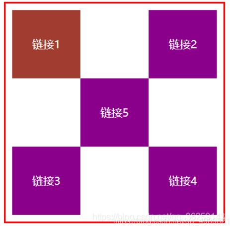
练习题:连接卡
- 使用div和a标签布局页面
- 每个超链接宽度和高度都是100px,背景颜色粉色,鼠标指针移上去变为蓝色
- 使用相对定位改变每个超链接的位置
<!DOCTYPE html>
<html lang="en">
<head>
    <meta charset="UTF-8">
    <title>Title</title>
    <style>
        #box{
            width: 300px;
            height: 300px;
            padding: 10px;
            border: 2px solid red;
        }
        a{
            width: 100px;
            height: 100px;
            text-decoration: none;
            background-color: darkmagenta;
            line-height: 100px;
            text-align: center;
            color: white;
            display: block;
        }
        a:hover{
            background: #a13d30;
        }
        .a2,.a4{
            position: relative;
            left: 200px;
            top: -100px;
        }
        .a5{
            position: relative;
            left: 100px;
            top: -300px;
        }
    </style>
</head>
<body>

<div id="box">
    <a class="a1" href="#">链接1</a>
    <a class="a2" href="#">链接2</a>
    <a class="a3" href="#">链接3</a>
    <a class="a4" href="#">链接4</a>
    <a class="a5" href="#">链接5</a>
</div>
</body>
</html>
绝对定位
position: absolute;
定位:基于xxx定位,上下左右
- 没有父级元素定位的前提下,相对于浏览器定位
- 假设父级元素存在定位,相对于父级元素进行偏移
- 在父级元素范围内移动
总结:相对一父级或浏览器的位置,进行指定的偏移,绝对定位的话,它不在标准文档流中(父级元素会塌陷),原来的位置不会被保留
<!DOCTYPE html>
<html lang="en">
<head>
    <meta charset="UTF-8">
    <title>Title</title>
    <style>
        div{
            margin: 10px;
            padding: 5px;
            font-size: 12px;
            line-height: 25px;
        }
        #father{
            border: 1px solid #666;
            padding: 0;
            position: relative;
        }
        #first{
            background-color: #a13d30;
            border: 1px dashed #b27530;

        }
        #second{
            background-color: green;
            border: 1px dashed #0ece4f;
            position: absolute;
            right:30px;
            top:30px
        }
        #third{
            background-color: red;
            border: 1px dashed #ff1b87;
        }
    </style>
</head>
<body>
<div id = "father">
    <div id="first">第一个盒子</div>
    <div id="second">第二个盒子</div>
    <div id="third">第三个盒子</div>
</div>
</body>
</html>
固定定位-fixed
position: fixed;
相对于浏览器定位
<!DOCTYPE html>
<html lang="en">
<head>
    <meta charset="UTF-8">
    <title>Title</title>
    <style>
        body{
            height: 1000px;
        }
         div:nth-of-type(1){/*绝对定位:没有相对的父级元素,所以相对于浏览器*/
             width: 100px;
             height: 100px;
             background:red;
             position: absolute;
             right: 0;
             bottom: 0;
         }
        div:nth-of-type(2){
            width: 50px;
            height: 50px;
            background: yellow;
            position: fixed;
            right: 0;
            bottom: 0;
        }
    </style>
</head>
<body>

<div>div1</div>
<div>div2</div>
</body>
</html>
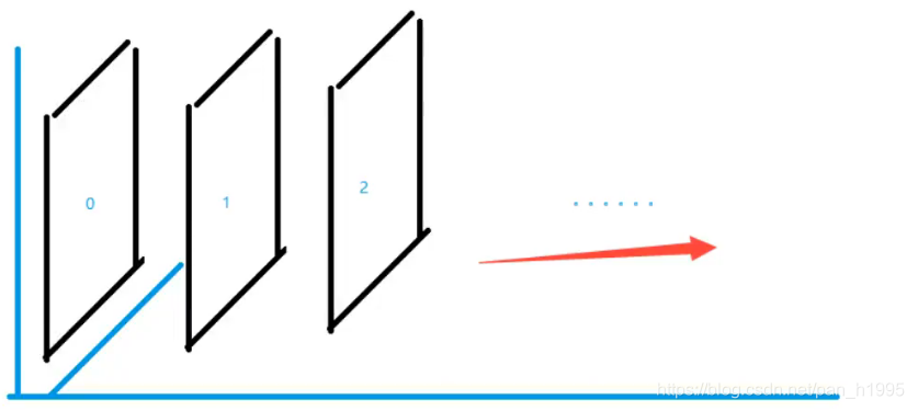
z-index
图层~
z-index:默认是0,最高无限~999
<!DOCTYPE html>
<html lang="en">
<head>
    <meta charset="UTF-8">
    <title>Title</title>
    <link rel="stylesheet" href="css/style.css">

</head>
<body>
<div id="content">
    <ul>
        <li><img src="images/bg.jpg" alt=""></li>
        <li class="tipText">学习微服务,找狂神</li>
        <li class="tipBg"></li>
        <li>时间:2099-01=01</li>
        <li>地点:月球一号基地</li>
    </ul>
</div>
</body>
</html>
style.css
#content{
    width: 380;
    padding: 0px;
    margin: 0px;
    overflow: hidden;
    font-size: 12px;
    line-height: 25px;
    border: 1px solid yellow;
}
ul,li{
    padding: 0px;
    margin: 0px;
    list-style: none;
}
/*父级元素相对定位*/
#content ul{
    position: relative;
}
.tipText,.tipBg{
    position: absolute;
    width: 380px;
    height: 25px;
    top:216px
}
.tipText{
    color: white;
    z-index: 999;
}
.tipBg{
    background: orange;
    opacity: 0.5;/*背景透明度*/
    filter: alpha(opacity=50);
}
动画及视野拓展
自行了解
总结