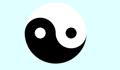
搭建一个太极的盒子
<body>
    <div></div>
</body>
样式(使用 linear-gradient线性渐变;radial-gradient径向渐变)
<style>
    body {
        background-color: lightcyan;
    }

    div {
        width: 200px;
        height: 200px;
        background: linear-gradient(#fff 50%, #000 50%);
        margin: 10px auto;
        display: flex;
        align-items: center;
        border-radius: 50%;
        transition: all 2s;
    }
    div:hover{
        transform: rotate(360deg);
    }
    div::before{
        content: '';
        display: block;
        width: 100px;
        height: 100px;
        background: radial-gradient(white 25%,black 25%);
        border-radius: 50%;
    }
    div::after{
        content: '';
        display: block;
        width: 100px;
        height: 100px;
        background: radial-gradient(black 25%,white 25%);
        border-radius: 50%;
    }
</style>
实现效果: