前言
在PC端中,子容器高度超出父容器高度,通常使用 overflow:auto 可出现滚动条拖动显示溢出的内容
而移动web开发中,由于浏览器厂商的系统不同、版本不同,会有部分机型不支持弹性滚动
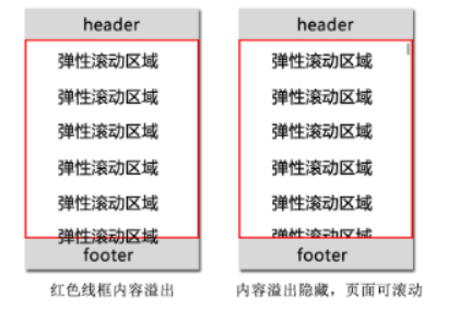
上图如果在PC端中,我们可以利用 position:fixed 和 overflow:auto 进行简单的布局实现我们需要的效果,而在手机端遇到的问题如下
ios4 和 android2.2 以下不支持 position:fixed
ios 和 android2.3 以下不支持 overflow:auto
ios4 和 android 不支持 overflow-scrolling
最严重的结果是:滚动区域内容无法拖动
对于 ios4 和 android2.2 以下不支持 position:fixed 的问题,有2种布局方法可以替代。
方案一:定义页面整体高度(body,html)为100%,然后使用 position:absolute 布局
<!DOCTYPE html>
<html>
<head>
  <meta charset="utf-8"/>
  <title>内容弹性滚动</title>
  <meta content="width=device-width, initial-scale=1.0, maximum-scale=1.0, user-scalable=0" name="viewport"/>
  <meta name="keywords" content="关键字"/>
  <meta name="description" content="描述"/>
  <style type="text/css">
    body, html {
      margin: 0;
      height: 100%;  //整体高度100%
    }

    .header, .footer {
      background-color: greenyellow;
      text-align: center;
      line-height: 40px;
      height: 40px;
      position: absolute; //采用position: absolute布局方式
      width: 100%;
    }

    .header {
      top: 0;
    }

    .footer {
      bottom: 0;
    }

    .main {
      position: absolute;
      z-index: 1;
      top: 40px;
      bottom: 40px;
      width: 100%;
      overflow: auto;
    }
  </style>
</head>
<body>
<div class="wrap">
  <div class="header">页面头部(固定在顶部)</div>
  <div class="main">
    <p>高度自动适应</p>
    <p>高度自动适应</p>
    <p>高度自动适应</p>
    <p>高度自动适应</p>
    <p>高度自动适应</p>
    <p>高度自动适应</p>
    <p>高度自动适应</p>
    <p>高度自动适应</p>
    <p>高度自动适应</p>
    <p>高度自动适应</p>
    <p>高度自动适应</p>
    <p>高度自动适应</p>
    <p>高度自动适应</p>
    <p>高度自动适应</p>
    <p>高度自动适应</p>
    <p>高度自动适应</p>
    <p>高度自动适应</p>
    <p>高度自动适应</p>
    <p>高度自动适应</p>
    <p>高度自动适应</p>
    <p>高度自动适应</p>
    <p>高度自动适应</p>
    <p>高度自动适应</p>
    <p>高度自动适应</p>
    <p>高度自动适应</p>
    <p>高度自动适应</p>
    <p>高度自动适应</p>
    <p>高度自动适应</p>
    <p>高度自动适应</p>
    <p>高度自动适应</p>
    <p>高度自动适应</p>
    <p>高度自动适应</p>
    <p>高度自动适应</p>
    <p>高度自动适应</p>
    <p>高度自动适应</p>
    <p>高度自动适应</p>
    <p>高度自动适应</p>
    <p>高度自动适应</p>
    <p>高度自动适应</p>
    <p>高度自动适应</p>
    <p>高度自动适应</p>
    <p>高度自动适应</p>
    <p>高度自动适应</p>
  </div>
  <div class="footer">页面底部(固定在底部)</div>
</div>
</body>
</html>
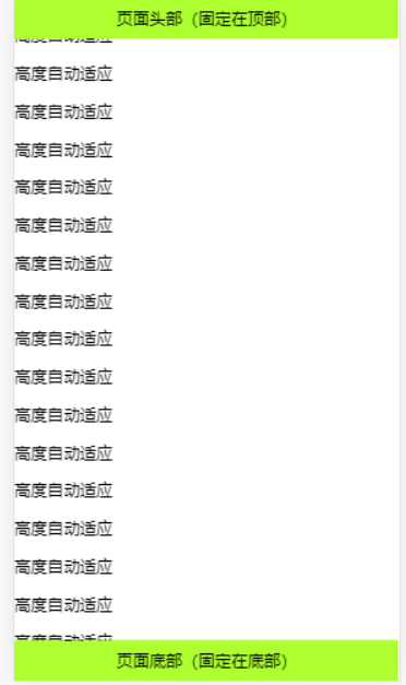
方案二:定义页面整体高度(body,html)为100%,然后使用 display:flex 布局
<!DOCTYPE html>
<html>
<head>
  <meta charset="utf-8"/>
  <title>内容弹性滚动</title>
  <meta content="width=device-width, initial-scale=1.0, maximum-scale=1.0, user-scalable=0" name="viewport"/>
  <meta name="keywords" content="关键字"/>
  <meta name="description" content="描述"/>
  <style type="text/css">
    body, html {
      margin: 0;
      height: 100%; //页面高度设置100%显示
    }

    .wrap {
      display: flex;
      flex-direction: column;  //flex布局
      width: 100%;
      height: 100%;
    }

    .header, .footer {
      background-color: greenyellow;
      text-align: center;
      line-height: 40px;
      height: 40px;
      width: 100%;
    }

    .main {
      flex: 1;
      width: 100%;
      overflow: auto;
    }
  </style>
</head>
<body>
<div class="wrap">
  <div class="header">页面头部(固定在顶部)</div>
  <div class="main">
    <p>高度自动适应</p>
    <p>高度自动适应</p>
    <p>高度自动适应</p>
    <p>高度自动适应</p>
    <p>高度自动适应</p>
    <p>高度自动适应</p>
    <p>高度自动适应</p>
    <p>高度自动适应</p>
    <p>高度自动适应</p>
    <p>高度自动适应</p>
    <p>高度自动适应</p>
    <p>高度自动适应</p>
    <p>高度自动适应</p>
    <p>高度自动适应</p>
    <p>高度自动适应</p>
    <p>高度自动适应</p>
    <p>高度自动适应</p>
    <p>高度自动适应</p>
    <p>高度自动适应</p>
    <p>高度自动适应</p>
    <p>高度自动适应</p>
    <p>高度自动适应</p>
    <p>高度自动适应</p>
    <p>高度自动适应</p>
    <p>高度自动适应</p>
    <p>高度自动适应</p>
    <p>高度自动适应</p>
    <p>高度自动适应</p>
    <p>高度自动适应</p>
    <p>高度自动适应</p>
    <p>高度自动适应</p>
    <p>高度自动适应</p>
    <p>高度自动适应</p>
    <p>高度自动适应</p>
    <p>高度自动适应</p>
    <p>高度自动适应</p>
    <p>高度自动适应</p>
    <p>高度自动适应</p>
    <p>高度自动适应</p>
    <p>高度自动适应</p>
    <p>高度自动适应</p>
    <p>高度自动适应</p>
    <p>高度自动适应</p>
  </div>
  <div class="footer">页面底部(固定在底部)</div>
</div>
</body>
</html>