【七】CSS之弹性布局
【1】什么是弹性布局
- 随着技术的发展,那么在当前市场上,安装浏览器的客户端越来越多,设备也越来越多,所以CSS提供的布局,不仅应用于PC端,还可以应用于移动端设备
- 例如:watch、ipad,mobile等,甚至包括机器人界面、智能屏、智能电视机、3D广告屏幕等等。
- 也因此前端开发越来越需要一套代码就可以应用任何一种不同的屏幕下的样式。
- 弹性布局,也叫Flex布局(Flexible Box)
- 这种布局方式是把HTML网页中每一个元素都看成1个能够进行自由伸缩的盒模型(Flex盒模型,弹性盒模型)。
- 任何一个html元素都可以指定为Flex盒模型。
.box{
   display: flex;  /* flex盒模型有2种,块级元素可以设置为flex盒模型,行内元素也可以通过 display: inline-flex; 设置为行级flex盒模型 */
}
注意,当元素设为 Flex 布局元素以后,当前flex盒模型元素的子元素的
float、clear和vertical-align属性将失效,因为flex布局本身也提供了替代的属性。
【2】基本概念
- 采用 Flex 布局的元素,称为 Flex 容器(flex container),简称"容器"。
- 它的所有子元素自动成为容器成员,称为 Flex 项目(flex item),简称"项目"。

- 容器默认存在两根轴:
- 水平的主轴(main axis,也叫横轴或X轴)和垂直的交叉轴(cross axis,也叫纵轴或Y轴)。
- 主轴的开始位置(与边框的交叉点)叫做
main start,结束位置叫做main end;交叉轴的开始位置叫做cross start,结束位置叫做cross end。
- 项目默认沿主轴排列。
- 单个项目占据的主轴空间叫做
main size,占据的交叉轴空间叫做cross size。
- 单个项目占据的主轴空间叫做
【3】Flex容器的属性
- 提供了6个属性可以设置在flex容器上。
| 属性 | 描述 |
|---|---|
| flex-direction | 决定主轴的方向(即项目的排列方向) |
| flex-wrap | 默认情况下,项目都排在一条线(又称"轴线")上。flex-wrap属性定义,如果一条轴线排不下,如何换行。 |
| flex-flow | flex-flow属性是flex-direction属性和flex-wrap属性的简写形式,默认值为row nowrap。 |
| justify-content | 定义flex项目在主轴(x轴)上的对齐方式。 |
| align-items | 定义flex项目在交叉轴(y轴)上如何对齐。 |
| align-content | 定义多根轴线的对齐方式。如果项目只有一根轴线,该属性不起作用。 |
(1)flex-direction
flex-direction属性决定主轴的方向(即项目的排列方向)。
| 属性值 | 描述 |
|---|---|
| row | 按行正向排列 |
| row-reverse | 按行翻转排列 |
| column | 按列正向排列 |
| column-reverse | 按列翻转排列 |
<!DOCTYPE html>
<html lang="en">
<head>
    <meta charset="UTF-8">
    <title>Title</title>
    <style>
    ul{display: flex;list-style: none;}
    li{width: 100px;height: 40px;margin: 5px;background: red;color: white;}
    .box1{flex-direction: row;}
    .box2{flex-direction: row-reverse;}
    .box3{flex-direction: column;}
    .box4{flex-direction: column-reverse;}
    </style>
</head>
<body>
    <ul class="box1">
      <li>1</li>
      <li>2</li>
      <li>3</li>
    </ul>

    <ul class="box2">
      <li>1</li>
      <li>2</li>
      <li>3</li>
    </ul>

    <ul class="box3">
      <li>1</li>
      <li>2</li>
      <li>3</li>
    </ul>

    <ul class="box4">
      <li>1</li>
      <li>2</li>
      <li>3</li>
    </ul>
</body>
</html>

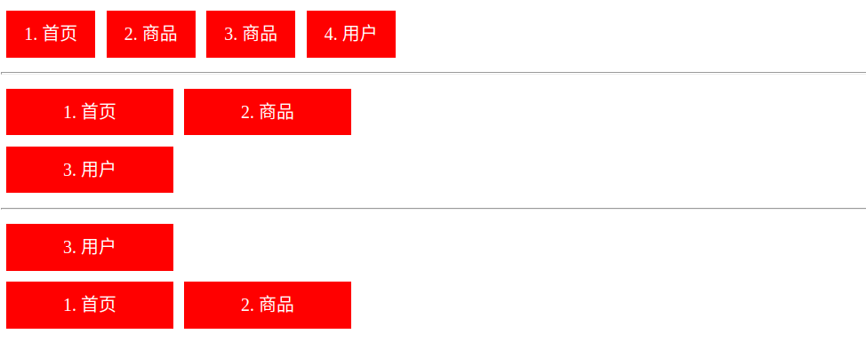
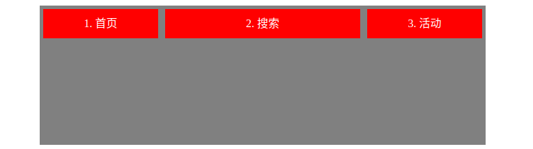
(2)flex-wrap属性
- 默认情况下,项目都排在一条线(又称"轴线")上。
flex-wrap属性定义,如果一条轴线排不下,如何换行。
| 属性值 | 描述 |
|---|---|
| nowrap | 默认值,不换行,压缩flex项目的宽度,让所有保持一行。 |
| wrap | 换行,不压缩flex项目的宽度,第一行在上方。 |
| wrap-reverse | 换行,不压缩flex项目的宽度,第一行在下方。 |
<!DOCTYPE html>
<html lang="en">
<head>
    <meta charset="UTF-8">
    <title>Title</title>
    <style>
    ul{display: flex;list-style: none;padding: 0; margin: 0; max-width: 360px;}
    li{width: 150px; height: 42px; line-height:42px; text-align: center; margin: 5px; background: red; color: white;}
    .box1{flex-direction: row; flex-wrap: nowrap;}
    .box2{flex-direction: row; flex-wrap: wrap; }
    .box3{flex-direction: row; flex-wrap: wrap-reverse; }
    </style>
</head>
<body>
    <ul class="box1">
      <li>1. 首页</li>
      <li>2. 商品</li>
      <li>3. 商品</li>
      <li>4. 用户</li>
    </ul>
    <hr>
    <ul class="box2">
      <li>1. 首页</li>
      <li>2. 商品</li>
      <li>3. 用户</li>
    </ul>
    <hr>
    <ul class="box3">
      <li>1. 首页</li>
      <li>2. 商品</li>
      <li>3. 用户</li>
    </ul>
</body>
</html>
(3)flex-flow
flex-flow属性是flex-direction属性和flex-wrap属性的简写形式,默认值为row nowrap。
.box {
    flex-flow: <flex-direction> || <flex-wrap>;
}
<!DOCTYPE html>
<html lang="en">
<head>
    <meta charset="UTF-8">
    <title>Title</title>
    <style>
    ul{display: flex;list-style: none;padding: 0; margin: 0; max-width: 360px;}
    li{width: 150px; height: 42px; line-height:42px; text-align: center; margin: 5px; background: red; color: white;}
    .box1{flex-flow: row nowrap;}
    .box2{flex-flow: row wrap; }
    .box3{flex-flow: row wrap-reverse; }
    </style>
</head>
<body>
    <ul class="box1">
      <li>1. 首页</li>
      <li>2. 商品</li>
      <li>3. 商品</li>
      <li>4. 用户</li>
    </ul>
    <hr>
    <ul class="box2">
      <li>1. 首页</li>
      <li>2. 商品</li>
      <li>3. 用户</li>
    </ul>
    <hr>
    <ul class="box3">
      <li>1. 首页</li>
      <li>2. 商品</li>
      <li>3. 用户</li>
    </ul>
</body>
</html>
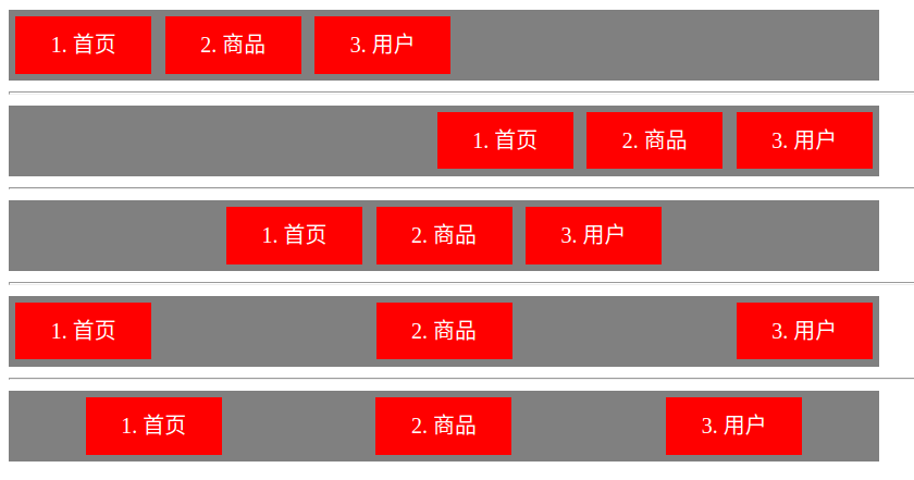
(4)justify-content属性
justify-content属性定义了flex项目在主轴(x轴)上的对齐方式。
| 属性值 | 描述 |
|---|---|
flex-start |
在主轴(x轴)上以起点对齐(左对齐) |
flex-end |
在主轴(x轴)上以终点对齐(右对齐) |
center |
在主轴(x轴)上以中点对齐(居中对齐) |
space-between |
在主轴(x轴)上以两边对齐(两边对齐),平均分割元素之间的空隙,不保留最左与最右的空隙 |
| space-around | 在主轴(x轴)上以两边对齐(两边对齐),平均分割元素之间的空隙,保留最左与最右的空隙 |
<!DOCTYPE html>
<html lang="en">
<head>
    <meta charset="UTF-8">
    <title>Title</title>
    <style>
    ul{display: flex;list-style: none;padding: 0; margin: 0; max-width: 640px; background: gray;}
    li{width: 100px; height: 42px; line-height:42px; text-align: center; margin: 5px; background: red; color: white;}
    .box1{justify-content: flex-start;}
    .box2{justify-content: flex-end;}
    .box3{justify-content: center;}
    .box4{justify-content: space-between;}
    .box5{justify-content: space-around;}
    </style>
</head>
<body>
    <ul class="box1"><li>1. 首页</li><li>2. 商品</li><li>3. 用户</li></ul>
    <hr>
    <ul class="box2"><li>1. 首页</li><li>2. 商品</li><li>3. 用户</li></ul>
    <hr>
    <ul class="box3"><li>1. 首页</li><li>2. 商品</li><li>3. 用户</li></ul>
    <hr>
    <ul class="box4"><li>1. 首页</li><li>2. 商品</li><li>3. 用户</li></ul>
    <hr>
    <ul class="box5"><li>1. 首页</li><li>2. 商品</li><li>3. 用户</li></ul>
</body>
</html>
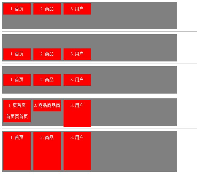
(5)align-items属性
align-items属性定义flex项目在交叉轴(y轴)上如何垂直对齐。
| 属性值 | 描述 |
|---|---|
| flex-start | 居上对齐 |
| flex-end | 居下对齐 |
| center | 垂直居中对齐 |
| baseline | 基于文本底线对齐 |
| stretch | 基于flex容器的上下边拉伸对齐 |
<!DOCTYPE html>
<html lang="en">
<head>
    <meta charset="UTF-8">
    <title>Title</title>
    <style>
    ul{display: flex;list-style: none;padding: 0; margin: 0; max-width: 640px; height: 100px; background: gray;}
    li{width: 100px; min-height: 42px; line-height: 42px; text-align: center; margin: 5px; background: red; color: white;}
    .box1{align-items: flex-start;}
    .box2{align-items: flex-end;}
    .box3{align-items: center;}
    .box4{align-items: baseline}
    .box5{align-items: stretch}
    </style>
</head>
<body>
    <ul class="box1"><li>1. 首页</li><li>2. 商品</li><li>3. 用户</li></ul>
    <hr>
    <ul class="box2"><li>1. 首页</li><li>2. 商品</li><li>3. 用户</li></ul>
    <hr>
    <ul class="box3"><li>1. 首页</li><li>2. 商品</li><li>3. 用户</li></ul>
    <hr>
    <ul class="box4">
        <li>1. 页首页<br>首页页首页</li>
        <li>2. 商品商品商</li>
        <li style="line-height: 42px;height: 100px;">3. 用户</li>
    </ul>
    <hr>
    <ul class="box5" style="height: 150px;"><li>1. 首页</li><li>2. 商品</li><li>3. 用户</li></ul>
</body>
</html>
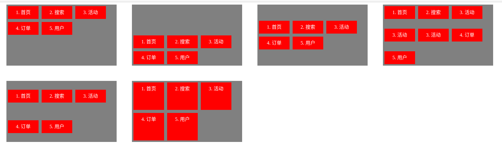
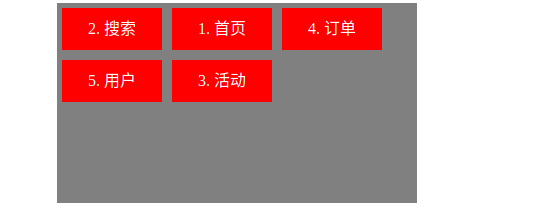
(6)align-content属性
align-content属性定义了多根轴线的对齐方式。- 如果项目只有一根轴线,该属性不起作用。
| 属性值 | 描述 |
|---|---|
| flex-start | 多行居上排列 |
| flex-end | 多行居下排列 |
| center | 多行居中排列 |
| space-between | 多行平均行间空隙排列,不保留首行上方与末行下方空隙 |
| space-around | 多行平均行间空隙排列,保留首行上方与末行下方空隙 |
| stretch |
<!DOCTYPE html>
<html lang="en">
<head>
    <meta charset="UTF-8">
    <title>Title</title>
    <style>
    ul{display: flex; float: left; flex-wrap: wrap; list-style: none;padding: 0; margin: 0; margin-left: 50px; margin-bottom: 50px; max-width: 360px; height: 200px; background: gray;}
    li{width: 100px; min-height: 42px; line-height: 42px; text-align: center; margin: 5px; background: red; color: white;}
    .box1{align-content: flex-start;}
    .box2{align-content: flex-end;}
    .box3{align-content: center;}
    .box4{align-content: space-between}
    .box5{align-content: space-around}
    .box6{align-content: stretch}
    </style>
</head>
<body>
    <ul class="box1">
        <li>1. 首页</li>
        <li>2. 搜索</li>
        <li>3. 活动</li>
        <li>4. 订单</li>
        <li>5. 用户</li>
    </ul>
    <ul class="box2">
        <li>1. 首页</li>
        <li>2. 搜索</li>
        <li>3. 活动</li>
        <li>4. 订单</li>
        <li>5. 用户</li>
    </ul>
    <ul class="box3">
        <li>1. 首页</li>
        <li>2. 搜索</li>
        <li>3. 活动</li>
        <li>4. 订单</li>
        <li>5. 用户</li>
    </ul>
    <ul class="box4">
        <li>1. 首页</li>
        <li>2. 搜索</li>
        <li>3. 活动</li>
        <li>3. 活动</li>
        <li>3. 活动</li>
        <li>4. 订单</li>
        <li>5. 用户</li>
    </ul>
    <ul class="box5">
        <li>1. 首页</li>
        <li>2. 搜索</li>
        <li>3. 活动</li>
        <li>4. 订单</li>
        <li>5. 用户</li>
    </ul>
    <ul class="box6">
        <li>1. 首页</li>
        <li>2. 搜索</li>
        <li>3. 活动</li>
        <li>4. 订单</li>
        <li>5. 用户</li>
    </ul>
</body>
</html>
【4】Flex项目的属性
- 以下6个属性设置在项目上。
| 属性 | 描述 |
|---|---|
order |
定义flex项目的排列顺序。数值越小,排列越靠前,默认为0。 |
| flex-grow | 定义flex项目的放大比例,默认为0,即如果存在剩余空间,也不放大。 |
| flex-shrink | 定义flex项目的缩小比例,默认为1,即如果空间不足,该项目将缩小。 |
| flex-basis | 定义在分配多余空间之前,flex项目占据的主轴空间(main size)。 浏览器根据这个属性,计算主轴是否有多余空间。它的默认值为 auto,即flex项目的本来大小。 |
flex |
flex属性是flex-grow, flex-shrink 和 flex-basis的简写,默认值为0 1 auto。后两个属性可选。 |
align-self |
align-self属性允许单个flex项目有与其他flex项目不一样的对齐方式,可覆盖align-items属性。默认值为 auto,表示继承父元素的align-items属性,如果没有父元素,则等同于stretch。 |
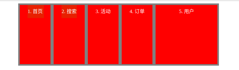
(1)order属性
order属性定义项目的排列顺序。数值越小,排列越靠前,默认为0。
<!DOCTYPE html>
<html lang="en">
<head>
    <meta charset="UTF-8">
    <title>Title</title>
    <style>
    ul{display: flex; float: left; flex-wrap: wrap; list-style: none;padding: 0; margin: 0; margin-left: 50px; margin-bottom: 50px; max-width: 360px; height: 200px; background: gray;}
    li{width: 100px; min-height: 42px; line-height: 42px; text-align: center; margin: 5px; background: red; color: white;}
    .box1{align-content: flex-start;}
    .box1 li:nth-child(1){order: 2;}
    .box1 li:nth-child(2){order: 1;}
    .box1 li:nth-child(3){order: 5;}
    .box1 li:nth-child(4){order: 3;}
    .box1 li:nth-child(5){order: 4;}
    </style>
</head>
<body>
    <ul class="box1">
        <li>1. 首页</li>
        <li>2. 搜索</li>
        <li>3. 活动</li>
        <li>4. 订单</li>
        <li>5. 用户</li>
    </ul>
</body>
</html>
(2)flex-grow属性
-
flex-grow属性定义项目的放大比例,默认为0,即如果存在剩余空间,也不放大。 -
如果所有项目的
flex-grow属性都为1,则它们将等分剩余空间(如果有的话)。 -
如果一个项目的
flex-grow属性为2,其他项目都为1,则前者占据的剩余空间将比其他项多一倍。
<!DOCTYPE html>
<html lang="en">
<head>
    <meta charset="UTF-8">
    <title>Title</title>
    <style>
    ul{display: flex; float: left; flex-wrap: wrap; list-style: none;padding: 0; margin: 0; margin-left: 50px; margin-bottom: 50px; width: 640px; height: 200px; background: gray;}
    li{width: 50px; min-height: 42px; line-height: 42px; text-align: center; margin: 5px; background: red; color: white;}
    .box1{align-content: flex-start;}
    .box1 li:nth-child(1){flex-grow: 1;}
    .box1 li:nth-child(2){flex-grow: 2;}
    .box1 li:nth-child(3){flex-grow: 1;}
    </style>
</head>
<body>
    <ul class="box1">
        <li>1. 首页</li>
        <li>2. 搜索</li>
        <li>3. 活动</li>
    </ul>
</body>
</html>
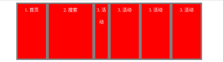
(3)flex-shrink属性
flex-shrink属性定义了项目的缩小比例,默认为1,即如果空间不足,该项目将缩小。- 负值对该属性无效。
- 如果所有项目的
flex-shrink属性都为1,当空间不足时,都将等比例缩小。 - 如果一个项目的
flex-shrink属性为0,其他项目都为1,则空间不足时,前者不缩小。
<!DOCTYPE html>
<html lang="en">
<head>
    <meta charset="UTF-8">
    <title>Title</title>
    <style>
    ul{display: flex; float: left; list-style: none; padding: 0; margin: 0; margin-left: 50px; margin-bottom: 50px; width: 640px; height: 200px; background: gray;}
    li{width: 150px; min-height: 42px; line-height: 42px; text-align: center; margin: 5px; background: red; color: white;}
    .box1{align-content: flex-start;}
    .box1 li:nth-child(1){flex-shrink: 1;}
    .box1 li:nth-child(2){flex-shrink: 0;}
    .box1 li:nth-child(3){flex-shrink: 2;}
    </style>
</head>
<body>
    <ul class="box1">
        <li>1. 首页</li>
        <li>2. 搜索</li>
        <li>3. 活动</li>
        <li>3. 活动</li>
        <li>3. 活动</li>
        <li>3. 活动</li>
    </ul>
</body>
</html>
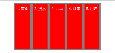
(4)flex-basis属性
flex-basis属性定义了在分配多余空间之前,项目占据的主轴空间(main size)。- 浏览器根据这个属性,计算主轴是否有多余空间。它的默认值为
auto,即项目的本来大小。
- 浏览器根据这个属性,计算主轴是否有多余空间。它的默认值为
- 它可以设为跟
width或height属性一样的值(比如350px),则项目将占据固定空间。
<!DOCTYPE html>
<html lang="en">
<head>
    <meta charset="UTF-8">
    <title>Title</title>
    <style>
    ul{display: flex; float: left; list-style: none; padding: 0; margin: 0; margin-left: 50px; margin-bottom: 50px; width: 360px; height: 200px; background: gray;}
    li{width: 150px; min-height: 42px; line-height: 42px; text-align: center; margin: 5px; background: red; color: white;}
    .box1{align-content: flex-start;}
    .box1 li:nth-child(1){flex-basis: 100px;}
    .box1 li:nth-child(2){flex-basis: 100px;}
    .box1 li:nth-child(3){flex-basis: 100px;}
    .box1 li:nth-child(4){flex-basis: 100px;}
    .box1 li:nth-child(5){flex-basis: 100px;}
    </style>
</head>
<body>
    <ul class="box1">
        <li>1. 首页</li>
        <li>2. 搜索</li>
        <li>3. 活动</li>
        <li>4. 订单</li>
        <li>5. 用户</li>
    </ul>
</body>
</html>
(5)flex属性
-
flex属性是flex-grow,flex-shrink和flex-basis的简写,默认值为0 1 auto。后两个属性可选。 -
该属性有两个快捷值:
auto(1 1 auto) 和 none (0 0 auto)。 -
建议优先使用这个属性,而不是单独写三个分离的属性,因为浏览器会推算相关值。
<!DOCTYPE html>
<html lang="en">
<head>
    <meta charset="UTF-8">
    <title>Title</title>
    <style>
    ul{display: flex; float: left; list-style: none; padding: 0; margin: 0; margin-left: 50px; margin-bottom: 50px; width: 640px; height: 200px; background: gray;}
    li{width: 150px; min-height: 42px; line-height: 42px; text-align: center; margin: 5px; background: red; color: white;}
    .box1{align-content: flex-start;}
    .box1 li:nth-child(1){flex: 1;}
    .box1 li:nth-child(2){flex: 1;}
    .box1 li:nth-child(3){flex: 1;}
    .box1 li:nth-child(4){flex: 1;}
    .box1 li:nth-child(5){flex: 2;}
    </style>
</head>
<body>
    <ul class="box1">
        <li>1. 首页</li>
        <li>2. 搜索</li>
        <li>3. 活动</li>
        <li>4. 订单</li>
        <li>5. 用户</li>
    </ul>
</body>
</html>
(6)align-self属性
align-self属性允许单个项目有与其他项目不一样的对齐方式,可覆盖align-items属性。- 默认值为
auto,表示继承父元素的align-items属性- 如果没有父元素,则等同于
stretch。
- 如果没有父元素,则等同于
- 该属性可能取6个值,除了auto,其他都与align-items属性完全一致。
| 属性值 | 描述 |
|---|---|
| auto | 默认值,表示当前flex项目集成父元素flex容器中的align-items的属性值 |
| flex-start | 居上对齐 |
| flex-end | 居下对齐 |
| center | 垂直居中对齐 |
| baseline | 基于首行文本的底线对齐 |
| stretch | 垂直拉伸元素的高度与父元素flex容器一致。 |
<!DOCTYPE html>
<html lang="en">
<head>
    <meta charset="UTF-8">
    <title>Title</title>
    <style>
    ul{display: flex;list-style: none;padding: 0; margin: 0; max-width: 640px; height: 100px; background: gray;}
    li{width: 100px; min-height: 42px; line-height: 42px; text-align: center; margin: 5px; background: red; color: white;}
    .box1{align-items: flex-start;}
    .box2{align-items: flex-end;}
    .box3{align-items: center;}
    .box4{align-items: baseline}
    .box5{align-items: stretch}
    .box1 li:nth-child(2){align-self: flex-end;}
    .box2 li:nth-child(2){align-self: stretch;}
    .box3 li:nth-child(2){align-self: flex-start;}
    .box3 li:nth-child(3){align-self: flex-end;}
    .box4 li:nth-child(2){align-self: stretch;}
    .box5 li:nth-child(2){align-self: center;}
    </style>
</head>
<body>
    <ul class="box1"><li>1. 首页</li><li>2. 商品</li><li>3. 用户</li></ul>
    <hr>
    <ul class="box2"><li>1. 首页</li><li>2. 商品</li><li>3. 用户</li></ul>
    <hr>
    <ul class="box3"><li>1. 首页</li><li>2. 商品</li><li>3. 用户</li></ul>
    <hr>
    <ul class="box4">
        <li>1. 页首页<br>首页页首页</li>
        <li>2. 商品商品商</li>
        <li style="line-height: 42px;height: 100px;">3. 用户</li>
    </ul>
    <hr>
    <ul class="box5" style="height: 150px;"><li>1. 首页</li><li>2. 商品</li><li>3. 用户</li></ul>
</body>
</html>
