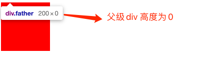
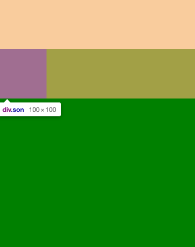
1、高度塌陷
原因:父元素没有设置高度,子元素设置浮动属性(float:left)之后,父元素的高度为0.***
<!DOCTYPE html>
<html lang="en">
<head>
    <meta charset="UTF-8">
    <meta http-equiv="X-UA-Compatible" content="IE=edge">
    <meta name="viewport" content="width=device-width, initial-scale=1.0">
    <title>Document</title>
    <style>
        .father{
            width: 200px;
            background-color: green;
        }
        .son{
            width: 100px;
            height: 100px;
            background-color: red;
            float: left;
        }
    </style>
</head>
<body>
    <div class="father">
        <div class="son"></div>
    </div>
</body>
</html>
高度塌陷问题处理:*****
1)父级增加高度属性
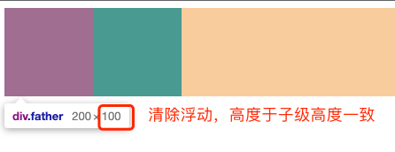
2)清除浮动
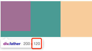
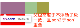
3).father增加一个带高度不浮动的子元素
4)触发BFC
1)父级增加高度属性
<!DOCTYPE html>
<html lang="en">
<head>
    <meta charset="UTF-8">
    <meta http-equiv="X-UA-Compatible" content="IE=edge">
    <meta name="viewport" content="width=device-width, initial-scale=1.0">
    <title>Document</title>
    <style>
        .father{
            width: 200px;
            height: 120px;
            background-color: green;
        }
        .son{
            width: 100px;
            height: 100px;
            background-color: red;
            float: left;
        }
    </style>
</head>
<body>
    <div class="father">
        <div class="son"></div>
    </div>
</body>
</html>
2)清除浮动
<!DOCTYPE html>
<html lang="en">
<head>
    <meta charset="UTF-8">
    <meta http-equiv="X-UA-Compatible" content="IE=edge">
    <meta name="viewport" content="width=device-width, initial-scale=1.0">
    <title>Document</title>
    <style>
        .father{
            width: 200px;
            background-color: green;
        }
        .son{
            width: 100px;
            height: 100px;
            background-color: red;
            float: left;
        }
    </style>
</head>
<body>
    <div class="father">
        <div class="son"></div>
        <!-- 用clear 清除浮动,写在浮动元素之后 -->
        <div style="clear: both;"></div>
    </div>
</body>
</html>
3)给.father增加一个带高度子级
<!DOCTYPE html>
<html lang="en">
<head>
    <meta charset="UTF-8">
    <meta http-equiv="X-UA-Compatible" content="IE=edge">
    <meta name="viewport" content="width=device-width, initial-scale=1.0">
    <title>Document</title>
    <style>
        .father{
            width: 200px;
            background-color: green;
        }
        .son{
            width: 100px;
            height: 100px;
            background-color: red;
            float: left;
        }
        .son2{
            width: 150px;
            height: 50px;
            background-color: yellow;
        }
    </style>
</head>
<body>
    <div class="father">
        <div class="son"></div>
        <!-- 用clear 清除浮动,写在浮动元素之后 -->
        <div class="son2"></div>
    </div>
</body>
</html>
2、外边距塌陷
(父子塌陷 和 兄弟塌陷) 只在垂直方向上,水平方向不会塌陷
父子塌陷原因:
根据规范,父级盒子没有上边框(border),上边内边距,它的上边距就会和第一个子级元素的上边距重叠(两者取大值)
<!DOCTYPE html>
<html lang="en">
<head>
    <meta charset="UTF-8">
    <meta http-equiv="X-UA-Compatible" content="IE=edge">
    <meta name="viewport" content="width=device-width, initial-scale=1.0">
    <title>Document</title>
    <style>
        *{
            margin: 0;
            padding: 0;
        }
        .father{
            width: 400px;
            height: 400px;
            /* padding-top:20px; */
            margin-top: 30px;

            background-color: green;
        }
        .son{
            width: 100px;
            height: 100px;
            margin-top: 50px;

            background-color: red;
        }
        .son2{
            width: 150px;
            height: 150px;
            /* margin-top: 50px; */
            background-color: yellow;
        }
    </style>
</head>
<body>
    <div class="father">
        <div class="son"></div>
        <!-- <div class="son2"></div> -->
    </div>
</body>
</html>
父子边距塌陷处理:(常见5种方法)
1)父元素加边框(border),加内边距(padding)。(不推荐因为增加了多余的内容)
<!DOCTYPE html>
<html lang="en">
<head>
    <meta charset="UTF-8">
    <meta http-equiv="X-UA-Compatible" content="IE=edge">
    <meta name="viewport" content="width=device-width, initial-scale=1.0">
    <title>Document</title>
    <style>
        *{
            margin: 0;
            padding: 0;
        }
        .father{
            width: 200px;
            height: 200px;
            /* padding-top:1px; */
            border-top: 1px solid gray;

            background-color: green;
        }
        .son{
            width: 100px;
            height: 100px;
            margin-top: 150px;
            background-color: red;
        }
        .son2{
            width: 150px;
            height: 150px;
            margin-top: 50px;
            margin-left: 100px;
            background-color: yellow;
        }
    </style>
</head>
<body>
    <div class="father">
        <div class="son"></div>
        <!-- <div class="son2"></div> -->
    </div>
</body>
</html>
2)利用 块级格式化上下文 BFC机制(box-formatting-context) :设置一个独立的渲染区域,规定了内部的盒子渲染不可以影响外部元素。做法:overflow: hidden;
<!DOCTYPE html>
<html lang="en">
<head>
    <meta charset="UTF-8">
    <meta http-equiv="X-UA-Compatible" content="IE=edge">
    <meta name="viewport" content="width=device-width, initial-scale=1.0">
    <title>Document</title>
    <style>
        *{
            margin: 0;
            padding: 0;
        }
        .father{
            width: 200px;
            height: 200px;
            /* 给父元素设置溢出隐藏触发bfc机制 */
            overflow: hidden;

            background-color: green;
        }
        .son{
            width: 100px;
            height: 100px;
            margin-top: 50px;
            background-color: red;
        }
        .son2{
            width: 150px;
            height: 150px;
            margin-top: 50px;
            margin-left: 100px;
            background-color: yellow;
        }
    </style>
</head>
<body>
    <div class="father">
        <div class="son"></div>
        <!-- <div class="son2"></div> -->
    </div>
</body>
</html>
3)脱标(脱离标准流)a、给父级或者子级增加浮动 (float:left) b、让父级或子级设置定位(绝对或者固定)
<!DOCTYPE html>
<html lang="en">
<head>
    <meta charset="UTF-8">
    <meta http-equiv="X-UA-Compatible" content="IE=edge">
    <meta name="viewport" content="width=device-width, initial-scale=1.0">
    <title>Document</title>
    <style>
        *{
            margin: 0;
            padding: 0;
        }
        .father{
            width: 200px;
            height: 200px;
            /* 边框 或者 内边距 */
            /* padding-top:1px;
            border-top: 1px solid gray; */
            /* 给父元素设置溢出隐藏触发bfc机制 */
            /* overflow: hidden; */
            /* 添加浮动 */
            /* float: left; */
            background-color: green;
        }
        .son{
            width: 100px;
            height: 100px;
            margin-top: 50px;
            /* 添加浮动 与 父级任选一个添加即可*/
            /* float: left; */
            background-color: red;
        }
        .son2{
            width: 150px;
            height: 150px;
            margin-top: 50px;
            margin-left: 100px;
            background-color: yellow;
        }
    </style>
</head>
<body>
    <div class="father">
        <div class="son"></div>
        <!-- <div class="son2"></div> -->
    </div>
</body>
</html>
定位脱离标准流
<!DOCTYPE html>
<html lang="en">
<head>
    <meta charset="UTF-8">
    <meta http-equiv="X-UA-Compatible" content="IE=edge">
    <meta name="viewport" content="width=device-width, initial-scale=1.0">
    <title>Document</title>
    <style>
        *{
            margin: 0;
            padding: 0;
        }
        .father{
            /* 脱离标准流定位 */
            /* position: absolute; */
            width: 200px;
            height: 200px;
            /* 边框 或者 内边距 */
            /* padding-top:1px;
            border-top: 1px solid gray; */
            /* 给父元素设置溢出隐藏触发bfc机制 */
            /* overflow: hidden; */
            /* 添加浮动 */
            /* float: left; */
            /* display: inline-block; */
            background-color: green;
        }
        .son{
            /* 脱离标准流定位 */
            position: absolute;
            width: 100px;
            height: 100px;
            margin-top: 50px;
            /* 添加浮动 与 父级任选一个添加即可*/
            /* float: left; */
            background-color: red;
        }
        .son2{
            width: 150px;
            height: 150px;
            margin-top: 50px;
            margin-left: 100px;
            background-color: yellow;
        }
    </style>
</head>
<body>
    <div class="father">
        <div class="son"></div>
        <!-- <div class="son2"></div> -->
    </div>
</body>
</html>
4)父级转为行内块元素(display: inline-block)
<!DOCTYPE html>
<html lang="en">
<head>
    <meta charset="UTF-8">
    <meta http-equiv="X-UA-Compatible" content="IE=edge">
    <meta name="viewport" content="width=device-width, initial-scale=1.0">
    <title>Document</title>
    <style>
        *{
            margin: 0;
            padding: 0;
        }
        .father{
            width: 200px;
            height: 200px;
            /* 边框 或者 内边距 */
            /* padding-top:1px;
            border-top: 1px solid gray; */
            /* 给父元素设置溢出隐藏触发bfc机制 */
            /* overflow: hidden; */
            /* 添加浮动 */
            /* float: left; */
            display: inline-block;
            background-color: green;
        }
        .son{
            width: 100px;
            height: 100px;
            margin-top: 50px;
            /* 添加浮动 与 父级任选一个添加即可*/
            /* float: left; */
            background-color: red;
        }
        .son2{
            width: 150px;
            height: 150px;
            margin-top: 50px;
            margin-left: 100px;
            background-color: yellow;
        }
    </style>
</head>
<body>
    <div class="father">
        <div class="son"></div>
        <!-- <div class="son2"></div> -->
    </div>
</body>
</html>
5)父级设为弹性布局
<!DOCTYPE html>
<html lang="en">
<head>
    <meta charset="UTF-8">
    <meta http-equiv="X-UA-Compatible" content="IE=edge">
    <meta name="viewport" content="width=device-width, initial-scale=1.0">
    <title>Document</title>
    <style>
        *{
            margin: 0;
            padding: 0;
        }
        .father{
            /* 脱离标准流定位 */
            /* position: absolute; */
            width: 200px;
            height: 200px;
            /* 边框 或者 内边距 */
            /* padding-top:1px;
            border-top: 1px solid gray; */
            /* 给父元素设置溢出隐藏触发bfc机制 */
            /* overflow: hidden; */
            /* 添加浮动 */
            /* float: left; */
            /* display: inline-block; */
            background-color: green;
            /* 父级设为弹性布局 */
            display: flex;
        }
        .son{
            /* 脱离标准流定位 */
            /* position: absolute; */
            width: 100px;
            height: 100px;
            margin-top: 50px;
            /* 添加浮动 与 父级任选一个添加即可*/
            /* float: left; */
            background-color: red;
        }
        .son2{
            width: 150px;
            height: 150px;
            margin-top: 50px;
            margin-left: 100px;
            background-color: yellow;
        }
    </style>
</head>
<body>
    <div class="father">
        <div class="son"></div>
        <!-- <div class="son2"></div> -->
    </div>
</body>
</html>
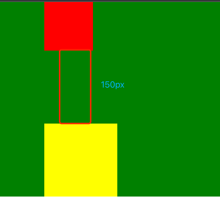
兄弟塌陷原因:
根据规范,同级盒子没有上下边框(border),上下内边距,它们的上下边距就会和相邻的同级盒子合并(两者取大值)
<!DOCTYPE html>
<html lang="en">
<head>
    <meta charset="UTF-8">
    <meta http-equiv="X-UA-Compatible" content="IE=edge">
    <meta name="viewport" content="width=device-width, initial-scale=1.0">
    <title>Document</title>
    <style>
        *{
            margin: 0;
            padding: 0;
        }
        .father{
            /* padding-top:20px; */
            /* margin-top: 30px; */

            background-color: green;
        }
        .son{
            width: 100px;
            height: 100px;
            margin-bottom: 150px;
            margin-left: 100px;
            background-color: red;
        }
        .son2{
            width: 150px;
            height: 150px;
            margin-top: 50px;
            margin-left: 100px;
            background-color: yellow;
        }
    </style>
</head>
<body>
    <div class="father">
        <div class="son"></div>
        <div class="son2"></div>
    </div>
</body>
</html>
兄弟边距塌陷处理:
1)只给两者之一添加margin来拉开距离。