1.css的渐变
线性渐变
/* 线性渐变 */
    .one {
      width: 300px;
      height: 300px;
      background: linear-gradient(to right, rgb(244, 239, 239) 2%, rgb(0, 9, 0) 5%, rgb(244, 239, 239)9%);
      border: 1px solid red;

    }
<div class="one"></div>
线性重复渐变
/* 重复线性渐变 */
    .two {
      width: 300px;
      height: 300px;
      background: repeating-linear-gradient(red 5%, green 20%);
      border: 1px solid red;


    }
 <div class="two"></div>
径向渐变
/* 径向渐变 */
    .four {
      width: 300px;
      height: 300px;
      background: radial-gradient(red 20%, yellow 50%, blue 20%);
      border: 1px solid red;

    }
 <div class="three"></div>
径向重复渐变
 /*径向重复渐变  */
    .three {
      width: 300px;
      height: 300px;
      background: repeating-radial-gradient(red 5%, rgb(111, 114, 111) 20%);
      border: 1px solid red;

    }
兼容性问体
-webkit-background-clip: text; 适用于谷歌浏览器
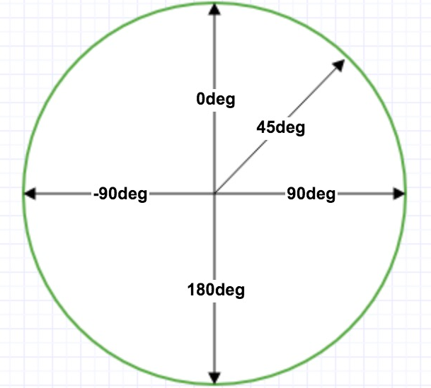
-webkit-和正常版本下的角度是互余关系
background: -webkit-linear-gradient(180deg, red, blue); /* Safari 5.1 - 6.0 */
background: -o-linear-gradient(180deg, red, blue); /* Opera 11.1 - 12.0 */
background: -moz-linear-gradient(180deg, red, blue); /* Firefox 3.6 - 15 */
background: linear-gradient(180deg, red, blue); /* 标准的语法 */
角度渐变
2.背景裁切
       background-clip: text;
      -webkit-background-clip: text;
.five {
      background:linear-gradient(to right, rgba(9, 0, 0, 0.132) 2%, rgba(239, 180, 3, 0.769)2%, rgba(215, 25, 25, 0.056)9%), url(./img/u=738234752\,3183324393&fm=193&f=GIF.jpg);
      background-size:cover ;
      color:rgba(255, 255, 255, 0.1);
      width: 800px;
      height: 400px;
      font-size: 100px;
      margin: 0 auto;
      text-align: center;
      line-height: 400px;
      background-clip: text;
      -webkit-background-clip: text;
      transition: all 2s;
    }
<div class="five">
云和数据,我来了!
</div>
3.盒子的阴影
<!DOCTYPE html>
<html lang="en">
<head>
    <meta charset="UTF-8">
    <meta name="viewport" content="width=device-width, initial-scale=1.0">
    <title>Document</title>
    <style>
        .one{
            width: 200px;
            height: 100px;
            background-color: rgb(195, 192, 192 );
            margin: 20px auto;
            position: relative;
            border-radius: 10px;
        }
        .one::after,.one::before{
            content: "";
            width: 90px;
            height: 30px;
            background-color: transparent;
            position: absolute;
            z-index: -1;
             top: 65px;
             left: 10px;
            transform: rotate(-3deg);
            box-shadow: 0 9px 9px rgb(128, 127, 127);

        }
        .one::after{
            left: auto;
            right: 10px;
            transform: rotate(3deg);

        }
    </style>
</head>
<body>
    <div class="one"></div>
</body>
</html>