一、认识flex布局
认识flexbox:
- 弹性盒子是一种用于按行或按列布局元素的一维布局方法;
- 元素可以膨胀一填充额外的空间,收缩一适应更小的空间;
- 通常我们使用flexbox来进行布局的方案之为flex布局(flex layout);
flex布局的重要概念
- 开启了flex布局的元素叫 flex container
- flex container 里面的直接子元素叫做 flex item
- 当flex container中的子元素变成了flex item时,具备以下特点
- flex item的布局将受flex container属性的设置来进行控制和布局;
- flex item不再严格区分块级元素和行内级元素;
- flex item默认情况下是包裹内容的,但是可以设置宽度和高度;
- 设置display属性为flex 或者 inline-flex 可以成为 flex container
- flex:flex container 以block-level形式存在
- inline-flex:flex container以inline-level形式存在
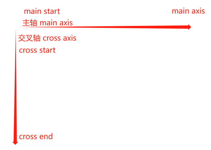
flex布局模型
二、flex属性
flex-direction
概念:默认都是沿着 main axis(主轴)从main start 开始往main end方向排布,决定了main axis的方向,有4个取值。
row(默认值)、row-reverse(反转)、column(交叉轴)、column-reverse(反转)
flex-wrap
概念:flex-wrap决定了 flex container 是单行还是多行
nowrap(默认值):单行、wrap:多行、wrap-reverse:多行(对比wrap,cross start与 cross end相反)
flex-flow(了解)
概念:flex-fliw属性是flex-direction 和 flex-wrap 的简写(顺序任意、可以省略)
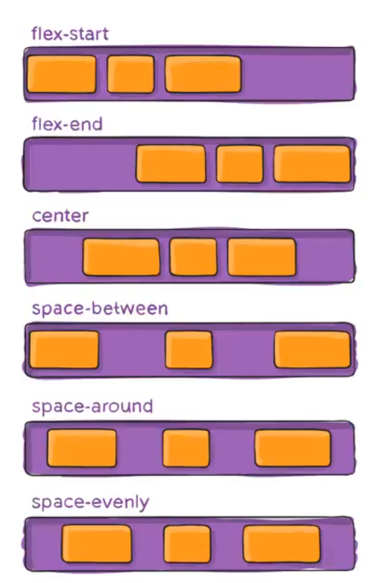
justify-content
概念:justify-content决定了flex items 在main axis上的对齐方式
- flex-start(默认值):与main start 对齐
- flex-end:与main end对齐
- center:居中对齐
- space-between:
- flex items之间的距离相等
- 与main start、main end两端对齐
- space-around:
- flex items之间的距离相等
- flex items 与 main start、main end之间的距离是flex items之间距离的一半
- space-evenly:
- flex items之间的距离相等
- flex items 与 main start、main end之间的距离等于flex items之间的距离
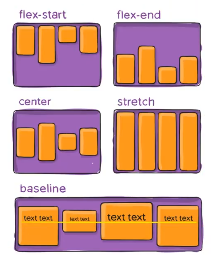
align-items
概念:align-items决定了flex items 在cross axis上的对齐方式
- normal:在弹性布局中,效果和stretch一样
- stretch:当flex items在cross axis方向的size为auto是,会自动拉伸至填充flex container
- flex-start:与cross start对齐
- flex-end:与cross end对齐
- center:居中对齐
- baseline:与基准线对齐
align-content
概念:align-content决定了多行flex items在cross axis上对齐方式,用法与justify-content类似
- stretch(默认值):与align-items的stretch类似
- flex-start:与cross start对齐
- flex-end:与cross end对齐
- center:居中对齐
- space-between:
- flex items之间的距离相等
- 与cross start、cross end两端对齐
- space-around:
- flex items之间的距离相等
- flex items与cross start、cross end之间的距离是flex items之间距离的一半
- space-evenly:
- flex items之间的距离相等
- flex items与cross start、cross end之间的距离等于 flex items之间的距离
flex-item属性 - order(了解)
概念:order决定了flex items的排布顺序
- 可以设置任意整数(正整数、负整数、0),值越小就越排在前面
- 默认值是0
flex-item属性 - align-self
概念:flex items 可以通过align-self覆盖 flex container设置的align-items
- auto(默认值):遵从flex container的align-items设置
- stretch、flex-start、flex-end、center、baseline,效果跟align-items一致
flex-item属性 - flex-grow(了解)
概念:flex-grow决定了flex items 如何扩展(拉伸/成长)
- 可以设置任意非负数字(正小数、正整数、0),默认值为0
- 当flex container在main axis方向上有剩余size时,flex-grow属性才会有效
- 如果所有flex items的flex-grow总和sum超过1 每个flex item扩展的size为
- flex container 的剩余size * flex-grow / sum
- flex items扩展后的最终size不能超过max-width/max-height
flex-item属性 - flex-shrink(了解)
概念:flex-shrink决定了flex items如何收缩(缩小)
- 可以设置任意非负数字(正小数、正整数、0),默认值是1
- 当flex items在main axis方向超过了flex container的size, flex-shrink属性才会有效
- 如果所有flex items的flex-shrink总和超过1,每个flex item收缩的size为
- flex items超过flex container的size * 收缩比例 / 所有 flex items的收缩比例之和
- flex items 收缩后的最终size不能小于min-width/min-height
flex-item属性 - flex-basis(了解)
概念:flex-basis用来设置flex items在main axis方向上的base size
- auto(默认值)、具体的宽度数值(100px)
- 决定flex items最终nase size的因素,从优先级高到低
- max-width\max-height\min-width\min-height
- flex-basis
- width\height
- 内容本身的size
flex-item属性 - flex属性
flex是flex-grow || flex-shrink || flex-basis的简写,flex属性可以指定一个值、两个值、三个值
none | [ <'flex-grow'> <'flex-shrink'>? || <'flex-basis'> ]
- 单值语法: 值必须为以下其中之一
- 一个无单位数(
): 它会被当作 的值 - 一个有效的宽度(width)值: 它会被当作
的值 - 关键字none,auto或initial.
- 一个无单位数(
- 双值语法: 第一个值必须为一个无单位数,并且它会被当作
的值 - 第二个值必须为以下之一:
一个无单位数:它会被当作的值 - 一个有效的宽度值: 它会被当作
的值
- 第二个值必须为以下之一:
- 三值语法:
- 第一个值必须为一个无单位数,并且它会被当作
的值 - 第二个值必须为一个无单位数,并且它会被当作
的值 - 第三个值必须为一个有效的宽度值,并且它会被当作
的值
- 第一个值必须为一个无单位数,并且它会被当作
三、flex布局常见问题
-
解决在设置<justify-content: space-between> && <flex-wrap: wrap>时出现的最后一个标签问题
<!DOCTYPE html>
<html lang="en">
<head>
  <meta charset="UTF-8">
  <meta name="viewport" content="width=device-width, initial-scale=1.0">
  <title>常见问题</title>
  <style>
    .flex-container {
      display: flex;
      width: 300px;
      height: 240px;
      background-color: pink;
      flex-wrap: wrap;
      justify-content: space-between;
    }
    .item {
      width: 80px;
      height: 80px;
    }
    .flex-container > i {
      width: 80px;
    }
  </style>
</head>
<body>
  <div class="flex-container">
    <div class="item item1">1</div>
    <div class="item item2">2</div>
    <div class="item item3">3</div>
    <div class="item item4">4</div>
    <div class="item item5">5</div>
    <div class="item item6">6</div>
    <div class="item item7">7</div>
    <div class="item item8">8</div>
    <!-- 列数 - 2加上标签设置宽度 -->
    <i></i><i></i>
    <!-- <div class="item item9">9</div> -->
  </div>

</body>
<script>
  let allItem = document.getElementsByClassName('item');
  const randomHex = () => `#${Math.floor(Math.random() * 0xffffff).toString(16).padEnd(6, "0")}`;
  for(let i = 0; i < allItem.length; i++) {
    for(let num = 0; num < allItem.length; num++) {
      allItem[num].style.background = randomHex();
    }
  }
</script>
</html>
解决方案:在items后面加上<列数 - 2>的标签数,同时设置与items标签相同宽度
原理:让盒子填满,但不设置高度,视觉上是看不到的