1.组件封装
<template>
  <el-tooltip effect="dark" :disabled="isShowTooltip" :content="content" placement="top">
    <p :class="['line1', className]" @mouseover="onMouseOver(refName)">
      <span :ref="setItemRef">{{ content || '-' }}</span>
    </p>
  </el-tooltip>
</template>

<script setup lang="ts">
import { ref, defineProps } from 'vue';
const props = defineProps({
  // 显示的文字内容
  content: {
    type: String,
    default: '',
  },
  // 外层框的样式,在传入的这个类名中设置文字显示的宽度
  className: {
    type: String,
    default: 'w100',
  },
  // 为页面文字标识(如在同一页面中调用多次组件,此参数不可重复)
  refName: {
    type: String,
    default: '',
  },
});

const iframeRefs = ref({});
const setItemRef = (el, key) => {
  if (el) {
    iframeRefs.value[props.refName] = el;
  }
};
const isShowTooltip = ref(true);
const onMouseOver = str => {
  let parentWidth = iframeRefs.value[str].parentNode.offsetWidth;
  let contentWidth = iframeRefs.value[str].offsetWidth;
  // 判断是否开启tooltip功能
  if (contentWidth > parentWidth) {
    isShowTooltip.value = false;
  } else {
    isShowTooltip.value = true;
  }
};
</script>

<style lang="scss" scoped>
.w86 {
  width: 86%;
}
.w100 {
  width: 100%;
}
</style>
2.组件引用
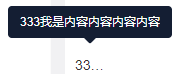
    <div style="width: 30px">
      <r-tooltip-over content="333我是内容内容内容内容" ref-name="ref2"></r-tooltip-over>
    </div>
3.效果
- 省略号 element-plus 一行 鼠标 element省略号element-plus一行 鼠标 element-plus一行element数据 element-plus quot element-plus elmessage element element-plus element plus element-plus element类型 文件 resizeobserver notifications element-plus undelivered resizeobserver element-plus exceeded element element-plus组件element功能 element-plus实战element项目