echarts柱状图
<template>
  <div id="main4" style="width:90%;height:90%;padding-top:10px;"></div>
</template>

<script>
  export default {
    name: "chart4",
    mounted() {
      this.initEcharts4();
    },
    methods: {
      initEcharts4() {
        var chartDom = document.getElementById('main4');
        var myChart4 = this.$echarts.init(chartDom);

        var option4 = {
          grid: {
            top: '30%', // 设置网格顶部距离为50px,增加柱状图离标题的距离
            left:'10%'
            // 其他网格配置...
          },
          xAxis: {
            type: 'category',
            data: ['周一', '周二', '周三', '周四', '周五', '周六', '周日'],
            axisLabel: {
              show: true, // 是否显示刻度标签,默认显示
              interval: 0, // 坐标轴刻度标签的显示间隔,在类目轴中有效;默认会采用标签不重叠的策略间隔显示标签;可以设置成0强制显示所有标签;如果设置为1,表示『隔一个标签显示一个标签』,如果值为2,表示隔两个标签显示一个标签,以此类推。
              inside: false, // 刻度标签是否朝内,默认朝外
              margin: 20, // 刻度标签与轴线之间的距离
              textStyle: {
                color: '#777777', // 设置X轴标签的颜色
              },
            },
            axisTick: {
              show: false, // 显示刻度线
            },
            axisLine: {
              show:false,
              lineStyle: {
                color: '#4DD85D', // 设置X轴颜色
              },
            },
          },
          yAxis: {
            type: 'value',
            // max: '24',
            min: '0',
            splitNumber: 6,
            axisLine: {
              show: false,    // 是否显示坐标轴轴线
              symbol: ['none'], // 轴线两端箭头,两个值,none表示没有箭头,arrow表示有箭头
              lineStyle: {
                color: '#4DD85D', // 设置X轴颜色
              },
            },
            axisLabel: {
              textStyle: {
                color: '#777777', // 设置X轴标签的颜色为红色
              },
            },
            splitLine: {
              show: true, // 设置为 true 显示刻度线
            }
          },
          series: [
            {
              data: [4.5,14, 8, 7, 9, 10, 6],
              type: 'bar',
              barWidth: 20, // 设置柱形宽度为20像素
              barCategoryGap: '20%',       //---柱形间距
              itemStyle: {
                barBorderRadius: [50], // 设置椭圆柱的两个半径,可以根据需要调整
                color: {
                  type: 'linear',
                  x: 0,
                  y: 0,
                  x2: 0,
                  y2: 1,
                  colorStops: [
                    {
                      offset: 0,
                      color: '#FED74B'
                    },
                    {
                      offset: 1,
                      color: '#FB7397'

                    }
                  ]
                }
              }
            }
          ],

          title: [
            {
              text: '睡眠时间/h'
            },

          ],
          graphic: [
            {
              type: 'rect',
              left: '70%',
              top: '0',
              shape: {
                width: 180,
                height: 40,
                r: 8,
              },
              style: {
                fill: '#93D39B',
              },
            },
            {
              type: 'text',
              left: '71%',
              top: '15',
              style: {
                text: '本月平均睡眠时间:6h',
                fill: '#fff',
                fontFamily: 'Arial',
                fontSize: 16,
              },
            },
          ],
          tooltip: {
            show: true,                  //---是否显示提示框,默认为true
            trigger: 'item',             //---数据项图形触发
            // formatter: function(params) {
            //   var tooltipContent =params.name  + ' ' + params.value + 'bpm'; // 修改格式
            //   return tooltipContent;
            // }
          },
        };
        myChart4.setOption(option4);//将配置参数option4应用到echarts图表实例mycharts4上的方法。通过调用该方法,将会把option4中定义的图表配置应用到mycharts上
      }
    }
  }
</script>

<style scoped>

</style>
echarts折线图
<template>
  <div id="main2" style="width:90%;height:90%;padding-top:10px;"></div>
</template>

<script>
  export default {
    name: "chart2",
    mounted() {
      this.initEcharts2();
    },
    methods: {
      initEcharts2() {
        var chartDom = document.getElementById('main2');
        var myChart2 = this.$echarts.init(chartDom);

        var option2={

          title: {
            text: '血压'
          },
          tooltip: {
            trigger: 'axis'
          },
          legend: {
            right:'0',
            data: ['收缩压', '舒张压']
          },
          grid: {
            left:'5%',
            bottom:'15%',
            containLabel: true
          },
          xAxis: {
            type: 'category',
            boundaryGap: false,
            data: ['06:00', '12:00', '18:00', '00:00'],
          },
          yAxis: {
            type: 'value',
            splitNumber: 1, // 将刻度线数量限制为五段值
            axisLine:{
              show:true
            }
          },
          series: [
            {
              name: '收缩压',
              type: 'line',
              data: [60, 86,75,78]
            },
            {
              name: '舒张压',
              type: 'line',
              data: [120, 110,130,140]
            }
          ]
        }

        myChart2.setOption(option2);
      }
    }
  }
</script>

<style scoped>

</style>
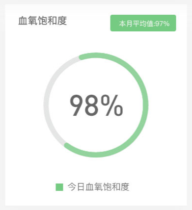
echarts环形图
<template>
  <div id="main1" style="width:90%;height:90%;"></div>
</template>

<script>
  export default {
    name: "chart1",
    mounted() {
      this.initEcharts1();
    },
    methods: {
      initEcharts1() {
        var chartDom = document.getElementById('main1');//通过ID获取容器元素
        var myChart1 = this.$echarts.init(chartDom);//初始化图表

        let total = 100;//总数
        let salayry1 = 98;//血氧饱和度
        let percentage1 = (salayry1 / total * 100).toFixed(0);//血氧饱和度百分比

        var option1 = {
      //标题部分:文本、字体、距离
          title: {
            text: '血氧饱和度',
            textStyle: {
              fontSize: 20,
              // fontWeight: 'bold'
            },
            padding: [10, 0, 0, 10]
          },
      //鼠标移动到图表上的提示框触发类型
          tooltip: {
            trigger: "item",
            // transitionDuration: 0, //让提示框跟随鼠标提示
          },
      //图表颜色
          color: [
            "#93D39B",
          ],
          legend: {
            orient: "vertical",//图例排列方式
            left: '25%',//图例水平位置
            bottom: "0",//图例垂直位置
            itemHeight: 12, //图例的高度
            itemGap: 12, //图例之间的间距
            data: [
              {
                name: "今日血氧饱和度",//图例名称
                icon: "square",//图例的图标样式
                textStyle: {
                  color: "#93D39B", // 单独设置某一个图列的颜色
                  fontSize: 18
                },
              }
            ],
            //图例的名字需要和饼图的name一致,才会显示图例
          },
          series: [
            // A版块
            {
              name: "今日血氧饱和度",//数据系列名称
              type: "pie",//图表类型为饼图
              radius: ["50%", "60%"],//饼图的半径范围
              center: ["50%", "50%"],//饼图的中心位置
              //环的位置
              label: {
                show: true,//显示标签
                position: "center",//标签位置
                fontSize: 36,//标签字号
                fontWeight: "bold",//标签加粗
              },
              labelLine: {
                normal: {
                  show: false,//不显示标签引导线
                },
              },
              emphasis: {
                label: {
                  show: true,
                  fontSize: "20",
                  fontWeight: "bold",
                },
              },
              data: [
                {
                  value: salayry1, //需要显示的数据
                  name: percentage1 + "%",//饼图扇区名称
                  itemStyle: {
                    normal: {
                      color: "#93D39B",//饼图扇区颜色
                    },
                  },
                },
                {
                  value: total - salayry1,
                  //不需要显示的数据,颜色设置成和背景一样
                  itemStyle: {
                    normal: {
                      color: "#E6E6E6",
                    },
                  },
                },
              ],
            },
          ],
          graphic: [//自定义图形元素
            {
              type: 'rect',//图形类型为矩形
              left:'55%',
              top: '0',
              shape: {
                width: 150,
                height: 40,
                r: 8,
              },
              style: {
                fill: '#93D39B',
              },
            },
            {
              type: 'text',
              left:'58%',
              top: '15',
              style: {
                text: '本月平均值:97%',
                fill: '#fff',
                fontFamily: 'Arial',
                fontSize: 16,
              },
            },
          ],
        };
        myChart1.setOption(option1);
      }
    }
  }
</script>

<style scoped>

</style>