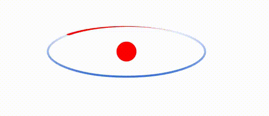
案例:
<svg xmlns="http://www.w3.org/2000/svg" width="389" height="412" viewBox="-10 -10 389 412" fill="none">
<path d="M43.9712 71.3301C54.9787 71.3301 64.9235 72.8 72.0993 75.1629C75.6898 76.3453 78.5593 77.7423 80.5209 79.2694C82.4887 80.8015 83.4714 82.405 83.4714 84.0022C83.4714 85.5993 82.4887 87.2027 80.5209 88.7348C78.5593 90.2619 75.6898 91.6589 72.0993 92.8412C64.9235 95.2042 54.9787 96.6741 43.9712 96.6741C32.964 96.6741 23.0193 95.2042 15.8436 92.8412C12.253 91.6589 9.38351 90.2619 7.422 88.7348C5.45416 87.2027 4.47144 85.5993 4.47144 84.0022C4.47144 82.405 5.45417 80.8015 7.42201 79.2694C9.38351 77.7423 12.253 76.3453 15.8436 75.1629C23.0193 72.8 32.964 71.3301 43.9712 71.3301Z" stroke="url(#paint6_linear_339_220)"/>

<g transform="translate(43.9714, 84.0021) scale(0.5642 0.1810)">
<path d="M 0,70 A 68,70 0 0,0 68,0 2,2 0 0,1 72,0 72,70 0 0,1 0,70Z" fill="red">
  <animateTransform attributeName="transform" type="rotate" from="360 0 0" to="0 0 0" dur="3s" repeatCount="indefinite" />
</path>
</g>

<circle fill="red" cx="0" cy="0" r="5"/>
<circle fill="red" cx="43.97141695022583" cy="84.00210189819336" r="5"/>

<script type="text/javascript">
    const lcx = document.querySelector("path");
    console.log("lcx.getTotalLength()", lcx.getTotalLength());
    console.log("lcx.getBBox()", lcx.getBBox());
    console.log("lcx.getBoundingClientRect()", lcx.getBoundingClientRect());

    const b = lcx.getBBox();
    const wi = b.width / 2;
    const he = b.height / 2;
    const cx = b.x + wi;
    const cy = b.y + he;
    console.log("圆环半径", wi, he);
    console.log("圆环中心", cx, cy);

    console.log("translate", cx, cy);
    console.log("scale", wi / 70, he / 70);
</script>

<defs>
<linearGradient id="paint6_linear_339_220" x1="43.9714" y1="70.8301" x2="43.9714" y2="97.1741" gradientUnits="userSpaceOnUse">
<stop stop-color="#386ED8" stop-opacity="0"/>
<stop offset="1" stop-color="#386ED8"/>
</linearGradient>
</defs>
</svg>
制作过程:
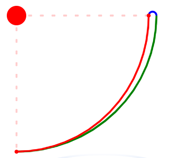
彗星变换前的样子
<path xmlns="http://www.w3.org/2000/svg" d="M 0,70 A 68,70 0 0,0 68,0 2,2 0 0,1 72,0 72,70 0 0,1 0,70Z" fill="red"/>
彗星路径分解:
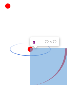
彗星中心点在0 0 处,头部中心点是70 0,左右各偏移2,粗为4:
<path d="M 68,0 A 2,2 0 0,1 72,0" stroke="blue"/>   0,1 小弧 顺时针
<path d="M 72,0 A 72,70 0 0,1 0,70" stroke="green"/>
<path d="M 0,70 A 68,70 0 0,0 68,0" stroke="red"/>  0,0 小弧   逆时针

<circle fill="red" cx="68" cy="0" r="1"/>
<path d="M 0,0 h 68 M 0,0 v 70" stroke="red" stroke-opacity="0.2" stroke-dasharray="2 4"/>
<circle fill="red" cx="0" cy="70" r="1"/>
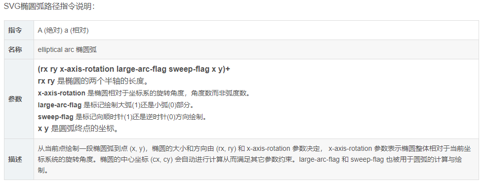
SVG路径(path)中的圆弧(A)指令的语法说明及计算逻辑:参考:https://blog.csdn.net/cuixiping/article/details/79663611
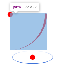
移动彗星顶点位置到圆弧心中点处:
<g xmlns="http://www.w3.org/2000/svg" transform="translate(43.9714, 84.0021)">
<path d="M 0,70 A 68,70 0 0,0 68,0 2,2 0 0,1 72,0 72,70 0 0,1 0,70Z" fill="red">
</path>
</g>
彗星宽度高度按照圆弧的宽高等比缩放:
<g xmlns="http://www.w3.org/2000/svg" transform="translate(43.9714, 84.0021) scale(0.5642 0.1810)">
<path d="M 0,70 A 68,70 0 0,0 68,0 2,2 0 0,1 72,0 72,70 0 0,1 0,70Z" fill="red">
</path>
</g>

加上旋转动画,案例完成
<g xmlns="http://www.w3.org/2000/svg" transform="translate(43.9714, 84.0021) scale(0.5642 0.1810)">
<path d="M 0,70 A 68,70 0 0,0 68,0 2,2 0 0,1 72,0 72,70 0 0,1 0,70Z" fill="red">
  <animateTransform attributeName="transform" type="rotate" from="360 0 0" to="0 0 0" dur="3s" repeatCount="indefinite"/>
</path>
</g>
svg之transform,参见:https://blog.csdn.net/qq_39492374/article/details/89356931
translate
transform="translate(x-value, y-value)"
偏移。沿x轴方向偏移x-value个单位长度,沿y轴方向偏移y-value个单位长度。
scale
transform="scale(x-value, y-value)"
缩放。x轴方向上的长度变为原来的x-value倍,y轴方向上的长度变为原来的y-value倍。允许只有一个参数scale(n),表示x和y轴方向上的长度同时变为原来的n倍。
rotate
transform="rotate(angle,[centerX, centerY])"
旋转。默认以坐标系中(0,0)原点为圆心,顺时针旋转angle度。0度为水平从左向右方向。
skewX和shewY
transform="skewX(angle) skewY(angle)"
skewX和shewY可以使x轴和Y轴歪斜