一、效果如下:
二、直接上代码
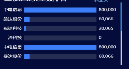
上一篇已经说过左侧分类,右侧数据对齐的方法,如果需要移步上篇,
此篇主要是纵向滚动条功能,代码如下:
dataZoom: [
      {
        type: "slider",
        realtime: true, // 拖动时,是否实时更新系列的视图
        startValue: 0,
        endValue: 5,
        width: 5,
        height: "90%",
        top: "5%",
        right: 0,
        // orient: 'vertical', // 设置横向还是纵向, 但是官方不太建议如此使用,建议使用 yAxisIndex 具体指明
        yAxisIndex: [0, 1], // 控制y轴滚动对象
        fillerColor: "#0093ff", // 滚动条颜色
        borderColor: "rgba(17, 100, 210, 0.12)",
        backgroundColor: "#cfcfcf", //两边未选中的滑动条区域的颜色
        handleSize: 0, // 两边手柄尺寸
        showDataShadow: false, //是否显示数据阴影 默认auto
        showDetail: false, // 拖拽时是否展示滚动条两侧的文字
        zoomLock: true,
        moveHandleStyle: {
          opacity: 0,
        },
      },
      {
        type: "inside",
        // width: 0,
        startValue: 0,
        endValue: 10,
        minValueSpan: 10,
        yAxisIndex: [0],
        zoomOnMouseWheel: false, // 关闭滚轮缩放
        moveOnMouseWheel: true, // 开启滚轮平移
        moveOnMouseMove: true, // 鼠标移动能触发数据窗口平移
      },
    ],
此段代码位置和grid、xAxis、legend、tooltip等同级