一、系统架构
1、B/S架构(Browser / Server)
- 浏览器 / 服务器的交互形式
- 优点:升级方便,只升级服务器端代码即可
- 缺点:速度慢、体验不好、界面不炫酷
- 代表:京东、天猫、百度。。。
2、C/S架构(Client / Server)
- 客户端 / 服务器端的交互形式
- 优点:速度快、体验好、界面炫酷
- 缺点:升级麻烦,维护成本较高
- 代表:QQ、微信、支付宝。。。
二、HTML 基础知识学习
HyperText Markup Language(超文本标记语言)
不是编程语言
告诉浏览器如何构造网页
1、HTML 是谁指定的
- W3C:世界万维网联盟,Word Wide Web,W3C指定了HTML规范,每个浏览器生产厂家都会遵守规范。
- HTLML规范目前最高的版本:HTML5.0
- W3C制定了很多协议:HTML、XML
2、HTML基本结构
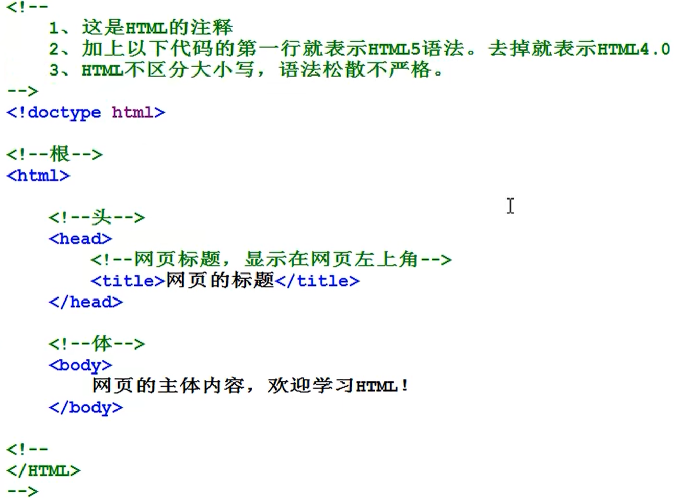
3、HTML基本标签
p标签:段落标签<h1-6>:标题字,<center><h1>居中</h1></center><br>:换行,独目标签<hr>:横线,独目标签<pre>:预留格式<del>:删除字<ins>:插入字<b>:粗体字<i>:斜体字<sub>:上角标<sup>:下角标<:小于号>:大于号 、&npsb:空格
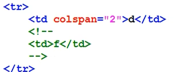
3.1 表格
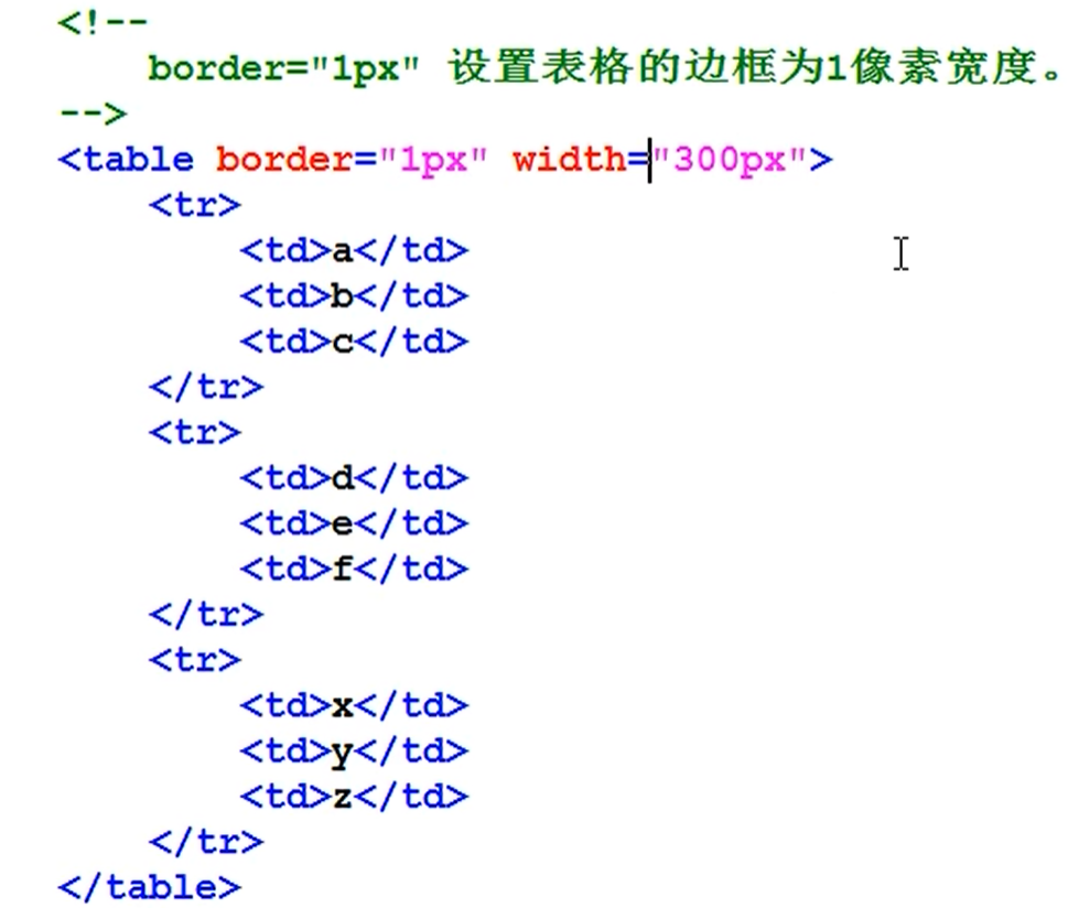
-
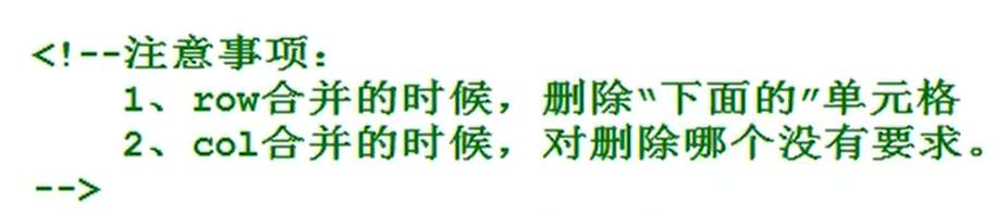
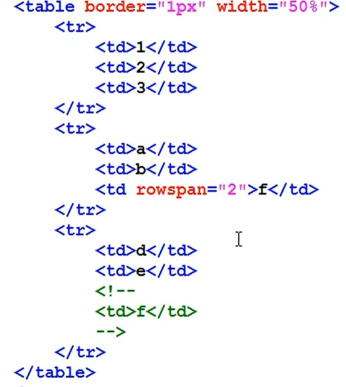
单元格合并
3.2 图片
- 在设置图片宽度和高度时,只设置宽度,高度会进行等比例缩放
- title设置鼠标悬停时显示的信息
- alt设置图片加载失败时显示的提示文字
3.3 表单
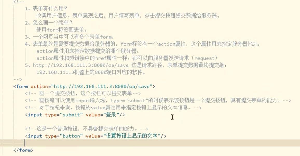
- form表单的name属性
- 需要提交给后台的才需要有name
- 不需要提交给后台的数据不需要加name
- form 表单的method属性
- get:提交的信息会在浏览器地址栏显示
- post:提交的信息不会显示在浏览器地址栏
- form 表单的value属性
- 提交用户输入的内容不需要加value
- 提交用户选择的内容(该内容不能是用户输入的,比如选择框、下拉列表)需要加value
- from 表单中单选按钮默认选择
- checked
- form 表单中下拉框的默认选择
- selected
- form 表单中的
<input type="hidden" name="userid" value="Mark"/>- 表示不需要用户看到,但需要提交给后台的数据
- 当
input的type为file时,form表单需要添加enctype="multipart/form-data - novalidate作用与form标签,表示提交信息时不做该表单的信息提交,即不提交给后台信息
autocomplete="on/off"表示是否自动提示历史记录
<form action="" method="post" enctype="multipart/form-data">
	<input type="file"/>
	<label for="">用户名</label>

	<!-- 表单提交校验与重置信息 -->
	<!--
	- autofocus 页面刷新,自动聚焦
	- required 在表单提交前做表单必填项验证
	- pattern="^\d{5}[imooc]$" 对表单信息做正则表达式验证,该验证方式为五位数字,加【imooc】中的任一字母
	-->
	<input type="text" name="userName" placeholder="请输入用户名" required autofocus/>
	<label for="">工号</label>
	<input type="text" name="userNum" placeholder="请输入工号" pattern="^\d{5}[imooc]$"/>
	<input type="submit"/>
	<input type="reset"/>
</form>
-
label中的for属性
<label for="man">男</label> <input type="radio" name="sex" id="man" required/> <label for="woman">女</label> <input type="radio" name="sex" id="woman" required/> -
下拉列表
<input type="text" list="tips"/>
<datalist id="tips">
	<option value="eval1"></option>
	<option value="eval2"></option>
	<option value="eval3"></option>
	<option value="eval4"></option>
</datalist>
4、HTML5表单约束验证API
- willValidate 属性,元素约束是否被符合,不符合返回false
- validity 属性,当前元素所属的验证状态 id.validity
- validationMessage 属性,描述元素失败的相关信息
- checkValidity()方法,如果元素没有满足它的任意约束,返回false,其他情况返回true
- setCustomValidity()方法,设置自定义的验证信息,用于即将实施与验证的约束来覆盖定义的信息,设置和预定义提示信息
<form action="" method="post"">
		<input type="number" id="number" oninput="checkLength(this,5)" step="0.01"/>
		<input type="email" id="email" value="aaa.com"/>
		<input type="submit"/>

	</form>
<script>
	function checkLength(obj,length){
		if(obj.value > length){
			obj.value = obj.value.substr(0,length)
		}
	}
	// 对type = email进行校验
	if(email.checkValidity()){
		console.log('是一个邮箱')
	}else{
		console.log('不是一个邮箱')
	}
</script>
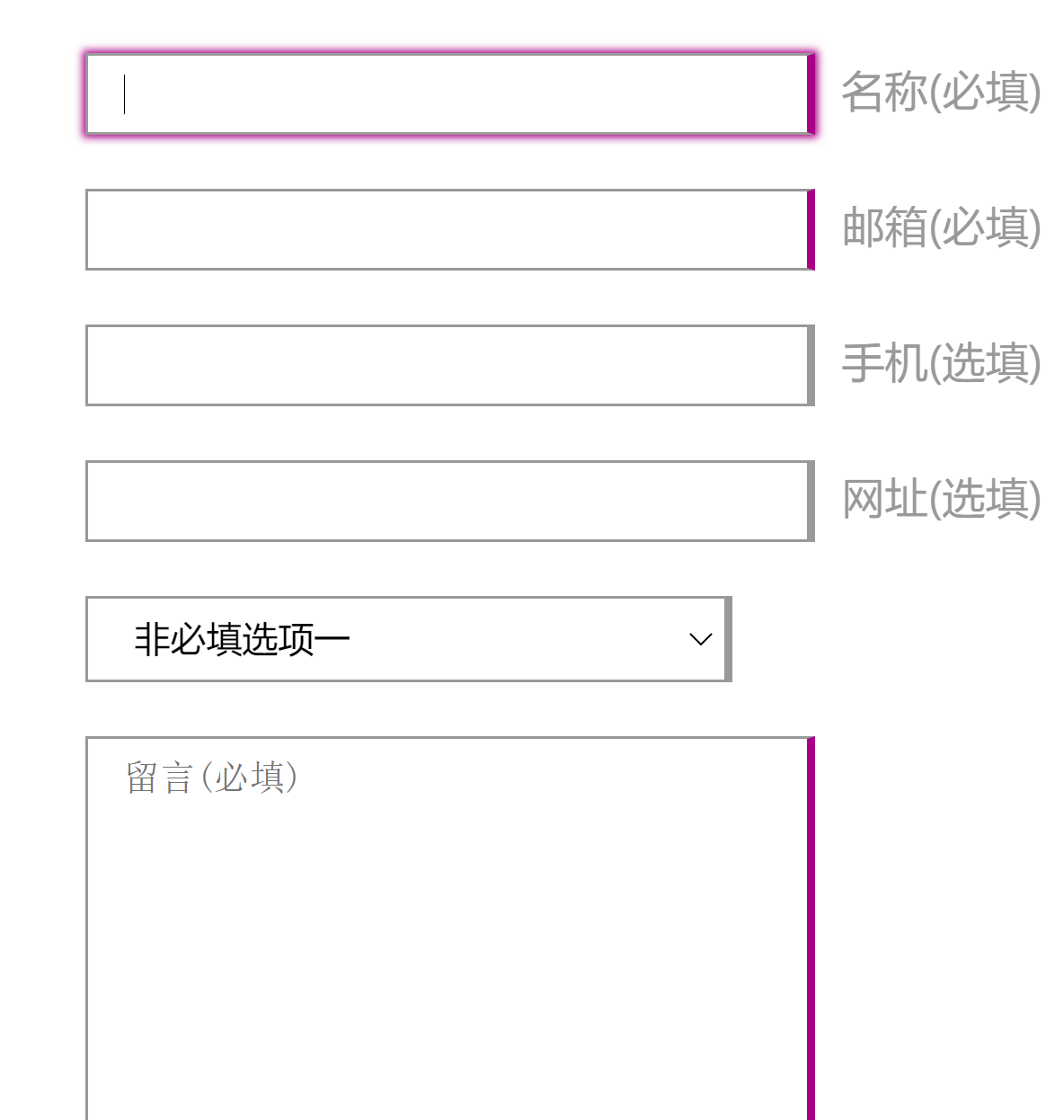
5、自带验证美化之伪类和选择器介绍
-
点击必填项和非必填项后出现不一样的边框样式
<!DOCTYPE html>
<html>
	<head>
		<meta charset="utf-8">
		<title>美化表单案例</title>
		<style>
			.container{
				max-width: 400px;
				margin: 20px auto;

			}
			input,
			select,
			textarea{
				width: 240px;
				margin: 10px 0;
				border: 1px solid #999;
				padding: .5em 1em;
			}
			label{
				color: #999;
				margin-left: 10px;
			}
			/* 必填项添加边框 */
			input:required,
			textarea:required{
				border-right:3px solid #a08;
			}
			/* 非必填项添加边框 */
			input:optional,
			select:optional{
				border-right: 3px solid #999;
			}
			/* 伪类选择器  + 的使用 */
			input:required + label::after{
				content: "(必填)";
			}
			input:optional + label::after{
				content: "(选填)";
			}
			/* 清除选中之后的边框效果 */
			/* outline鼠标移上去的效果 */
			input:focus,
			select:focus,
			textarea:focus{
				outline: 0;
			}
			/* 选中之后输入框的变化 */
			input:required:focus,
			textarea:required:focus{
				box-shadow: 0 0 3px 1px #a08;
			}
			input:optional:focus,
			select:optional:focus{
				box-shadow: 0 0 3px 1px #999;
			}
			input[type="submit"]{
				background-color: #cc00aa;
				border: 2px solid #a08;
				color: #fff;
			}
			input[type="submit"]:hover{
				background-color: #a08;
			}
		</style>
	</head>
	<body>
		<div class="container">
			<input type="name" required/><label>名称</label>
			<input type="email" required/><label>邮箱</label>
			<input type="tel" /><label>手机</label>
			<input type="url" /><label>网址</label>
			<select name="#">
				<option value="1">非必填选项一</option>
				<option value="2">非必填选项二</option>
				<option value="3">非必填选项三</option>
				<option value="4">非必填选项四</option>
			</select>
			<textarea name="#" cols="30" rows="10" placeholder="留言(必填)" required></textarea>
			<input type="submit" value="提交表单"/>
		</div>
	</body>
</html>
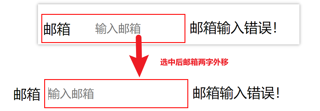
6、自带验证美化之伪类和选择器介绍
-
选中输入框后实现动态效果
<!DOCTYPE html>
<html>
	<head>
		<meta charset="utf-8">
		<title></title>
		<style>
			.container{
				margin: 100px;
				position: relative;
			}
			input{
				border: 1px solid #999;
				outline: 0;// 鼠标移上去的效果
				width: 140px;
				height: 30px;
				line-height: 30px;
				text-indent: 60px; // 文字缩进
				transition:all .3s;//动画
				border-radius:4px;
			}
			span.title{
				position: absolute;
				line-height: 30px;
				height: 30px;
				left: 2px;
				top: 2px;
				transition: all .3s;
			}
			input:focus,input:hover{
				text-indent:2px;
			}
			input:focus + span.title,
			input:hover + span.title{
				transform:translateX(-120%)
			}
			/* 添加校验 */
			input:valid~label::after{
				content: "邮箱输入正确!";
			}
			input:invalid~label::after{
				content: "邮箱输入错误!";
			}
			input:valid{
				border: 1px solid green;
			}
			input:invalid{
				border: 1px solid red;
			}
		</style>
	</head>
	<body>
		<div class="container">
			<input id="mail" type="email" required placeholder="输入邮箱"/>
			<span class="title"> 邮箱</span>
			<label for="mail"></label>

		</div>
	</body>
</html>
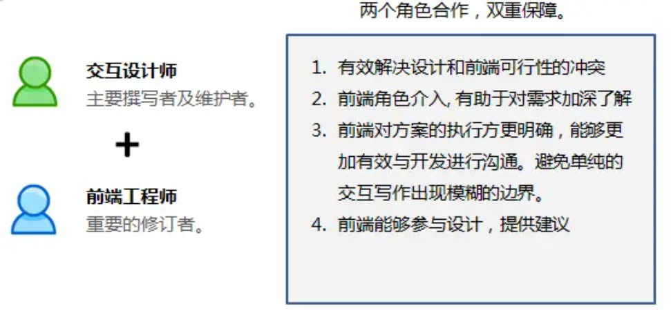
界面交互设计文档
- 解释:让交互设计师能够将界面承载不了的信息通过文档沉淀下来,降低项目里的沟通成本和风险。
三、HTML编写规则和语义化写法
1、使用工具
1.1、浏览器
- Google Chrome
- Mozilla Firefox
- Edge
- 强烈拒绝IE、360浏览器、遨游、QQ浏览器等作为开发浏览器
1.2、编辑器
- Visual Studio Code
- WebStorm
- Hbuilder
- SublimeText