简介
用Python做可视化展示是非常便捷的,现成的工具包有很多,不仅可以做成一个平面图,而且还可以交互展示。Matplotlib算是最老牌且使用范围最广的画图工具了。
常规绘图方法
import matplotlib.pyplot as plt
import numpy as mp
%matplotlib inline

# 一个简单的折线图
plt.plot([1,2,3,4,5],[1,4,9,16,25])
plt.xlabel('xlabel',fontsize = 16)
plt.ylabel('ylabel')
常用的线条类型
常用的颜色缩写
# 红色的虚点线 颜色和线条参数也可以写在一起 r--
plt.plot([1,2,3,4,5],[1,4,9,16,25],'-.',color='r')
plt.plot([1,2,3,4,5],[1,4,9,16,25],'r-.')
#fontsize 表示字体的大小
plt.xlabel('xlabel',fontsize = 16)
plt.ylabel('ylabel',fontsize = 16)
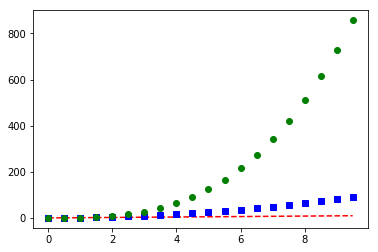
# 多次调用plot()函数来加入多次绘图的结果
tang_array = np.arange(0,10,0.5)
plt.plot(tang_array,tang_array,'r--') # red 红色虚线
plt.plot(tang_array,tang_array**2,'bs') # blue 蓝色正方点线
plt.plot(tang_array,tang_array**3,'go') # green 绿色圆点线
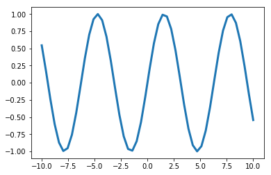
x = np.linspace(-10,10)
y = np.sin(x)# 设置线条宽度
plt.plot(x,y,linewidth = 3.0)
# 指定不同参数来绘图
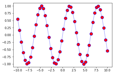
plt.plot(x,y,color='b',linestyle=':',marker = 'o',markerfacecolor='r',markersize = 10)
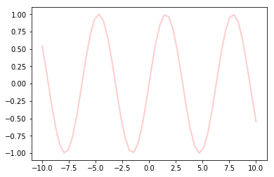
line = plt.plot(x,y)
#alpha 表示透明程度
plt.setp(line,color='r',linewidth = 2.0, alpha = 0.2)
绘图的方法和参数还有很多,通常只要整洁、清晰就可以,并不需要太多的修饰。
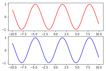
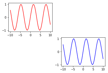
plt.subplot(211)
plt.plot(x,y,color='r')
plt.subplot(212)
plt.plot(x,y,color='b')
subplot(211) 表示要画的图整体是2行1列的,一共包括两幅子图,最后的1表示当前绘制顺序是第一幅子图。subplot(212)表示还是这个整体,只是在顺序上要画第2个位置上的子图。
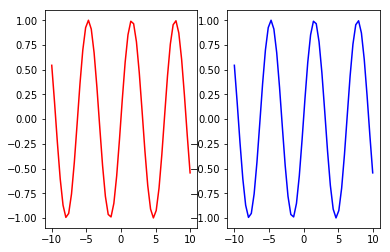
plt.subplot(121)
plt.plot(x,y,color='r')
plt.subplot(122)
plt.plot(x,y,color='b')
1行2列的两幅
plt.subplot(221)
plt.plot(x,y,color='r')
plt.subplot(224)
plt.plot(x,y,color='b')
2行2列,如果在当前子图位置没有执行绘图操作,该位置子图也会空出来
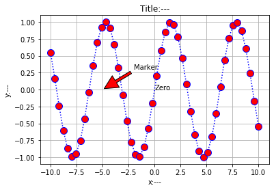
plt.plot(x,y,color='b',linestyle=':',marker = 'o',markerfacecolor='r',markersize = 10)
plt.xlabel('x:---')
plt.ylabel('y:---')
# 图题
plt.title('Title:---')
# 在指定位置添加注释
plt.text(0,0,'Zero')
# 显示网络
plt.grid(True)
# 添加箭头,需给定起始和终止位置以及箭头的各种属性
plt.annotate('Marker',xy=(-5,0),xytext=(-2,0.3),arrowprops = dict(facecolor='red',shrink=0.05,headlength= 20,headwidth = 20))
绘图完成之后,通常会在图上加一些解释说明,也就是标注
x = range(10)
y = range(10)
fig = plt.gca()
plt.plot(x,y)
fig.axes.get_xaxis().set_visible(False)
fig.axes.get_yaxis().set_visible(False)
上图中显示了网格,有时为了整体的美感和需求也可以把网格隐藏起来,通过plt.gca()来获得当前图表,然后改变其属性值
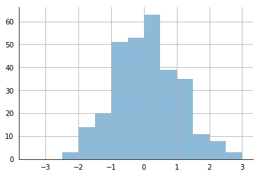
import math
# 随机创建一些数据
x = np.random.normal(loc = 0.0,scale=1.0,size=300)
width = 0.5
bins = np.arange(math.floor(x.min())-width,
                 math.ceil(x.max())+width,width)
ax = plt.subplot(111)
# 去掉上方和右方的坐标轴线
ax.spines['top'].set_visible(False)
ax.spines['right'].set_visible(False)
# 可以自己选择隐藏坐标轴上的锯齿线
plt.tick_params(bottom='off',top='off',left = 'off',right='off')
# 加入网络
plt.grid()
# 绘制直方图
plt.hist(x,alpha = 0.5,bins = bins)
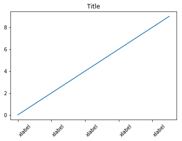
x = range(10)
y = range(10)
labels = ['xlabel' for i in range(10)]
fig,ax = plt.subplots()
plt.plot(x,y)
plt.title('Title')
ax.set_xticklabels(labels,rotation = 45,horizontalalignment='left')
在细节设置中,可以调节的参数太多,例如在x轴上,如果字符太多,横着写容易堆叠在一起了,这该怎么办呢?
x = np.arange(10)
for i in range(1,4):
    plt.plot(x,i*x**2,label = 'Group %d'%i)

plt.legend(loc='best')
指定颜色和类别的对应关系,loc='best'相当于让工具包自己找一个合适的位置来显示图表中颜色所对应的类别,可选值为
===============   =============
Location String   Location Code
===============   =============
'best'            0
'upper right'     1
'upper left'      2
'lower left'      3
'lower right'     4
'right'           5
'center left'     6
'center right'    7
'lower center'    8
'upper center'    9
'center'          10
===============   =============
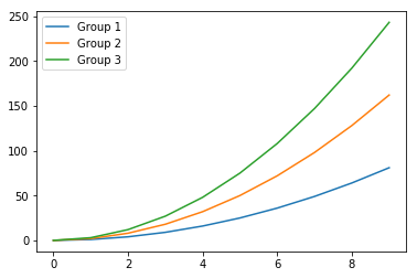
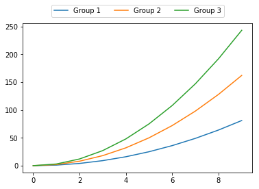
fig = plt.figure()
ax = plt.subplot(111)
x = np.arange(10)
for i in range(1,4):
    plt.plot(x,i*x**2,label = 'Group %d'%i)

ax.legend(loc='upper center',bbox_to_anchor = (0.5,1.15) ,ncol=3)
loc参数中还可以指定特殊位置
在Matplotlib中,绘制一个图表还是比较容易的,只需要传入数据即可,但是想把图表展示得完美就得慢慢调整了,其中能涉及的参数还是比较多的。最偷懒的方法就是寻找一个绘图的模板,然后把所需数据传入即可,在Matplotlib官网和Sklearn官网的实例中均有绘好的图表,这些都可以作为平时的积累。
plt.style.available # 查看可用的风格
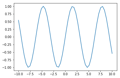
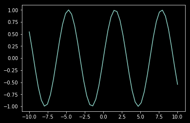
x = np.linspace(-10,10)
y = np.sin(x)
plt.plot(x,y)
默认风格
x = np.linspace(-10,10)
y = np.sin(x)
plt.style.use('dark_background')
# plt.style.use('default') # 返回默认格式
plt.plot(x,y)
改变当前风格
常用图表绘制
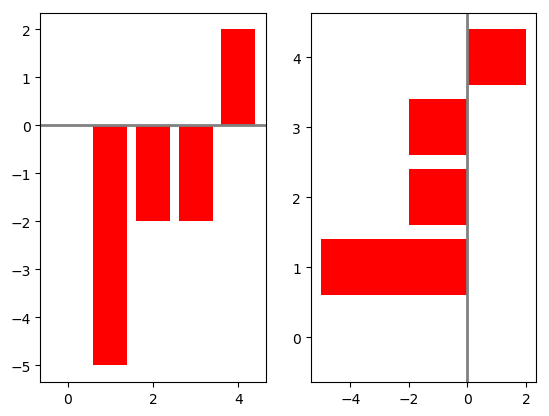
np.random.seed(0)
x = np.arange(5)
# 随机创建一些数据
y = np.random.randint(-5,5,5)
fig,axes = plt.subplots(ncols = 2)
# 正常的条形图
v_bars = axes[0].bar(x,y,color='red')
# 也可以横着来画
h_bars = axes[1].barh(x,y,color='red')
# 通过子图索引来分别设置各自细节
axes[0].axhline(0,color='grey',linewidth=2)
axes[1].axvline(0,color='grey',linewidth=2)
plt.show()
条形图
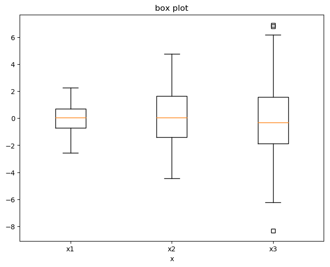
tang_data = [np.random.normal(0,std,100) for std in range(1,4)]
fig = plt.figure(figsize = (8,6))
plt.boxplot(tang_data,sym='s',vert=True)
plt.xticks([y+1 for y in range(len(tang_data))],['x1','x2','x3'])
plt.xlabel('x')
plt.title('box plot')
盒图(boxplot)主要由最小值(min)、下四分位数(Q1)、中位数(median)、上四分位数(Q3)、最大值(max) 五部分组成。
在每一个小盒图中,从下到上就分别对应之前说的5个组成部分,计算方法如下:
- IQR=Q3–Q1,即上四分位数与下四分位数之间的差;
- min=Q1–1.5×IQR,正常范围的下限;
- max=Q3+1.5×IQR,正常范围的上限。
其中的方块代表异常点或者离群点,离群点就是超出上限或下限的数据点,所以用盒图可以很方便地观察离群点的情况。
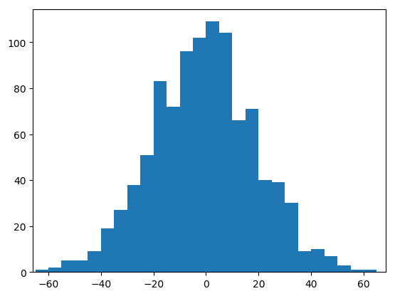
data = np.random.normal(0,20,1000)
bins = np.arange(-100,100,5)
plt.hist(data,bins=bins)
plt.xlim([min(data)-5,max(data)+5])
plt.show()
直方图(Histogram)可以更清晰地表示数据的分布情况
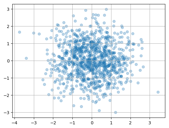
N = 1000
x = np.random.randn(N)
y = np.random.randn(N)
plt.scatter(x, y,alpha=0.3)
plt.grid(True)
plt.show()
通常还可以用散点图来表示特征之间的相关
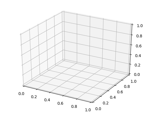
import matplotlib.pyplot as plt
# 需要额外导入绘制 3D 图的工具
from mpl_toolkits.mplot3d import Axes3D
fig = plt.figure()
# 需要绘制 3D 图
ax = fig.add_subplot(111,projection = '3d')
plt.show()
如果要展示三维数据情况,就需要用到3D图
总结
本文学习了可视化库Matplotlib的基本使用方法,绘制图表还是比较方便的,只需1行核心代码就够了,如果想画得更精致,就要用各种参数慢慢尝试。其实在进行绘图展示的时候很少有人自己从头去写,基本上都是拿一个差不多的模板,再把实际需要的数据传进去,推荐使用sklearn工具包的官方实例,里面有很多可视化展示结果,画得比较精致,而且都和机器学习相关,需要时直接取一个模板即可。