效果
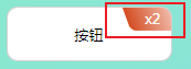
代码
<!DOCTYPE html>
<html lang="en">

<head>
    <meta charset="UTF-8">
    <meta name="viewport" content="width=device-width, initial-scale=1.0">
    <title>Document</title>
    <style>
        body,
        html {
            height: 100%;
            width: 100%;
        }

        body {
            display: flex;
            justify-content: center;
            align-items: center;
            background-image: linear-gradient(120deg, #84fab0 0%, #8fd3f4 100%);
        }
        .btn{
            width: 150px;
            height: 50px;
            line-height: 50px;
            border-radius: 10px;
            background: #ffffff;
            overflow: hidden;
            text-align: center;
            overflow: hidden;
            border:1px solid #746c6c4f ;
        }
        .button {
            width: 60%;
            height: 50%;
            position: relative;
            z-index: 1;
        }

        .button::before {
            content: '';
            position: absolute;
            overflow: hidden;
            width: 80px;
            height: 25px;
            top: -55px;
            right: -100px;
            background-image: linear-gradient(to right, #d44c22 0%, #eeb4a2 50%);
            transform: skew(20deg);
            border-radius:0 5px ;
        }
        span {
            position: relative;
            color: #ffffff;
            width: 80px;
            height: 25px;
            top: -65px;
            right: -85px;
        }
    </style>
</head>

<body>
    <button class="btn">
        按钮
        <div class="button"><span>x2</span></div>
    </div>

</body>

</html>