| Q | A |
|---|---|
| 这个项目属于哪个课程 | 2023数据采集与融合技术 |
| 组名、项目简介 | 组名:喵喵队、项目需求:设计出一个交互友好的多源异构数据的采集与融合的小应用 、项目目标:通过在网页中上传文本、图片、视频或音频分析其中的情感 、项目开展技术路线:前端3件套、Python、fastapi |
| 团队成员学号 | 102102143、102102140、102102141、102102152、102102117、102102114、102102121、102102132 |
| 这个项目目标 | 通过在网页中上传文本、图片、视频或音频分析其中的情感 |
项目整体介绍:
项目名称:多模态情感分析系统
项目背景:在当前的数字化时代,情感分析在各种应用中变得越来越重要,如客户服务、市场分析和社交媒体监控。多模态情感分析能够提供比单一模态更丰富、更准确的情感识别和分析。
项目目标:开发一个多模态情感分析系统,能够处理和分析文本、图片、音频和视频数据,从而提供综合的情感分析结果。
技术路线:
-
前端开发:
-
使用HTML、CSS和JavaScript进行界面设计,实现用户与系统的交互。
-
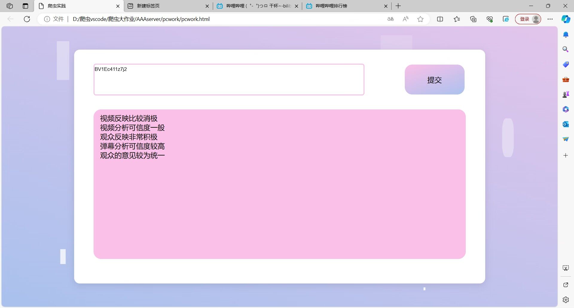
通过用户给出的bv号进行查询
-
-
后端开发:
-
使用Python进行后端逻辑的编写。
-
利用Flask搭建简易后端框架。
-
-
数据处理与分析:
-
文本分析:调用华为云NLP情感分析API。
-
视频分析
- 提取视频中的音频部分。
- 对提取的音频进行分析,使用同音频分析的方法。
-
音频分析
- 使用openai开源的whisper进行音频分析。
- 对上传的音频文件进行特征提取和情感识别。
-
-
结果输出与展示:将分析结果通过前端界面展示。
最终效果:
通过在本地上传文件进行分析并且得到结果
我的分工
- 用h5制作前端页面部分
- html:
<!DOCTYPE html>
<html lang="en">
<head>
    <meta charset="UTF-8">
    <meta name="viewport" content="width=device-width, initial-scale=1.0">
    <title>爬虫实践</title>
    <link rel="stylesheet" href="./pcwork.css">
    <script src="http://libs.baidu.com/jquery/2.0.0/jquery.min.js"></script>
    <script src="./pcwork.js"></script>
</head>
<body>
    <div class="container">
        <div class="container1">
            <div class="inputsbox"><input type="text" class="inputs" placeholder="在此输入bv号"></div>
            <div class="submitbox"><button class="submit" onclick="do_submit()">提交</button></div>
        </div>
        <div class="container2"><div class="outputs">111</div></div>
    </div>
    <div class="square">
        <ul>
            <li></li>
            <li></li>
            <li></li>
            <li></li>
            <li></li>
        </ul>
    </div>
    <div class="circle">
        <ul>
            <li></li>
            <li></li>
            <li></li>
            <li></li>
            <li></li>
        </ul>
    </div>
</body>
</html>
- css:
/* 公共区域 */
* {
    margin: 0;/* 外边距 */
    padding: 0;/* 内边距 */
}

input {
    outline: none;
    border: none;/* 边框 */
}

a {
    text-decoration: none;
}

img {
    vertical-align: middle;
    position: absolute;
    height: 100%;
    aspect-ratio: 1;
    left: 0%;
    top: 0%;
}

button {
    height: 100%;
    width: 100%;
    left: 0;
    top: 0;
}

body{
    height: 100vh;
    display: flex;
    justify-content: center;
    align-items: center;
    background: linear-gradient(200deg,#e3c5eb,#a9c1ed);
    overflow: hidden;
}

body{background-color: #000000;}

/* 界面 */
.container {
    position: relative;
    z-index: 1;
    background-color: #fff;
    border-radius: 15px;
    /* 弹性布局 垂直排列 */
    display: flex;
    flex-direction: column;
    align-items: center;
    height: 39.0625rem;
    width: 68.75rem;
    box-shadow: 0 5px 20px rgba(0,0,0,0.1);
}

.container1 {
    position: relative;
    border-radius: 15px;
    display: flex;
    flex-direction: row;
    align-items: center;
    height: 10rem;
    width: 68.75rem;
}

.inputsbox{
    height: 5rem;
    width: 45rem;
    outline: none;
    margin: 0px auto;
    outline-style:solid;
    border-radius: 0.25rem;
    outline-color:#fac0e7;
}

.submitbox{
    height: 5rem;
    width: 10rem;
    margin: 0px auto;
}


.inputs {
    height: 100%;
    width: 100%;
    font-size: 120%;
    border-bottom: 1px solid #ddd;
}

.submit {
    height: 100%;
    width: 100%;
    border: none;
    border-radius: 1.25rem;
    font-size: 120%;
    background: linear-gradient(-200deg,#fac0e7,#aac2ee);
    transition: 0.5s;
}
.container button:hover{
    background: linear-gradient(-200deg,#aac2ee,#fac0e7);
    background-position-x: -10rem;
}

.container2 {
    height: 25rem;
    width: 62.25rem;
    border-radius: 1.25rem;
    background-color: #fac0e7;
    overflow:auto;
}

.outputs {
    height: 23rem;
    width: 60rem;
    border-radius: 1.25rem;
    margin: 10px auto;
    font-size: 120%;
}

ul li{
    position: absolute;
    border: 1px solid #fff;
    background-color: #fff;
    width: 30px;
    height: 30px;
    list-style: none;
    opacity: 0;
}
.square li{
    top: 40vh;
    left: 60vw;
    animation: square 10s linear infinite;
}
.square li:nth-child(2){
    top: 80vh;
    left: 10vw;
    animation-delay: 2s;
}
.square li:nth-child(3){
    top: 80vh;
    left: 85vw;
    animation-delay: 4s;
}
.square li:nth-child(4){
    top: 10vh;
    left: 70vw;
    animation-delay: 6s;
}
.square li:nth-child(5){
    top: 10vh;
    left: 10vw;
    animation-delay: 8s;
}
.circle li{
    bottom: 0;
    left: 15vw;
    animation: circle 10s linear infinite;
}
.circle li:nth-child(2){
    left: 35vw;
    animation-delay: 2s;
}
.circle li:nth-child(3){
    left: 55vw;
    animation-delay: 6s;
}
.circle li:nth-child(4){
    left: 75vw;
    animation-delay: 4s;
}
.circle li:nth-child(5){
    left: 90vw;
    animation-delay: 8s;
}

/* 定义动画 */
@keyframes square {
    0%{
        transform: scale(0) rotateY(0deg);
        opacity: 1;
    }
    100%{
        transform: scale(5) rotateY(1000deg);
        opacity: 0;
    }
}
@keyframes circle {
    0%{
        transform: scale(0) rotateY(0deg);
        opacity: 1;
        bottom: 0;
        border-radius: 0;
    }
    100%{
        transform: scale(5) rotateY(1000deg);
        opacity: 0;
        bottom: 90vh;
        border-radius: 50%;
    }
}