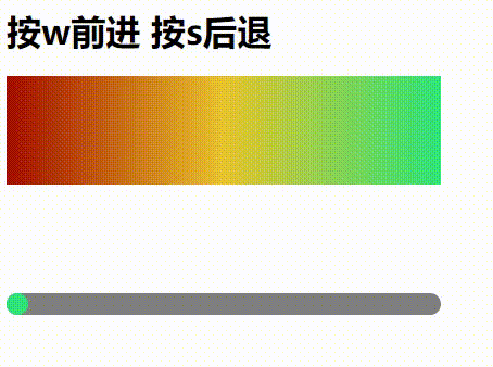
<h1>按w前进   按s后退</h1>

<?xml version="1.0" encoding="utf-8"?>
<svg xmlns="http://www.w3.org/2000/svg" width="400" height="400" viewBox="0 0 400 400">
<defs>
<linearGradient id="gradient" x1="-100%" x2="0%" y1="0" y2="0">
<stop offset="0%" stop-color="#a40c00"/>
<stop offset="50%" stop-color="#e9c42f"/>
<stop offset="100%" stop-color="#2fe37b"/>
</linearGradient>

<linearGradient id="gradient2" x1="0%" x2="100%" y1="0" y2="0">
<stop offset="0%" stop-color="#a40c00"/>
<stop offset="50%" stop-color="#e9c42f"/>
<stop offset="100%" stop-color="#2fe37b"/>
</linearGradient>

<clipPath id="rectClip">
<rect x="0" y="200" width="400" height="20" rx="10" ry="10" fill="none">
</rect>
</clipPath>

</defs>

<rect x="0" y="0" width="400" height="100" fill="url(#gradient2)">
</rect>

<rect x="0" y="200" width="400" height="20" rx="10" ry="10" fill="gray">
</rect>
<rect class="rect2" x="-380" y="200" width="400" height="20" rx="10" ry="10" style="clip-path: url(#rectClip)" fill="url(#gradient)">
</rect>

</svg>

<script type="text/javascript">
    const color1 = document.querySelector("linearGradient");
    const rect2 = document.querySelector(".rect2");

    let x2 = rect2.getAttribute('x');
    let y2 = rect2.getAttribute('y');

    let currLen = 0;

    document.onkeydown = function(event){
        if (event.key == 'w') {
            currLen = currLen + 3;
        } else if (event.key == 's') {
            currLen = currLen - 3;
        } else {
            return;
        }
        (currLen > 380) && (currLen = 380);
        (currLen < 0) && (currLen = 0);
        rect2.setAttribute('x', -380 + currLen);
        color1.setAttribute('x1', -100 + currLen / 4);
        color1.setAttribute('x2', 0 + currLen / 4);
    }

</script>
注意:渐变色的 x1 和 x2 不要加百分号
如果写成下面这样,就达不到预期的效果了
color1.setAttribute('x1', -100 + currLen / 4 + "%");
color1.setAttribute('x2', 0 + currLen / 4 + "%");
效果会变成下图这样,是一个完整的渐变色区间的移动
不加百分号其实是等于把渐变色的区间放大了一百倍,每次只取中间的10分之一