显示效果:
代码实现:
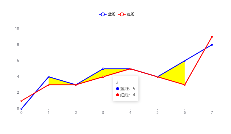
<!DOCTYPE html>
<html lang="en">
  <head>
    <meta charset="UTF-8" />
    <meta name="viewport" content="width=device-width, initial-scale=1.0" />
    <title>ECharts实现两条曲线数据比较,高出区域高亮显示</title>
    <link rel="stylesheet" href="./index.css" />
    <!-- 引入 ECharts.js 库 -->
    <script src="https://cdn.jsdelivr.net/npm/echarts@5.0.2/dist/echarts.min.js"></script>
    <!-- <script src="./echarts.min.js"></script> -->
  </head>
  <body>
    <!-- 用于显示图表的 DOM 元素 -->
    <div id="chart" style="width: 800px; height: 400px"></div>

    <script>
      /**
       * echarts diff值形成多变形
       * @param { type: array, desc: 数据高出的第一条线 } highLine
       * @param { type: array, desc: 数据低于的第二条线 } lowLine
       */
      const echartsPolygon = (highLine, lowLine) => {
        // 求出:第一条线高于第二条线的数据 {x:x轴坐标,high:高坐标,low:底点坐标}
        const xAxle = highLine.map((_, idx) => idx);
        const diffArea = [];
        for (let i = 0, len = xAxle.length; i < len; i++) {
          if (highLine[i] > lowLine[i]) {
            let prevNode = null;
            if (i === 0) {
              prevNode = null;
            } else {
              prevNode = {
                x: i - 1,
                high: highLine[i - 1],
                low: lowLine[i - 1],
              };
            }

            let nextNode = null;
            if (lowLine[i + 1] > highLine[i + 1]) {
              nextNode = null;
            } else {
              nextNode = {
                x: i + 1,
                high: highLine[i + 1],
                low: lowLine[i + 1],
              };
            }

            diffArea.push(
              prevNode,
              {
                x: i,
                high: highLine[i],
                low: lowLine[i],
              },
              nextNode
            );
          } else {
            diffArea.push(null);
          }
        }

        // 多边形分组,如果其中high等于low则为开始或结束位置,则需要分组
        let areasLen = -1;
        let areasList = [];
        for (let i = 0, len = diffArea.length; i < len; i++) {
          if (diffArea[i] === null) {
            areasLen += 1;
            areasList.push([]);
          } else {
            // 强化处理,避免低位数据比高位数据还添加到数组里
            if (diffArea[i].low > diffArea[i].high) {
              continue;
            }
            areasList[areasLen].push(diffArea[i]);
          }
        }
        // 过滤空数组
        areasList = areasList.filter((arr) => arr.length);

        // 点连线,线连面
        // 先获取高点的点,再获取低点的点,形成二维数组矩形
        let resultObj = {};
        for (let i = 0, iLen = areasList.length; i < iLen; i++) {
          resultObj[i] = [];
          const point = areasList[i];
          // 获取高点数据,顺序
          for (let j = 0, jLen = point.length; j < jLen; j++) {
            resultObj[i].push([point[j].x, point[j].high]);
          }
          // 获取低点数据,倒序
          for (let z = point.length - 1; z >= 0; z--) {
            resultObj[i].push([point[z].x, point[z].low]);
          }
        }

        return resultObj;
      };

      //------------------------------------------------------------ 业务代码 -------------------------------------------------------------------

      // 初始化 ECharts 实例
      var myChart = echarts.init(document.getElementById("chart"));

      // 蓝线比红线高时绘制区域阴影,其它不用
      const time_slot = [0, 1, 2, 3, 4, 5, 6, 7];
      const red_line = [1, 3, 3, 4, 5, 4, 3, 9];
      const blue_line = [0, 4, 3, 5, 5, 4, 6, 8];

      // 矩形数据
      const resultObj = echartsPolygon(blue_line, red_line);
      const customList = [];
      for (const key in resultObj) {
        const item = resultObj[key];
        customList.push({
          type: "custom",
          name: "黄色区域",
          data: item,
          renderItem: function (params, api) {
            if (params.context.rendered) {
              return;
            }
            params.context.rendered = true;

            let points = [];
            for (let i = 0; i < item.length; i++) {
              points.push(api.coord(item[i]));
            }
            return {
              type: "polygon",
              transition: ["shape"],
              tooltip: {
                formatter: {},
              },
              shape: {
                points: points,
              },
              style: api.style({
                fill: "yellow",
              }),
            };
          },
        });
      }

      const option = {
        animation: false,
        tooltip: {
          confine: true,
          trigger: "axis",
          formatter: (params) => {
            let time = "";
            time = time_slot[params[0].dataIndex];

            const h = params.reduce((prev, cur) => {
              if (cur.componentSubType === "custom") {
                return prev;
              }
              return `${prev}<div>${cur.marker}${cur.seriesName}:${cur.value}</div>`;
            }, "");
            return `<div>${time}</div>${h}`;
          },
        },
        yAxis: {
          type: "value",
        },
        xAxis: {
          type: "category",
          boundaryGap: false,
          data: time_slot,
        },
        legend: {
          data: [
            {
              name: "蓝线",
            },
            {
              name: "红线",
            },
            // {
            //   name: "黄色区域",
            // },
          ],
        },
        series: [
          {
            data: blue_line,
            type: "line",
            color: "blue",
            name: "蓝线",
          },
          {
            data: red_line,
            type: "line",
            color: "red",
            name: "红线",
          },
          ...customList,
        ],
      };

      // 使用配置项显示图表
      myChart.setOption(option);
    </script>
  </body>
</html>