<!DOCTYPE html>
<html lang="en">
<head>
<meta charset="UTF-8">
<meta http-equiv="X-UA-Compatible" content="IE=edge">
<meta name="viewport" content="width=device-width, initial-scale=1.0">
<title>荧光效果</title>
<style>
body{
background-color: black;
/* 背景 颜色 */
}
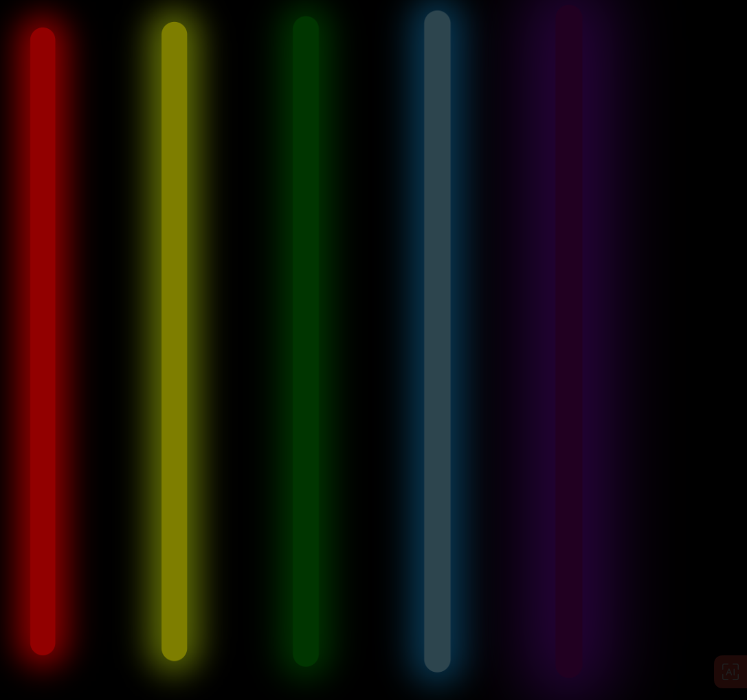
.box{
width: 900px;/* 宽度 */
height: 700px;/* 高度 */
/* background-color: green; */
/* 绿色 */
margin: 200px auto;
/* 居上200px 左右居中 */
}
.list{
float: left;
/* 同一行排列 */
margin: 50px;
/* 外边距 */
width: 20px;
height: 500px;
border-radius: 20px ;
/* 圆角 */
animation: run 2s infinite linear;
/* 实现动画 动画名 动画时间 循环*/
}
.red{
background-color: red;
box-shadow: 0px 0 25px 10px red ;
/* X轴偏移量、Y轴偏移量、模糊半径、扩散半径和颜色。 */
animation-delay: 0.1s;/* 在过渡效果开始前等待 */
}
.yellow{
background-color: yellow;
box-shadow: 0px 0 25px 10px rgb(195, 223, 12) ;
animation-delay: 0.2s;/* 在过渡效果开始前等待 */
}
.green{
background-color: green;
box-shadow: 0 0 25px 10px green;
/* X轴偏移量、Y轴偏移量、模糊半径、扩散半径和颜色。 */
animation-delay: 0.3s;/* 在过渡效果开始前等待 */
}
.blue{
background-color: skyblue;
box-shadow: 0 0 25px 10px rgb(23, 170, 255);
/* X轴偏移量、Y轴偏移量、模糊半径、扩散半径和颜色。 */
animation-delay: 0.4s;/* 在过渡效果开始前等待 */
}
.purple{
background-color: purple;
box-shadow: 0 0 50px 20px rgb(166, 13, 255);
/* X轴偏移量、Y轴偏移量、模糊半径、扩散半径和颜色。 */
animation-delay: 0.5s;/* 在过渡效果开始前等待 */
}
@keyframes run { /*创建动画 动画名*/
0%{
opacity: 1;
/* 透明度 */
transform: translateX(0) scale(1);
/* 变形 移动x轴的值 伸缩 */
}
50% {
opacity: 0.2;
transform: translateX(200%) scale(1.2);
}
100% {
opacity: 1;
transform: translateX(400%) scale(1);
}
}
</style>
</head>
<body>
<div class="box"> <!-- 盒子标签 -->
<div class="list red"></div>
<div class="list yellow"></div>
<div class="list green"></div>
<div class="list blue"></div>
<div class="list purple"></div>
</div>
</body>
</html>