  <div class="w-lg-500px p-10">
    <!--begin::Form-->
    <VForm
      class="form w-100"
      id="kt_login_signin_form"
      @submit="onSubmitLogin"
      :validation-schema="login"
      :initial-values="{ email: 'admin@demo.com', password: 'demo' }"
    >
      <!--begin::Heading-->
      <div class="text-center mb-10">
        <!--begin::Title-->
        <h1 class="text-dark mb-3">{{ t("Login") }}</h1>
        <!--end::Title-->
      </div>
      <!--begin::Heading-->

      <div class="mb-10 bg-light-info p-8 rounded">
        <div class="text-info">{{ t("welcome") }}</div>
      </div>

      <!--begin::Input group-->
      <div class="fv-row mb-10">
        <!--begin::Label-->
        <label class="form-label fs-6 fw-bold text-dark">Email</label>
        <!--end::Label-->

        <!--begin::Input-->
        <Field
          tabindex="1"
          class="form-control form-control-lg form-control-solid"
          type="text"
          name="email"
          autocomplete="off"
        />
        <!--end::Input-->
        <div class="fv-plugins-message-container">
          <div class="fv-help-block">
            <ErrorMessage name="email" />
          </div>
        </div>
      </div>
      <!--end::Input group-->

      <!--begin::Input group-->
      <div class="fv-row mb-10">
        <!--begin::Wrapper-->
        <div class="d-flex flex-stack mb-2">
          <!--begin::Label-->
          <label class="form-label fw-bold text-dark fs-6 mb-0">Password</label>
          <!--end::Label-->

          <!--begin::Link-->
          <router-link to="/password-reset" class="link-primary fs-6 fw-bold">
            Forgot Password ?
          </router-link>
          <!--end::Link-->
        </div>
        <!--end::Wrapper-->

        <!--begin::Input-->
        <Field
          tabindex="2"
          class="form-control form-control-lg form-control-solid"
          type="password"
          name="password"
          autocomplete="off"
        />
        <!--end::Input-->
        <div class="fv-plugins-message-container">
          <div class="fv-help-block">
            <ErrorMessage name="password" />
          </div>
        </div>
      </div>
      <!--end::Input group-->

      <!--begin::Actions-->
      <div class="text-center">
        <!--begin::Submit button-->
        <button
          tabindex="3"
          type="submit"
          ref="submitButton"
          id="kt_sign_in_submit"
          class="btn btn-lg btn-primary w-100 mb-5"
        >
          <span class="indicator-label"> Continue </span>

          <span class="indicator-progress">
            Please wait...
            <span
              class="spinner-border spinner-border-sm align-middle ms-2"
            ></span>
          </span>
        </button>
        <!--end::Submit button-->
      </div>
      <!--end::Actions-->
    </VForm>
    <!--end::Form-->
  </div>
  <!--begin::Authentication Layout -->
  <div class="d-flex flex-column flex-lg-row flex-column-fluid">
    <!--begin::Body-->
    <div
      class="d-flex flex-column flex-lg-row-fluid w-lg-50 p-10 order-2 order-lg-1"
    >
      <!--begin::Form-->
      <div class="d-flex flex-center flex-column flex-lg-row-fluid">
        <!--begin::Wrapper-->
        <div class="w-lg-500px p-10">
          <router-view></router-view>
        </div>
        <!--end::Wrapper-->
      </div>
      <!--end::Form-->
    </div>
    <!--end::Body-->
  </div>
css 背景色是中心往两侧渐变的半圆 先上下渐变 再中心像左右渐变
也就是 背景从顶部中中心顶点 颜色朝着四面八方渐变成白色
background: radial-gradient(circle at top center, rgb(252, 244, 208), white);
上边框的颜色是从中心往两侧渐变
.gradient-bg {
  background: radial-gradient(circle at top center, rgb(252, 249, 235), white);
  position: relative;
  height: 100%;
  border: 1px solid rgb(231, 233, 235);
  border-radius: 5%;
  margin-left: -10%;
  /* 上边框 */

  border-top: 1px solid rgb(231, 233, 235);
}

.gradient-bg::before {
  content: "";
  position: absolute;
  top: -1px;
  left: 0;
  right: 0;
  height: 1px;
  width: 90%;
  margin-left: 16px;
  /* 上边框渐变背景 */
  background: linear-gradient(
    to left,
    rgb(231, 233, 235),
    rgb(242, 192, 75),
    rgb(231, 233, 235)
  );
}
左边右边下边灰色外扩阴影
  border-top: 1px solid rgb(231, 233, 235);
  /* 左右阴影 */
  box-shadow: 36px 0 36px -12px rgba(0, 0, 0, 0.5),
    -36px 0 36px -12px rgba(0, 0, 0, 0.5);
  /* 底部阴影 */
  box-shadow: 0 36px 36px -12px rgba(0, 0, 0, 0.2);
css顶置单选框
.custom-checkbox {
  /* 隐藏原始复选框 */
  appearance: none;
  -webkit-appearance: none;
  -moz-appearance: none;
  outline: none;
  border: none;
  cursor: pointer;
  position: relative;
  width: 16px;
  height: 16px;
}

.custom-checkbox::before {
  /* 伪元素创建圆角效果 */
  content: "";
  display: block;
  position: absolute;
  top: 0;
  left: 0;
  width: 100%;
  height: 100%;
  border: 1px solid rgb(210, 213, 218);
  border-radius: 25%;
}

.custom-checkbox:checked::before {
  /* 选中时的样式 */
  background-color: rgb(242, 244, 247);
  content: "\2714"; /* 使用Unicode编码表示勾号 */
  font-size: 15px;
  text-align: center;
  line-height: 16px;
  color: #000000; /* 设置勾号颜色为黑色 */
}
 <div style="margin-top: 20px; margin-bottom: 20px">
        <div style="display: flex; align-items: center">
          <input type="checkbox" v-model="checked1" class="custom-checkbox" />
          <label
            for="custom-checkbox"
            class="form-label fw-bold text-dark fs-6 mb-0"
            style="margin-left: 10px"
            >Remember me</label
          >
        </div>
      </div>
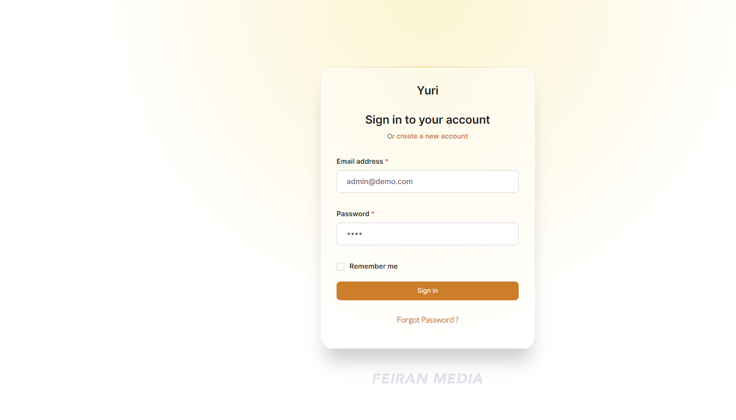
<template>
  <div class="w-lg-410px p-10 gradient-bg">
    <!--begin::Form-->

    <VForm
      class="form w-100"
      id="kt_login_signin_form"
      @submit="onSubmitLogin"
      :validation-schema="login"
      :initial-values="{ email: 'admin@demo.com', password: 'demo' }"
    >
      <!--begin::Heading-->
      <div class="text-center mb-10">
        <!--begin::Title-->
        <h1 class="text-dark mb-3">Yuri</h1>
        <!--end::Title-->
      </div>
      <!--begin::Heading-->

      <div style="text-align: center">
        <h1 class="text-dark mb-3">{{ t("welcome") }}</h1>
      </div>
      <!-- <div style="text-align: center">
        Or

        <router-link to="/sign-up" class="link-primary fs-6 fw-bold">
          <span style="color: rgb(208, 131, 59)">create a new account</span>
        </router-link>
      </div> -->

      <!--begin::Input group-->
      <div class="fv-row mb-10" style="margin-top: 60px">
        <!--begin::Label-->
        <label class="form-label fs-6 fw-bold text-dark required"
          >Email address</label
        >
        <!--end::Label-->

        <!--begin::Input-->
        <Field
          tabindex="1"
          class="form-control form-control-lg form-control-solid"
          type="text"
          name="email"
          autocomplete="off"
        />
        <!--end::Input-->
        <div class="fv-plugins-message-container">
          <div class="fv-help-block">
            <ErrorMessage name="email" />
          </div>
        </div>
      </div>
      <!--end::Input group-->

      <!--begin::Input group-->
      <div class="fv-row mb-10" style="margin-top: 17px">
        <!--begin::Wrapper-->
        <div class="d-flex flex-stack mb-2">
          <!--begin::Label-->
          <label class="form-label fw-bold text-dark fs-6 mb-0 required"
            >Password</label
          >
          <!--end::Label-->
        </div>
        <!--end::Wrapper-->

        <!--begin::Input-->
        <Field
          tabindex="2"
          class="form-control form-control-lg form-control-solid"
          type="password"
          name="password"
          autocomplete="off"
        />
        <!--end::Input-->
        <div class="fv-plugins-message-container">
          <div class="fv-help-block">
            <ErrorMessage name="password" />
          </div>
        </div>
      </div>
      <!--end::Input group-->

      <div style="margin-top: 20px; margin-bottom: 20px">
        <div style="display: flex; align-items: center">
          <input type="checkbox" v-model="checked1" class="custom-checkbox" />
          <label
            for="custom-checkbox"
            class="form-label fw-bold text-dark fs-6 mb-0"
            style="margin-left: 10px"
            >Remember me</label
          >
        </div>
      </div>

      <!--begin::Actions-->
      <div class="text-center">
        <!--begin::Submit button-->
        <button
          tabindex="3"
          type="submit"
          ref="submitButton"
          id="kt_sign_in_submit"
          class="btn-lg w-100 mb-2 siginbutton"
          style="background-color: rgb(205, 126, 43)"
        >
          <span class="indicator-label" style="color: white"> Sign in </span>

          <span class="indicator-progress" style="color: white">
            Please wait...
            <span
              class="spinner-border spinner-border-sm align-middle ms-2"
            ></span>
          </span>
        </button>
        <!--end::Submit button-->
      </div>
      <!--end::Actions-->

      <!-- <div style="display: flex; justify-content: center; margin-top: 20px">

        <router-link to="/password-reset" class="link-primary fs-6 fw-bold">
          <span
            style="
              color: rgb(205, 125, 46);
              font-family: Lato, sans-serif;
              font-size: 16px;
            "
            >Forgot Password ?</span
          >
        </router-link>

      </div> -->
    </VForm>
    <!--end::Form-->
  </div>
  <div style="margin-top: 40px; text-align: center; margin-left: -20px">
    <span
      style="color: rgb(209, 212, 217); font-size: 30px; font-family: Gill Sans"
      >FEIRAN MEDIA</span
    >
  </div>
</template>

<script lang="ts">
import { getAssetPath } from "@/core/helpers/assets";
import { defineComponent, ref } from "vue";
import { ErrorMessage, Field, Form as VForm } from "vee-validate";
import { useAuthStore, type User } from "@/stores/auth";
import { useRouter } from "vue-router";
import Swal from "sweetalert2";
import * as Yup from "yup";
import { useI18n } from "vue-i18n";
export default defineComponent({
  name: "sign-in",
  components: {
    Field,
    VForm,
    ErrorMessage,
  },
  setup() {
    const store = useAuthStore();
    const router = useRouter();
    const { t } = useI18n();
    const submitButton = ref<HTMLButtonElement | null>(null);
    const checked1 = ref(false);
    //Create form validation object
    const login = Yup.object().shape({
      email: Yup.string().email().required().label("Email"),
      password: Yup.string().min(4).required().label("Password"),
    });

    //Form submit function
    const onSubmitLogin = async (values: any) => {
      values = values as User;
      // Clear existing errors
      store.logout();

      if (submitButton.value) {
        // eslint-disable-next-line
        submitButton.value!.disabled = true;
        // Activate indicator
        submitButton.value.setAttribute("data-kt-indicator", "on");
      }

      // Send login request
      await store.login(values);
      const error = Object.values(store.errors);

      if (error.length === 0) {
        Swal.fire({
          text: "You have successfully logged in!",
          icon: "success",
          buttonsStyling: false,
          confirmButtonText: "Ok, got it!",
          heightAuto: false,
          customClass: {
            confirmButton: "btn fw-semobold btn-light-primary",
          },
        }).then(() => {
          // Go to page after successfully login
          router.push({ name: "dashboard" });
        });
      } else {
        Swal.fire({
          text: error[0] as string,
          icon: "error",
          buttonsStyling: false,
          confirmButtonText: "Try again!",
          heightAuto: false,
          customClass: {
            confirmButton: "btn fw-semobold btn-light-danger",
          },
        }).then(() => {
          store.errors = {};
        });
      }

      //Deactivate indicator
      submitButton.value?.removeAttribute("data-kt-indicator");
      // eslint-disable-next-line
        submitButton.value!.disabled = false;
    };

    return {
      onSubmitLogin,
      login,
      submitButton,
      getAssetPath,
      t,
      checked1,
    };
  },
});
</script>
<style scoped>
@import url("https://fonts.googleapis.com/css2?family=Lato:wght@100;300&display=swap");

.gradient-bg {
  background: radial-gradient(circle at top center, rgb(254, 249, 231), white);
  position: relative;
  height: 90%;
  border: 1px solid rgb(231, 233, 235);
  border-radius: 5%;

  /* 上边框 */

  border-top: 1px solid rgb(231, 233, 235);
  /* 左右阴影 */
  box-shadow: 36px 0 36px -12px rgba(0, 0, 0, 0.5),
    -36px 0 36px -12px rgba(0, 0, 0, 0.5);
  /* 底部阴影 */
  box-shadow: 0 36px 36px -12px rgba(0, 0, 0, 0.2);
}

.gradient-bg::before {
  content: "";
  position: absolute;
  top: -1px;
  left: 0;
  right: 0;
  height: 1px;
  width: 90%;
  margin-left: 16px;
  /* 上边框渐变背景 */
  background: linear-gradient(
    to left,
    rgb(231, 233, 235),
    rgb(242, 192, 75),
    rgb(231, 233, 235)
  );
}
.custom-checkbox {
  /* 隐藏原始复选框 */
  appearance: none;
  -webkit-appearance: none;
  -moz-appearance: none;
  outline: none;
  border: none;
  cursor: pointer;
  position: relative;
  width: 16px;
  height: 16px;
}

.custom-checkbox::before {
  /* 伪元素创建圆角效果 */
  content: "";
  display: block;
  position: absolute;
  top: 0;
  left: 0;
  width: 100%;
  height: 100%;
  border: 1px solid rgb(210, 213, 218);
  border-radius: 25%;
}

.custom-checkbox:checked::before {
  /* 选中时的样式 */
  background-color: rgb(242, 244, 247);
  content: "\2714"; /* 使用Unicode编码表示勾号 */
  font-size: 15px;
  text-align: center;
  line-height: 16px;
  color: #000000; /* 设置勾号颜色为黑色 */
}
.siginbutton {
  height: 38px;
  border-radius: 8px;
  border: none;
}

.form-control.form-control-solid {
  background-color: rgb(233, 240, 253) !important;
  border: 1px solid rgb(231, 233, 235);
}
</style>