一、选题的背景
二、大数据分析设计方案
- 本数据集的数据内容与数据特征分析
数据内容主要包括员工的基本信息、工作经历、薪资福利、绩效评价、离职原因等。这些数据可以帮助我们了解员工的基本情况、工作表现和离职原因,从而分析出员工离职的主要原因。
数据特征方面,我们将主要考虑以下几个特征:
- 基本信息:如年龄、性别、学历、工作经验等。
- 工作表现:如绩效评价、晋升情况、工作满意度等。
- 离职原因:员工选择离职的主要原因,这是定性数据。
- 其他:如薪资福利、职业发展机会等,也可能对员工的离职意向产生影响。
- 数据分析的课程设计方案概述(包括实现思路与技术难点)
实现思路:
- 数据预处理:包括数据清洗、缺失值处理、异常值处理等,确保数据的准确性和一致性。
- 数据探索:利用描述性统计分析方法初步了解数据的分布和特征。
- 特征工程:根据分析目标,进行特征提取和特征选择,构建适合机器学习算法的特征集。
- 模型训练:选择合适的机器学习算法进行模型训练,如分类算法、聚类算法等。
- 结果评估与解释:对模型进行评估,并根据业务需求对结果进行解释和应用。
技术难点:
- 数据清洗和预处理:如何有效地处理缺失值和异常值,以及如何进行有效的数据转换和特征工程。
- 特征选择和提取:如何从大量特征中筛选出与员工离职最相关的特征,降低维度,提高分析效率。
- 模型选择与调优:如何选择最适合本问题的机器学习算法,并对其进行有效的调优,以提高模型的准确性和稳定性。
- 结果解释与应用:如何将分析结果以直观的方式呈现出来,并为企业提供有价值的建议和解决方案。
三、数据分析步骤
1.数据源
(1)Age:员工年龄(1表示已经离职,2表示未离职,这是目标预测值)
(2)Attrition:员工是否已经离职(Non-Travel表示不出差,Travel_Rarely表示不经常出差,Travel_Frequently表示经常出差)
(3)BusinessTravel:商务差旅频率(Sales表示销售部,Research & Development表示研发部,Human Resources表示人力资源部)
(4)Department:员工所在部门(Sales表示销售部,Research & Development表示研发部,Human Resources表示人力资源部)
(5)DistanceFromHome:公司跟家庭住址的距离,(从1到29,1表示最近,29表示最远)
(6)Education:员工的教育程度(从1到5,5表示教育程度最高)
(7)EducationField:员工所学习的专业领域(Life Sciences表示生命科学,Medical表示医疗,Marketing表示市场营销,Technical Degree表示技术学位,Human Resources表示人力资源,Other表示其他)
(8)EmployeeNumber:员工号码;
(9)EnvironmentSatisfaction:员工对于工作环境的满意程度(从1到4,1的满意程度最低,4的满意程度最高)
(10)Gender:员工性别(Male表示男性,Female表示女性);
(11)JobInvolvement:员工工作投入度(从1到4,1为投入度最低,4为投入度最高)
(12)JobLevel:职业级别(从1到5,1为最低级别,5为最高级别)
(13)JobRole:工作角色 (Sales Executive是销售主管,Research Scientist是科学研究员,Laboratory Technician实验室技术员,Manufacturing Director是制造总监,Healthcare Representative是医疗代表,Manager是经理,Sales Representative是销售代表,Research Director是研究总监,Human Resources是人力资源)
(14)JobSatisfaction:工作满意度(从1到4,1代表满意程度最低,4代表满意程度最高)
(15)MaritalStatus:员工婚姻状况(Single代表单身,Married代表已婚,Divorced代表离婚)
(16)MonthlyIncome:员工月收入(范围在1009到19999之间)
(17)NumCompaniesWorked:员工曾经工作过的公司数
(18)Over18:年龄是否超过18岁
(19)OverTime:是否加班(Yes表示加班,No表示不加班)
(20)PercentSalaryHike:工资提高的百分比
(21)PerformanceRating:绩效评估
(22)RelationshipSatisfaction:关系满意度(从1到4,1表示满意度最低,4表示满意度最高)
(23)StandardHours:标准工时
(24)StockOptionLevel:股票期权水平
(25)TotalWorkingYears:总工龄
(26)TrainingTimesLastYear:上一年的培训时长(从0到6,0表示没有培训,6表示培训时间最长)
(27)WorkLifeBalance:工作与生活平衡程度(从1到4,1表示平衡程度最低,4表示平衡程度最高)
(28)YearsAtCompany:在目前公司工作年数
(29)YearsInCurrentRole:在目前工作职责的工作年数
(30)YearsSinceLastPromotion:距离上次升职时长
(31)YearsWithCurrManager:跟目前的管理者共事年数
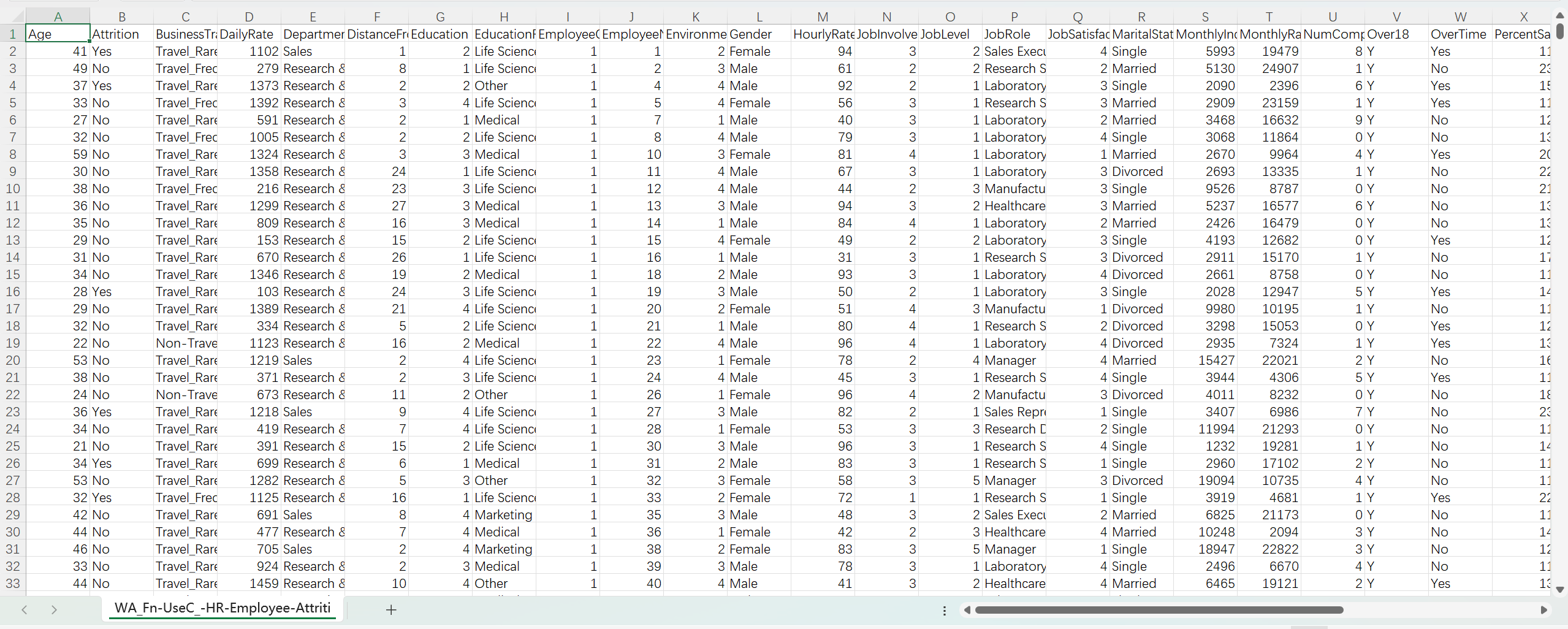
部分数据截图如下:
2.数据清洗
2.1导入库
导入一些Python库以及机器学习模型,如Pandas,Numpy等,这些库在数据处理过程中非常有用。
 1 # 导入相关库
 2 import pandas as pd
 3 import numpy as np
 4 import matplotlib.pyplot as plt
 5 import seaborn as sns
 6 import hvplot.pandas
 7 import plotly.express as px
 8 import warnings
 9 import plotly.graph_objects as go
10 import scipy
11 import plotly.io as pio
12 import plotly.figure_factory as ff
13 from scipy.stats import chi2_contingency
14 from plotly.subplots import make_subplots
15 from plotly.offline import init_notebook_mode
16 from statistics import stdev
17 from pprint import pprint
18 from sklearn.model_selection import train_test_split
19 from sklearn.preprocessing import RobustScaler, StandardScaler
20 from sklearn.model_selection import RandomizedSearchCV
21 from sklearn.ensemble import RandomForestClassifier
22 from sklearn.metrics import accuracy_score, roc_auc_score
23 warnings.filterwarnings("ignore")
24 pio.templates.default = "plotly_white"
2.2读取数据
读取要清洗的数据。
1 df = pd.read_csv("WA_Fn-UseC_-HR-Employee-Attrition.csv")
2 data = pd.read_csv("WA_Fn-UseC_-HR-Employee-Attrition.csv")
3 attrition_data = pd.read_csv("WA_Fn-UseC_-HR-Employee-Attrition.csv")
2.3查看数据集
1 df.head(5)
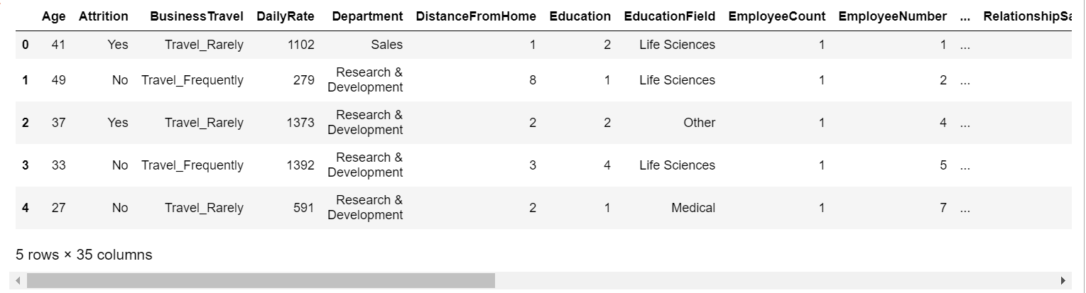
查看数据集前五行
2.2查看数据集是否异常
-
列和行:数据集中有多少列和行?
-
缺失数据:数据集中是否存在缺失值?
-
数据类型:在此数据集中使用的数据有哪些不同类型?
1 df.info()
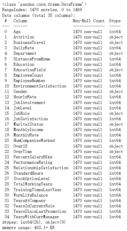
数据集由 1470 个观测值(行)和 35 个特征变量(列)组成,无缺失值,无异常值,无重复值。数据类型包括字符串和整数,明确区分了两者。这简化了我们的分析过程。
3.数据分析及可视化
3.1年龄分析
- 年轻员工和年长员工的流失率是否存在差异?
- 不同年龄组的流失模式是否存在基于性别的差异?
- 流失率与年龄的趋势如何?他们之间有关系吗?
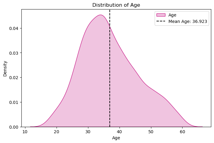
1 #绘制分布图
2 sns.displot(data['Age'], kde=True)
3 plt.title('Distribution of Age')
4 plt.show()
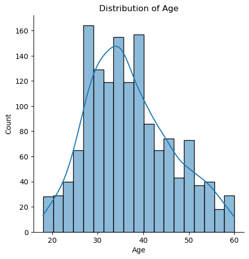
根据分布图,我们可以数据集年龄集中分布在 28-38岁。
1 #绘制线图
2 age_att=df.groupby(['Age','Attrition']).apply(lambda x:x['DailyRate'].count()).reset_index(name='Counts')
3 px.line(age_att,x='Age',y='Counts',color='Attrition',title='Age Overview')
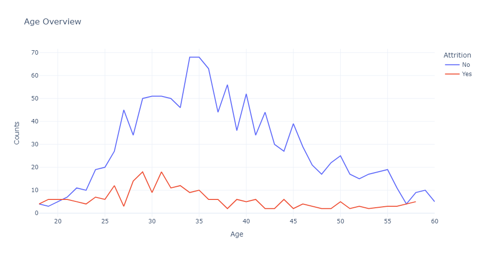
根据线图表示,离职率最高的年龄段是 28-32 岁,这表明随着年龄的增长,个人希望保持工作角色的稳定性。
相反,员工在较年轻的年龄(特别是 18 至 20 岁之间)离开组织的可能性也有所增加,因为他们正在探索不同的机会。
随着年龄的增长,离职率逐渐下降,直到21岁左右达到平衡点。35岁以后,离职率逐渐减少。
1 #年龄分布的核密度估计图
2 plt.figure(figsize=(8,5))
3 sns.kdeplot(x=df['Age'],color='MediumVioletRed',shade=True,label='Age')
4 plt.axvline(x=df['Age'].mean(),color='k',linestyle ="--",label='Mean Age: 36.923')
5 plt.legend()
6 plt.title('Distribution of Age')
7 plt.show()
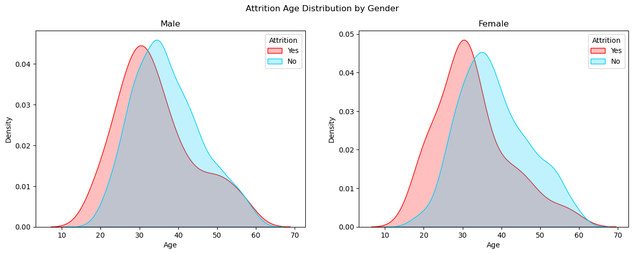
 1 #男性员工和女性员工的离职年龄分布图
 2 fig, axes = plt.subplots(1, 2, sharex=True, figsize=(15,5))
 3 fig.suptitle('Attrition Age Distribution by Gender')
 4 sns.kdeplot(ax=axes[0],x=df[(df['Gender']=='Male')&(df['Attrition']=='Yes')]['Age'], color='r', shade=True, label='Yes')
 5 sns.kdeplot(ax=axes[0],x=df[(df['Gender']=='Male')&(df['Attrition']=='No')]['Age'], color='#01CFFB', shade=True, label='No')
 6 axes[0].set_title('Male')
 7 axes[0].legend(title='Attrition')
 8 sns.kdeplot(ax=axes[1],x=df[(df['Gender']=='Female')&(df['Attrition']=='Yes')]['Age'], color='r', shade=True, label='Yes')
 9 sns.kdeplot(ax=axes[1],x=df[(df['Gender']=='Female')&(df['Attrition']=='No')]['Age'], color='#01CFFB', shade=True, label='No')
10 axes[1].set_title('Female')
11 axes[1].legend(title='Attrition')
12 plt.show()
3.2性别分析
- 男性员工和女性员工各有多少人?
- 女性和男性的流失率是否不同?
- 男性和女性组的工资中位数是多少?
- 在公司的总工作年限和性别之间有关系吗?
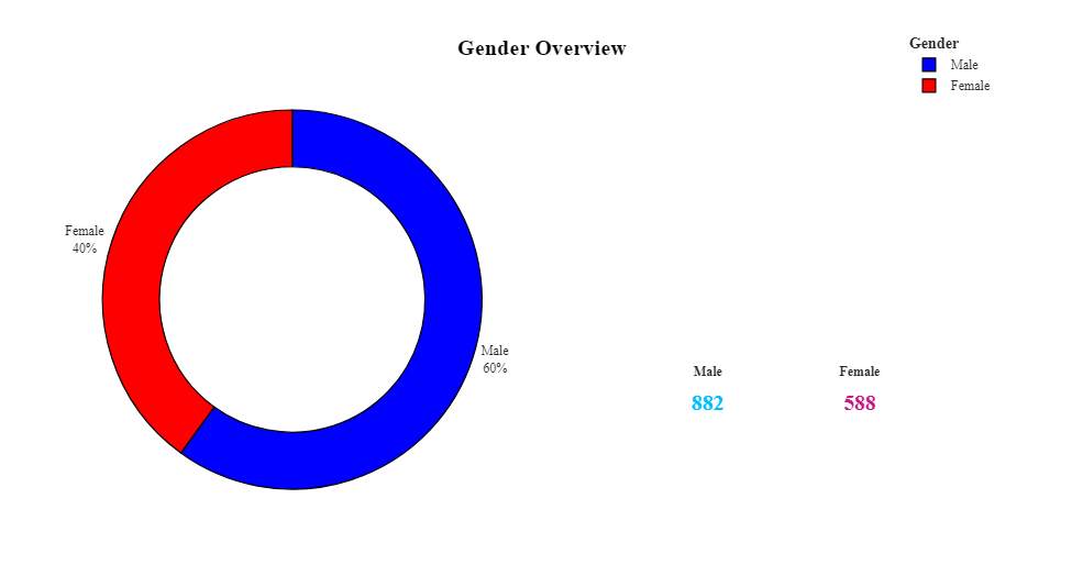
 1 #绘制饼图,显示男性和女性的数量
 2 att1=df.groupby(['Gender'],as_index=False)['Age'].count()
 3 att1.rename(columns={'Age':'Count'},inplace=True)
 4 fig = make_subplots(rows=1, cols=2, specs=[[{"type": "pie"},{"type": "pie"}]],subplot_titles=('',''))
 5 fig.add_trace(go.Pie(values=att1['Count'],labels=['Female','Male'],hole=0.7,marker_colors=['Red','Blue']),row=1,col=1)
 6 fig.add_layout_image(
 7     dict(
 8         source="https://encrypted-tbn0.gstatic.com/images?q=tbn:ANd9GcT8aOWxpkvZGU2EzQ0_USzl6PhuWLi_36xptjeWVXvSqQ2a13MNAjCWyBnhMlkr_ZbFACk&usqp=CAU",
 9         xref="paper",
10         yref="paper",
11         x=0.94, y=0.272,
12         sizex=0.35, sizey=1,
13         xanchor="right", yanchor="bottom", sizing= "contain",
14     )
15 )
16 fig.update_traces(textposition='outside', textinfo='percent+label')
17 fig.update_layout(title_x=0.5,template='simple_white',showlegend=True,legend_title_text="<b>Gender",title_text='<b style="color:black; font-size:120%;">Gender Overview',font_family="Times New Roman",title_font_family="Times New Roman")
18 fig.update_traces(marker=dict(line=dict(color='#000000', width=1.2)))
19 fig.update_layout(title_x=0.5,legend=dict(orientation='v',yanchor='bottom',y=1.02,xanchor='right',x=1))
20 fig.add_annotation(x=0.715,
21                    y=0.18,
22                    text='<b style="font-size:1.2vw" >Male</b><br><br><b style="color:DeepSkyBlue; font-size:2vw">882</b>',
23                    showarrow=False,
24                    xref="paper",
25                    yref="paper",
26                   )
27 fig.add_annotation(x=0.89,
28                    y=0.18,
29                    text='<b style="font-size:1.2vw" >Female</b><br><br><b style="color:MediumVioletRed; font-size:2vw">588</b>',
30                    showarrow=False,
31                    xref="paper",
32                    yref="paper",
33                   )
34 fig.show()
 1 #绘制饼图 第一个饼图显示所有员工的离职情况,第二个饼图显示女性员工的离职情况,第三个饼图显示男性员工的离职情况。
 2 att1=df.groupby('Attrition',as_index=False)['Age'].count()
 3 att1['Count']=att1['Age']
 4 att1.drop('Age',axis=1,inplace=True)
 5 att2=df.groupby(['Gender','Attrition'],as_index=False)['Age'].count()
 6 att2['Count']=att2['Age']
 7 att2.drop('Age',axis=1,inplace=True)
 8 fig=go.Figure()
 9 fig=make_subplots(rows=1,cols=3)
10 fig = make_subplots(rows=1, cols=3, specs=[[{"type": "pie"}, {"type": "pie"}, {"type": "pie"}]],subplot_titles=('<b>Employee Attrition', '<b>Female Attrition','<b>Male Attrition'))
11 fig.add_trace(go.Pie(values=att1['Count'],labels=att1['Attrition'],hole=0.7,marker_colors=['DeepSkyBlue','LightCoral'],name='Employee Attrition',showlegend=False),row=1,col=1)
12 fig.add_trace(go.Pie(values=att2[(att2['Gender']=='Female')]['Count'],labels=att2[(att2['Gender']=='Female')]['Attrition'],hole=0.7,marker_colors=['DeepSkyBlue','LightCoral'],name='Female Attrition',showlegend=False),row=1,col=2)
13 fig.add_trace(go.Pie(values=att2[(att2['Gender']=='Male')]['Count'],labels=att2[(att2['Gender']=='Male')]['Attrition'],hole=0.7,marker_colors=['DeepSkyBlue','LightCoral'],name='Male Attrition',showlegend=True),row=1,col=3)
14 fig.update_layout(title_x=0,template='simple_white',showlegend=True,legend_title_text="<b style=\"font-size:90%;\">Attrition",title_text='<b style="color:black; font-size:120%;"></b>',font_family="Times New Roman",title_font_family="Times New Roman")
15 fig.update_traces(marker=dict(line=dict(color='#000000', width=1)))
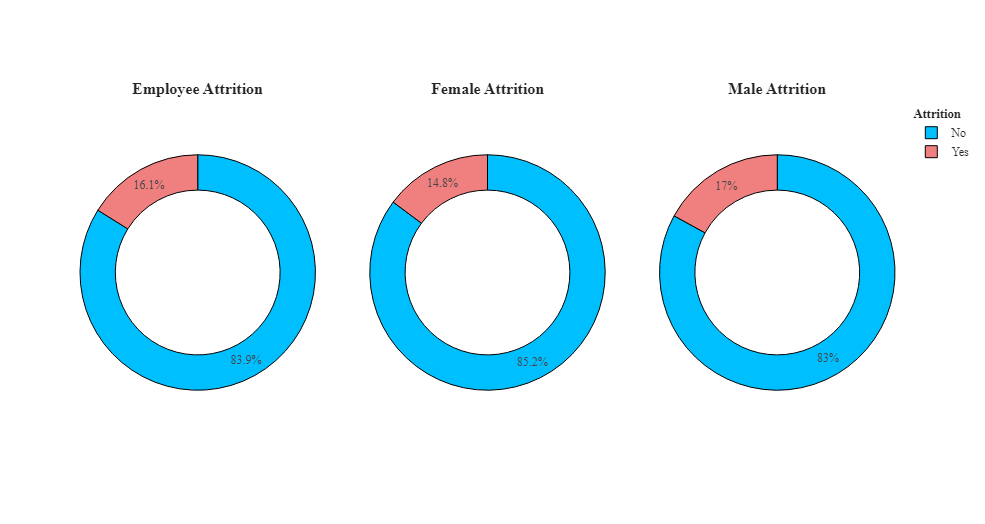
根据饼图可以看出,员工离职率为16%,男性员工的离职率为 17%,女性员工的离职率为 14.8%,男性员工的离职率最高。
1 #箱线图,用于展示员工离职率与月收入之间的关系,并按照性别进行分组
2 fig=px.box(df,x='Gender',y='MonthlyIncome',color='Attrition',template='simple_white',color_discrete_sequence=['LightCoral','DeepSkyBlue'])
3 fig=fig.update_xaxes(visible=True)
4 fig=fig.update_yaxes(visible=True)
5 fig=fig.update_layout(title_x=0.5,template='simple_white',showlegend=True,title_text='<b style="color:black; font-size:105%;">Employee Attrition based on Monthly Income</b>',font_family="Times New Roman",title_font_family="Times New Roman")
6 fig.show()
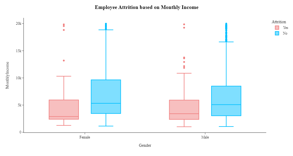
根据箱线图可以看出工资较低的员工离职率较高。
1 #创建箱线图,展示员工离职率(Attrition)与总工作年限(TotalWorkingYears)之间的关系,并按照性别(Gender)进行分组
2 fig=px.box(df,x='Gender',y='TotalWorkingYears',color='Attrition',template='simple_white',color_discrete_sequence=['LightCoral','DeepSkyBlue'])
3 fig=fig.update_xaxes(visible=True)
4 fig=fig.update_yaxes(visible=True)
5 fig=fig.update_layout(title_x=0.5,template='simple_white',showlegend=True,title_text='<b style="color:black; font-size:105%;">Employee Attrition based on Total working Years</b>',font_family="Times New Roman",title_font_family="Times New Roman")
6 fig.show()
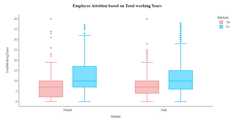
从上面的箱线图我们可以看出,女性往往在公司呆的时间更长。工龄19年的男女员工已离职。
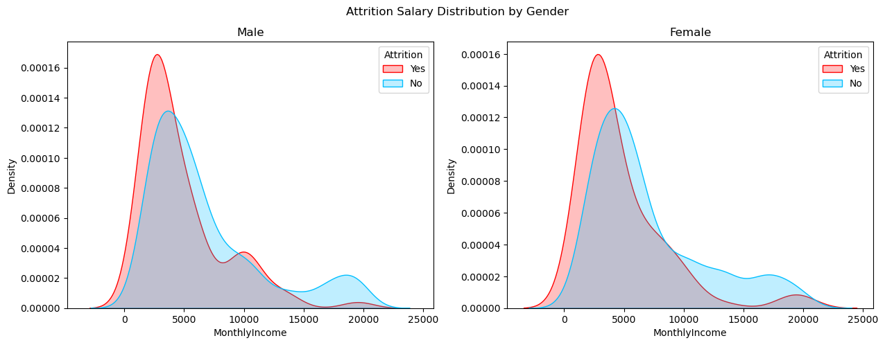
 1 #绘制核密度估计图,展示男性和女性员工的月收入分布,并按照是否已离职进行分组。
 2 fig, axes = plt.subplots(1, 2, sharex=True, figsize=(15,5))
 3 fig.suptitle('Attrition Salary Distribution by Gender')
 4 sns.kdeplot(ax=axes[0],x=df[(df['Gender']=='Male')&(df['Attrition']=='Yes')]['MonthlyIncome'], color='r', shade=True, label='Yes')
 5 sns.kdeplot(ax=axes[0],x=df[(df['Gender']=='Male')&(df['Attrition']=='No')]['MonthlyIncome'], color='#00BFFF', shade=True, label='No')
 6 axes[0].set_title('Male')
 7 axes[0].legend(title='Attrition')
 8 sns.kdeplot(ax=axes[1],x=df[(df['Gender']=='Female')&(df['Attrition']=='Yes')]['MonthlyIncome'], color='r', shade=True, label='Yes')
 9 sns.kdeplot(ax=axes[1],x=df[(df['Gender']=='Female')&(df['Attrition']=='No')]['MonthlyIncome'], color='#00BFFF', shade=True, label='No')
10 axes[1].set_title('Female')
11 axes[1].legend(title='Attrition')
12 plt.show()
男性和女性员工数量:该数据集有 882 名男性和 588 名女性,确定男性和女性员工的数量有助于了解劳动力的性别构成。
按性别划分的离职率:分析显示,男性和女性员工的离职率存在差异。男性员工的离职率较高,男性员工离职率为 17%,而女性员工的离职率略低,为 14.8%。这表明性别可能在员工离职中发挥作用。
按性别划分的工资中位数:检查男性和女性员工的工资中位数可以深入了解影响员工流失的任何潜在的与工资相关的因素。据观察,中位工资为2,886的女性员工已经离开公司,而中位工资为3,400的男性员工也出现了离职。这表明工资较低的员工更有可能离开组织。
总工作年限与性别之间的关系:箱线图分析表明在公司的总工作年限与性别之间存在潜在关系。与男性相比,女性在公司工作的时间往往更长。值得注意的是,工龄19年的男性和女性员工均已离开公司,这表明员工留任的潜在门槛或转折点。
3.3收入分析
收入是员工离职的主要因素吗?
1 #创建线图,展示一个组织内员工的月收入分布以及离职情况
2 rate_att=df.groupby(['MonthlyIncome','Attrition']).apply(lambda x:x['MonthlyIncome'].count()).reset_index(name='Counts')
3 rate_att['MonthlyIncome']=round(rate_att['MonthlyIncome'],-3)
4 rate_att=rate_att.groupby(['MonthlyIncome','Attrition']).apply(lambda x:x['MonthlyIncome'].count()).reset_index(name='Counts')
5 fig=px.line(rate_att,x='MonthlyIncome',y='Counts',color='Attrition',title='Monthly Income basis counts of People in an Organization')
6 fig.show()
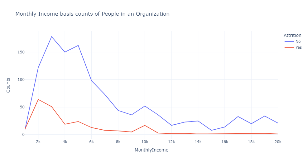
根据线图可以看出,在收入水平非常低(每月不到 5,000 人)的情况下,自然离职率显然很高。
这一数字进一步下降,但在 10k 左右出现了小幅峰值,表明中产阶级的生活水平。
他们倾向于追求更好的生活水平,因此转向不同的工作。
当月收入相当不错时,员工离开组织的可能性很低——如平线所示。
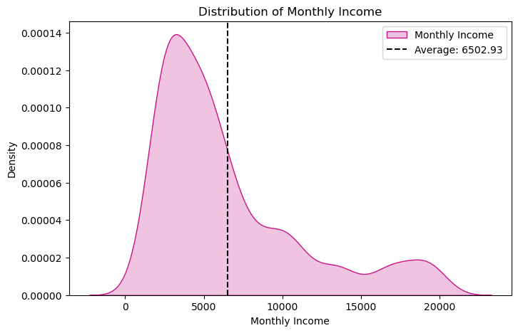
1 #绘制员工月收入分布的核密度估计图,添加月收入均值的垂直线
2 plt.figure(figsize=(8,5))
3 sns.kdeplot(x=df['MonthlyIncome'],color='MediumVioletRed',shade=True,label='Monthly Income')
4 plt.axvline(x=df['MonthlyIncome'].mean(),color='k',linestyle ="--",label='Average: 6502.93')
5 plt.xlabel('Monthly Income')
6 plt.legend()
7 plt.title('Distribution of Monthly Income')
8 plt.show()
 1 #创建条形图,显示不同部门、离职情况和性别之间的月收入中位数
 2 plot_df = data.groupby(['Department', 'Attrition', 'Gender'])['MonthlyIncome'].median()
 3 plot_df = plot_df.mul(12).rename('Salary').reset_index().sort_values('Salary', ascending=False).sort_values('Gender')
 4 fig = px.bar(plot_df, x='Department', y='Salary', color='Gender', text='Salary',
 5              barmode='group', opacity=0.75, color_discrete_map={'Female': '#ACBCE3','Male': '#ACBCA3'},
 6              facet_col='Attrition', category_orders={'Attrition': ['Yes', 'No']})
 7 fig.update_traces(texttemplate='$%{text:,.0f}', textposition='outside',
 8                   marker_line=dict(width=1, color='#28221F'))
 9 fig.update_yaxes(zeroline=True, zerolinewidth=1, zerolinecolor='#28221F')
10 fig.update_layout(title_text='Median Salaries by Department', font_color='#28221F',
11                   yaxis=dict(title='Salary',tickprefix='$',range=(0,79900)),width=950,height=500,
12                   paper_bgcolor='#F4F2F0', plot_bgcolor='#F4F2F1')
13 fig.show()
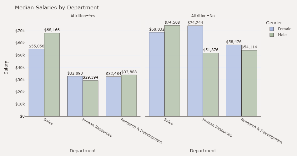
根据条形图,可以看出销售部门月收入较高,以及男性月收入高于女性,低收入部门离职率高。
1 #创建散点图,显示不同离职率下年龄与月收入之间的关系,查看线性回归趋势线。
2 fig = px.scatter(data, x="Age", y="MonthlyIncome", color="Attrition", trendline="ols")
3 fig.update_layout(title="Age vs. Monthly Income by Attrition")
4 fig.show()
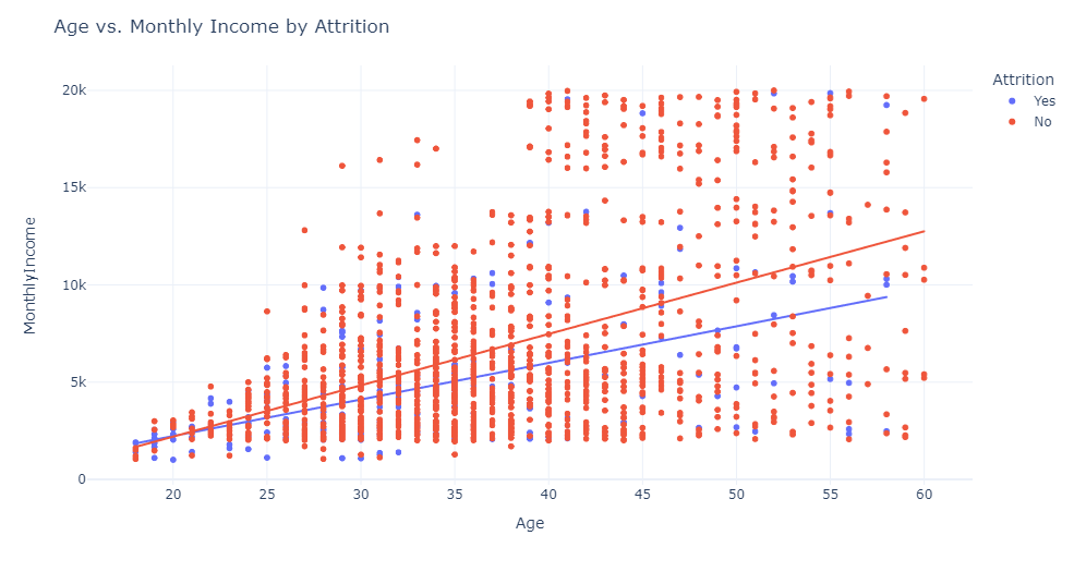
根据散点图可以看出,随着年龄的增长,每月收入增加。我们还可以看到,低月收入的员工离职率很高。
 1 #创建散点图,显示月收入与总工作年数以及职位级别的关系
 2 plot_df = data.copy()
 3 plot_df['JobLevel'] = pd.Categorical(
 4     plot_df['JobLevel']).rename_categories(
 5     ['Entry level', 'Mid level', 'Senior', 'Lead', 'Executive'])
 6 col=['#73AF8E', '#4F909B', '#707BAD', '#A89DB7','#C99193']
 7 fig = px.scatter(plot_df, x='TotalWorkingYears', y='MonthlyIncome',
 8                  color='JobLevel', size='MonthlyIncome',
 9                  color_discrete_sequence=col,
10                  category_orders={'JobLevel': ['Entry level', 'Mid level', 'Senior', 'Lead', 'Executive']})
11 fig =fig.update_layout(legend=dict(orientation="h", yanchor="bottom", y=1.02, xanchor="right", x=1),
12                   title='Correlation between Monthly income and total number of years worked and job level <br>',
13                   xaxis_title='Total Working Years', yaxis=dict(title='Income',tickprefix='$'),
14                   legend_title='', font_color='#28221D',
15                   margin=dict(l=40, r=30, b=80, t=120),paper_bgcolor='#F4F2F0', plot_bgcolor='#F4F2F0')
16 fig.show()
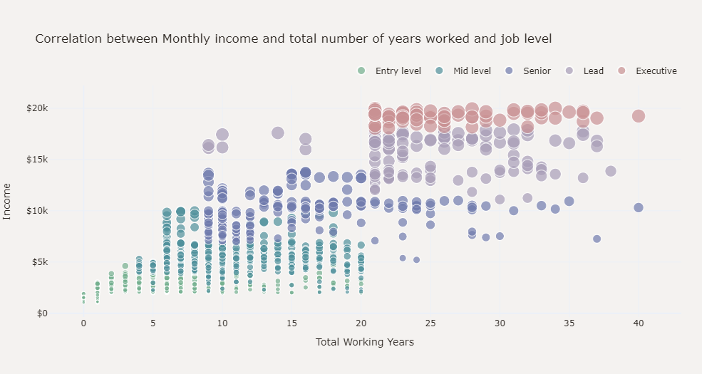
根据散点图可以看出,月收入与总工作年限呈正相关,并且与工作级别之间存在很强的相关性。
3.4部门分析
工作部门会影响人员离职吗?
1 #创建条形图,显示不同部门人员离职率的统计
2 dept_att=df.groupby(['Department','Attrition']).apply(lambda x:x['DailyRate'].count()).reset_index(name='Counts')
3 fig=px.bar(dept_att,x='Department',y='Counts',color='Attrition',title='Department wise Counts of People in an Organization')
4 fig.show()
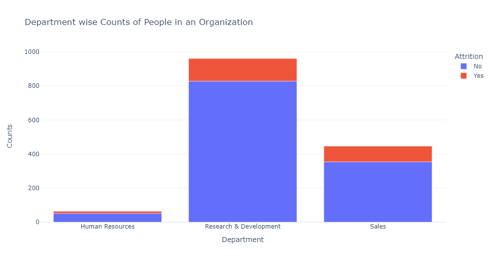
根据条形图可以看出,研究与开发部门的离职率最低,得到该部门的稳定性和内容。
 1 #创建饼图,显示不同部门员工的离职情况。
 2 k=df.groupby(['Department','Attrition'],as_index=False)['Age'].count()
 3 k.rename(columns={'Age':'Count'},inplace=True)
 4 fig=go.Figure()
 5 fig=make_subplots(rows=1,cols=3)
 6 fig = make_subplots(rows=1, cols=3, specs=[[{"type": "pie"}, {"type": "pie"}, {"type": "pie"}]],subplot_titles=('Human Resources', 'Research & Development','Sales'))
 7 fig =fig.add_trace(go.Pie(values=k[k['Department']=='Human Resources']['Count'],labels=k[k['Department']=='Human Resources']['Attrition'],hole=0.7,marker_colors=['DeepSkyBlue','LightCoral'],name='Human Resources',showlegend=False),row=1,col=1)
 8 fig =fig.add_trace(go.Pie(values=k[k['Department']=='Research & Development']['Count'],labels=k[k['Department']=='Research & Development']['Attrition'],hole=0.7,marker_colors=['DeepSkyBlue','LightCoral'],name='Research & Development',showlegend=False),row=1,col=2)
 9 fig =fig.add_trace(go.Pie(values=k[k['Department']=='Sales']['Count'],labels=k[k['Department']=='Sales']['Attrition'],hole=0.7,marker_colors=['DeepSkyBlue','LightCoral'],name='Sales',showlegend=True),row=1,col=3)
10 fig =fig.update_layout(title_x=0.5,template='simple_white',showlegend=True,legend_title_text="Attrition",title_text='<b style="color:black; font-size:100%;">Department wise Employee Attrition',font_family="Times New Roman",title_font_family="Times New Roman")
11 fig =fig.update_traces(marker=dict(line=dict(color='#000000', width=1)))
12 fig.show()
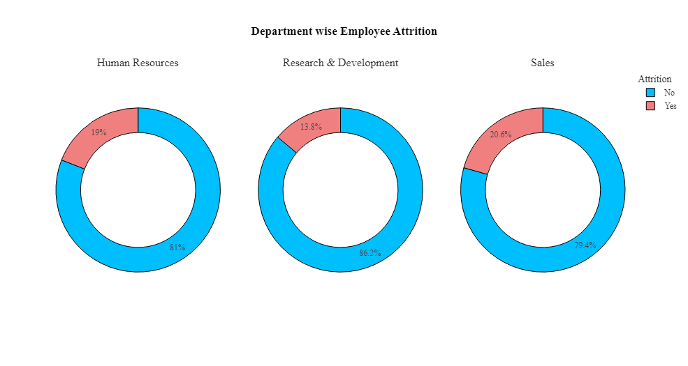
该数据仅包含3个主要部门,其中销售部门的离职率最高(25.84%),其次是人力资源部(19.05%)。
 1 #创建饼图,显示不同教育领域中员工的离职情况
 2 bus=df.groupby(['EducationField','Attrition'],as_index=False)['Age'].count()
 3 bus.rename(columns={'Age':'Count'},inplace=True)
 4 fig=go.Figure()
 5 fig = make_subplots(rows=2, cols=3, specs=[[{"type": "pie"}, {"type": "pie"}, {"type": "pie"}],[{"type": "pie"}, {"type": "pie"}, {"type": "pie"}]],subplot_titles=('Life Sciences', 'Medical','Marketing','Technical Degree','Human Resources','Other'))
 6 fig.add_trace(go.Pie(values=bus[bus['EducationField']=='Life Sciences']['Count'],labels=bus[bus['EducationField']=='Life Sciences']['Attrition'],hole=0.7,marker_colors=['DeepSkyBlue','LightCoral'],name='Life Sciences',showlegend=False),row=1,col=1)
 7 fig.add_trace(go.Pie(values=bus[bus['EducationField']=='Medical']['Count'],labels=bus[bus['EducationField']=='Medical']['Attrition'],hole=0.7,marker_colors=['DeepSkyBlue','LightCoral'],name='Medical',showlegend=False),row=1,col=2)
 8 fig.add_trace(go.Pie(values=bus[bus['EducationField']=='Marketing']['Count'],labels=bus[bus['EducationField']=='Marketing']['Attrition'],hole=0.7,marker_colors=['DeepSkyBlue','LightCoral'],name='Marketing',showlegend=True),row=1,col=3)
 9 fig.add_trace(go.Pie(values=bus[bus['EducationField']=='Technical Degree']['Count'],labels=bus[bus['EducationField']=='Technical Degree']['Attrition'],hole=0.7,marker_colors=['DeepSkyBlue','LightCoral'],name='Technical Degree',showlegend=False),row=2,col=1)
10 fig.add_trace(go.Pie(values=bus[bus['EducationField']=='Human Resources']['Count'],labels=bus[bus['EducationField']=='Human Resources']['Attrition'],hole=0.7,marker_colors=['DeepSkyBlue','LightCoral'],name='Human Resources',showlegend=False),row=2,col=2)
11 fig.add_trace(go.Pie(values=bus[bus['EducationField']=='Other']['Count'],labels=bus[bus['EducationField']=='Other']['Attrition'],hole=0.7,marker_colors=['DeepSkyBlue','LightCoral'],name='Other',showlegend=False),row=2,col=3)
12 fig.update_layout(title_x=0.5,template='simple_white',showlegend=True,legend_title_text="Attrition",title_text='<b style="color:black; font-size:100%;">Employee Attrition based on Education Feild',font_family="Times New Roman",title_font_family="Times New Roman")
13 fig.update_traces(marker=dict(line=dict(color='#000000', width=1)))
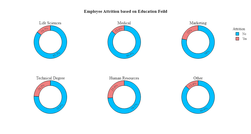
根据饼图可以看出,人力资源、营销和技术学位教育领域的员工离职率最高。医疗、生命科学领域教育的员工离职率较低。
 1 # 创建条形图,显示不同职位的员工离职情况
 2 k=df.groupby(['JobRole','Attrition'],as_index=False)['Age'].count()
 3 a=k[k['Attrition']=='Yes']
 4 b=k[k['Attrition']=='No']
 5 a['Age']=a['Age'].apply(lambda x: -x)
 6 k=pd.concat([a,b],ignore_index=True)
 7 k['Count']=k['Age']
 8 k.rename(columns={'JobRole':'Job Role'},inplace=True)
 9 fig=px.bar(k,x='Job Role',y='Count',color='Attrition',template='simple_white',text='Count',color_discrete_sequence=['LightCoral','DeepSkyBlue'])
10 fig=fig.update_yaxes(range=[-200,300])
11 fig=fig.update_traces(marker=dict(line=dict(color='#000000', width=1)),textposition = "outside")
12 fig=fig.update_xaxes(visible=True)
13 fig=fig.update_yaxes(visible=True)
14 fig=fig.update_layout(title_x=0.5,template='simple_white',showlegend=True,title_text='<b style="color:black; font-size:105%;">Employee Attrition based on Job Roles</b>',font_family="Times New Roman",title_font_family="Times New Roman")
15 fig.show()
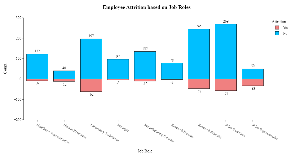
根据条形图可以看出,大多数员工的职位是销售主管、研究科学家和实验室技术员。离职率最高的员工职位是销售主管、销售代表、实验室技术员和研究科学家。员工流失最少的职位是研究总监、经理和医疗保健代表。
5.其他原因
5.1婚姻状况
婚姻状况是一个影响因素吗?
 1 #创建条形图显示不同婚姻状况的员工离职情况
 2 att1=df.groupby('Attrition',as_index=False)['Age'].count()
 3 att1['Count']=att1['Age']
 4 att1.drop('Age',axis=1,inplace=True)
 5 att2=df.groupby(['MaritalStatus','Attrition'],as_index=False)['Age'].count()
 6 att2['Count']=att2['Age']
 7 att2.drop('Age',axis=1,inplace=True)
 8 fig=go.Figure()
 9 fig=make_subplots(rows=1,cols=4)
10 fig = make_subplots(rows=1, cols=4, specs=[[{"type": "pie"}, {"type": "pie"}, {"type": "pie"},{"type": "pie"} ]],subplot_titles=('<b>Employee Attrition', '<b>Married Attrition','<b>Single Attrition','<b>Divorced Attrition'))
11 fig.add_trace(go.Pie(values=att1['Count'],labels=att1['Attrition'],hole=0.7,marker_colors=['DeepSkyBlue','LightCoral'],name='Employee Attrition',showlegend=False),row=1,col=1)
12 fig.add_trace(go.Pie(values=att2[(att2['MaritalStatus']=='Married')]['Count'],labels=att2[(att2['MaritalStatus']=='Married')]['Attrition'],hole=0.7,marker_colors=['DeepSkyBlue','LightCoral'],name='Married Attrition',showlegend=False),row=1,col=2)
13 fig.add_trace(go.Pie(values=att2[(att2['MaritalStatus']=='Single')]['Count'],labels=att2[(att2['MaritalStatus']=='Single')]['Attrition'],hole=0.7,marker_colors=['DeepSkyBlue','LightCoral'],name='Single Attrition',showlegend=True),row=1,col=3)
14 fig.add_trace(go.Pie(values=att2[(att2['MaritalStatus']=='Divorced')]['Count'],labels=att2[(att2['MaritalStatus']=='Divorced')]['Attrition'],hole=0.7,marker_colors=['DeepSkyBlue','LightCoral'],name='Divorced Attrition',showlegend=True),row=1,col=4)
15 fig.update_layout(title_x=0,template='simple_white',showlegend=True,legend_title_text="<b style=\"font-size:90%;\">Attrition",title_text='<b style="color:black; font-size:120%;"></b>',font_family="Times New Roman",title_font_family="Times New Roman")
16 fig.update_traces(marker=dict(line=dict(color='#000000', width=1)))
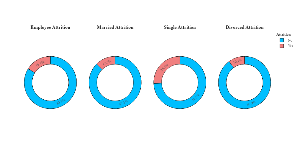
根据条形图可以看出,与已婚和离婚的人相比,单身人士的离职率更高。离婚者的离职率较低。
5.2工作经验
工作经验如何影响员工离职?
1 #绘制面积图,可以直观地看到不同工作经历和离职情况下的员工数量分布
2 ncwrd_att=df.groupby(['NumCompaniesWorked','Attrition']).apply(lambda x:x['DailyRate'].count()).reset_index(name='Counts')
3 fig = px.area(ncwrd_att,x='NumCompaniesWorked',y='Counts',color='Attrition',title='Work Experience Distribution: Analyzing the Level of Work Experience in an Organization')
4 fig.show()
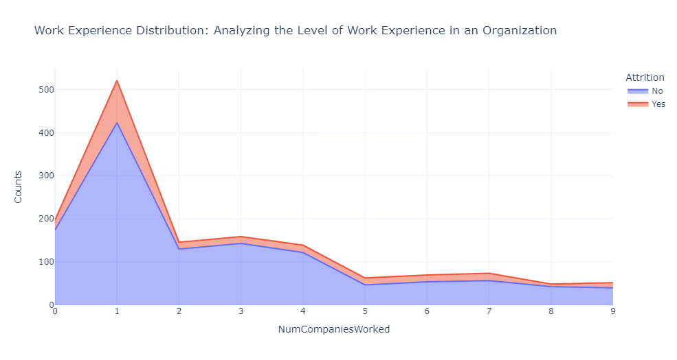
上图可以看出来,在公司开始职业生涯或在职业生涯早期加入的员工更有可能离开到另一个组织。
相反,在多家公司获得丰富工作经验的个人往往表现出更高的忠诚度,并且更有可能留在他们加入的公司。
5.3工作环境
环境满意度如何影响员工离职?
1 # 绘制面积图,显示不同工作满意度和离职情况下的员工数量分布
2 sats_att=df.groupby(['JobSatisfaction','Attrition']).apply(lambda x:x['DailyRate'].count()).reset_index(name='Counts')
3 fig = px.area(sats_att,x='JobSatisfaction',y='Counts',color='Attrition',title='Job Satisfaction level Counts of People in an Organization')
4 fig.show()
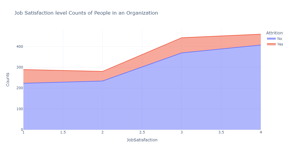
根据面积图可以看出,较高的工作满意度与较低的员工离职率相关。
此外,在环境满意度为 1-2 的范围内,人员离职会减少,但从 2-3 开始增加,表明个人可能会为了更好的机会而离开。
5.4加薪比例
加薪百分比会影响离职吗?
1 #绘制线条图,显示不同薪资涨幅和离职情况下的员工数量分布
2 hike_att=df.groupby(['PercentSalaryHike','Attrition']).apply(lambda x:x['DailyRate'].count()).reset_index(name='Counts')
3 px.line(hike_att,x='PercentSalaryHike',y='Counts',color='Attrition',title='Distribution of Hike Percentage')
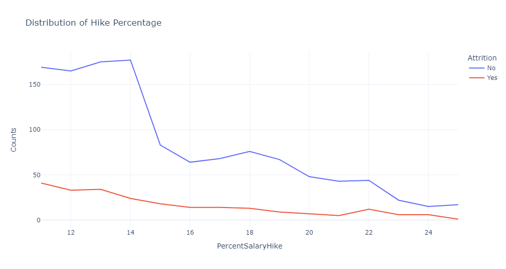
根据线条图可以看出,更高的加薪会激励人们更好地工作并留在组织中。
因此,我们看到员工离开加薪较低的组织的比例,远远高于加薪良好的公司。
4.建模预测
4.1特征选择和转换
准备机器学习模型来预测员工离职。该数据集具有许多具有分类值的特征。我将这些分类变量转换为数值,这样可以方便后续的数据处理和机器学习模型的训练。
 1 # 特征选择和转换
 2 from sklearn.preprocessing import LabelEncoder
 3 le = LabelEncoder()
 4 data['Attrition'] = le.fit_transform(data['Attrition'])
 5 data['BusinessTravel'] = le.fit_transform(data['BusinessTravel'])
 6 data['Department'] = le.fit_transform(data['Department'])
 7 data['EducationField'] = le.fit_transform(data['EducationField'])
 8 data['Gender'] = le.fit_transform(data['Gender'])
 9 data['JobRole'] = le.fit_transform(data['JobRole'])
10 data['MaritalStatus'] = le.fit_transform(data['MaritalStatus'])
11 data['Over18'] = le.fit_transform(data['Over18'])
12 data['OverTime'] = le.fit_transform(data['OverTime'])
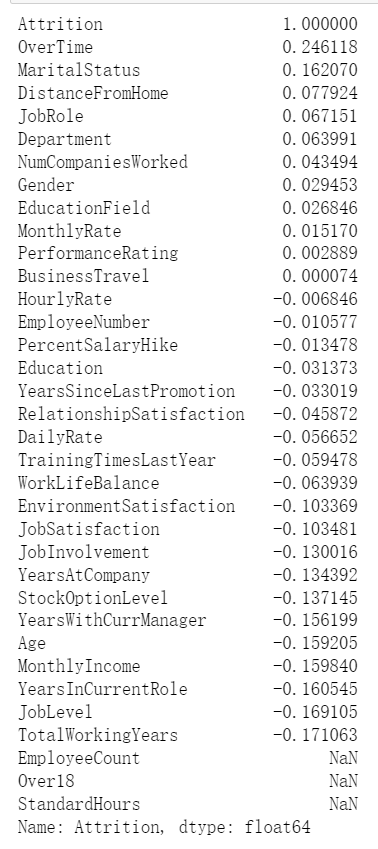
4.2查看相关性并可视化
1 #查看相关性并可视化
2 correlation = data.corr()
3 print(correlation["Attrition"].sort_values(ascending=False))
4.3划分训练集和测试集
1 #将数据分为训练集和测试集
2 from sklearn.model_selection import train_test_split
3 from sklearn.metrics import accuracy_score
4 # Split the data into training and testing sets
5 X = data.drop(['Attrition'], axis=1)
6 y = data['Attrition']
7 xtrain, xtest, ytrain, ytest = train_test_split(X, y, test_size=0.3, random_state=42)
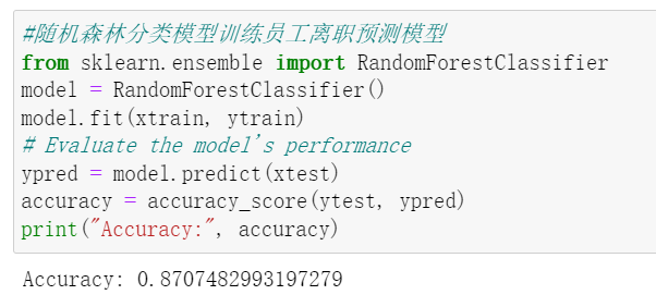
4.4选择模型
使用随机森林分类模型训练员工流失预测模型:
1 #随机森林分类模型训练员工离职预测模型
2 from sklearn.ensemble import RandomForestClassifier
3 model = RandomForestClassifier()
4 model.fit(xtrain, ytrain)
5 # Evaluate the model's performance
6 ypred = model.predict(xtest)
7 accuracy = accuracy_score(ytest, ypred)
8 print("Accuracy:", accuracy)
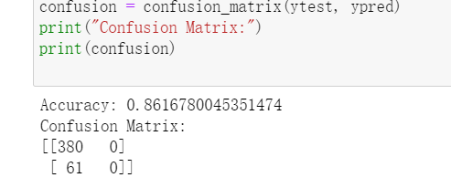
模型准确率:
使用逻辑回归模型训练员工流失预测模型:
1 #Logistic模型训练员工离职预测模型
2 from sklearn.linear_model import LogisticRegression
3 model = LogisticRegression()
4 model.fit(xtrain, ytrain)
5 # Evaluate the model's performance
6 ypred = model.predict(xtest)
7 accuracy = accuracy_score(ytest, ypred)
8 print("Accuracy:", accuracy)
模型准确率:
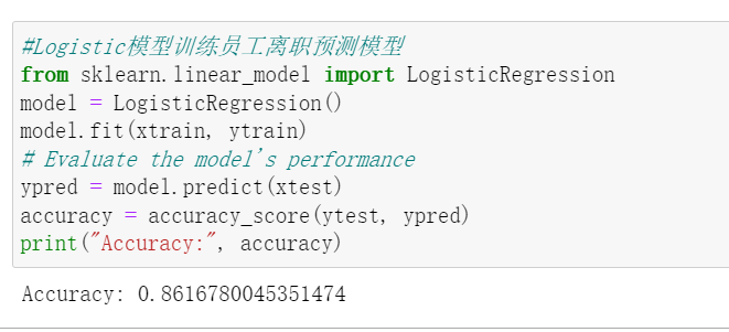
根据两个模型准确率,可以看出随机森林分类模型概率准确率略高,所以选择随机森林分类模型。
4.5评估模型
混淆矩阵:
1 #混淆矩阵
2 from sklearn.linear_model import LogisticRegression
3 from sklearn.metrics import accuracy_score, confusion_matrix, roc_curve, auc
4 confusion = confusion_matrix(ytest, ypred)
5 print("Confusion Matrix:")
6 print(confusion)
特征曲线(ROC曲线):
 1 # 绘制ROC曲线和AUC值
 2 yprob = model.predict_proba(xtest)[:, 1]
 3 fpr, tpr, thresholds = roc_curve(ytest, yprob)
 4 auc = auc(fpr, tpr)
 5 plt.figure(figsize=(10, 8))
 6 plt.plot(fpr, tpr, label='ROC curve (area = %0.2f)' % auc)
 7 plt.plot([0, 1], [0, 1], 'k--')  # diagonal line (random guess) as reference line for the AUC value plot
 8 plt.xlabel('False Positive Rate')
 9 plt.ylabel('True Positive Rate')
10 plt.title('Receiver Operating Characteristic (ROC)')
11 plt.legend(loc='lower right')
12 plt.show()
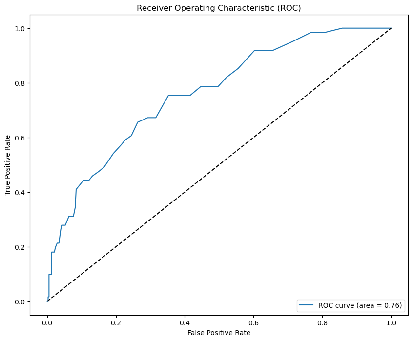
ROC曲线越靠近左上角,模型的准确性越高。
通过性能分析可以得出,机器学习预测模型成功地对87%的未知(验证集)样本进行了正确有效的分类,并对不同的性能指标给出了统计数据。
因此,通过这种方式,可以使用数据分析和机器学习建立员工离职预测模型。
四、总结
一、数据分析结论:
在本次课程设计中,通过对员工离职原因的数据分析和挖掘,得出了一些有益的结论。首先,确定了员工离职的主要原因,包括年龄、性别、收入水平、学历、工作部门、婚姻状况、工作环境、工作经验、加薪比例等等多方面分析。其次,还发现了不同部门或岗位的员工离职原因存在一定的差异。通过本次课程设计,顺利地完成了预期目标。不仅确定了员工离职的主要原因,还分析了不同部门或岗位、员工个人因素对离职的影响。此外,还预测了离职率的趋势和离职员工的去向等信息。
二、个人收获与改进建议:
在完成这次课程设计的过程中,首先,我学会了使用Python进行数据分析和挖掘的技能,掌握了数据清洗、预处理、特征工程和模型选择等一系列流程。这为我在数据处理和分析领域打下坚实的基础。其次,我提高了解决问题和分析数据的能力,培养了批判性思维和解决问题的能力。此外,我还学会了使用Python的可视化工具进行数据可视化,使分析结果更加直观和易于理解。
建议:
- 增加数据源的多样性:可以考虑引入更多的数据源,如员工满意度调查、工作评估等,以便更全面地了解员工的需求和期望。
- 强化数据预处理能力:在数据清洗和预处理方面,可以进一步学习和掌握更多的技术和方法,以提高数据处理的质量和效率。
- 提高可视化表达能力:在可视化方面,可以学习和使用更多的图表类型和样式,使分析结果更加生动和易于理解。
- 提升特征选择能力:通过提取和选择与员工离职最相关的特征,可以构建适合机器学习算法的特征集,以便于机器学习算法的训练和预测。
- 加强模型选择与评估:模型的选择,需要根据实际问题和数据特点选择最适合的机器学习算法。对于员工离职预测问题,可以使用分类算法(如逻辑回归、随机森林等)进行训练和预测,进一步评估模型的性能和准确性。
源码(如下):
  1 # 导入相关库
  2 import pandas as pd
  3 import numpy as np
  4 import matplotlib.pyplot as plt
  5 import seaborn as sns
  6 import hvplot.pandas
  7 import plotly.express as px
  8 import warnings
  9 import plotly.graph_objects as go
 10 import scipy
 11 import plotly.io as pio
 12 import plotly.figure_factory as ff
 13 from scipy.stats import chi2_contingency
 14 from plotly.subplots import make_subplots
 15 from plotly.offline import init_notebook_mode
 16 from statistics import stdev
 17 from pprint import pprint
 18 from sklearn.model_selection import train_test_split
 19 from sklearn.preprocessing import RobustScaler, StandardScaler
 20 from sklearn.model_selection import RandomizedSearchCV
 21 from sklearn.ensemble import RandomForestClassifier
 22 from sklearn.metrics import accuracy_score, roc_auc_score
 23 warnings.filterwarnings("ignore")
 24 pio.templates.default = "plotly_white"
 25
 26 # 读取数据
 27 df = pd.read_csv("WA_Fn-UseC_-HR-Employee-Attrition.csv")
 28 data = pd.read_csv("WA_Fn-UseC_-HR-Employee-Attrition.csv")
 29 attrition_data = pd.read_csv("WA_Fn-UseC_-HR-Employee-Attrition.csv")
 30
 31 #查看数据集前五行
 32 df.head(5)
 33
 34 #查看数据是否异常
 35 df.info()
 36
 37 #绘制分布图
 38 sns.displot(data['Age'], kde=True)
 39 plt.title('Distribution of Age')
 40 plt.show()
 41
 42 #绘制线图
 43 age_att=df.groupby(['Age','Attrition']).apply(lambda x:x['DailyRate'].count()).reset_index(name='Counts')
 44 px.line(age_att,x='Age',y='Counts',color='Attrition',title='Age Overview')
 45
 46 #年龄分布的核密度估计图
 47 plt.figure(figsize=(8,5))
 48 sns.kdeplot(x=df['Age'],color='MediumVioletRed',shade=True,label='Age')
 49 plt.axvline(x=df['Age'].mean(),color='k',linestyle ="--",label='Mean Age: 36.923')
 50 plt.legend()
 51 plt.title('Distribution of Age')
 52 plt.show()
 53
 54 #男性员工和女性员工的离职年龄分布图
 55 fig, axes = plt.subplots(1, 2, sharex=True, figsize=(15,5))
 56 fig.suptitle('Attrition Age Distribution by Gender')
 57 sns.kdeplot(ax=axes[0],x=df[(df['Gender']=='Male')&(df['Attrition']=='Yes')]['Age'], color='r', shade=True, label='Yes')
 58 sns.kdeplot(ax=axes[0],x=df[(df['Gender']=='Male')&(df['Attrition']=='No')]['Age'], color='#01CFFB', shade=True, label='No')
 59 axes[0].set_title('Male')
 60 axes[0].legend(title='Attrition')
 61 sns.kdeplot(ax=axes[1],x=df[(df['Gender']=='Female')&(df['Attrition']=='Yes')]['Age'], color='r', shade=True, label='Yes')
 62 sns.kdeplot(ax=axes[1],x=df[(df['Gender']=='Female')&(df['Attrition']=='No')]['Age'], color='#01CFFB', shade=True, label='No')
 63 axes[1].set_title('Female')
 64 axes[1].legend(title='Attrition')
 65 plt.show()
 66
 67 #绘制饼图,显示男性和女性的数量
 68 att1=df.groupby(['Gender'],as_index=False)['Age'].count()
 69 att1.rename(columns={'Age':'Count'},inplace=True)
 70 fig = make_subplots(rows=1, cols=2, specs=[[{"type": "pie"},{"type": "pie"}]],subplot_titles=('',''))
 71 fig.add_trace(go.Pie(values=att1['Count'],labels=['Female','Male'],hole=0.7,marker_colors=['Red','Blue']),row=1,col=1)
 72 fig.add_layout_image(
 73     dict(
 74         source="https://encrypted-tbn0.gstatic.com/images?q=tbn:ANd9GcT8aOWxpkvZGU2EzQ0_USzl6PhuWLi_36xptjeWVXvSqQ2a13MNAjCWyBnhMlkr_ZbFACk&usqp=CAU",
 75         xref="paper",
 76         yref="paper",
 77         x=0.94, y=0.272,
 78         sizex=0.35, sizey=1,
 79         xanchor="right", yanchor="bottom", sizing= "contain",
 80     )
 81 )
 82 fig.update_traces(textposition='outside', textinfo='percent+label')
 83 fig.update_layout(title_x=0.5,template='simple_white',showlegend=True,legend_title_text="<b>Gender",title_text='<b style="color:black; font-size:120%;">Gender Overview',font_family="Times New Roman",title_font_family="Times New Roman")
 84 fig.update_traces(marker=dict(line=dict(color='#000000', width=1.2)))
 85 fig.update_layout(title_x=0.5,legend=dict(orientation='v',yanchor='bottom',y=1.02,xanchor='right',x=1))
 86 fig.add_annotation(x=0.715,
 87                    y=0.18,
 88                    text='<b style="font-size:1.2vw" >Male</b><br><br><b style="color:DeepSkyBlue; font-size:2vw">882</b>',
 89                    showarrow=False,
 90                    xref="paper",
 91                    yref="paper",
 92                   )
 93 fig.add_annotation(x=0.89,
 94                    y=0.18,
 95                    text='<b style="font-size:1.2vw" >Female</b><br><br><b style="color:MediumVioletRed; font-size:2vw">588</b>',
 96                    showarrow=False,
 97                    xref="paper",
 98                    yref="paper",
 99                   )
100 fig.show()
101
102 #绘制饼图。第一个饼图显示所有员工的离职情况,第二个饼图显示女性员工的离职情况,第三个饼图显示男性员工的离职情况。
103 att1=df.groupby('Attrition',as_index=False)['Age'].count()
104 att1['Count']=att1['Age']
105 att1.drop('Age',axis=1,inplace=True)
106 att2=df.groupby(['Gender','Attrition'],as_index=False)['Age'].count()
107 att2['Count']=att2['Age']
108 att2.drop('Age',axis=1,inplace=True)
109 fig=go.Figure()
110 fig=make_subplots(rows=1,cols=3)
111 fig = make_subplots(rows=1, cols=3, specs=[[{"type": "pie"}, {"type": "pie"}, {"type": "pie"}]],subplot_titles=('<b>Employee Attrition', '<b>Female Attrition','<b>Male Attrition'))
112 fig.add_trace(go.Pie(values=att1['Count'],labels=att1['Attrition'],hole=0.7,marker_colors=['DeepSkyBlue','LightCoral'],name='Employee Attrition',showlegend=False),row=1,col=1)
113 fig.add_trace(go.Pie(values=att2[(att2['Gender']=='Female')]['Count'],labels=att2[(att2['Gender']=='Female')]['Attrition'],hole=0.7,marker_colors=['DeepSkyBlue','LightCoral'],name='Female Attrition',showlegend=False),row=1,col=2)
114 fig.add_trace(go.Pie(values=att2[(att2['Gender']=='Male')]['Count'],labels=att2[(att2['Gender']=='Male')]['Attrition'],hole=0.7,marker_colors=['DeepSkyBlue','LightCoral'],name='Male Attrition',showlegend=True),row=1,col=3)
115 fig.update_layout(title_x=0,template='simple_white',showlegend=True,legend_title_text="<b style=\"font-size:90%;\">Attrition",title_text='<b style="color:black; font-size:120%;"></b>',font_family="Times New Roman",title_font_family="Times New Roman")
116 fig.update_traces(marker=dict(line=dict(color='#000000', width=1)))
117
118 #箱线图,用于展示员工离职率与月收入之间的关系,并按照性别进行分组
119 fig=px.box(df,x='Gender',y='MonthlyIncome',color='Attrition',template='simple_white',color_discrete_sequence=['LightCoral','DeepSkyBlue'])
120 fig=fig.update_xaxes(visible=True)
121 fig=fig.update_yaxes(visible=True)
122 fig=fig.update_layout(title_x=0.5,template='simple_white',showlegend=True,title_text='<b style="color:black; font-size:105%;">Employee Attrition based on Monthly Income</b>',font_family="Times New Roman",title_font_family="Times New Roman")
123 fig.show()
124
125 #创建箱线图,展示员工离职率(Attrition)与总工作年限(TotalWorkingYears)之间的关系,并按照性别(Gender)进行分组
126 fig=px.box(df,x='Gender',y='TotalWorkingYears',color='Attrition',template='simple_white',color_discrete_sequence=['LightCoral','DeepSkyBlue'])
127 fig=fig.update_xaxes(visible=True)
128 fig=fig.update_yaxes(visible=True)
129 fig=fig.update_layout(title_x=0.5,template='simple_white',showlegend=True,title_text='<b style="color:black; font-size:105%;">Employee Attrition based on Total working Years</b>',font_family="Times New Roman",title_font_family="Times New Roman")
130 fig.show()
131
132 #绘制核密度估计图,展示男性和女性员工的月收入分布,并按照是否已离职进行分组。
133 fig, axes = plt.subplots(1, 2, sharex=True, figsize=(15,5))
134 fig.suptitle('Attrition Salary Distribution by Gender')
135 sns.kdeplot(ax=axes[0],x=df[(df['Gender']=='Male')&(df['Attrition']=='Yes')]['MonthlyIncome'], color='r', shade=True, label='Yes')
136 sns.kdeplot(ax=axes[0],x=df[(df['Gender']=='Male')&(df['Attrition']=='No')]['MonthlyIncome'], color='#00BFFF', shade=True, label='No')
137 axes[0].set_title('Male')
138 axes[0].legend(title='Attrition')
139 sns.kdeplot(ax=axes[1],x=df[(df['Gender']=='Female')&(df['Attrition']=='Yes')]['MonthlyIncome'], color='r', shade=True, label='Yes')
140 sns.kdeplot(ax=axes[1],x=df[(df['Gender']=='Female')&(df['Attrition']=='No')]['MonthlyIncome'], color='#00BFFF', shade=True, label='No')
141 axes[1].set_title('Female')
142 axes[1].legend(title='Attrition')
143 plt.show()
144
145 #创建线图,展示一个组织内员工的月收入分布以及离职情况
146 rate_att=df.groupby(['MonthlyIncome','Attrition']).apply(lambda x:x['MonthlyIncome'].count()).reset_index(name='Counts')
147 rate_att['MonthlyIncome']=round(rate_att['MonthlyIncome'],-3)
148 rate_att=rate_att.groupby(['MonthlyIncome','Attrition']).apply(lambda x:x['MonthlyIncome'].count()).reset_index(name='Counts')
149 fig=px.line(rate_att,x='MonthlyIncome',y='Counts',color='Attrition',title='Monthly Income basis counts of People in an Organization')
150 fig.show()
151
152 #绘制员工月收入分布的核密度估计图,添加月收入均值的垂直线
153 plt.figure(figsize=(8,5))
154 sns.kdeplot(x=df['MonthlyIncome'],color='MediumVioletRed',shade=True,label='Monthly Income')
155 plt.axvline(x=df['MonthlyIncome'].mean(),color='k',linestyle ="--",label='Average: 6502.93')
156 plt.xlabel('Monthly Income')
157 plt.legend()
158 plt.title('Distribution of Monthly Income')
159 plt.show()
160
161 #创建条形图,显示不同部门、离职情况和性别之间的月收入中位数
162 plot_df = data.groupby(['Department', 'Attrition', 'Gender'])['MonthlyIncome'].median()
163 plot_df = plot_df.mul(12).rename('Salary').reset_index().sort_values('Salary', ascending=False).sort_values('Gender')
164 fig = px.bar(plot_df, x='Department', y='Salary', color='Gender', text='Salary',
165              barmode='group', opacity=0.75, color_discrete_map={'Female': '#ACBCE3','Male': '#ACBCA3'},
166              facet_col='Attrition', category_orders={'Attrition': ['Yes', 'No']})
167 fig.update_traces(texttemplate='$%{text:,.0f}', textposition='outside',
168                   marker_line=dict(width=1, color='#28221F'))
169 fig.update_yaxes(zeroline=True, zerolinewidth=1, zerolinecolor='#28221F')
170 fig.update_layout(title_text='Median Salaries by Department', font_color='#28221F',
171                   yaxis=dict(title='Salary',tickprefix='$',range=(0,79900)),width=950,height=500,
172                   paper_bgcolor='#F4F2F0', plot_bgcolor='#F4F2F1')
173 fig.show()
174
175 #创建散点图,显示不同离职率下年龄与月收入之间的关系,查看线性回归趋势线。
176 fig = px.scatter(data, x="Age", y="MonthlyIncome", color="Attrition", trendline="ols")
177 fig.update_layout(title="Age vs. Monthly Income by Attrition")
178 fig.show()
179
180 #创建散点图,显示月收入与总工作年数以及职位级别的关系
181 plot_df = data.copy()
182 plot_df['JobLevel'] = pd.Categorical(
183     plot_df['JobLevel']).rename_categories(
184     ['Entry level', 'Mid level', 'Senior', 'Lead', 'Executive'])
185 col=['#73AF8E', '#4F909B', '#707BAD', '#A89DB7','#C99193']
186 fig = px.scatter(plot_df, x='TotalWorkingYears', y='MonthlyIncome',
187                  color='JobLevel', size='MonthlyIncome',
188                  color_discrete_sequence=col,
189                  category_orders={'JobLevel': ['Entry level', 'Mid level', 'Senior', 'Lead', 'Executive']})
190 fig =fig.update_layout(legend=dict(orientation="h", yanchor="bottom", y=1.02, xanchor="right", x=1),
191                   title='Correlation between Monthly income and total number of years worked and job level <br>',
192                   xaxis_title='Total Working Years', yaxis=dict(title='Income',tickprefix='$'),
193                   legend_title='', font_color='#28221D',
194                   margin=dict(l=40, r=30, b=80, t=120),paper_bgcolor='#F4F2F0', plot_bgcolor='#F4F2F0')
195 fig.show()
196
197 #创建条形图,显示不同部门人员离职率的统计
198 dept_att=df.groupby(['Department','Attrition']).apply(lambda x:x['DailyRate'].count()).reset_index(name='Counts')
199 fig=px.bar(dept_att,x='Department',y='Counts',color='Attrition',title='Department wise Counts of People in an Organization')
200 fig.show()
201
202 #创建饼图,显示不同部门员工的离职情况。
203 k=df.groupby(['Department','Attrition'],as_index=False)['Age'].count()
204 k.rename(columns={'Age':'Count'},inplace=True)
205 fig=go.Figure()
206 fig=make_subplots(rows=1,cols=3)
207 fig = make_subplots(rows=1, cols=3, specs=[[{"type": "pie"}, {"type": "pie"}, {"type": "pie"}]],subplot_titles=('Human Resources', 'Research & Development','Sales'))
208 fig =fig.add_trace(go.Pie(values=k[k['Department']=='Human Resources']['Count'],labels=k[k['Department']=='Human Resources']['Attrition'],hole=0.7,marker_colors=['DeepSkyBlue','LightCoral'],name='Human Resources',showlegend=False),row=1,col=1)
209 fig =fig.add_trace(go.Pie(values=k[k['Department']=='Research & Development']['Count'],labels=k[k['Department']=='Research & Development']['Attrition'],hole=0.7,marker_colors=['DeepSkyBlue','LightCoral'],name='Research & Development',showlegend=False),row=1,col=2)
210 fig =fig.add_trace(go.Pie(values=k[k['Department']=='Sales']['Count'],labels=k[k['Department']=='Sales']['Attrition'],hole=0.7,marker_colors=['DeepSkyBlue','LightCoral'],name='Sales',showlegend=True),row=1,col=3)
211 fig =fig.update_layout(title_x=0.5,template='simple_white',showlegend=True,legend_title_text="Attrition",title_text='<b style="color:black; font-size:100%;">Department wise Employee Attrition',font_family="Times New Roman",title_font_family="Times New Roman")
212 fig =fig.update_traces(marker=dict(line=dict(color='#000000', width=1)))
213 fig.show()
214
215 #创建饼图,显示不同教育领域中员工的离职情况
216 bus=df.groupby(['EducationField','Attrition'],as_index=False)['Age'].count()
217 bus.rename(columns={'Age':'Count'},inplace=True)
218 fig=go.Figure()
219 fig = make_subplots(rows=2, cols=3, specs=[[{"type": "pie"}, {"type": "pie"}, {"type": "pie"}],[{"type": "pie"}, {"type": "pie"}, {"type": "pie"}]],subplot_titles=('Life Sciences', 'Medical','Marketing','Technical Degree','Human Resources','Other'))
220 fig.add_trace(go.Pie(values=bus[bus['EducationField']=='Life Sciences']['Count'],labels=bus[bus['EducationField']=='Life Sciences']['Attrition'],hole=0.7,marker_colors=['DeepSkyBlue','LightCoral'],name='Life Sciences',showlegend=False),row=1,col=1)
221 fig.add_trace(go.Pie(values=bus[bus['EducationField']=='Medical']['Count'],labels=bus[bus['EducationField']=='Medical']['Attrition'],hole=0.7,marker_colors=['DeepSkyBlue','LightCoral'],name='Medical',showlegend=False),row=1,col=2)
222 fig.add_trace(go.Pie(values=bus[bus['EducationField']=='Marketing']['Count'],labels=bus[bus['EducationField']=='Marketing']['Attrition'],hole=0.7,marker_colors=['DeepSkyBlue','LightCoral'],name='Marketing',showlegend=True),row=1,col=3)
223 fig.add_trace(go.Pie(values=bus[bus['EducationField']=='Technical Degree']['Count'],labels=bus[bus['EducationField']=='Technical Degree']['Attrition'],hole=0.7,marker_colors=['DeepSkyBlue','LightCoral'],name='Technical Degree',showlegend=False),row=2,col=1)
224 fig.add_trace(go.Pie(values=bus[bus['EducationField']=='Human Resources']['Count'],labels=bus[bus['EducationField']=='Human Resources']['Attrition'],hole=0.7,marker_colors=['DeepSkyBlue','LightCoral'],name='Human Resources',showlegend=False),row=2,col=2)
225 fig.add_trace(go.Pie(values=bus[bus['EducationField']=='Other']['Count'],labels=bus[bus['EducationField']=='Other']['Attrition'],hole=0.7,marker_colors=['DeepSkyBlue','LightCoral'],name='Other',showlegend=False),row=2,col=3)
226 fig.update_layout(title_x=0.5,template='simple_white',showlegend=True,legend_title_text="Attrition",title_text='<b style="color:black; font-size:100%;">Employee Attrition based on Education Feild',font_family="Times New Roman",title_font_family="Times New Roman")
227 fig.update_traces(marker=dict(line=dict(color='#000000', width=1)))
228
229 # 创建条形图,显示不同职位的员工离职情况
230 k=df.groupby(['JobRole','Attrition'],as_index=False)['Age'].count()
231 a=k[k['Attrition']=='Yes']
232 b=k[k['Attrition']=='No']
233 a['Age']=a['Age'].apply(lambda x: -x)
234 k=pd.concat([a,b],ignore_index=True)
235 k['Count']=k['Age']
236 k.rename(columns={'JobRole':'Job Role'},inplace=True)
237 fig=px.bar(k,x='Job Role',y='Count',color='Attrition',template='simple_white',text='Count',color_discrete_sequence=['LightCoral','DeepSkyBlue'])
238 fig=fig.update_yaxes(range=[-200,300])
239 fig=fig.update_traces(marker=dict(line=dict(color='#000000', width=1)),textposition = "outside")
240 fig=fig.update_xaxes(visible=True)
241 fig=fig.update_yaxes(visible=True)
242 fig=fig.update_layout(title_x=0.5,template='simple_white',showlegend=True,title_text='<b style="color:black; font-size:105%;">Employee Attrition based on Job Roles</b>',font_family="Times New Roman",title_font_family="Times New Roman")
243 fig.show()
244
245 #创建条形图显示不同婚姻状况的员工离职情况
246 att1=df.groupby('Attrition',as_index=False)['Age'].count()
247 att1['Count']=att1['Age']
248 att1.drop('Age',axis=1,inplace=True)
249 att2=df.groupby(['MaritalStatus','Attrition'],as_index=False)['Age'].count()
250 att2['Count']=att2['Age']
251 att2.drop('Age',axis=1,inplace=True)
252 fig=go.Figure()
253 fig=make_subplots(rows=1,cols=4)
254 fig = make_subplots(rows=1, cols=4, specs=[[{"type": "pie"}, {"type": "pie"}, {"type": "pie"},{"type": "pie"} ]],subplot_titles=('<b>Employee Attrition', '<b>Married Attrition','<b>Single Attrition','<b>Divorced Attrition'))
255 fig.add_trace(go.Pie(values=att1['Count'],labels=att1['Attrition'],hole=0.7,marker_colors=['DeepSkyBlue','LightCoral'],name='Employee Attrition',showlegend=False),row=1,col=1)
256 fig.add_trace(go.Pie(values=att2[(att2['MaritalStatus']=='Married')]['Count'],labels=att2[(att2['MaritalStatus']=='Married')]['Attrition'],hole=0.7,marker_colors=['DeepSkyBlue','LightCoral'],name='Married Attrition',showlegend=False),row=1,col=2)
257 fig.add_trace(go.Pie(values=att2[(att2['MaritalStatus']=='Single')]['Count'],labels=att2[(att2['MaritalStatus']=='Single')]['Attrition'],hole=0.7,marker_colors=['DeepSkyBlue','LightCoral'],name='Single Attrition',showlegend=True),row=1,col=3)
258 fig.add_trace(go.Pie(values=att2[(att2['MaritalStatus']=='Divorced')]['Count'],labels=att2[(att2['MaritalStatus']=='Divorced')]['Attrition'],hole=0.7,marker_colors=['DeepSkyBlue','LightCoral'],name='Divorced Attrition',showlegend=True),row=1,col=4)
259 fig.update_layout(title_x=0,template='simple_white',showlegend=True,legend_title_text="<b style=\"font-size:90%;\">Attrition",title_text='<b style="color:black; font-size:120%;"></b>',font_family="Times New Roman",title_font_family="Times New Roman")
260 fig.update_traces(marker=dict(line=dict(color='#000000', width=1)))
261
262 #绘制面积图,可以直观地看到不同工作经历和离职情况下的员工数量分布
263 ncwrd_att=df.groupby(['NumCompaniesWorked','Attrition']).apply(lambda x:x['DailyRate'].count()).reset_index(name='Counts')
264 fig = px.area(ncwrd_att,x='NumCompaniesWorked',y='Counts',color='Attrition',title='Work Experience Distribution: Analyzing the Level of Work Experience in an Organization')
265 fig.show()
266
267 # 绘制面积图,显示不同工作满意度和离职情况下的员工数量分布
268 sats_att=df.groupby(['JobSatisfaction','Attrition']).apply(lambda x:x['DailyRate'].count()).reset_index(name='Counts')
269 fig = px.area(sats_att,x='JobSatisfaction',y='Counts',color='Attrition',title='Job Satisfaction level Counts of People in an Organization')
270 fig.show()
271
272 #绘制线条图,显示不同薪资涨幅和离职情况下的员工数量分布
273 hike_att=df.groupby(['PercentSalaryHike','Attrition']).apply(lambda x:x['DailyRate'].count()).reset_index(name='Counts')
274 px.line(hike_att,x='PercentSalaryHike',y='Counts',color='Attrition',title='Distribution of Hike Percentage')
275
276 # 特征选择和转换
277 from sklearn.preprocessing import LabelEncoder
278 le = LabelEncoder()
279 data['Attrition'] = le.fit_transform(data['Attrition'])
280 data['BusinessTravel'] = le.fit_transform(data['BusinessTravel'])
281 data['Department'] = le.fit_transform(data['Department'])
282 data['EducationField'] = le.fit_transform(data['EducationField'])
283 data['Gender'] = le.fit_transform(data['Gender'])
284 data['JobRole'] = le.fit_transform(data['JobRole'])
285 data['MaritalStatus'] = le.fit_transform(data['MaritalStatus'])
286 data['Over18'] = le.fit_transform(data['Over18'])
287 data['OverTime'] = le.fit_transform(data['OverTime'])
288
289 #查看相关性并可视化
290 correlation = data.corr()
291 print(correlation["Attrition"].sort_values(ascending=False))
292
293 #将数据分为训练集和测试集
294 from sklearn.model_selection import train_test_split
295 from sklearn.metrics import accuracy_score
296 # Split the data into training and testing sets
297 X = data.drop(['Attrition'], axis=1)
298 y = data['Attrition']
299 xtrain, xtest, ytrain, ytest = train_test_split(X, y, test_size=0.3, random_state=42)
300
301 #随机森林分类模型训练员工离职预测模型
302 from sklearn.ensemble import RandomForestClassifier
303 model = RandomForestClassifier()
304 model.fit(xtrain, ytrain)
305 # Evaluate the model's performance
306 ypred = model.predict(xtest)
307 accuracy = accuracy_score(ytest, ypred)
308 print("Accuracy:", accuracy)
309
310 #Logistic模型训练员工离职预测模型
311 from sklearn.linear_model import LogisticRegression
312 model = LogisticRegression()
313 model.fit(xtrain, ytrain)
314 # Evaluate the model's performance
315 ypred = model.predict(xtest)
316 accuracy = accuracy_score(ytest, ypred)
317 print("Accuracy:", accuracy)
318
319 #混淆矩阵
320 from sklearn.linear_model import LogisticRegression
321 from sklearn.metrics import accuracy_score, confusion_matrix, roc_curve, auc
322 confusion = confusion_matrix(ytest, ypred)
323 print("Confusion Matrix:")
324 print(confusion)
325
326 # 绘制ROC曲线和AUC值
327 yprob = model.predict_proba(xtest)[:, 1]
328 fpr, tpr, thresholds = roc_curve(ytest, yprob)
329 auc = auc(fpr, tpr)
330 plt.figure(figsize=(10, 8))
331 plt.plot(fpr, tpr, label='ROC curve (area = %0.2f)' % auc)
332 plt.plot([0, 1], [0, 1], 'k--')  # diagonal line (random guess) as reference line for the AUC value plot
333 plt.xlabel('False Positive Rate')
334 plt.ylabel('True Positive Rate')
335 plt.title('Receiver Operating Characteristic (ROC)')
336 plt.legend(loc='lower right')
337 plt.show()