选题背景:
时尚购物在中国的消费市场中占据了重要地位,并且受到越来越多消费者的追捧。中国消费者在时尚购物方面的动机是什么,了解其背后的原因和驱动力对于了解中国市场、时尚行业的发展趋势以及消费者行为具有重要意义。本选题旨在探讨中国时尚购物的动机。
时尚购物在中国的兴盛背后有多重因素。首先,中国的经济发展和中产阶级的崛起为时尚购物提供了广阔的市场。随着经济发展,越来越多的中国消费者有了更高的收入和消费能力,他们渴望通过购买时尚商品来展示自己的生活品味和社会地位。
社交媒体的普及也对时尚购物的推动起了积极作用。中国的年轻消费者越来越重视自己的形象和时尚感,他们通过社交媒体平台分享自己的时尚品味,并且关注时尚博主和名人的穿着。这种社交媒体的影响力促使他们购买流行的时尚商品以展现自己的个性和时尚意识。,这一选题想从中了解享乐的动机和各个数据在数据集中的占比进行分析处理
数据学习案例设计方案:
从网站中下载相关的数据集,对数据集进行整理,在python的环境中,给数据集中的文件打上标签,对数据进行预处理,利用所学的python知识分析出需要的图片以及要展示的数据
该数据集包含了403名中国消费者的回答,代表了更广泛的人群。该调查的重点是了解实体店和电子商务环境下时尚服装购物背后的动机。它旨在深入了解中国消费者在时尚零售领域的独特动机。
| ID | User ID |
|---|---|
| Gender | Gender |
| Age | Age of Respondent |
| Edu | Education Level |
| Inc | Income Level |
| Emp | Employment Status |
| Monthly_Spend | Expenditure on Clothing |
| Retail_Platform | High Street or eCommerce Shopping |
| Adv | Hedonic: Adventure Shopping |
| Soc | Hedonic: Social Shopping |
| Grat | Hedonic: Gratification Shopping |
| Ide | Hedonic: Idea Shopping |
| Rol | Hedonic: Role Shopping |
| Val | Hedonic: Value Shopping |
| Eff | Utilitarian: Efficiency Shopping |
| Ach | Utilitarian: Achievement Shopping |
| MAH_1 | Mahalanobis Distance |
| filter_$ | MAH_1 < 26.13 (FILTER) |
| Spend | Expenditure on Clothing |
| Occupation | Occupation |
1 数据源:
这是选自kaggle中的数据集,链接:Motivations for Fashion Shopping in China (kaggle.com),
该数据集包含了403名中国消费者的回答,代表了更广泛的人群。该调查的重点是了解实体店和电子商务环境下时尚服装购物背后的动机。它旨在深入了解中国消费者在时尚零售领域的独特动机。
2 导入数据
点击查看代码
# 导入模块
1. import inline
2. import matplotlib
3. import pandas as pd
4. import numpy as np
5. import matplotlib.pyplot as plt
6. import seaborn as sns

8. # 显示所有列
9. pd.set_option('display.max_columns', None)
10. # 显示所有行
11. pd.set_option('display.max_rows', None)

13.  # 读取数据集
14. df = pd.read_csv("shopping_motivations_in_china.csv")
15. print(df.head())

17. #查看数据基本信息
18. df.info()


3、Pandas数据处理
Pandas是一个强大的数据处理和分析工具,它提供了丰富的功能和方法来处理和操作数据。下面是一些常见的Pandas数据处理操作
点击查看代码
1. # 检查缺失值
2. print("\nCheck for missing values:")
3. missing_values = df.isnull().sum()
4. print(missing_values)

6. # 快速统计汇总
7. print(df.describe())

9. # 分类列中的唯一值
10. print("\nUnique Values:")
11. for column in df.select_dtypes(include='object').columns:
12.     print(f"{column}: {df[column].unique()}")

14. #数据形状
15. print("\nData Shape:")
16. print(df.shape)


4数据可视化
各项数据在数据中的分布
性别分布
点击查看代码
1. 各项数据在数据中的分布
2. #性别分布
3. gender_distribution = df['Gender'].value_counts()

5. #绘制分布
6. plt.figure(figsize=(8, 6))
7. sns.countplot(x='Gender', data=df)
8. plt.title('Distribution of Genders')
9. plt.xlabel('Gender')
10. plt.ylabel('Count')
11. plt.show()

13. # 将分布显示为百分比
14. print("Gender Distribution:")
15. print(gender_distribution)


收入水平分配
点击查看代码
#收入水平分配
income_distribution = df['Inc'].value_counts()

# 绘制分布
1. plt.figure(figsize=(10, 6))
2. sns.countplot(x='Inc', data=df, order=df['Inc'].value_counts().index)
3. plt.title('Distribution of Income Levels')
4. plt.xlabel('Income Level')
5. plt.ylabel('Count')
6. plt.show()

8. # 将分布显示为百分比
9. print("Income Level Distribution:")
10. print(income_distribution)


年龄分布
点击查看代码
1. #年龄分布
2. age_distribution = df['Age'].value_counts()

4. #绘制分布
5. plt.figure(figsize=(8, 6))
6. sns.countplot(x='Age', data=df)
7. plt.title('Distribution of age')
8. plt.xlabel('age')
9. plt.ylabel('Count')
10. plt.show()

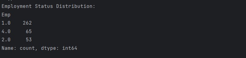
就业状况分布
点击查看代码
1. # 就业状况分布
2. employment_distribution = df['Emp'].value_counts()

4. # 绘制分布
5. plt.figure(figsize=(10, 6))
6. sns.countplot(x='Emp', data=df, order=df['Emp'].value_counts().index)
7. plt.title('Distribution of Employment Status')
8. plt.xlabel('Employment Status')
9. plt.ylabel('Count')
10. plt.show()

12. # 以百分比显示分布
13. print("Employment Status Distribution:")
14. print(employment_distribution)

就业状况饼图
点击查看代码
1. # 就业状况饼图分布
2. employment_distribution = df['Emp'].value_counts()

4. # 绘制分布
5. plt.figure(figsize=(8,6))
6. plt.pie(employment_distribution)
7. plt.title('Distribution of Employment Status')
8. plt.xlabel('Employment Status')
9. plt.ylabel('Count')
10. plt.show()

每月支出分布
点击查看代码
1. # 每月支出分布
2. plt.figure(figsize=(8, 6))
3. sns.histplot(df['Monthly_Spend'], bins=20, kde=True)
4. plt.title('Distribution of Monthly Spending on Clothing')
5. plt.xlabel('Monthly Spending (in Currency)')
6. plt.ylabel('Count')
7. plt.show()

被调查者的马氏距离(MAH_1)如何变化,有多少低于指定阈值?
点击查看代码
1. #被调查者的马氏距离(MAH_1)如何变化,有多少低于指定阈值?
2. # 距离分布
3. plt.figure(figsize=(8, 6))
4. sns.histplot(df['MAH_1'], bins=20, kde=True)
5. plt.title('Distribution of Mahalanobis Distance (MAH_1)')
6. plt.xlabel('Mahalanobis Distance')
7. plt.ylabel('Count')
8. plt.show()

10. # 低于指定阈值的应答者数量
11. threshold_count = df[df['MAH_1'] < 26.13].shape[0]
12. print(f"Number of respondents with MAH_1 < 26.13: {threshold_count}"


功利动机分配
点击查看代码
1. #功利动机分配
2. utilitarian_cols = ['Eff', 'Ach']
3. utilitarian_distribution = df[utilitarian_cols].sum()

5. #绘制分布
6. plt.figure(figsize=(8, 6))
7. sns.barplot(x=utilitarian_distribution.index, y=utilitarian_distribution.values)
8. plt.title('Distribution of Utilitarian Motivations for Shopping')
9. plt.xlabel('Utilitarian Motivation')
10. plt.ylabel('Count')
11. plt.show()

13. #显示每个功利动机的分布
14. print("Utilitarian Motivations Distribution:")
15. print(utilitarian_distribution)


享乐动机分布
点击查看代码
1. #享乐动机分布
2. hedonic_cols = ['Adv', 'Soc', 'Grat', 'Ide', 'Rol', 'Val']
3. hedonic_distribution = df[hedonic_cols].sum()

5. #绘制分布
6. plt.figure(figsize=(10, 6))
7. sns.barplot(x=hedonic_distribution.index, y=hedonic_distribution.values)
8. plt.title('Distribution of Hedonic Motivations for Shopping')
9. plt.xlabel('Hedonic Motivation')
10. plt.ylabel('Count')
11. plt.show()

13. #显示每个享乐动机的分布
14. print("Hedonic Motivations Distribution:")
15. print(hedonic_distribution)


散点图可视化关系
点击查看代码
#散点图可视化关系
1. plt. figure(figsize=(8, 6))
2. sns. scatterplot(x='Age', y='Monthly_Spend', data=df)
3. plt. title('Relationship between Age and Monthly Spending')
4. plt.xlabel('Age')
5. plt. ylabel('Monthly Spending (in Currency)')
6. plt.show()

8. # 相关性分析
9. correlation_age_spending = df['Age'].corr(df['Monthly_Spend'])
10. print(f"Correlation between Age and Monthly Spending: {correlation_age_spending}")


零售平台每月消费的箱线图
点击查看代码
1. # 零售平台每月消费的箱线图
2. plt. figure(figsize=(10, 8))
3. sns. boxplot(x='Retail_Platform', y='Monthly_Spend', data=df)
4. plt. title('Monthly Spending Distribution by Retail Platform')
5. plt. xlabel('Retail Platform')
6. plt. ylabel('Monthly Spending (in Currency)')
7. plt.show()

马氏距离(按职业)的箱线图
点击查看代码
1. # 马氏距离(按职业)的箱线图
2. plt. figure(figsize=(10, 8))
3. sns. boxplot(x='Occupation', y='MAH_1', data=df)
4. plt. title('Mahalanobis Distance Distribution by Occupation')
5. plt.xlabel('Occupation')
6. plt. ylabel('Mahalanobis Distance')
7. plt.show()

动机列的成对相关矩阵
点击查看代码
1. #动机列的成对相关矩阵
2. motivations_corr = df[['Adv', 'Soc', 'Grat', 'Ide', 'Rol', 'Val', 'Eff', 'Ach']].corr()

4. #热图可视化
5. plt.figure(figsize=(10, 8))
6. sns.heatmap(motivations_corr, annot=True, cmap='coolwarm', fmt=".2f")
7. plt.title('Pairwise Correlation among Motivational Columns')
8. plt.show()

按年龄组划分的每月消费小提琴图
点击查看代码
1. #按年龄组划分的每月消费小提琴图
2. plt.figure(figsize=(8, 6))
3. sns.violinplot(x='Age', y='Monthly_Spend', data=df)
4. plt.title('Monthly Spending Distribution by Age Group')
5. plt.xlabel('Age Group')
6. plt.ylabel('Monthly Spending (in Currency)')
7. plt.show()

每个享乐动机按收入水平的箱线图
点击查看代码
1. # 每个享乐动机按收入水平的箱线图
2. hedonic_cols = ['Adv', 'Soc', 'Grat', 'Ide', 'Rol', 'Val']
3. plt.figure(figsize=(14, 8))
4. for col in hedonic_cols:
5.     plt.subplot(2, 3, hedonic_cols.index(col) + 1)
6.     sns.boxplot(x='Inc', y=col, data=df)
7.     plt.title(f'{col} by Income Level')
8. plt.tight_layout()
9. plt.show()

零售平台的马氏距离箱线图
点击查看代码
1. #零售平台的马氏距离箱线图
2. plt. figure(figsize=(8, 6))
3. sns. boxplot(x='Retail_Platform', y='MAH_1', data=df)
4. plt. title('Mahalanobis Distance Distribution by Retail Platform')
5. plt. xlabel('Retail Platform')
6. plt. ylabel('Mahalanobis Distance')
7. plt.show()

马哈拉诺比斯距离与综合享乐动机的散点图
点击查看代码
1. # 创建一个新的列为合并的享乐动机
2. df['Combined_Hedonic'] = df[['Adv', 'Soc', 'Grat', 'Ide', 'Rol', 'Val']].sum(axis=1)

4. #马哈拉诺比斯距离与综合享乐动机的散点图
5. plt. figure(figsize=(8, 6))
6. sns. scatterplot(x='Combined_Hedonic', y='MAH_1', data=df)
7. plt. title('Mahalanobis Distance vs. Combined Hedonic Motivations')
8. plt. xlabel('Combined Hedonic Motivations')
9. plt. ylabel('Mahalanobis Distance')
10. plt.show()

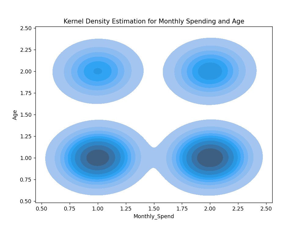
KDE每月消费和年龄图
点击查看代码
1. # KDE每月消费和年龄图
2. plt.figure(figsize=(8, 6))
3. sns.kdeplot(data=df, x='Monthly_Spend', y='Age', fill=True)
4. plt.title('Kernel Density Estimation for Monthly Spending and Age')
5. plt.show()
所有数值列的关联矩阵
点击查看代码
1. #所有数值列的关联矩阵
2. all_numeric_corr = df.corr()
3. # 热图可视化
4. plt.figure(figsize=(16, 12))
5. sns.heatmap(all_numeric_corr, annot=True, cmap='coolwarm', fmt=".2f")
6. plt.title('Correlation Matrix for All Numerical Columns')
7. plt.show()

动机雷达图
点击查看代码
1. #动机雷达图
2. from math import pi
3. motivation_cols = ['Adv', 'Soc', 'Grat', 'Ide', 'Rol', 'Val', 'Eff', 'Ach']
4. motivation_data = df[motivation_cols].mean()
5. #绘制雷达图
6. angles = [n / float(len(motivation_cols)) * 2 * pi for n in range(len(motivation_cols))]
7. angles += angles[:1]
8. values = motivation_data.tolist() + motivation_data.tolist()[:1]
9. plt.figure(figsize=(8, 8))
10. plt.polar(angles, values, marker='.')
11. plt.fill(angles, values, alpha=0.25)
12. plt.title('Radar Chart for Shopping Motivations')
13. plt.show()

NMDS对于购物动机的差异
点击查看代码
# NMDS对于购物动机的差异
1. from sklearn.manifold import MDS
2. from sklearn.metrics import euclidean_distances

4. motivation_cols = ['Adv', 'Soc', 'Grat', 'Ide', 'Rol', 'Val', 'Eff', 'Ach']
5. motivations_data = df[motivation_cols]
6. distances = euclidean_distances(motivations_data)

8. mds = MDS(n_components=2, dissimilarity='precomputed', random_state=42)
9. mds_result = mds.fit_transform(distances)

11. #NMDS结果散点图
12. plt.figure(figsize=(8, 6))
13. plt.scatter(mds_result[:, 0], mds_result[:, 1])
14. plt.title('Scatter Plot of NMDS Results for Shopping Motivations')
15. plt.xlabel('NMDS Dimension 1')
16. plt.ylabel('NMDS Dimension 2')
17. plt.show()

方差分析测试每月支出按教育水平
点击查看代码
1. #方差分析测试每月支出按教育水平
2. import statsmodels.api as sm
3. from statsmodels.formula.api import ols

5. #拟合方差分析模型
6. model = ols('Monthly_Spend ~ Edu', data=df).fit()
7. anova_table = sm.stats.anova_lm(model, typ=2)

9. # 显示ANOVA表
10. print("ANOVA Table for Monthly Spending by Education Level:")
11. print(anova_table)

卡方检验的列联表
点击查看代码
1. #卡方检验的列联表
2. gender_retail_crosstab = pd.crosstab(df['Gender'], df['Retail_Platform'])

4. # 卡方检验
5. from scipy.stats import chi2_contingency

7. chi2, x, _, _ = chi2_contingency(gender_retail_crosstab)
8. print(f"Chi-square statistic: {chi2}")
9. print(f"P-value: {x}")

四、总结
本次分析对数据进行多图的解析,让我从中看出了男女比例中女生对于时尚的需求比较高一点,等信息我更加了解这个数据集,让我了解以下价格和性价比也是影响消费者购物动机的重要因素,尤其是对于一些年轻消费者来说,他们会选择价格适中且具有高性价比的时尚品。
总结代码
点击查看代码
1. # 导入模块
2. import inline
3. import matplotlib
4. import pandas as pd
5. import numpy as np
6. import matplotlib.pyplot as plt
7. import seaborn as sns

9. # 显示所有列
10. pd.set_option('display.max_columns', None)
11. # 显示所有行
12. pd.set_option('display.max_rows', None)

14.  # 读取数据集
15. df = pd.read_csv("shopping_motivations_in_china.csv")
16. print(df.head())

18. #查看数据基本信息
19. df.info()

21. # 检查缺失值
22. print("\nCheck for missing values:")
23. missing_values = df.isnull().sum()
24. print(missing_values)

26. # 快速统计汇总
27. print(df.describe())

29. # 分类列中的唯一值
30. print("\nUnique Values:")
31. for column in df.select_dtypes(include='object').columns:
32.     print(f"{column}: {df[column].unique()}")

34. #数据形状
35. print("\nData Shape:")
36. print(df.shape)


39. 各项数据在数据中的分布
40. #性别分布
41. gender_distribution = df['Gender'].value_counts()

43. #绘制分布
44. plt.figure(figsize=(8, 6))
45. sns.countplot(x='Gender', data=df)
46. plt.title('Distribution of Genders')
47. plt.xlabel('Gender')
48. plt.ylabel('Count')
49. plt.show()

51. # 将分布显示为百分比
52. print("Gender Distribution:")
53. print(gender_distribution)

55. #收入水平分配
56. income_distribution = df['Inc'].value_counts()

58. # 绘制分布
59. plt.figure(figsize=(10, 6))
60. sns.countplot(x='Inc', data=df, order=df['Inc'].value_counts().index)
61. plt.title('Distribution of Income Levels')
62. plt.xlabel('Income Level')
63. plt.ylabel('Count')
64. plt.show()

66. # 将分布显示为百分比
67. print("Income Level Distribution:")
68. print(income_distribution)

70. #年龄分布
71. age_distribution = df['Age'].value_counts()

73. #绘制分布
74. plt.figure(figsize=(8, 6))
75. sns.countplot(x='Age', data=df)
76. plt.title('Distribution of age')
77. plt.xlabel('age')
78. plt.ylabel('Count')
79. plt.show()

81. # 就业状况分布
82. employment_distribution = df['Emp'].value_counts()

84. # 绘制分布
85. plt.figure(figsize=(10, 6))
86. sns.countplot(x='Emp', data=df, order=df['Emp'].value_counts().index)
87. plt.title('Distribution of Employment Status')
88. plt.xlabel('Employment Status')
89. plt.ylabel('Count')
90. plt.show()

92. # 以百分比显示分布
93. print("Employment Status Distribution:")
94. print(employment_distribution)

96. # 就业状况饼图
97. employment_distribution = df['Emp'].value_counts()

99. # 绘制分布
100. plt.figure(figsize=(8,6))
101. plt.pie(employment_distribution)
102. plt.title('Distribution of Employment Status')
103. plt.xlabel('Employment Status')
104. plt.ylabel('Count')
105. plt.show()


108. # 每月支出分布
109. plt.figure(figsize=(8, 6))
110. sns.histplot(df['Monthly_Spend'], bins=20, kde=True)
111. plt.title('Distribution of Monthly Spending on Clothing')
112. plt.xlabel('Monthly Spending (in Currency)')
113. plt.ylabel('Count')
114. plt.show()

116. #被调查者的马氏距离(MAH_1)如何变化,有多少低于指定阈值?
117. # 距离分布
118. plt.figure(figsize=(8, 6))
119. sns.histplot(df['MAH_1'], bins=20, kde=True)
120. plt.title('Distribution of Mahalanobis Distance (MAH_1)')
121. plt.xlabel('Mahalanobis Distance')
122. plt.ylabel('Count')
123. plt.show()

125. # 低于指定阈值的应答者数量
126. threshold_count = df[df['MAH_1'] < 26.13].shape[0]
127. print(f"Number of respondents with MAH_1 < 26.13: {threshold_count}")

129. #功利动机分配
130. utilitarian_cols = ['Eff', 'Ach']
131. utilitarian_distribution = df[utilitarian_cols].sum()

133. #绘制分布
134. plt.figure(figsize=(8, 6))
135. sns.barplot(x=utilitarian_distribution.index, y=utilitarian_distribution.values)
136. plt.title('Distribution of Utilitarian Motivations for Shopping')
137. plt.xlabel('Utilitarian Motivation')
138. plt.ylabel('Count')
139. plt.show()

141. #显示每个功利动机的分布
142. print("Utilitarian Motivations Distribution:")
143. print(utilitarian_distribution)

145. #享乐动机分布
146. hedonic_cols = ['Adv', 'Soc', 'Grat', 'Ide', 'Rol', 'Val']
147. hedonic_distribution = df[hedonic_cols].sum()

149. #绘制分布
150. plt.figure(figsize=(10, 6))
151. sns.barplot(x=hedonic_distribution.index, y=hedonic_distribution.values)
152. plt.title('Distribution of Hedonic Motivations for Shopping')
153. plt.xlabel('Hedonic Motivation')
154. plt.ylabel('Count')
155. plt.show()

157. #显示每个享乐动机的分布
158. print("Hedonic Motivations Distribution:")
159. print(hedonic_distribution)

161. #散点图可视化关系
162. plt. figure(figsize=(8, 6))
163. sns. scatterplot(x='Age', y='Monthly_Spend', data=df)
164. plt. title('Relationship between Age and Monthly Spending')
165. plt.xlabel('Age')
166. plt. ylabel('Monthly Spending (in Currency)')
167. plt.show()

169. # 相关性分析
170. correlation_age_spending = df['Age'].corr(df['Monthly_Spend'])
171. print(f"Correlation between Age and Monthly Spending: {correlation_age_spending}")

173. # 零售平台每月消费的箱线图
174. plt. figure(figsize=(10, 8))
175. sns. boxplot(x='Retail_Platform', y='Monthly_Spend', data=df)
176. plt. title('Monthly Spending Distribution by Retail Platform')
177. plt. xlabel('Retail Platform')
178. plt. ylabel('Monthly Spending (in Currency)')
179. plt.show()

181. # 马氏距离(按职业)的箱线图
182. plt. figure(figsize=(10, 8))
183. sns. boxplot(x='Occupation', y='MAH_1', data=df)
184. plt. title('Mahalanobis Distance Distribution by Occupation')
185. plt.xlabel('Occupation')
186. plt. ylabel('Mahalanobis Distance')
187. plt.show()

189. #动机列的成对相关矩阵
190. motivations_corr = df[['Adv', 'Soc', 'Grat', 'Ide', 'Rol', 'Val', 'Eff', 'Ach']].corr()

192. #热图可视化
193. plt.figure(figsize=(10, 8))
194. sns.heatmap(motivations_corr, annot=True, cmap='coolwarm', fmt=".2f")
195. plt.title('Pairwise Correlation among Motivational Columns')
196. plt.show()

198. #按年龄组划分的每月消费小提琴图
199. plt.figure(figsize=(8, 6))
200. sns.violinplot(x='Age', y='Monthly_Spend', data=df)
201. plt.title('Monthly Spending Distribution by Age Group')
202. plt.xlabel('Age Group')
203. plt.ylabel('Monthly Spending (in Currency)')
204. plt.show()

206. # 每个享乐动机按收入水平的箱线图
207. hedonic_cols = ['Adv', 'Soc', 'Grat', 'Ide', 'Rol', 'Val']
208. plt.figure(figsize=(14, 8))
209. for col in hedonic_cols:
210.     plt.subplot(2, 3, hedonic_cols.index(col) + 1)
211.     sns.boxplot(x='Inc', y=col, data=df)
212.     plt.title(f'{col} by Income Level')
213. plt.tight_layout()
214. plt.show()

216. #零售平台的马氏距离箱线图
217. plt. figure(figsize=(8, 6))
218. sns. boxplot(x='Retail_Platform', y='MAH_1', data=df)
219. plt. title('Mahalanobis Distance Distribution by Retail Platform')
220. plt. xlabel('Retail Platform')
221. plt. ylabel('Mahalanobis Distance')
222. plt.show()

224. # 创建一个新的列为合并的享乐动机
225. df['Combined_Hedonic'] = df[['Adv', 'Soc', 'Grat', 'Ide', 'Rol', 'Val']].sum(axis=1)

227. #马哈拉诺比斯距离与综合享乐动机的散点图
228. plt. figure(figsize=(8, 6))
229. sns. scatterplot(x='Combined_Hedonic', y='MAH_1', data=df)
230. plt. title('Mahalanobis Distance vs. Combined Hedonic Motivations')
231. plt. xlabel('Combined Hedonic Motivations')
232. plt. ylabel('Mahalanobis Distance')
233. plt.show()

235. # KDE每月消费和年龄图
236. plt.figure(figsize=(8, 6))
237. sns.kdeplot(data=df, x='Monthly_Spend', y='Age', fill=True)
238. plt.title('Kernel Density Estimation for Monthly Spending and Age')
239. plt.show()

241. #所有数值列的关联矩阵
242. all_numeric_corr = df.corr()
243. # 热图可视化
244. plt.figure(figsize=(16, 12))
245. sns.heatmap(all_numeric_corr, annot=True, cmap='coolwarm', fmt=".2f")
246. plt.title('Correlation Matrix for All Numerical Columns')
247. plt.show()

249. #动机雷达图
250. from math import pi
251. motivation_cols = ['Adv', 'Soc', 'Grat', 'Ide', 'Rol', 'Val', 'Eff', 'Ach']
252. motivation_data = df[motivation_cols].mean()
253. #绘制雷达图
254. angles = [n / float(len(motivation_cols)) * 2 * pi for n in range(len(motivation_cols))]
255. angles += angles[:1]
256. values = motivation_data.tolist() + motivation_data.tolist()[:1]
257. plt.figure(figsize=(8, 8))
258. plt.polar(angles, values, marker='.')
259. plt.fill(angles, values, alpha=0.25)
260. plt.title('Radar Chart for Shopping Motivations')
261. plt.show()

263. # NMDS对于购物动机的差异
264. from sklearn.manifold import MDS
265. from sklearn.metrics import euclidean_distances

267. motivation_cols = ['Adv', 'Soc', 'Grat', 'Ide', 'Rol', 'Val', 'Eff', 'Ach']
268. motivations_data = df[motivation_cols]
269. distances = euclidean_distances(motivations_data)

271. mds = MDS(n_components=2, dissimilarity='precomputed', random_state=42)
272. mds_result = mds.fit_transform(distances)

274. #NMDS结果散点图
275. plt.figure(figsize=(8, 6))
276. plt.scatter(mds_result[:, 0], mds_result[:, 1])
277. plt.title('Scatter Plot of NMDS Results for Shopping Motivations')
278. plt.xlabel('NMDS Dimension 1')
279. plt.ylabel('NMDS Dimension 2')
280. plt.show()


283. #方差分析测试每月支出按教育水平
284. import statsmodels.api as sm
285. from statsmodels.formula.api import ols

287. #拟合方差分析模型
288. model = ols('Monthly_Spend ~ Edu', data=df).fit()
289. anova_table = sm.stats.anova_lm(model, typ=2)

291. # 显示ANOVA表
292. print("ANOVA Table for Monthly Spending by Education Level:")
293. print(anova_table)

295. #卡方检验的列联表
296. gender_retail_crosstab = pd.crosstab(df['Gender'], df['Retail_Platform'])

298. # 卡方检验
299. from scipy.stats import chi2_contingency

301. chi2, x, _, _ = chi2_contingency(gender_retail_crosstab)
302. print(f"Chi-square statistic: {chi2}")
303. print(f"P-value: {x}")