vue时间选择器
https://blog.csdn.net/Marshall_Ma/article/details/124244451
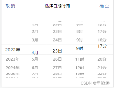
1、年-月-日 时:分
效果展示:

打开选择器:

<div class="label">记录日期:</div>
<nut-cell :showIcon="true" :isLink="true" @click.native="switchPicker">
	<span slot="title">
	<label>日期时间选择</label>
	</span>
	<div slot="desc" class="selected-option">
	<span class="show-value">{{recordTime ? recordTime : ''}}</span>
	</div>
</nut-cell>
<nut-datepicker
	:is-visible="isVisible"
	title="选择日期时间"
	type="datetime"
	:defaultValue="defaultValue"
	startDate="2022-01-01 00:08"
	endDate="2030-10-05 10:04"
	@close="switchPicker"
	@choose="setChooseValue"
></nut-datepicker>
- 1
- 2
- 3
- 4
- 5
- 6
- 7
- 8
- 9
- 10
- 11
- 12
- 13
- 14
- 15
- 16
- 17
- 18
- 19
export default {
    data() {
      return {
      	isVisible: false,
        defaultValue: '',
		recordTime: ''
	  }
	},
	methods: {
	  switchPicker() {
        this.isVisible = !this.isVisible;
      },
      setChooseValue(param) {
        console.log('param:' + param);
        const theDate = param[5];
        this.recordTime = theDate;
      },
      getDateTime() {
        let now = new Date();
        let year = now.getFullYear();
        let month = now.getMonth() + 1;
        let day = now.getDate();
        let hour = now.getHours();
        let minute = now.getMinutes();
        let time = `${year}-${month}-${day} ${hour}:${minute}`;
        console.log('time:' + time);
        this.defaultValue = time;
      }
	},
	created() {
	  this.getDateTime();
	}
}
- 1
- 2
- 3
- 4
- 5
- 6
- 7
- 8
- 9
- 10
- 11
- 12
- 13
- 14
- 15
- 16
- 17
- 18
- 19
- 20
- 21
- 22
- 23
- 24
- 25
- 26
- 27
- 28
- 29
- 30
- 31
- 32
- 33
注:
(1)defaultValue:选择器的默认打开时间和defaultValue相关,所以需要打开时对defaultValue赋值,给定需要打开的时间即可;
(2)startDate:如果不指定startDate,选择器可选择日期的开始时间为2000-01-01 00:00,可根据自身情况给定或者动态赋值;
(3)endDate:如果不给定endDate那么当天日期会有问题,只能选择0时时间,可根据自身情况给定或者动态赋值;
2、年-月-日
2.1 nut-datepicker
效果展示:

打开选择器:

<div class="label">记录日期:</div>
<nut-cell
	:showIcon="true"
	title="每列不显示中文(年/月/日)"
	:desc="date ? date : '请选择'"
	@click.native="switchPicker">
</nut-cell>
<nut-datepicker
	:is-visible="isVisible"
	type="date"
	title="选择年月日"
	:defaultValue="defaultValue"
	:is-show-chinese="false"
	@close="switchPicker"
	@choose="setChooseValue"
></nut-datepicker>

- 1
- 2
- 3
- 4
- 5
- 6
- 7
- 8
- 9
- 10
- 11
- 12
- 13
- 14
- 15
- 16
export default {
    data() {
      return {
      	isVisible: false,
        defaultValue: '',
		date: null
	  }
	},
	methods: {
	  switchPicker() {
        this.isVisible = !this.isVisible;
      },
      setChooseValue(param) {
        console.log('param:' + param);
        const theDate = param[3];
        this.date = theDate;
      },
      getDateTime() {
        let now = new Date();
        let year = now.getFullYear();
        let month = now.getMonth() + 1;
        let day = now.getDate();
        let hour = now.getHours();
        let minute = now.getMinutes();
        // let time = `${year}-${month}-${day} ${hour}:${minute}`;
        let time = `${year}-${month}-${day}`;
        console.log('time:' + time);
        this.defaultValue = time;
      }
	},
	created() {
	  this.getDateTime();
	}
}
- 1
- 2
- 3
- 4
- 5
- 6
- 7
- 8
- 9
- 10
- 11
- 12
- 13
- 14
- 15
- 16
- 17
- 18
- 19
- 20
- 21
- 22
- 23
- 24
- 25
- 26
- 27
- 28
- 29
- 30
- 31
- 32
- 33
- 34
注:
(1)defaultValue:选择器的默认打开时间和defaultValue相关,所以需要打开时对defaultValue赋值,给定需要打开的时间即可;
2.2 nut-calendar
效果展示:

打开选择器:
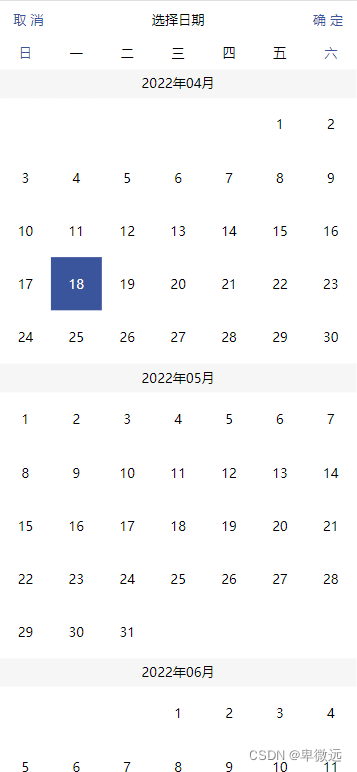
<div class="label">记录日期:</div>
<nut-calendar :is-visible.sync="isVisible"
startDate="2022-01-01"
:default-value="recordTime"
:is-auto-back-fill="true"
@close="switchPickerClose"
@choose="setChooseValue"
>
</nut-calendar>
<nut-cell :is-link="true" :show-icon="true" @click.native="switchPicker">
<span slot="title">日期选择</span>
<div slot="desc" class="selected-option">
  <span class="show-value">
	{{recordTime ? recordTime : '请选择日期'}}
  </span>
</div>
</nut-cell>
- 1
- 2
- 3
- 4
- 5
- 6
- 7
- 8
- 9
- 10
- 11
- 12
- 13
- 14
- 15
- 16
- 17
export default {
    data() {
      return {
      	isVisible: false,
        defaultValue: '',
		date: null
	  }
	},
	methods: {
	  setChooseValue(param) {
        const theDate = param[3];
        this.recordTime = theDate;
      },
      switchPickerClose() {
        this.isVisible = !this.isVisible;
      },
      switchPicker() {
        this.isVisible = !this.isVisible;
      }
	}
}
- 1
- 2
- 3
- 4
- 5
- 6
- 7
- 8
- 9
- 10
- 11
- 12
- 13
- 14
- 15
- 16
- 17
- 18
- 19
- 20
- 21
注:
(1)此选择器打开会默认为当前日期;
(2)startDate:选择器开始日期,若不指定,则从当前日期开始,可根据实际情况给定或动态赋值;
3、时:分
效果展示:

打开选择器:
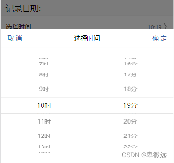
<div class="label">记录日期:</div>
<nut-cell :showIcon="true" :isLink="true" @click.native="switchPicker">
	<span slot="title">
	<label>选择时间</label>
	</span>
	<div slot="desc" class="selected-option">
	{{recordTime ? recordTime : ''}}
	</div>
</nut-cell>
<nut-datepicker
	:is-visible="isVisible"
	type="time"
	title="选择时间"
	@close="switchPicker"
	@choose="setChooseValue"
	:defaultValue="defaultValue"
></nut-datepicker>
- 1
- 2
- 3
- 4
- 5
- 6
- 7
- 8
- 9
- 10
- 11
- 12
- 13
- 14
- 15
- 16
- 17
export default {
    data() {
      return {
      	isVisible: false,
        defaultValue: '',
		date: null
	  }
	},
	methods: {
	  switchPicker() {
        this.isVisible = !this.isVisible;
      },
      setChooseValue(param) {
       console.log('param:' + param);
        const theDate = param[2];
        this.recordTime = theDate;
      },
      getDateTime() {
        let now = new Date();
        let year = now.getFullYear();
        let month = now.getMonth() + 1;
        let day = now.getDate();
        let hour = now.getHours();
        let minute = now.getMinutes();
        // let time = `${year}-${month}-${day} ${hour}:${minute}`;
        let time = `${hour}:${minute}`;
        console.log('time:' + time);
        this.defaultValue = time;
      }
	},
	created() {
	  this.getDateTime();
	}
}
- 1
- 2
- 3
- 4
- 5
- 6
- 7
- 8
- 9
- 10
- 11
- 12
- 13
- 14
- 15
- 16
- 17
- 18
- 19
- 20
- 21
- 22
- 23
- 24
- 25
- 26
- 27
- 28
- 29
- 30
- 31
- 32
- 33
- 34
注:
(1)defaultValue:选择器的默认打开时间和defaultValue相关,所以需要打开时对defaultValue赋值,给定需要打开的时间即可;
4、时:分:秒
效果展示:

打开选择器:
<div class="label">记录日期:</div>
<nut-cell :showIcon="true" :isLink="true" @click.native="switchPicker">
	<span slot="title">
	<label>选择时间</label>
	</span>
	<div slot="desc" class="selected-option">
	{{recordTime ? recordTime : ''}}
	</div>
</nut-cell>
<nut-datepicker
	:is-visible="isVisible"
	type="time"
	title="选择时间"
	:default-value="defaultValue"
	@close="switchPicker"
	@choose="setChooseValue"
	:is-set-second="true"
></nut-datepicker>
- 1
- 2
- 3
- 4
- 5
- 6
- 7
- 8
- 9
- 10
- 11
- 12
- 13
- 14
- 15
- 16
- 17
- 18
export default {
    data() {
      return {
      	isVisible: false,
        defaultValue: '',
		date: null
	  }
	},
	methods: {
	  export default {
    data() {
      return {
      	isVisible: false,
        defaultValue: '',
		date: null
	  }
	},
	methods: {
	  switchPicker() {
        this.isVisible = !this.isVisible;
      },
      setChooseValue(param) {
       console.log('param:' + param);
        const theDate = param[3];
        this.recordTime = theDate;
      },
      getDateTime() {
        let now = new Date();
        let year = now.getFullYear();
        let month = now.getMonth() + 1;
        let day = now.getDate();
        let hour = now.getHours();
        let minute = now.getMinutes();
        let second = now.getSeconds();
        // let time = `${year}-${month}-${day} ${hour}:${minute}`;
        let time = `${hour}:${minute}:${second}`;
        console.log('time:' + time);
        this.defaultValue = time;
      }
	},
	created() {
	  this.getDateTime();
	}
}
	},
	created() {
	  this.getDateTime();
	}
}
- 1
- 2
- 3
- 4
- 5
- 6
- 7
- 8
- 9
- 10
- 11
- 12
- 13
- 14
- 15
- 16
- 17
- 18
- 19
- 20
- 21
- 22
- 23
- 24
- 25
- 26
- 27
- 28
- 29
- 30
- 31
- 32
- 33
- 34
- 35
- 36
- 37
- 38
- 39
- 40
- 41
- 42
- 43
- 44
- 45
- 46
- 47
- 48
- 49
注:
(1)defaultValue:选择器的默认打开时间和defaultValue相关,所以需要打开时对defaultValue赋值,给定需要打开的时间即可;
(2)startHour:若需限制开始小时,指定startHour即可,例:startHour=“8”,也可动态赋值;
(3)endHour:若需指定结束小时,指定startHour即可,例:
endHour=“18”,也可动态赋值。
5、分钟数递增步长设置
效果展示:

打开选择器:

<div class="label">记录日期:</div>
<nut-cell :showIcon="true" :isLink="true" @click.native="switchPicker">
	<span slot="title">
	<label>选择时间</label>
	</span>
	<div slot="desc" class="selected-option">
	{{recordTime ? recordTime : ''}}
	</div>
</nut-cell>
<nut-datepicker
	:is-visible="isVisible"
	type="time"
	title="选择时间"
	:minute-step="5"
	:default-value="defaultValue"
	@close="switchPicker"
	@choose="setChooseValue"
></nut-datepicker>
- 1
- 2
- 3
- 4
- 5
- 6
- 7
- 8
- 9
- 10
- 11
- 12
- 13
- 14
- 15
- 16
- 17
- 18
export default {
    data() {
      return {
      	isVisible: false,
        defaultValue: '',
		date: null
	  }
	},
	methods: {
	  export default {
    data() {
      return {
      	isVisible: false,
        defaultValue: '',
		date: null
	  }
	},
	methods: {
	  switchPicker() {
        this.isVisible = !this.isVisible;
      },
      setChooseValue(param) {
       console.log('param:' + param);
        const theDate = param[2];
        this.recordTime = theDate;
      },
      getDateTime() {
        let now = new Date();
        let year = now.getFullYear();
        let month = now.getMonth() + 1;
        let day = now.getDate();
        let hour = now.getHours();
        let minute = now.getMinutes();
        let second = now.getSeconds();
        // let time = `${year}-${month}-${day} ${hour}:${minute}`;
        let time = `${hour}:${minute}`;
        console.log('time:' + time);
        this.defaultValue = time;
      }
	},
	created() {
	  this.getDateTime();
	}
}
	},
	created() {
	  this.getDateTime();
	}
}
- 1
- 2
- 3
- 4
- 5
- 6
- 7
- 8
- 9
- 10
- 11
- 12
- 13
- 14
- 15
- 16
- 17
- 18
- 19
- 20
- 21
- 22
- 23
- 24
- 25
- 26
- 27
- 28
- 29
- 30
- 31
- 32
- 33
- 34
- 35
- 36
- 37
- 38
- 39
- 40
- 41
- 42
- 43
- 44
- 45
- 46
- 47
- 48
- 49
注:
(1)defaultValue:选择器的默认打开时间和defaultValue相关,所以需要打开时对defaultValue赋值,给定需要打开的时间即可;
(2)minute-step=“5”:分钟步长设置。
附1、属性介绍
| 字段 | 说明 | 类型 | 默认值 |
|---|---|---|---|
| type | 类型,日期’date’, 日期时间’datetime’,时间’time’ | String | ‘date’ |
| is-visible | 是否可见 | Boolean | false |
| is-use12-hours | 是否十二小时制度,只限类型为’time’时使用 | Boolean | false |
| is-am | 是否上午 | Boolean | true |
| minute-step | 分钟步进值 | String | 1 |
| is-show-chinese | 每列是否展示中文 | Boolean | true |
| title | 设置标题 | String | null |
| default-value | 默认值 | String | null |
| start-date | 开始日期 | String | ‘2000-01-01’ |
| end-date | 结束日期 | String | 今天 |
| start-hour | 开始小时 | Number | 1 |
| end-hour | 结束小时 | Number | 23 |
| is-set-second | 是否支持秒,仅限type类型为’time’时支持 | Boolean | false |
附2、事件介绍
| 字段 | 说明 | 回调参数 |
|---|---|---|
| choose | 点击确认按钮时候回调 | 返回日期时间 |
| close | 关闭时触发 | - |
关于移动端时间选择器样式定位异常问题:
如图:
查看nut-datepicker发现,引用的是picker.scss里的样式

经过多次查找,发现是样式定位异常导致,只需要在全局样式文件重新定义即可:
<style>
    .nut-picker-list .nut-picker-content, .nut-picker-list .nut-picker-roller {
        position: relative;
    }
</style>
- 1
- 2
- 3
- 4
- 5