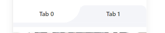
<View class="tabs" style="display: flex; justify-content: space-between">
            <View class="tabs-item" style="width: 50%">
                <Button class="tabs-btn" :class="0 ? 'active-left' : ''" style="">Tab 0</Button>
                <View class="tabs-content"></View>
            </View>
            <View class="tabs-item" style="width: 50%">
                <Button class="tabs-btn" :class="1 ? 'active-right' : ''">Tab 1</Button>
                <View class="tabs-content"></View>
            </View>
        </View>
.tabs {
        margin-top: 10px;
        background: #ffffff;
        .tabs-item {
            .tabs-btn {
                cursor: pointer;
                width: 100%;
                display: inline-block;
                background-color: #ffffff;
                color: white;
                text-align: center;
                transition: 0.25s ease;
                border: none;
                height: 100px;
                // padding: 20px 0;
                font-size: 34px;
                font-weight: 500;
                color: #3d3d40;
                line-height: 44px;
                border-radius: 0;
            }
            .active-left {
                background-color: #f4f5f9;
                outline: none;
                border-radius: 30px 30px 0 0;
            }
            .active-left::after {
                content: '';
                position: absolute;
                top: 0;
                right: -96px;
                height: 100px;
                width: 100px;
                background: radial-gradient(circle at 0 0, transparent 100px, #f4f5f9 100px);
                z-index: 10;
                border-radius: 0 60px 0 0;
                transform-origin: center;
                transform: rotateY(180deg);
            }

            .active-right {
                border-radius: 30px 30px 0 0;
                background-color: #f4f5f9;
                outline: none;
            }
            .active-right::after {
                content: '';
                position: absolute;
                top: 0;
                left: -96px;
                height: 100px;
                width: 100px;
                background: radial-gradient(circle at 0 0, transparent 100px, #f4f5f9 100px);
                border-radius: 0 10px 0 0;
            }
        }
    }