PoshyTip 是JQuery中一款文本提示插件,在Jsp页面使用相当方便,插件内包含了很多外观样式,可以作为FormTooltips使用。
插件包下载地址:http://vadikom.com/files/?file=poshytip/poshytip-1.2.zip
PoshyTip Demo地址:http://vadikom.com/demos/poshytip/
下载好插件包后,解压可看到目录中有自定义样式,我们把这些样式引入页面中就可以使用了,如图

第一步:将整个文件夹引入到你的js文件夹内(个人觉得不需要这么多,你需要哪个样式就引入哪个,但是有两个主文件必须引入,下一步再说);
第二步:在JSP页面引入poshiytip的关键代码:

<head id="head" runat="server">
   <link rel="stylesheet" type="text/css" href="<%=request.getContextPath()%>/js/poshytip/tip-yellowsimple/tip-yellowsimple.css" />
   //这两个必须引入
   <script type="text/javascript" src="<%=request.getContextPath()%>/js/poshytip/jquery.poshytip.min.js"></script>
   <script type="text/javascript" src="<%=request.getContextPath()%>/js/jquery-1.6.2.min.js"></script>
     <script type="text/javascript">
         $(function () {
            $('#demo-tip-yellowsimple').poshytip({
                 className: 'tip-yellowsimple',
                 content:'[title]',
                 showTimeout: 1,
                 alignTo: 'target',
                 alignX: 'center',
                 offsetY: 5,
                 allowTipHover: false

                  });
              });

     </script>
 </head>
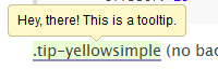
执行效果如图:
示例:在个人的使用中出现了要显示一个小提示页面的功能,要在不同的位置循环显示,就不可能去挨个title里面写内容,就在content里面写元素内容完全没有显示,后来发现是content内写组合元素内容不能分行
效果如图:

代码如下:
<!DOCTYPE html PUBLIC "-//W3C//DTD XHTML 1.0 Transitional//EN" "http://www.w3.org/TR/xhtml1/DTD/xhtml1-transitional.dtd">
<html xmlns="http://www.w3.org/1999/xhtml">
<head>
<meta http-equiv="Content-Type" content="text/html; charset=utf-8" />
<title>tips 信息提示</title>
</head>

<body >
<link rel="stylesheet" href="<%=request.getContextPath()%>/js/poshytip-1.1/tip-yellow/tip-yellow.css" type="text/css" />
<script type="text/javascript" src="<%=request.getContextPath()%>/js/jquery-1.6.2.min.js"></script>
<script type="text/javascript" src="<%=request.getContextPath()%>/js/poshytip-1.1/jquery.poshytip.js"></script>

<script type="text/javascript">
         $(function () {
          for(var i=1;i<4;i++){
            $('#demo-tip-yellow'+i).poshytip({
                className: 'tip-yellow',
                content:'<div style="color:#636363 "> <strong>1.PoshyTip:</strong>文本提示信息<br/>
                         <table frame="box" style="border-collapse:collapse" border="1">
                         <tbody><tr align="center"><td >content</td><td>提示气泡里面显示的内容</td></tr>
                         <tr align="center"><td >className</td><td>指定的tips class样式</td></tr> </div> ',
                      //此处写content提示信息内容不能分行,要在一行写,不然不能显示出来
                showOn: 'hover',
                alignY: 'bottom',
                showTimeout: 50,
            });
            }
              });
</script>

    <p><a id="demo-tip-yellow1"  href="#">.demo-tip-yellow1</a></p>
    <p><a id="demo-tip-yellow2"  href="#">.demo-tip-yellow2</a></p>
    <p><a id="demo-tip-yellow3"  href="#">.demo-tip-yellow3</a></p>

</body>
</html>
最后来总结一下它的属性:
className: 'tip-yellowsimple'     //指定的tips class样式,包里面已经有自定义样式

content:'[title]'            // 提示气泡里面显示的内容,默认为元素的标题,可以是指定的字符串、元素、回调函数、jquery对象

bgImageFrameSize:10,    //按照像素计算背景图片和显示内容的内边距

showTimeout:500,        // 延时多久开始显示(1000 == 1 second)

hideTimeout:100,        // 延时多久开始隐藏

timeOnScreen:0,         // 自动隐藏之前延时多久

showOn:'hover',       //显示方式 支持'hover'鼠标划入、'focus' 获取焦点、'none'手动显式调用

liveEvents:false,    // 支持live  事件  同样可以对未来元素进行影响

alignTo:'cursor',    // 和谁进行对齐 ('cursor' 鼠标, 'target' 目标元素)

alignX:'right',     // 水平方向对齐方式 可选参数:'right', 'center', 'left', 'inner-left', 'inner-right' ,如果 alignTo:'target' ,无效

alignY:'top',    // 垂直方向对齐方式 可选参数:'bottom', 'center', 'top', 'inner-bottom', 'inner-top' ,如果 alignTo:'target' ,无效

offsetX:-22,    // 水平偏移量,如果alignX:'center',无效

offsetY:18,   // 垂直方向偏移量,如果alignX:'center',无效

allowTipHover:true,   //hover显示方式下,允许鼠标离开元素仍然显示提示信息

followCursor:false,   // 提示信息随着鼠标移动 只在满足hover显示方式下,对齐方式为alignTo:'cursor' 才有效

fade:true,    // 使用动画

slide:true,   // 使用slie效果

slideOffset:8,// slide 动画的偏移量

showAniDuration:300,  // 动画显示的时间间隔 如果不想动画效果,设置为0即可

hideAniDuration:300  // 动画隐藏的时间间隔 如果不想动画效果,设置为0即可