
参照博客
-
Matplotlib tutorial for beginners
真的很适合新手,把基础的内容都讲解了一遍 -
[Simple Matplotlib & Visualization Tips ?](https://www.kaggle.com/code/subinium/simple-matplotlib-visualization-tips#2.-Colormap)
是博主的使用matplotlib的心得吧,有很多适用技巧
Setting
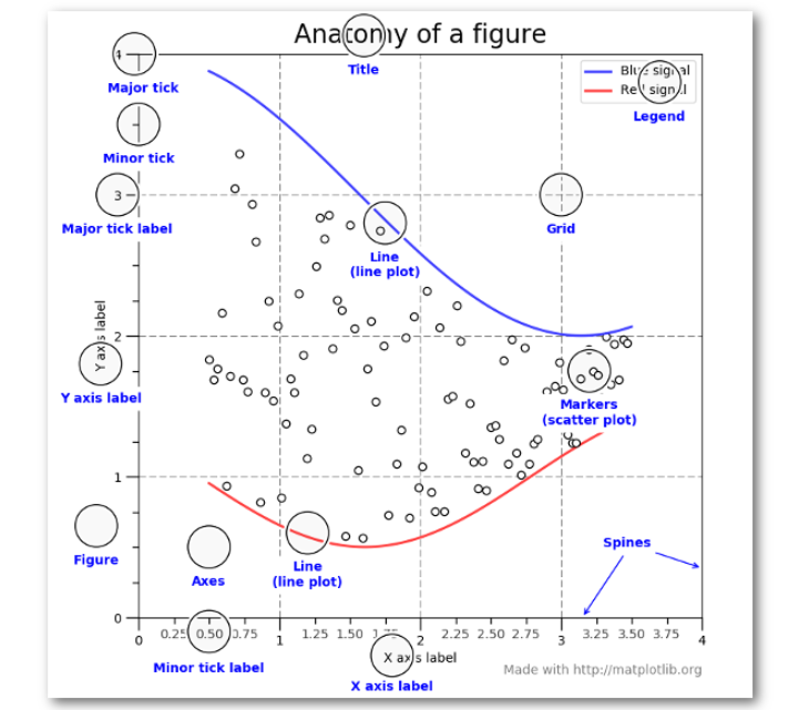
Figure和axes的关系
A Figure object is the outermost container for a Matplotlib plot. The Figure object contain multiple Axes objects. So, the Figure is the final graphic that may contain one or more Axes. The Axes represent an individual plot.
So, we can think of the Figure object as a box-like container containing one or more Axes. The Axes object contain smaller objects such as tick marks, lines, legends, title and text-boxes.
Matplotlib has two APIs to work
A MATLAB-style state-based interface and a more powerful object-oriented (OO) interface. The former MATLAB-style state-based interface is called pyplot interface and the latter is called Object-Oriented interface.
这就是为什么有时候我们能够看到plt.plot,又能够看到axes.plot,因为这是使用了不同的API,后面我们以Object-Oriented interface为主
Show
-
Plotting from an IPython shell
We can use Matplotlib interactively within an IPython shell. IPython works well with Matplotlib if we specify Matplotlib mode. To enable this mode, we can use the %matplotlib magic command after starting ipython. Any plt plot command will cause a figure window to open and further commands can be run to update the plot.
-
Plotting from a Jupyter notebook
Interactive plotting within a Jupyter Notebook can be done with the %matplotlib command. There are two possible options to work with graphics in Jupyter Notebook. These are as follows:-
%matplotlib notebook – This command will produce interactive plots embedded within the notebook.
%matplotlib inline – It will output static images of the plot embedded in the notebook.
Label
import numpy as np
import pandas as pd
import matplotlib
import matplotlib.pyplot as plt
%matplotlib notebook
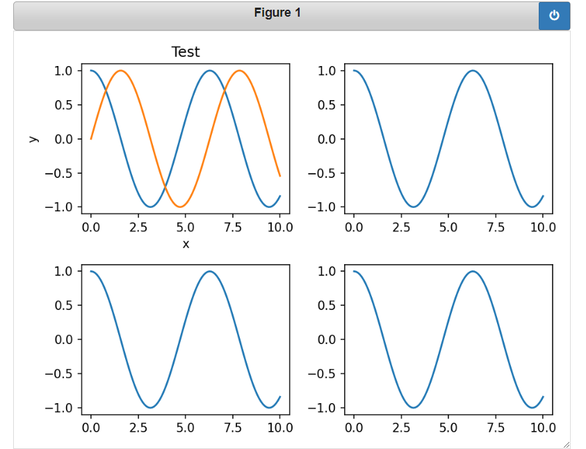
想要在一个figure上绘制出多幅子图,可以使用:
fig=plt.figure() # 设置figure
ax1=fig.add_subplot(2, 2,1)
ax1.plot(x,np.cos(x))
ax1.plot(x,np.sin(x))
ax1.set_xlabel("x")
ax1.set_ylabel("y")
ax1.set_title("Test")

ax2=fig.add_subplot(2, 2,2)
ax2.plot(x,np.cos(x))

ax3=fig.add_subplot(2, 2,3)
ax3.plot(x,np.cos(x))

ax4=fig.add_subplot(2, 2,4)
ax4.plot(x,np.cos(x))

plt.tight_layout() # 为了让子图之间间隔看起来更好看
为了更加方便,也可以使用:
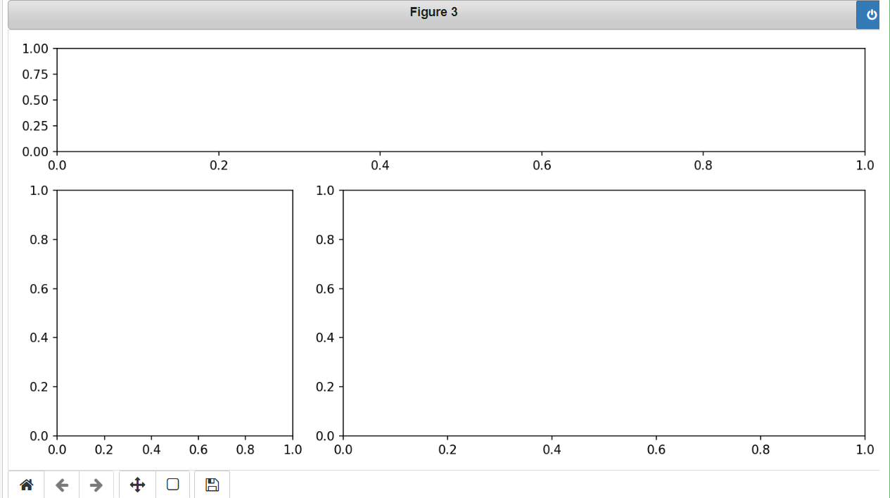
fig, axes = plt.subplots(2, 2, figsize=(10, 5)) # figsize设置figure大小

axes[0,0].plot(x,np.sin(x),label="sin")
axes[0,0].plot(x,np.cos(x),label="cos")
axes[0, 0].legend()  # 显示图例

# 方法一:通过set_xticks手动设置坐标轴
axes[0,0].set_xticks(np.linspace(-5,15,10)) # 设置坐标轴
axes[0,0].set_yticks([]) # 相当于不设置坐标轴

axes[0,1].plot(x,np.sin(x),label="sin")
axes[0,1].plot(x,np.cos(x),label="cos")
axes[0, 1].legend()  # 显示图例

# 方法二: 通过 ticker库来设置
import matplotlib.ticker as ticker

axes[0,1].xaxis.set_major_locator(ticker.MultipleLocator(1)) # 设置x轴主间隔为1


axes[1,0].grid(True) # 设置网格

plt.tight_layout() # 让多幅图间隔更好
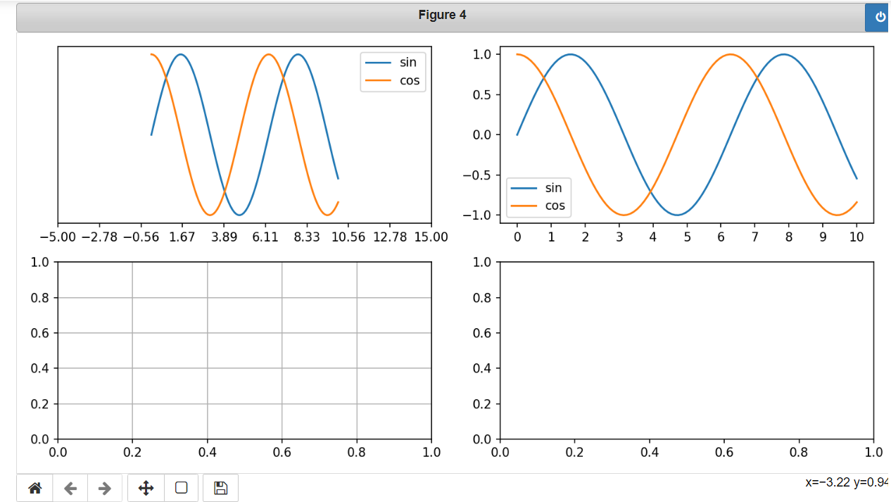
改变子图布局:
fig3,axes3=plt.subplots(3,3,figsize=(10, 5))

# 改变每一个子图的布局
axes3[0,0] = plt.subplot2grid((3,3), (0,0), colspan=3)
axes3[1,0] = plt.subplot2grid((3,3),(1,0),rowspan=2,colspan=1)
axes3[1,1] = plt.subplot2grid((3,3),(1,1),rowspan=2,colspan=2)

plt.tight_layout()
Color
The colour names and colour abbreviations are given in the following table:-
Colour abbreviation Colour name
b blue
c cyan
g green
k black
m magenta
r red
w white
y yellow
There are several ways to specify colours, other than by colour abbreviations:
• The full colour name, such as yellow
• Hexadecimal string such as ##FF00FF
• RGB tuples, for example (1, 0, 1)
• Grayscale intensity, in string format such as ‘0.7’.
line style
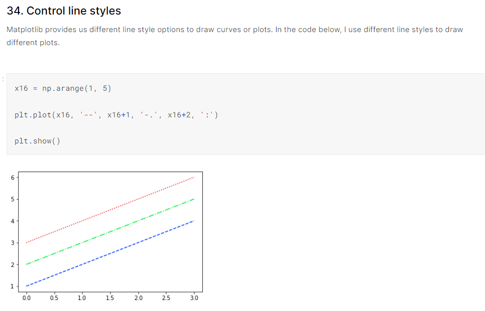
The above code snippet generates a blue dashed line, a green dash-dotted line and a red dotted line.
All the available line styles are available in the following table:
Style abbreviation Style
* solid line
-- dashed line
-. dash-dot line
: dotted line
Now, we can see the default format string for a single line plot is 'b-'.