描述:
因为个人很喜欢flex布局,所以在做某个项目html框架的时候,会有如下这种情况出现
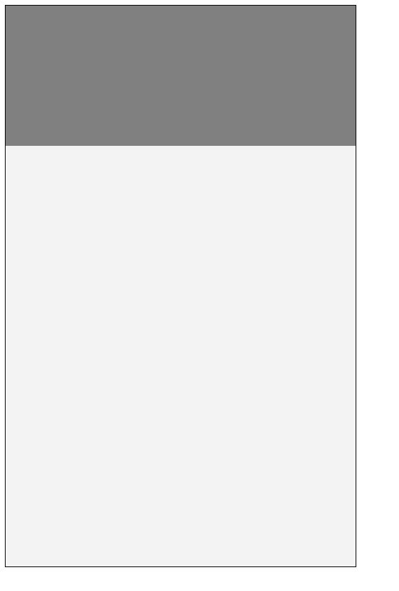
一个很简单的布局,大的盒子下包含了两个子盒子,第一个子盒子的高度固定,现在要让第二个盒子自适应撑满父布局剩下的高度,自然用css很简单实现
设定一个flex,然后grow为1就行
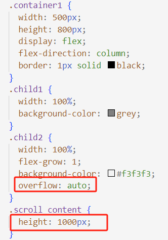
.container1 {
  width: 500px;
  height: 800px;
  display: flex;
  flex-direction: column;
  border: 1px solid black;
}
.child1 {
  width: 100%;
  background-color: grey;
}
.child2 {
  width: 100%;
  flex-grow: 1;
  background-color: #f3f3f3;
}
效果如下:
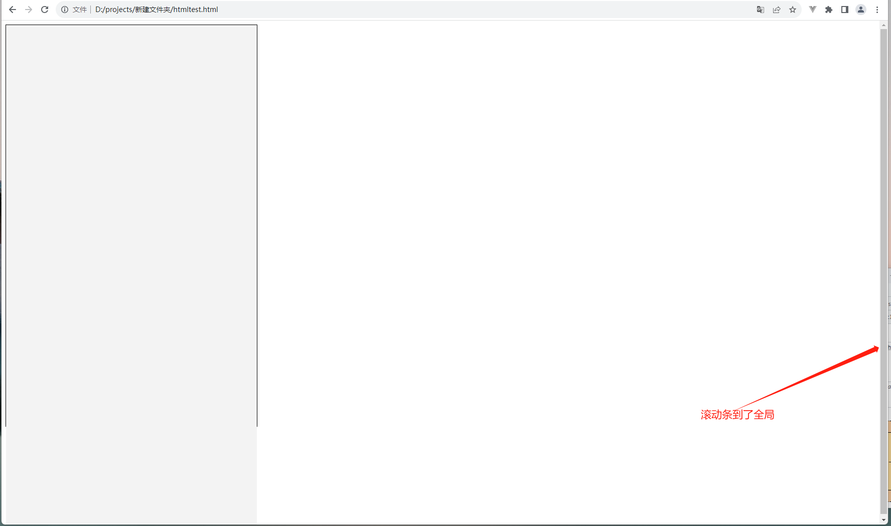
现在,要在child2中进行滚动处理,很容易想到加个overflow就行,但是滚动内容超过了父布局,就会将child1挤压,如:
效果会有问题:
解决方案:
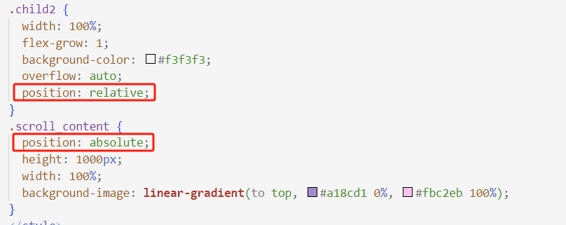
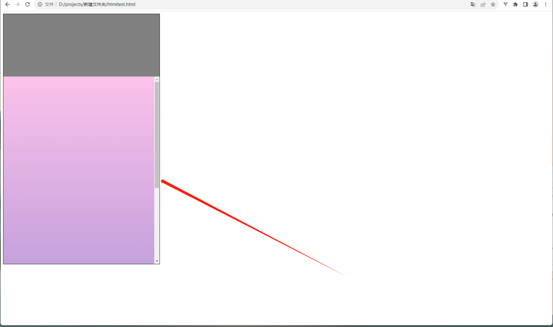
用position相对定位定位好child2,再在child2中绝对定位滚动的盒子,就能实现需要的效果(为了查看效果copy了一个渐变的背景):
效果:
代码:
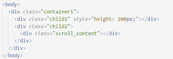
<body>
  <div class="container1">
    <div class="child1" style="height: 200px;"></div>
    <div class="child2">
      <div class="scroll_content"></div>
    </div>
  </div>
</body>
<style>
.container1 {
  width: 500px;
  height: 800px;
  display: flex;
  flex-direction: column;
  border: 1px solid black;
}
.child1 {
  width: 100%;
  background-color: grey;
}
.child2 {
  width: 100%;
  flex-grow: 1;
  background-color: #f3f3f3;
  overflow: auto;
  position: relative;
}
.scroll_content {
  position: absolute;
  height: 1000px;
  width: 100%;
  background-image: linear-gradient(to top, #a18cd1 0%, #fbc2eb 100%);
}
</style>
注意事项:
absolute过后慎用父组件的padding和margin效果,因为当前元素已脱离流,尽量在自身基础上进行盒子设置,必要时scroll_content下再建个盒子装滚动内容