1.lilo-icon-button 一般按钮模式:
  1 <template>
  2     <div class="icon-button" :style="{ color: font.color }" @click="onclick">
  3         <i :class="[icon.type]" :style="{ color: icon.color, fontSize: icon.size }" class="right" v-if="showIcon"></i>
  4         <slot>
  5             <span class="text" :style="{ fontSize: font.size }">{{ title }}</span>
  6         </slot>
  7     </div>
  8 </template>
  9
 10 <script>
 11 export default {
 12     name: 'LiloIconButton',
 13     props: {
 14         title: {
 15             type: String,
 16             default: '',
 17             required: false
 18         },
 19         showIcon: {
 20             type: Boolean,
 21             default: true
 22         },
 23         icon: {
 24             type: Object,
 25             default() {
 26                 return {
 27                     type: 'el-icon-setting',
 28                     size: '1em',
 29                     color: '#00417a'
 30                 };
 31             },
 32             required: false
 33         },
 34         font: {
 35             type: Object,
 36             default() {
 37                 return {
 38                     size: '1em',
 39                     color: '#00417a'
 40                 };
 41             },
 42             required: false
 43         }
 44     },
 45     data() {
 46         return {
 47             selected: true
 48         };
 49     },
 50     methods: {
 51         onclick() {
 52             this.selected = !this.selected;
 53             this.$emit('toggle', this.selected);
 54         }
 55     }
 56 };
 57 </script>
 58
 59 <style lang="scss" scoped>
 60
 61 $blue: #00417a;
 62
 63 .icon-button {
 64     -webkit-transition: all 0.3s ease 0s;
 65     transition: all 0.3s ease 0s;
 66     cursor: pointer;
 67     text-align: center;
 68     display: inline-block;
 69     -moz-user-select: none;
 70     -webkit-user-select: none;
 71     user-select: none;
 72     .right{
 73         margin-right: 3px;
 74     }
 75     &:after {
 76         content: ' ';
 77         // position: absolute;
 78         z-index: 2;
 79         // bottom: -5px;
 80         margin-left: 50%;
 81         margin-top: 2px;
 82         display: block;
 83         width: 100%;
 84         height: 2px;
 85         transform: translate(-50%);
 86     }
 87     &:hover:after {
 88         height: 2px;
 89         animation: add_width 0.2s ease forwards;
 90         background: $blue;
 91     }
 92     @keyframes add_width {
 93         from {
 94             width: 0;
 95         }
 96         to {
 97             width: 100%;
 98         }
 99     }
100     .text {
101         letter-spacing: 1px;
102     }
103 }
104 </style>
2.lilo-icon-switcher 开关切换按钮模式:
  1 <template>
  2     <div class="icon-switcher" :style="{ color: font.color }" :class="[selected ? 'active' : 'deactive']" @click="onclick">
  3         <i :class="[icon.type]" :style="{ color: icon.color, fontSize: icon.size }" class="right"></i>
  4         <slot>
  5             <span class="text" :style="{ fontSize: font.size }">{{ title }}</span>
  6         </slot>
  7     </div>
  8 </template>
  9
 10 <script>
 11 export default {
 12     name: 'LiloIconSwitcher',
 13     props: {
 14         title: {
 15             type: String,
 16             default: '',
 17             required: false
 18         },
 19         icon: {
 20             type: Object,
 21             default() {
 22                 return {
 23                     type: 'el-icon-setting',
 24                     size: '1em',
 25                     color: '#00417a'
 26                 };
 27             },
 28             required: false
 29         },
 30         font: {
 31             type: Object,
 32             default() {
 33                 return {
 34                     size: '1em',
 35                     color: '#00417a'
 36                 };
 37             },
 38             required: false
 39         },
 40         checked: {
 41             type: Boolean,
 42             default: false,
 43             required: false
 44         }
 45     },
 46     data() {
 47         return {
 48             selected: this.checked
 49         };
 50     },
 51     methods: {
 52         onclick() {
 53             this.selected = !this.selected;
 54             this.$emit('toggle', this.selected);
 55         }
 56     }
 57 };
 58 </script>
 59
 60 <style lang="scss" scoped>
 61
 62 $blue: #00417a;
 63
 64 .icon-switcher {
 65     -webkit-transition: all 0.3s ease 0s;
 66     transition: all 0.3s ease 0s;
 67     cursor: pointer;
 68     text-align: center;
 69     display: inline-block;
 70     -moz-user-select: none;
 71     -webkit-user-select: none;
 72     user-select: none;
 73     .right {
 74         margin-right: 3px;
 75     }
 76     &.active {
 77         &:after {
 78             content: ' ';
 79             z-index: 2;
 80             margin-left: 50%;
 81             margin-top: 2px;
 82             display: block;
 83             width: 100%;
 84             height: 2px;
 85             transform: translate(-50%);
 86             background: $blue;
 87         }
 88     }
 89     &.deactive {
 90         &:after {
 91             content: ' ';
 92             z-index: 2;
 93             margin-left: 50%;
 94             margin-top: 2px;
 95             display: block;
 96             width: 100%;
 97             height: 2px;
 98             transform: translate(-50%);
 99         }
100     }
101     &:hover:after {
102         height: 2px;
103         animation: add_width 0.2s ease forwards;
104         background: $blue;
105     }
106     @keyframes add_width {
107         from {
108             width: 0;
109         }
110         to {
111             width: 100%;
112         }
113     }
114     .text {
115         letter-spacing: 1px;
116     }
117 }
118
119 </style>
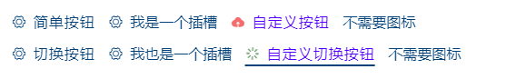
调用示例:
 1     <div class="mt-10">
 2             <lilo-icon-button class="mr-10" title="简单按钮"></lilo-icon-button>
 3             <lilo-icon-button class="mr-10"><span>我是一个插槽</span></lilo-icon-button>
 4             <lilo-icon-button
 5                 class="mr-10"
 6                 title="自定义按钮"
 7                 :icon="{ type: 'el-icon-upload', color: '#f56c6c', size: '1rem' }"
 8                 :font="{ color: '#5500ff', size: '1rem' }"
 9                 @toggle="toggle"
10             ></lilo-icon-button>
11             <lilo-icon-button class="mr-10" :showIcon="false"><span>不需要图标</span></lilo-icon-button>
12         </div>
13         <div class="mt-10">
14             <lilo-icon-switcher class="mr-10" title="切换按钮"></lilo-icon-switcher>
15             <lilo-icon-switcher class="mr-10"><span>我也是一个插槽</span></lilo-icon-switcher>
16             <lilo-icon-switcher
17                 class="mr-10"
18                 title="自定义切换按钮"
19                 :icon="{ type: 'el-icon-loading', color: '#005500', size: '1rem' }"
20                 :font="{ color: '#5500ff', size: '1rem' }"
21                 :checked="true"
22                 @toggle="toggle"
23             ></lilo-icon-switcher>
24             <lilo-icon-button class="mr-10" :showIcon="false"><span>不需要图标</span></lilo-icon-button>
25         </div>
效果图: