matplotlib 中的 yticks 函数用于设置坐标轴的刻度和标签,包括位置和显示的文本标签。
matplotlib.pyplot.yticks(ticks=None, labels=None, **kwargs)
ticks: 刻度位置,可以是一个列表或数组。labels: 刻度对应的标签,可以是一个列表或数组。**kwargs: 其他关键字参数,用于控制刻度的外观属性。
最佳实践:
- 同样可以和xticks函数一样使用
rotation和fontsize参数。 - 如果需要显示百分比或其他特殊格式,可以使用
StrMethodFormatter。
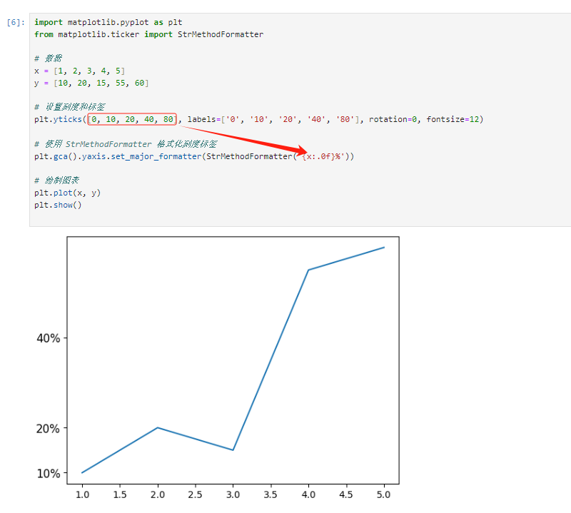
import matplotlib.pyplot as plt
from matplotlib.ticker import StrMethodFormatter

# 数据
x = [1, 2, 3, 4, 5]
y = [10, 20, 15, 25, 30]

# 设置刻度和标签
plt.yticks([0, 10, 20, 30, 40], labels=['0%', '10%', '20%', '30%', '40%'], rotation=0, fontsize=12)

# 使用 StrMethodFormatter 格式化刻度标签
plt.gca().yaxis.set_major_formatter(StrMethodFormatter('{x:.0f}%'))

# 绘制图表
plt.plot(x, y)
plt.show()
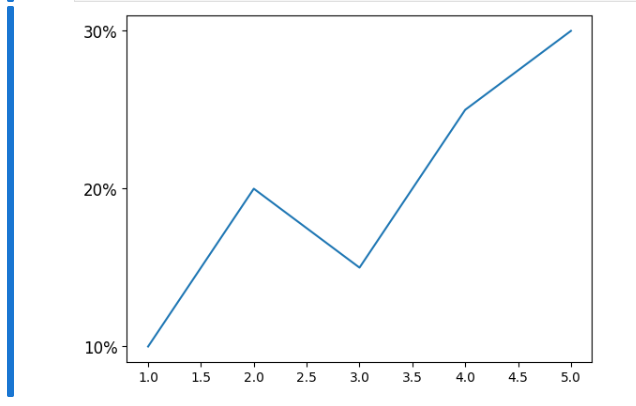
这段代码演示了如何使用 matplotlib 中的 yticks 函数来设置 y 轴的刻度位置和标签,并使用 StrMethodFormatter 格式化刻度标签。下面是对这段代码的详细解释:
这段代码的作用是绘制一条折线图,y 轴的刻度标签被设置为显示百分比,并且刻度标签被格式化为整数加上百分号。
1. 导入必要的模块:
import matplotlib.pyplot as plt
from matplotlib.ticker import StrMethodFormatter
这里导入了 matplotlib.pyplot 模块用于绘图,以及 StrMethodFormatter 用于格式化刻度标签。
2. 定义数据:
x = [1, 2, 3, 4, 5]
y = [10, 20, 15, 25, 30]
这里定义了 x 和 y 轴的数据。
3. 设置 y 轴刻度和标签:此用例没有设置x的刻度和标签哦
plt.yticks([0, 10, 20, 30, 40], labels=['0%', '10%', '20%', '30%', '40%'], rotation=0, fontsize=12)
plt.yticks()用于设置 y 轴的刻度位置和标签。[0, 10, 20, 30, 40]指定了刻度的位置。labels=['0%', '10%', '20%', '30%', '40%']指定了与刻度位置对应的标签。rotation=0表示刻度标签不旋转。fontsize=12设置刻度标签的字体大小。
4. 使用 StrMethodFormatter 格式化刻度标签:
plt.gca().yaxis.set_major_formatter(StrMethodFormatter('{x:.0f}%'))
plt.gca().yaxis获取当前坐标轴的 y 轴。set_major_formatter(StrMethodFormatter('{x:.0f}%'))设置刻度标签的格式,这里是将标签格式化为整数并添加百分号。
5. 绘制图表
最后,使用plt.plot()绘制了具有指定数据的图表,并使用plt.show()显示图表。